RDP 2025-06: An AI-powered Tool for Central Bank Business Liaisons: Quantitative Indicators and On-demand Insights from Firms 4. New Capabilities
August 2025
4.1 Quick searches
The first and simplest feature introduced by our new tool is the ability to efficiently filter the full history of liaison text using combinations of keywords and other metadata, such as a firm's geographic location and industry. After filtering, staff can subsequently extract insights for downstream policy analysis and produce on-demand briefings for executive staff.
Previously, the CRM captured a time series of ordinal staff scores and quantitative wage outcomes reported by firms. Staff also kept manual logs of key messages by theme. However, the process of manually retrieving liaison summaries on a broader range of topics and narrowing in on the relevant sections of the text were time-consuming tasks. This made it difficult to respond to as many ad hoc requests for information as might be useful. Further, doing so in a timely way was in many cases not possible and it was not easy to place information within its historical context, which meant that detailed historical comparisons of liaison information were infrequently completed. These difficulties in systematically searching over the full history of liaison information also exposed staff to potential behavioural biases.
The relational structure of the TARS database means that staff are now able to simultaneously apply many different combinations of paragraph- and firm-level filters for highly specific searches of the full history of liaison paragraphs. For example, in Figure 3, the application has been used to show only paragraphs for construction firms in the state of New South Wales that mention either cost, costs or expenses.
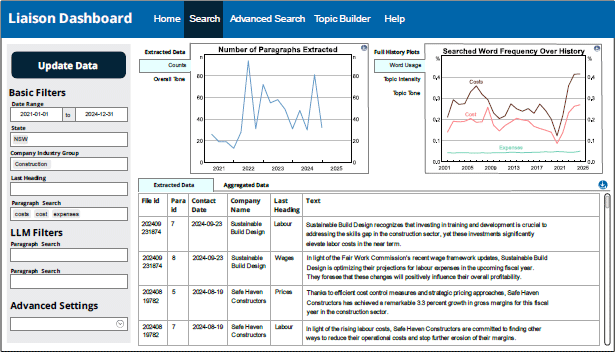
Note: This purely illustrative example shows mock firms and liaison data generated by ChatGPT because of the confidential nature of the information collected.
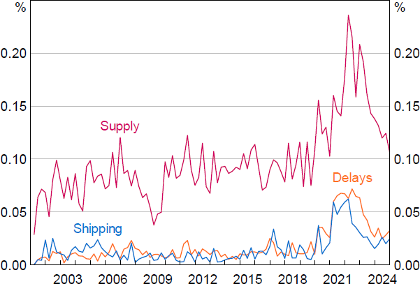
Advanced filtering can also be used to quickly examine term-frequency indices over the full history of liaison text. For instance, Figure 4 shows a count of the key terms ‘supply’, ‘shipping’ and ‘delays’ aggregated to a quarterly level to measure the associated term frequency over time in the liaison dataset.
Sources: Authors' calculations; RBA.
4.2 Topic and tone
The next capability introduced by our tool is filtering the historical liaison summaries by the macroeconomic and financial themes that pervade them. That is, rather than retrieving paragraphs through keyword and metadata filters alone, users can filter based on the themes that run through the text.
This capability confers two additional benefits. First, filtering the text by broad topics related to macroeconomics and finance allows for more general discovery of information, which is particularly well suited for broader topics of interest. For example, a user interested in firms' costs could filter for the topics of ‘non-labour costs’ and/or ‘labour costs’ to reveal all the possible ways costs may have increased or decreased for firms, both through time as well as between firms at a point in time. By manually parsing the associated text snippets a user could then drill into specific details about the various factors that have affected firms' costs over the cycle.
Second, in addition to filtering by topic and then manually examining the text, statistical indicators can be constructed that measure, in a systematic way, the level of interest in the topic as well as the tone of the associated discussion. The fundamental idea behind these widely used text-as-data statistical measures (see Blei (2012)) is that the amount of time interviewees spend talking about a specific topic indicates its significance and that the tone of the discussion is informative and can be captured by examining the semantics of the text – such as the lexical choice of words, modifiers, polarity, negation and use of intensifiers or diminishers.[7]
Specifically, we can define the level of interest in a topic by counting the number of text snippets (be it sentences or paragraphs) dedicated to it. For a given period t, we have liaisons i = 1...Nt. The topic exposure for liaison i is:
Average topic exposure for all liaisons within period t (including multiple liaisons by the same firm, if applicable) can be computed by averaging this ratio over the Nt liaisons that occurred during period t, treating each liaison's exposure equally regardless of the length of the summary:[8]
Next, the tool allows staff to measure the tone of discussions about a given topic, giving rise to our second NLP-based aggregate indicator:
Equation (2) calculates the average tone of the discussions about a particular topic by averaging the tone of each single liaison and then averaging these over the Nt liaisons that occurred during period t.[9]
The procedures we use to classify the topic of each text snippet and measure the tone of the associated discussion are discussed next.
4.2.1 Language models
Our first approach to classify the topics discussed in each liaison paragraph and measure its tone is to use transformer-based language models (LMs).
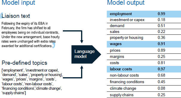
Starting with topic classifications, for every liaison paragraph – including new paragraphs as they become available – we use a transformer-based LM to determine the probability the paragraph is about each of our 14 topics of interest. Each topic probability score is between 0 and 1 and is independent of the other topic scores, meaning a paragraph can have a high likelihood of being about multiple topics at the same time. In practice, this is done by enabling the model's multi-label option, such that it performs 14 separate passes over the corpus to assess the probability of each topic independently. In the liaison summaries each paragraph of text is often about multiple topics and we are more interested in identifying those topics rather than clearly distinguishing between predominant topics.
The chosen topics of interest include: ‘demand’, ‘sales’, ‘investment or capex’, ‘property or housing’, ‘employment’, ‘wages’, ‘prices’, ‘margins’, ‘costs’, ‘labour costs’, ‘non-labour costs’, ‘supply chains’, ‘financing conditions’, and ‘climate change’.
These topics were selected in close collaboration with subject matter experts from the liaison program and broadly reflect the core questions used in the program. Categories can be expanded to include new topics as needed.[10] The stylised example shown in Figure 5 illustrates how the model assigns probability scores to paragraphs of text, with the LM in this instance indicating there is a high probability the paragraph is about ‘employment’, ‘wages’ and ‘labour costs’. The specific transformer-based LM used for topic classification is BART-large-MNLI.[11] This model can classify text into user-defined categories without prior training on those specific categories.[12] The model's training objective is to minimise the statistical loss associated with re-constructing corrupted sentences into their original form, learning the dependencies and context of natural language along the way (Lewis et al 2019).
To filter paragraphs based on the output from the topic classification model we need to map from the probabilistic scores to a true/false variable that indicates if a given paragraph is about a given topic. We do this with a threshold: a topic label is assigned to a paragraph if the probability for that label is greater than a pre-defined threshold:[13]
We can also quantify the level of interest in each topic over time. For liaison i in time t the count of paragraphs p about a given topic is given by:
where the indicator function {.} is equal to +1 if the topic probability is greater than some threshold. This expression is the numerator in Equation (1) when it is estimated using LMs.
Next, we use a transformer-based LM called FinBERT (Yang, Uy and Huang 2020) to analyse the tone of each paragraph. FinBERT is fine-tuned to assess the sentiment of financial text. It was trained on a large dataset of financial news, enabling it to capture the nuances of financial language more accurately. FinBERT outputs a sentiment score between −1 (negative) and +1 (positive) for each paragraph.[14] The combination of topic classification and sentiment labels for each paragraph provides a comprehensive view of the interest in, and tone of, different economic concepts. Users can select paragraphs based on the topic classification (Equation (3)) and then calculate the average tone of these paragraphs by averaging the sentiment scores estimated by the LM.
4.2.2 Keywords
Our second approach to classify the topics in each liaison paragraph and measure its tone is to use lists of relevant keywords.
Starting with thematic categorisations, users can construct their own topics by building up lists of keywords or phrases related to that topic. One way to construct these lists of keywords is to consult with analysts that have deep domain expertise in the topic of interest. For example, this was the approach taken in Windsor and Zang (2023) when constructing lists of keywords related to input costs, demand and final prices. These lists of keywords can be passed into our tool to filter paragraphs.
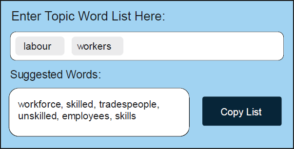
As a complement to this approach, our tool helps users augment their lists of topic-specific keywords using machine learning. Specifically, it uses word2vec (Mikolov et al 2013) to automatically suggest words that are semantically similar to those in a pre-existing list of keywords or phrases (see Figure 6, for example) to help analysts build up the most representative list of words for a topic. In this way, users can iteratively use the pre-trained word2vec model to populate and extend a list of keywords by first specifying an initial set of seed words related to the topic; second, selecting which suggested words (based on semantic similarity) to incorporate; and third, repeating this process until they are satisfied with the completeness of their list of terms given their area of interest.
Word2vec uses a shallow, two-layer neural network to learn word embeddings (that is, their meanings) from large text corpora. These embeddings capture semantic relationships between words, meaning that words used in similar contexts are mapped to nearby points in the vector space. We trained word2vec from scratch on the full liaison text dataset. This allows the model to better capture the semantics of liaison notes than a model trained on a more generic corpus (such as Wikipedia or the news).[15]
In this paper, our keyword-based topic and tone classifiers for ‘wages’ and ‘labour costs’ (used in the preceding sections) are constructed using this approach. Lists of words about wages and labour costs were compiled in consultation with economists from the liaison team and these lists were then augmented using the word2vec-based topic builder.
Having defined a topic in this way, the tool can then be used to count the number of times words from the list appear in each liaison summary, assuming the frequency of mentions reflects the importance of the topic. Specifically, letting d be the pre-defined dictionary (list of keywords) and breaking down liaison summary i into its constituent words Wi, t = [w1,w2,...,wn], (with repetitions included as separate elements), we can count terms according to the below:
where the sum iterates over each word w in liaison summary i and the indicator function {.} checks if the word w is in the dictionary d; if this is true it equals 1, otherwise it equals 0. This expression is used as the numerator of Equation (1) when measured using a keyword-based approach. The denominator is equal to the total number of words in the list Wi,t, such that the keyword-based topic exposure indicator corresponds to the share of words in each liaison summary that are in the relevant dictionary.
Next, to measure the tone of each sentence, users can develop new lists of tonal keywords or rely on several pre-existing dictionaries, such as the popular Loughran and Macdonald (2016) dictionary. To create keyword topic-specific tone indices, users can first filter for paragraphs that contain relevant keywords for their topic and then calculate the tone of these pre-filtered paragraphs by counting the number of words with positive tone (as defined by the dictionary) and subtracting the number of terms with negative tone (as defined by the dictionary).
To provide an example, Table 1 shows four text snippets related to wages alongside the LM-based topic probability (from BART-large-MNLI), the LM-based sentiment score (from FinBERT) and the relevant sentiment words.[16]
| Text snippet | LM-based topic probability | LM-based sentiment | Sentiment words |
|---|---|---|---|
| Wages rose by 4 per cent on average across the business, above the long-term average of 2–3 per cent. | 0.99 | 0.95 | ‘rose’, ’above’ |
| The firm has been considering different options for remuneration given the current conditions. They have decided to allow a small increase in wages, plus performance-based bonuses. | 0.97 | 0.67 | ‘increase’ |
| The outlook for wages growth remains closely linked to CPI. | 0.99 | 0.00 | |
| Annual wage growth has been very low, at around 2 per cent, and this is likely to continue. | 0.99 | −0.96 | ‘low’ |
|
Sources: Authors' calculations; RBA. |
|||
4.2.3 Assessing accuracy
The benefit of the keyword-based approach is that it is completely transparent. However, the process of developing dictionaries is manual and has several limitations. First, the dictionaries are non-exhaustive, giving rise to false negatives. Second, relying on keyword matches does not capture semantic meaning, potentially giving rise to a significant number of false positives. Finally, in our applied case, dictionaries are vulnerable to changes in the language used in liaison summaries over time, which could be driven, for example, by changing editorial preferences among management and general changes in the style of internal drafting. In contrast, the LM-based approach can capture context and semantic meaning but is less transparent and could struggle to generalise from the financial text on which it was trained. How well each approach performs is a question that must be evaluated empirically.
To assess and compare the topic accuracy of our dictionary- and LM-based classifiers, we focus on the performance of our approaches in classifying liaison paragraphs into the topics ‘wages’ or ‘labour’. This is done by comparing 600 labelled paragraphs from each approach to human-labelled classifications, which is the consensus classification from three human experts.
We use three statistics to summarise the validity of our dictionary- and LM-based topic classifications. The first is the precision of the classifications for the wages or labour topics when measured against the human consensus – that is, given the classifier tagged a paragraph as about a given topic, what is the probability the paragraph is about that topic according to human consensus. This is estimated as the number of paragraphs both the classifier and human labellers agree are about the topic divided by the total number of paragraphs the classifier alone assigns to the topic. Put differently, this is estimated as the number of true positives (TPs) divided by the number of TPs plus false positives (FPs). The second is recall – that is, given that the human consensus labelled a document as belonging to the wages or labour topics, what is the chance that our classifiers do the same. This is calculated by taking the number of TPs divided by the number of human-labelled paragraphs classified as being about that topic, or TPs plus false negatives (FNs). The final metric is the F1 score, which is the harmonic mean of precision and recall.
To select our sample of paragraphs for human assessment, we pick those that are likely to be about the wages or labour topics, as identified by the LM. We do this to deliberately increase the number of these paragraphs to make sure we have enough examples to evaluate performance properly. To adjust for this increase, or up-sampling of the positive class, we create weights for each paragraph to show how representative it is of all the liaison summaries. These weights are then used to calculate our performance statistics (see Appendix A for details).
A few things stand out in the results shown in Table 2. First, at a high level, this exercise indicates that our approaches to classifying paragraphs into topics related to economics and finance – that is, the LM- and keyword-based approaches – are highly accurate. Overall F1 scores are high relative to external benchmarks.[17] This is because the text of the liaison summaries being classified is very clean, having been written according to a pre-defined template that generally adheres to a thematic structure and is drafted and edited to be clear and concise. In addition to this, the topics we have chosen to assess accuracy against – ‘wages’ or ‘labour’ – are relatively easy to identify. In a smaller spot-checking exercise presented in Appendix B, we find that topics that require more context and nuance to properly classify – such as ‘non-labour costs’ and ‘financing conditions’ – appear to have lower precision (see Table B1).
| Precision (TP / TP + FP) |
Recall (TP / TP + FN) |
F1 | |
|---|---|---|---|
| Human 1 versus human consensus | 0.99 | 0.91 | 0.95 |
| LM-based versus human consensus | 0.96 | 0.73 | 0.83 |
| Dictionary versus human consensus | 0.89 | 0.97 | 0.93 |
|
Sources: Authors' calculations; RBA. |
|||
Second, even though the overall classification accuracy is high, human error still affects the task. When comparing an individual human annotator's labels to the majority consensus of human annotators, precision is nearly perfect (0.99), meaning the annotator rarely labels something as positive when it is not. However, recall is lower (0.91), indicating that the annotator misses some of the positive labels identified by the majority.
Finally, while the dictionary-based method has better overall performance, as indicated by the F1 score, the LM-based classifier is more precise. This is because the LM is more discerning when it comes to classifying relevant paragraphs (i.e. it has higher precision) but is more prone to exclude relevant paragraphs (i.e. it has lower recall). A user looking to minimise false positives would be advised to err on the side of using the LM-based classifications.
4.2.4 Topics and tone: an example
For illustrative purposes, Figure 7 provides an example of the extraction of a topic exposure index (from Equation (1.1)) and topic-specific tone index (from Equation (2)), focusing on the ‘wages’ topic. Indices are shown using both the LM- and dictionary-based approaches. A few features are worth highlighting.
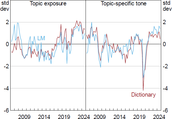
Note: Each series is standardised to show how many standard deviations it is from its mean value.
Sources: Authors' calculations; RBA.
First, for the topic exposure indices and the topic-specific tone indices, both the LM-based and the dictionary-based versions are similar when aggregated to a quarterly frequency. The correlation between each of the topic exposure series is around 0.75. This similarity, or convergent validity, suggests that both indices are capturing the same underlying phenomenon, even though they were derived using different approaches. This is also true for the topic-specific tone series.
Second, the aggregate indices from both methodologies appear to be related to significant turning points in the official measure of wages growth. For instance, the tone about wages declined after the global financial crisis as well as immediately after the outbreak of the pandemic in early 2020. Following the pandemic, interest in the ‘wages’ topic peaked at historically high levels owing to concerns around the availability of suitable labour. This increase in topic exposure among liaison contacts led a strong rebound in the official statistical measure of wages growth. Summing up, it appears our topic exposure and topic-specific tone indices are a useful narrative tool for explaining aggregate fluctuations in topics related to economics and finance from the unique perspective of firms.
4.3 Uncertainty
In addition to using keywords to capture topics and tone, we can also use them to measure uncertainty. An important advantage of using liaison material to measure uncertainty is that it contains the direct views of firms. While there have been numerous studies focusing on measuring macroeconomic policy uncertainty (e.g. Jurado, Ludvigson and Ng 2015; Baker, Bloom and Davis 2016; Ahir, Bloom and Furceri 2020) there has been less focus on measuring firm-level uncertainty specifically through text analysis. Our text analytics and information retrieval tool makes it possible to analyse text that records the direct views of firms over a long period of time.
The construction of our liaison-based uncertainty index is the same as that for the keyword-based topic exposure indices discussed above. As a starting point we use Loughran and McDonald's (2016) list of 298 words related to uncertainty. This initial dictionary was then consolidated by expert staff from the RBA's liaison team to a core set of words, judged to be commonly used to describe uncertainty in liaison summaries written by staff.[18] This core set was then expanded using a machine learning-based model (word2vec) that identifies contextually similar words specific to the liaison text, leading to a final list of 83 uncertainty terms in our dictionary.
Trends in the resulting business liaison uncertainty index are shown in Figure 8. Intuitively, uncertainty peaks among liaison contacts in the global financial crisis, around the time of Australia's 2010 hung parliament, early in the pandemic and just after the first interest rate increase following the pandemic in 2022.
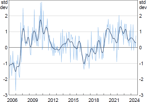
Note: Series is standardised to show how many standard deviations it is from its mean value; monthly with a 13-month Henderson trend.
Sources: Authors' calculations; RBA.
While our new index captures a unique aspect of uncertainty by eliciting the direct views of firms about the specific conditions they face, it is useful to externally validate it by comparing it to other, more broadly based, uncertainty indices. These include the Economic Policy Uncertainty Index for Australia, the Australia Economic Uncertainty Index and the Australian stock market volatility index (S&P/ASX200 VIX).[19] Correlations with the Economic Policy Uncertainty Index for Australia and the Australian Economic Uncertainty Index are around 0.4, while the correlation with the S&P/ASX200 VIX is lower at around 0.25 (all statistically significant). This suggests that there is a common firm-driven uncertainty factor driving variation in these indices, but that our new index is not capturing much uncertainty emanating from financial markets.
4.4 Extracting precise numerical quantities
Finally, the tool has the capability to extract and access specific numerical quantities mentioned in the liaison summaries. The program has recorded information on firms' numerical outcomes (such as growth in their wages and prices over the previous year and expected growth for the next year) since its inception. However, except for wages, this information has not been systematically recorded, other than in liaison summaries, over the 25-year history (spanning 22,000 liaison notes) and so a time series has not been readily available for analysis. Our tool enables users to extract and access a broader range of numerical quantities. Below, we focus on the workflow associated with extracting and validating firms' self-reported inflation figures in the liaison summaries.
To create a time series of firms' reported price inflation, we start by extracting relevant numbers from a given firm's liaison summary. These numbers are then averaged to produce document-level price inflation rates.[20] These numbers are then averaged again across all firms, N, in each time period to produce quarterly (or monthly) price inflation measures, as per Equation (5) below:
Various text processing techniques are performed in a step-by-step manner to do this:
Step 1. Rule-based filters are applied to narrow the search space to paragraphs that mention ‘price’ or ‘prices’ and that contain numbers. Paragraphs are also filtered for those that contain the words ‘per cent’. These filters were designed in close consultation with expert staff on how liaison notes have historically been drafted and structured.
Step 2. From this narrowed corpus an LM is used to identify clauses that are likely to be about price changes. The transformer-based LM used in this stage (‘roberta-base for Extractive QA’) was designed to help users interrogate text by submitting questions and receiving answers about the text (Lui et al 2019).[21] For each liaison sentence, the model was asked the following question: ‘What is the rate associated with the price change?’. The model typically responds with an extract that indicates a price change, for example ‘4–5 per cent’.
Step 3. Another LM is used to determine the sign (+ or −) of the change in prices. To do this, BART-large-MNLI (the language model introduced in Section 4.2.1 to group text into pre-defined topics) is used. This model is used to determine which of the following labels best describes the sentence: ‘price increase’, ‘price decrease’ or ‘no changes to price’.[22] Each label corresponds to a sign. For example, if a sentence is found to be best described by ‘price decrease’, it will be assigned a –1 value. A ‘No change’ sentence is assigned a 0. The final step simply multiplies the extracted number from Step 2 with its sign.
Step 4. To remove outliers, extracted prices that fall outside of the 10th and 90th percentiles of the distribution across firms each year are dropped in that year.[23]
Figure 9 compares three series: the extracted price inflation estimates, official measures of consumer price inflation, and ordinal staff scores for current price inflation. The three series are tightly associated: the peak correlation between extracted price inflation and actual CPI inflation is 0.77 while the peak correlation with staff scores recorded for firms' prices outcome is 0.85.[24] Granger causality tests for predictive or contemporaneous relationships also indicate there is bi-directional Granger causality between the extracted price inflation series and official statistics – that is, past information in the extracted price inflation measure can help to predict CPI inflation in the reference quarter, after considering past values of both variables, and vice versa. Moreover, the self-reported price inflation estimates lead the staff scores, with Granger causality only running in one direction.
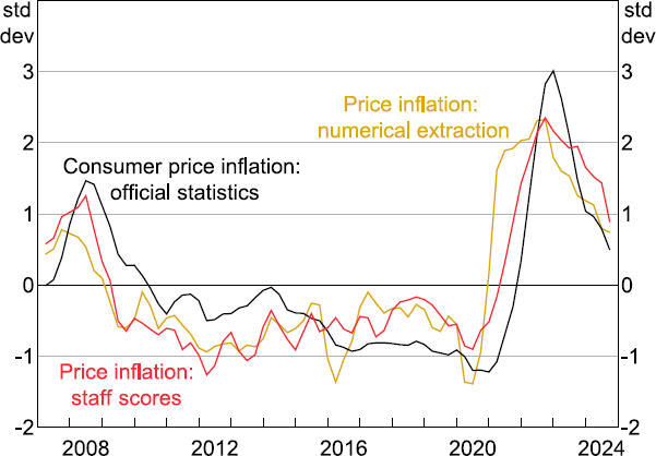
Notes: Each series is standardised to show how many standard deviations it is from its mean value.
Sources: ABS; Authors' calculations; RBA.
In addition to providing a timely read on developments in average price inflation over time, we can also use the new extracted price inflation measure to examine the distribution of price outcomes across firms over time. Figure 10 illustrates how the distribution of price growth across firms has evolved. The first thing to note is that the dispersion of price inflation across firms has stayed reasonably stable over time, including over recent years, which were characterised by sizable supply shocks. However, the distribution became more positively (or right) skewed over 2021 to 2023. During that time, a few firms were reporting large price increases, while a large share of firms were reporting moderately stronger rises relative to the preceding couple of years. Relative to the decade prior to the pandemic where the distribution of outcomes was negatively (or left) skewed, firms' outcomes over 2024 remained consistent with other periods of higher inflation.
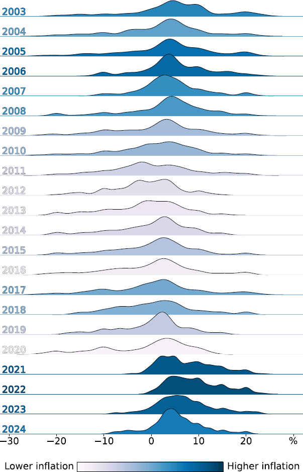
Note: When using and plotting the self-reported price inflation series we remove outliers, defined as observations falling outside of the 10th and 90th percentiles of the distribution.
Sources: Authors' calculations; RBA.
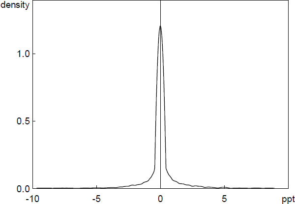
To validate the accuracy of our approach to extracting numerical quantities, we replicate the exercise conducted above for prices on wage information. This has the advantage that the liaison team has systematically hand-recorded numerical wages growth reported by firms over the past two decades in a database, providing a benchmark to test the machine-extracted numbers against.
Figure 11 plots the liaison-level errors that result from subtracting the extracted self-reported wage inflation rates from the hand-collected series. The mean and median of the errors (0.3 and 0.0 basis points, respectively) are not statistically different from zero with a mean absolute value of 50 basis points and a standard deviation of 140 basis points. Over time the two series are also very closely correlated, with a correlation of 0.92, indicating that our approach to extracting numerical quantities from the text performs well.
Sources: Authors' calculations; RBA.
Footnotes
The focus of liaison meetings is primarily driven by the core questions that have been stable over time, with a portion of meetings typically used to answer each question. Interviewers can steer interviewees with follow-up questions, but by and large, the length of time spent on a topic is determined by a contact's interest and willingness to share information on that topic, with the vast majority of each interview comprised of the interviewee talking. [7]
Alternatively, overall topic exposure can be calculated by summing the counts of relevant text snippets on the given topic across all firms at time t and dividing by the total number of snippets across all firms at time t, providing a collective measure of topic exposure, where firms with longer liaisons have more effect on the overall exposure. [8]
In Equation (2), firms are not weighted according to how many text snippets they dedicate to discussing the topic of interest. To account for this, overall topic-specific tone can be calculated by taking an average of the tone of all relevant text snippets in time period t, with firms that discussed the relevant topic more having more effect on the overall exposure. [9]
Any arbitrary topic label can be added to the list. With the computational resources available to us now (T4 GPU), classifying the current history of paragraphs into a new topic takes around 2.5 hours. [10]
The Hugging Face model card is available at <https://huggingface.co/facebook/bart-large-mnli>. [11]
BART-large, a pre-trained model based on Bidirectional and AutoRegressive Transformers, learns language semantics from large datasets such as Wikipedia and BookCorpus. Bidirectional and AutoRegressive Transformers are advanced types of neural networks used in NLP. ‘Bidirectional’ means the model reads text in both directions (left to right and right to left) to understand context better. ‘AutoRegressive’ means the model predicts the next word in a sequence based on the previous words. Together, these techniques help the model understand human-like text. The MNLI part, which stands for Multi-Genre Natural Language Inference, fine-tunes BART using a dataset of sentence pairs labelled as entailment or contradiction. This fine-tuning enables BART to function effectively as a zero-shot text classifier. Despite the name, BART-large is now considered a small language model – with only around 400 million parameters. We opted for a small LM to ensure fast processing across the entire data history from within our secure (computationally limited) environment. As we gain access to improved computational capacity, future work may examine whether larger models can improve performance. [12]
The application allows users the flexibility to choose the threshold, but we recommend setting the threshold high enough to minimise the incidence of false positives. [13]
FinBERT has a reported accuracy of 84 per cent on the Financial PhraseBank dataset classification task, beating available benchmarks at the time of its publication. [14]
Training the model specifically for our corpus was feasible because word2vec is a shallow neural network and requires much less computational resources or data to train than transformer-based LMs. [15]
FinBERT classifies ‘higher wages growth’ as having positive sentiment. This is because FinBERT was fine-tuned on labelled sentences from financial news about listed companies, where annotators were asked to give labels according to how they think the information in the sentence might affect the mentioned company's stock price. In doing so, the LM has learnt that ‘increasing wages’ usually carries positive sentiment from the perspective of an investor. Knowing this is a feature of the model, users should interpret this information in this context. [16]
For example, the benchmark F1 score for the BART-large-MNLI classifier when assessed against the Yahoo Answers database in Davison (2020) is 0.54. [17]
This process of expert filtering allowed staff to identify and remove words commonly used to convey uncertainty in other contexts. [18]
The Economic Policy Uncertainty Index for Australia (Baker et al 2016) is a text-based frequency index counting the number of articles that are relevant to Australia that contain at least one of the words ‘uncertain’, ‘uncertainty’, ‘economic’ or ‘economy’. The Australia Economic Uncertainty Index (Moore 2017) is a composite index of newspaper text, analyst earnings forecast dispersion, stock market volatility and GDP forecast dispersion. [19]
Because the liaison program collects information on actual and expected prices, the average includes both backward-and forward-looking price information where both have been provided by firms. A range of approaches were tried to separate past and future statements around prices (e.g. tense detection using dictionary look ups as well as a previously trained tense detection algorithm), but no method provided useful improvements. [20]
The Hugging Face model card is available at <https://huggingface.co/deepset/roberta-base-squad2>. [21]
For each sentence, the model assigns probabilities of that sentence belonging to each of the three labels. These probabilities sum to 1. The label with the highest probability value gets associated with the sentence. [22]
Outliers in some cases will reflect errors – either a typographical error or extraction of a number unrelated to the firm's final price increase. [23]
Because staff scores involve more judgement, it is possible the extracted series removes any human hesitancy around scoring turning points that may affect judgement in scoring outcomes on an ordinal scale. Further, staff scores for outcomes and expectations are scored separately, whereas price extractions will often capture both and average them. As a result, the extractions draw in additional forward-looking information into the extraction measure. [24]