RDP 2021-09: Is the Phillips Curve Still a Curve? Evidence from the Regions Appendix B: Local Labour Market Definitions
September 2021
- Download the Paper 1,707KB
US studies often use ‘commuting zones’ to represent local labour markets across the United States (see Foote, Kutzbach and Vilhuber (2017) for a review). Commuting zones are areas with a high degree of overlap between where people live and where they work. We develop similar classifications by following the methodology used to construct US commuting zones (Tolbert and Sizer 1996), with a few modifications. Our steps are below.
Step 1: Data matrix
The building blocks of our classifications are 2,089 SA2s (at the 2011 Census), which cover the entire continent.[47]
The 2011 Census provides employment counts by ‘place of usual residence’ cross-tabulated by ‘place of work’. These cross-tabulations – in the form of a 2,089 by 2,089 matrix – provide a detailed snapshot of movements of people to and from work in 2011. Each row of the matrix represents a place of usual residence (origin), each column represents a place of work (destination), and each cell is the number of people who travel from a particular origin to a particular destination for work.
We use this data matrix to construct a 2,089 by 2,089 ‘dissimilarity matrix’. Each element Dij measures the dissimilarity of SA2 i from SA2 j :
where fij is the number of commuters who live in i and work in j, and (including fii) is the resident workforce in SA2 i .[48] Values of Dij close to zero indicate strong commuting ties between areas i and j, while values close to one indicate weak commuting ties. The main diagonal of the dissimilarity matrix is set to zero.
Step 2: Cluster analysis
The next step is to group the SA2s into a set of ‘clusters’, with each cluster representing a distinct local labour market (otherwise known as a commuting zone). To do this we perform a hierarchical cluster analysis using the dissimilarity matrix constructed in Step 1.[49] The clustering algorithm groups together SA2s based on the strength of their commuting ties.[50]
The most important decision in the procedure is at what point to stop merging clusters together. The algorithm starts out by treating each SA2 as its own cluster, and then continues to group these together – in order of how strong their commuting ties are – until we tell it to stop. If we stop the procedure too early, only the SA2s with the strongest commuting links will be merged into clusters. If we stop the procedure too late, even clusters with relatively weak commuting ties will be merged together.
The eventual number of clusters formed will depend on the ‘height’ of allowable clusters (i.e. the average between-cluster dissimilarity). As an example, at a height of 0.7 very few SA2s have been merged together – that is, most clusters will comprise a single SA2 (Figure B1). However, this changes rapidly as the height of allowable clusters is increased beyond this point: more and more SA2s are merged to form clusters and the average number of SA2s per cluster increases.
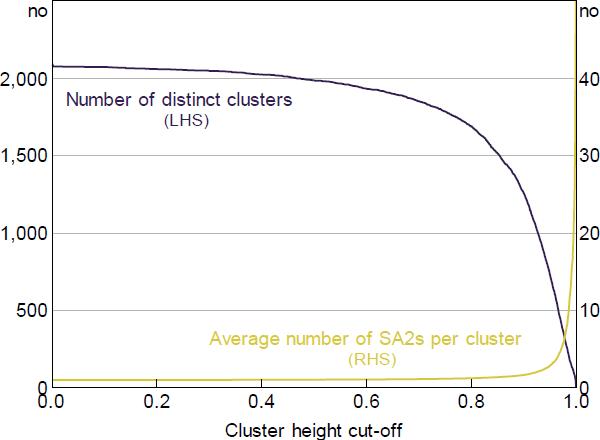
Sources: ABS; Authors' calculations
The commuting zone classifications commonly used in the United States are based on a rule that allows clusters to form that are no higher than a height of 0.98 (Tolbert and Sizer 1996). In other words, clusters that form at the 0.98 threshold are deemed to exhibit sufficiently strong commuting ties such that they should not be divided into multiple commuting zones, while clusters that form above this cut-off are deemed sufficiently distant from one another to warrant separation. This choice of cut-off value, which results in 741 commuting zones for the United States, was based on Tolbert and Sizer's (1996, p 14) observation that it ‘produced reasonable and consistent results across the wide variety of U.S. counties’.
We also define local labour markets based on a cut-off value of 0.98, to be consistent with the US research and because this cut-off value produces geographic groupings that look broadly sensible.[51]
Our local labour markets exhibit roughly the same amount of live–work overlap as SA4s (Table B1). Although higher cut-offs would increase the extent of live–work overlap, it would come at the cost of a smaller cross-sectional sample size and less integration within each labour market.
| Number of areas | Mean population (‵000s) |
Mean land area (‵000 km2) |
Mean inter-area commuting rate(a) (%) |
Mean inter-area mobility rate(b) (%) |
|
|---|---|---|---|---|---|
| SA2 | 2,196 | 10 | 4 | 65.1 | 10.2 |
| SA3 | 333 | 65 | 23 | 45.1 | 7.1 |
| SA4 | 88 | 244 | 87 | 26.9 | 4.7 |
| GCCSA | 16 | 1,344 | 480 | 4.3 | 3.5 |
| State/Territory | 9 | 2,390 | 854 | 2.5 | 3.2 |
| FERs – CofFEE | 159 | 135 | 48 | 14.7 | 5.4 |
| FERs – PC | 88 | 244 | 87 | 6.6 | 4.9 |
| Local labour markets | 291 | 74 | 26 | 29.9 | 6.8 |
|
Notes: As at 2011 Census; excludes Norfolk Island; greater capital city statistical areas (GCCSAs) include the greater capital city region of each state and the ‘rest of state’; functional economic regions (FERs) developed by the Centre of Full Employment and Equity (CofFEE) and the Productivity Commission (PC) are described in Appendix C (a) Average of the mean outbound commuting rate and the mean inbound commuting rate (b) Average of the mean annual outbound mobility rate and the mean annual inbound mobility rate (for the year to September 2011); excludes overseas arrivals and departures Sources: ABS; Authors' calculations; Centre of Full Employment and Equity; National Skills Commission; Productivity Commission |
|||||
Footnotes
Some SA2s represent unpopulated areas, such as airports, major commercial and industrial zones, national parks, defence land, urban parks, and sporting precincts. We combine these SA2s with their closest populated SA2. [47]
This calculation expresses the commuting ties between two areas with respect to the smaller of the two areas. In a few rare cases, the sum of the workers commuting between SA2s is greater than the smaller SA2's resident labour force, in which case we set Dij to 0.001. [48]
Following Tolbert and Sizer (1996), we use an average-linkage hierarchical clustering algorithm. [49]
When forming clusters, the algorithm is agnostic about whether SA2s are located next to each other (i.e. contiguous) or not. For example, if fly-in-fly-out workers are commuting long distances it is possible that distant SA2s could form a cluster. However, this rarely happens in practice given that such commuting patterns are atypical. [50]
By itself, the cluster analysis procedure offers little guidance for choosing the ‘optimal’ cut-off point. However, we can use other information to guide this choice. Theory suggests that variables such as wages growth, employment growth and housing price growth should be highly correlated across geographic areas within each local labour market (and less correlated across different local labour markets). As such, to help us choose an appropriate cut-off point we compare the average within-cluster correlation for these economic variables for every possible cut-off point. In addition to these correlations, we consider the average inbound and outbound commuting rates at every possible cut-off value. On these metrics, a cut-off of 0.98 produced reasonable results compared to other possible cut-off values. Although a higher cut-off would lead to a set of labour markets with lower inflow and outflow shares on average, this needs to be balanced against the fact the resultant labour markets would comprise regions with less synchronised market conditions. We also observe that our preferred local labour markets classifications look reasonable when plotted on a map. [51]