RDP 2009-06: Inflation Volatility and Forecast Accuracy 3. Properties of Inflation
October 2009
3.1 Level of Permanent Components
Figure 1 plots median estimates of the permanent component of inflation (τ) derived from the UC-SV model with actual inflation. All our models are estimated on quarterly inflation, but the results are presented on an annualised basis hereafter. Note that the graphs for the UK and the US have a different vertical scale than for other countries. Uncertainty is captured by 90 per cent confidence intervals around the permanent component shown in Figure D1. Unsurprisingly, the width of the confidence intervals is higher when inflation is more volatile.
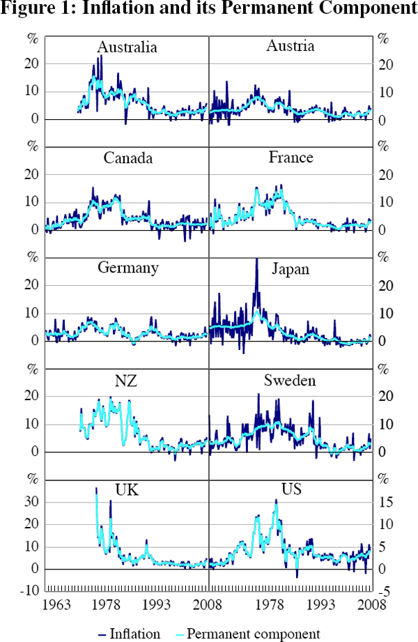
Three features of Figure 1 are especially salient. First, although the peaks of the ‘Great Inflation’ period (1971–1983) can be seen in most countries, their relative size varies greatly, and the effects of country-specific shocks are readily apparent. Second, in the 1970s the estimated permanent component was high and volatile, tracking inflation itself. However, after 1990 the permanent component declined markedly, to a level that is relatively stable by historical standards. Finally, most countries experienced an increase in inflation in the last two years of the sample, much of which was due to a rise in the permanent component.[10]
More than the usual level of caution seems warranted when placing economic interpretations on the results of this statistical model. As already noted, the UC-SV model, taken literally, implies somewhat extreme behaviour of inflation (out-of-sample) – namely, that it has a unit root and that the variance of the change in inflation is infinite (Pagan 2008). With these caveats in mind, one interpretation is that the shocks to inflation in the 1970s were permanent (or at least very persistent), while the dominance of temporary shocks in the latter half of the sample shows that the permanent component of inflation became better anchored (Mishkin 2007).
Bernanke (2007) interprets Stock and Watson's results as evidence that inflation expectations in the United States were better anchored after 1990 than from 1970 to 1980, due to improvements in monetary policy. The results shown in Figure 1 are consistent with the same conclusion for all the countries in our sample; although there may be other plausible explanations (including the absence of large inflation shocks).
Table 2 reports simple summary statistics for the permanent component of inflation,
τ. The first row for each country shows the sample average,  .
The second row gives the sample standard deviation of τ. The
third row shows the ratio of that standard deviation to the standard deviation
of inflation. The results show that the average of the permanent component
after 1992 fell in all countries. It also appears that in the latter part
of the sample, the permanent component of inflation converged somewhat across
countries. Furthermore, the sample standard deviation of τ clearly
fell in all countries between the first and second parts of the sample. Over
time, the volatility of the permanent component tended to fall somewhat relative
to the volatility of overall inflation for most, though not all, countries.
.
The second row gives the sample standard deviation of τ. The
third row shows the ratio of that standard deviation to the standard deviation
of inflation. The results show that the average of the permanent component
after 1992 fell in all countries. It also appears that in the latter part
of the sample, the permanent component of inflation converged somewhat across
countries. Furthermore, the sample standard deviation of τ clearly
fell in all countries between the first and second parts of the sample. Over
time, the volatility of the permanent component tended to fall somewhat relative
to the volatility of overall inflation for most, though not all, countries.
| 1960–2008 (I) |
1977–1992 (II) |
1993–2008 (III) |
Change (III)-(II) |
||
|---|---|---|---|---|---|
| Australia | |
5.88 | 7.68 | 2.66 | −5.02 |
| στ | 3.77 | 2.32 | 0.89 | ||
| στ/σπ | 0.85 | 0.75 | 0.62 | ||
| Austria | |
3.50 | 3.79 | 2.11 | −1.68 |
| στ | 1.84 | 1.42 | 0.91 | ||
| στ/σπ | 0.66 | 0.64 | 0.60 | ||
| Canada | |
4.14 | 6.38 | 1.98 | −4.40 |
| στ | 3.02 | 2.86 | 0.88 | ||
| στ/σπ | 0.86 | 0.87 | 0.44 | ||
| France | |
4.73 | 6.91 | 1.71 | −5.20 |
| στ | 3.75 | 3.94 | 0.72 | ||
| στ/σπ | 0.95 | 0.96 | 0.61 | ||
| Germany | |
2.88 | 3.07 | 1.89 | −1.18 |
| στ | 1.80 | 1.93 | 1.07 | ||
| στ/σπ | 0.82 | 0.84 | 0.72 | ||
| Japan | |
3.20 | 2.97 | 0.21 | −2.76 |
| στ | 3.18 | 2.08 | 0.89 | ||
| στ/σπ | 0.63 | 0.72 | 0.56 | ||
| NZ | |
6.69 | 9.74 | 2.20 | −7.54 |
| στ | 5.39 | 5.22 | 1.24 | ||
| στ/σπ | 0.98 | 0.97 | 0.75 | ||
| Sweden | |
4.84 | 7.74 | 1.61 | −6.13 |
| στ | 3.33 | 2.40 | 1.50 | ||
| στ/σπ | 0.74 | 0.58 | 0.65 | ||
| UK | |
5.60 | 7.55 | 2.46 | −5.09 |
| στ | 5.17 | 4.30 | 0.74 | ||
| στ/σπ | 0.94 | 0.88 | 0.73 | ||
| US | |
4.14 | 5.79 | 2.73 | −3.06 |
| στ | 2.83 | 3.30 | 0.78 | ||
| στ/σπ | 0.95 | 0.94 | 0.62 | ||
3.2 Time-varying Inflation Volatility
We turn now to the estimated time series of the volatilities of the permanent and
transitory shocks to inflation, that is,  and
and  .
(Note that these volatilities should not be confused with
.
(Note that these volatilities should not be confused with  and
and  , which govern the
magnitude of the time-variation in and .)
, which govern the
magnitude of the time-variation in and .)
The time profiles of σε,t and ση,t
are shown in Figure 2. Figure 3 shows the ratio of the standard deviation of the
permanent shocks to the sum of the standard deviations of the temporary and
permanent shocks, that is,  (with 90 per cent
confidence intervals).
(with 90 per cent
confidence intervals).
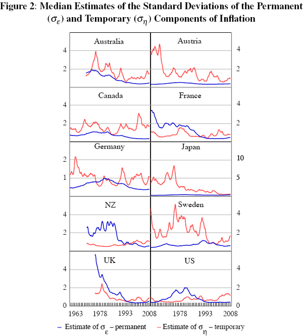
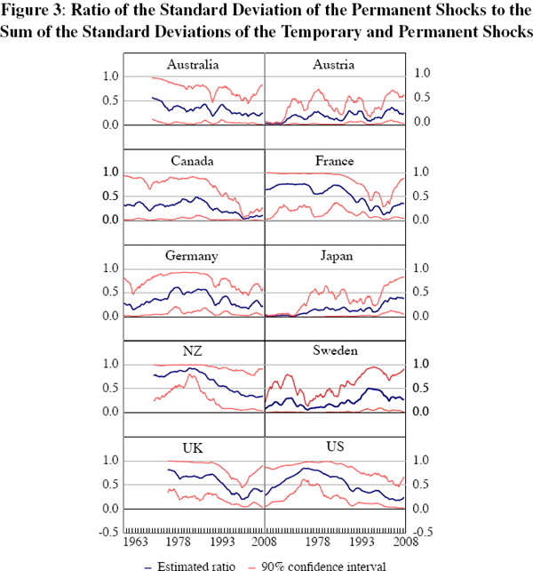
Across most countries in the sample, the high-inflation episodes of the 1970s were characterised by a relatively high level of variance of the permanent shocks, which had fallen by the mid 1990s. One interpretation is that the decline in the volatility of the permanent shocks (Figure 2) is evidence of a decrease in inflation uncertainty. Interestingly, the rise in the level of the permanent component of inflation in the 1970s (Figure 1) was matched by an increase in the volatility of the permanent shocks (Figure 2). The most recent estimates of the volatility of the permanent shocks are still very close to the sample lows in each country.
Focusing on the United States first, Figures 2 and 3 suggest that its monetary policy was less successful in stabilising inflation during the 1970s than at other times; this is reflected in the relative and absolute rise of σε in the 1970s. A similar pattern can be discerned in other countries, although there are some differences across countries. These differences will in part be due to the inherent uncertainty that is an explicit feature of any econometric estimates such as provided by the UC-SV model (but are not captured by more simplistic measures of underlying inflation trends). They are also likely to reflect differences in circumstances and institutions across the countries in our sample. Nevertheless, at least over more recent years, the relative importance of the volatility of the permanent shocks has been low in all countries – σε remained below ση and the estimated level of σε has been generally low relative to the uncertainty surrounding the estimate (see Table E1). This means that it is difficult to distinguish between different policy regimes based on the behaviour of the permanent component of inflation.
In order to shed more light on possible differences between IT and non-IT countries, we can compare estimates of the distribution of the permanent component of inflation across these two groups over time. Specifically, we look at four time periods: one before, one around, and two after the introduction of inflation targeting (exactly which dates we look at does not affect the key conclusions from this exercise).[11] At any point in time, we have an estimate of the distribution for the standard deviation of the permanent component of inflation (the median of each of these is shown in Figure 2 above). So, it is straight forward to combine these distributions across countries within the IT and non-IT groups, assigning equal weight to all countries within each group, as shown in Figure 4.
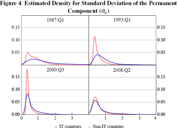
From this figure we can see some evidence that after 1993 the distribution of the standard deviation of the permanent shocks to inflation narrowed, particularly for IT countries. This suggests that inflation targeters became better at managing shocks hitting the economy than in the past (including, perhaps, by contributing less to monetary policy shocks) and are now comparable to non-targeters, who also improved on this score. This is consistent with Truman (2003), who finds IT countries experienced larger declines in inflation volatility, but with differences in initial conditions for IT and non-IT countries. Of course, caution should be used in interpreting the results. For example, we are unable to determine the extent to which these changes were simply due to good luck.
Footnotes
Ireland (2007) and Cogley and Sbordone (2008) analyse US inflation dynamics using comparable techniques, and produce similar results. International comparisons are, however, scarce. [10]
The adoption date of inflation targeting varies from country to country. Kuttner (2004) dates inflation targeting to have begun in: Australia in March 1993; Canada in February 1991; New Zealand in December 1989; Sweden in January 1993; and the UK in October 1992. All had adopted the inflation-targeting framework by 1993:Q1. Classifying countries as inflation and non-inflation targeters can seem a bit arbitrary, particularly for countries in Europe in the run-up to monetary union, which entailed explicit targets for inflation. [11]