RDP 2023-02: Did Labour Market Concentration Lower Wages Growth Pre-COVID? 4. How concentrated are Australian markets?
March 2023
- Download the Paper 1.8MB
Table 1 provides summary statistics on the degree of concentration in Australian local labour markets. Assessing whether labour markets are highly concentrated is difficult given the lack of clear guidance on what constitutes a ‘concentrated’ market. One benchmark that can be applied is whether the HHI is above 0.25. This benchmark is used by some competition regulators in product markets (US Department of Justice and Federal Trade Commission 2010), though whether it is appropriate for labour markets is unclear. On this metric around 58 per cent of markets are concentrated. However, these market account for only around 14 per cent of workers, as smaller markets are, unsurprisingly, more concentrated.
Another way to assess the level of concentration in Australian markets is to compare them to other countries, although this can be difficult due to different industry and locality definitions. Still, on this basis Australian markets appear less concentrated than those in Europe. In the sample of European countries examined in OECD (2021), markets with an HHI above 0.25 account for around 20 per cent employment, on average. Australian markets similarly appear less concentrated than US markets, based on evidence from Rinz (2018) (Figure 1), although they are potentially more concentrated than UK markets (Abel et al 2018).
These average levels hide a great deal of heterogeneity, as shown in Table 1. Part of this heterogeneity reflects difference across industries. As in the US, industries such as mining, manufacturing, transport and utilities, and retail trade tend to be more concentrated. In contrast, services, including accommodation and hospitality, tend to be less concentrated. This could, in part, reflect the fact that industry classifications tend to be less detailed in the services sector.[6]
| Unweighted | Weighted | |
|---|---|---|
| 25th percentile | 0.153 | 0.011 |
| Median | 0.298 | 0.031 |
| Mean | 0.346 | 0.103 |
| 75th percentile | 0.500 | 0.133 |
| Share with HHI | 58% | 14% |
| above 0.25 | ||
| Note: Reports summary statistics for local labour markets. Average taken for each market across time. | ||
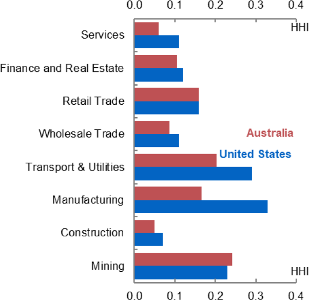
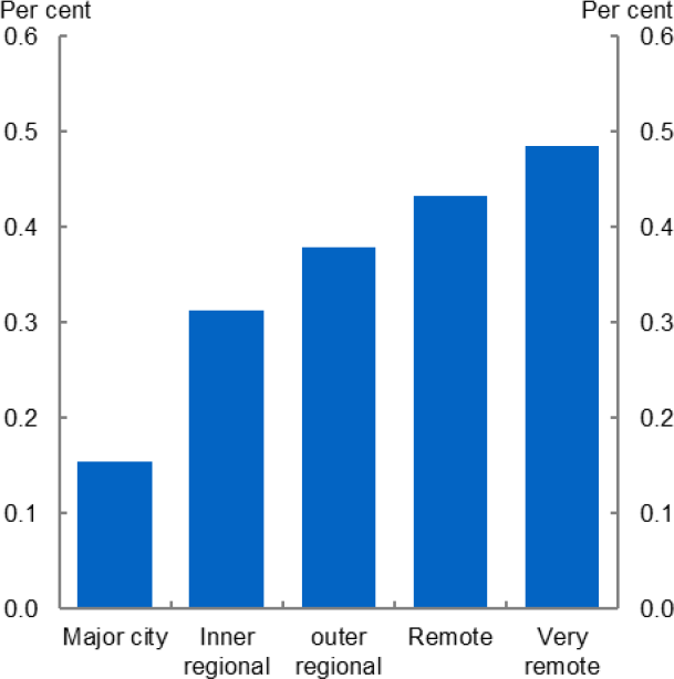
Note: Figure 1, services include Accommodation and Hospitality, Information, Media and Technology, Professional Services, Administrative Services, Arts & Recreation, and Other Services. Interpretation of the results for mining might be affected by fly-in-fly-out work. Figure 2 remoteness based on ABS remoteness structures. Source: Author’s calculations, Rinz (2018)
Much of the variation also reflects geographic differences. As shown in Figure 2, markets in major cities tend to be less concentrated. Unsurprisingly, regional and rural areas tend to have more concentrated labour markets.
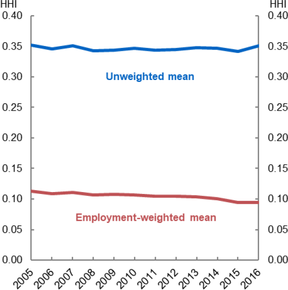
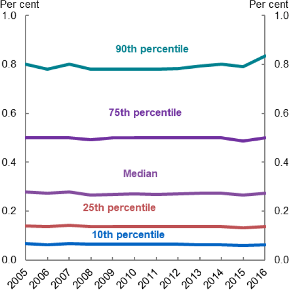
Overall, local labour market concentration has not changed in Australia over the sample. Figure 3 plots the average level of concentration. Using an employment-weighted average of the individual labour markets shows some decline over the period. However, this reflects a compositional shift with workers moving to urban centres, which tend to be less concentrated. The unweighted average has been broadly unchanged (Figure 3), while the distribution has been similarly stable (Figure 4). Taken together, this shows that concentration has been broadly unchanged over the period.
Source: Author's calculations
Footnote
Some caution should be taken in interpreting the mining results, given the use of fly-in, fly-out (FIFO) workers. Results for construction may also be affected by the prevalence of contractors who will not be recorded as employees. [6]