RDP 2019-01: Online Appendices: A Model of the Australian Housing Market Appendix C: Baseline Forecast
March 2019
- Download the Online Appendices 1,185KB
Our model can be used for conditional forecasting. Forecasts starting in 2018:Q3 are shown in Figure C1. These forecasts should not be confused with the RBA's official forecasts published in the Statement on Monetary Policy (SMP). Our forecasts are only one of many inputs to the SMP, which also reflects other models, leading indicators, liaison and judgement. To construct the forecasts we assume that interest rates evolve in line with forward rates. Real income and population growth are projected to grow at their recent average growth rates, according to autoregressions. We make similar neutral assumptions for other exogenous variables. We implicitly assume that policy with respect to zoning or taxes is unchanged. Then we solve the model.
These forecasts form the baseline for some of the scenarios considered in Section 5 of the paper. They are also of interest in their own right. Although the forecasts shown above quickly become out of date, the code used to generate them is available with the supplementary information for this paper on the RBA website, so anyone with access to the data can update them (series on vacancies and prices need to be purchased). These forecasts use data available at the end of October 2018. More recent forecasts show smaller increases in the cash rate and larger reductions in housing prices and construction activity.
In the past few years, construction activity has been moderately strong, relative both to its trend ratio to income (top left panel) and to exogenous household formation (top right). That reflects responses to previous falls in interest rates and rises in house prices. As those effects fade away, various measures of construction (the first three panels) and the vacancy rate (second row, right) decline. Real rents (third row, left) stop falling and gradually return to trend growth.
Over the next two years, the cash rate and bond yields rise gradually, in line with the yield curve (third row, right), which boosts the user cost of housing (fourth row, left). Real dwelling prices (last two panels) continue to decline, reflecting momentum and rising interest rates.
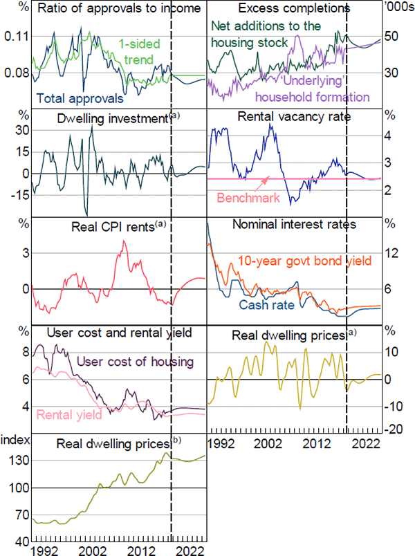
Notes:
Dashed vertical line represents forecasts beginning in 2018:Q3
(a) Year-ended growth
(b) 2005 average = 100
Sources: ABS; Authors' calculations; Corelogic; RBA; REIA