RDP 2016-04: Housing Prices, Mortgage Interest Rates and the Rising Share of Capital Income in the United States 4. Stylised Facts
May 2016
- Download the Paper 1.13MB
4.1 Housing Expenditure and Income by the Type of Housing
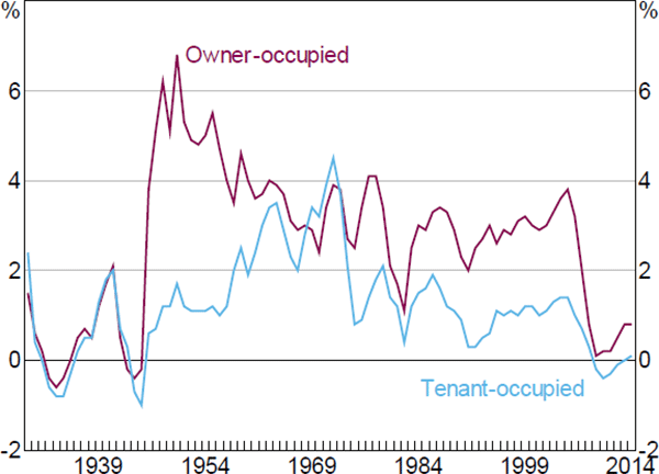
If we dig into the national accounts and divide the share of capital income by the type of housing, we find that the secular rise is mainly due to the rising share of income going to owner-occupiers (i.e. imputed rent). The owner-occupier share of aggregate income has risen from just under 2 per cent in 1950 to close to 5 per cent in 2014. The share of income going to landlords (i.e. market rent) has also doubled in the post-war era (left-hand panel of Figure 2). But, in aggregate, the effect of imputed rent is larger simply because there are nearly twice as many home owners as renters in the US economy. A similar, and perhaps even more striking, phenomena is observed in the personal consumption expenditure data (right-hand panel of Figure 2).
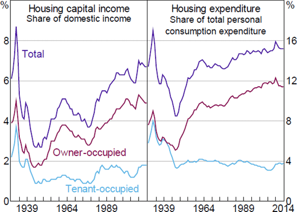
Note: Housing capital income measured as the net operating surplus of the housing sector
Source: Bureau of Economic Analysis
Piketty's first ‘fundamental law of capitalism’ provides a useful framework for decomposing the secular rise in the housing share. In the context of housing, the ‘law’ states that the share of housing capital (or rental) income (α) is equal to: i) the ‘rate of return’ on housing (r) multiplied by ii) the housing wealth-to-income ratio (β). For each type of housing j∈(O,T) (owner-occupied (j = O) or tenant-occupied (j = T)) this can be written as:
where, for each type of housing, total rental income is given by the average rental price (PR) multiplied by the real flow of housing services (YR). The total value of each type of housing stock is given by the average housing price (PH) multiplied by the real stock of housing (KH). For the aggregate economy, total income is given by the average price of all goods and services (P) multiplied by the real flow of all goods and services (Y).
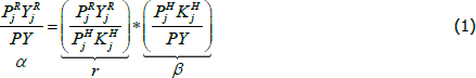
This decomposition in the national accounts suggests that the rise in the share of housing reflects a combination of both a higher rate of return (left-hand panel in Figure 3) and a higher wealth-to-income ratio (right-hand panel in Figure 3). The increase in the rate of return appears to explain the rise in the share of housing capital income in the early 1980s while the rise in the housing wealth-to-income ratio has been the more important factor since the 1990s.
Note: Housing capital income measured as the net operating surplus of the housing sector
Sources: Author's calculations; Bureau of Economic Analysis
But, most strikingly, the decomposition by type of housing indicates that the upward trend in the aggregate housing capital income share is due to an increase in the wealth-to-income ratio for owner-occupied housing. In contrast, the wealth-to-income ratio for tenant-occupied housing has been in steady decline since at least the Great Depression.
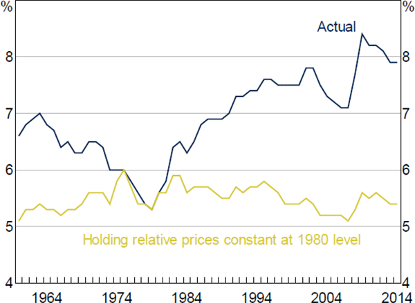
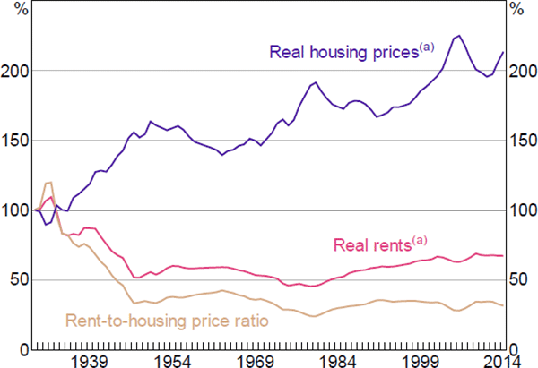
An alternative way to decompose the share of housing capital income is to divide it into relative prices and volumes. The national accounts estimates indicate that the aggregate rise in the share of housing in recent decades is solely due to an increase in the price of rents relative to the price of all goods and services (Figure 4). The real share of housing income has been constant since at least the 1960s.
Since 1980, measured on a net value added basis and in nominal terms, the housing share of the economy has risen by more than 2 percentage points. But, measured in real terms, the housing share of the economy has declined slightly over the same period. In other words, the rise in the price of rent (relative to non-housing prices) explains more than 100 per cent of the rise in the housing share of the economy over the past quarter of a century.
Note: Housing capital income measured as the net value added of the housing sector
Sources: Author's calculations; Bureau of Economic Analysis
It is also possible to look at the prices and volumes of different types of housing in the United States.[7] The national accounts indicate that, over the past 25 years, in nominal terms, the share of aggregate income going to owner-occupiers has risen by 1.9 percentage points and by 0.6 percentage points for landlords. In real terms, the share of aggregate income going to owner-occupiers has been unchanged since 1980 and it has actually fallen by 0.2 percentage points for landlords.
The different real trends for owner-occupied and tenant-occupied housing suggest that factors such as an increase in the rate of home ownership and in the average quality of owner-occupied housing have played some role in explaining the secular rise of housing in recent decades. These differences are reflected in the national accounts estimates of housing investment – the rate of investment for owner-occupied housing has been at least three times as high as that for tenant-occupied housing over the past quarter of a century (Figure 5).[8]
Note: Net housing investment equals gross housing investment less depreciation of the housing stock
Source: Bureau of Economic Analysis
Still, the dominant factor in explaining the secular rise of housing has been the increase in
the price of housing relative to non-housing prices, holding the quality of housing constant
over time. To gain further insight, it is useful to re-write the housing capital share as
consisting of three separate terms: 1) the housing rent-to-price ratio (or ‘user cost of
capital’) ; 2) the relative price of housing
  ;
and 3) the relative volume of housing
;
and 3) the relative volume of housing  :
:

The housing capital income share can rise as a result of a higher user cost of capital, a higher relative price of housing or a higher relative volume of housing. These three factors are not independent of each other (Poterba 1998). For example, theory suggests that the observed long-run decline in interest rates in recent decades should have lowered the price of renting relative to owning (i.e. the user cost of housing capital should have declined). And the direct effect of this should have been a lower share of the economy going to housing, all other things being equal.
But the indirect effect of the long-run decline in interest rates has been to increase the price of owner-occupied housing (relative to non-housing prices) through higher housing demand. This has increased the nominal share of income going to housing under the assumption that: the relative volume of housing has not declined much in response to the higher relative price because there are few substitutes for housing (i.e. housing demand is price inelastic); and/or new housing production has not responded much due to constraints on the amount of available land (i.e. housing supply is price inelastic).
In a purely accounting sense, a rise in housing prices has no direct impact on the share of capital income in total income (Bonnet et al 2014). But changes in housing prices can have an indirect effect through their impact on rents. To the extent that the housing rent-to-price ratio is stationary over the medium to long-run, higher relative housing prices should translate into higher rental prices (relative to non-housing prices). There is evidence to suggest that rents positively co-move with housing prices (e.g. Davis, Lehnert and Martin 2008; Sommer et al 2013) even if rents are sluggish and move less than one-for-one in response to housing price shocks (e.g. Genesove 2003).
This is what is observed in the data. Over the long-run, there has been a clear rise in the relative price of housing, which has contributed to higher rents relative to non-housing prices (Figure 6). In contrast, the user cost of capital (rents relative to housing prices) has been flat to falling in recent decades. I will build on these observations in the statistical analysis.
Note: (a) Deflated by GDP deflator
Source: Bureau of Economic Analysis
4.2 Housing Expenditure and Income by US State
An alternative way to examine the aggregate trends is to decompose the national accounts by state. The state-level estimates suggest that the rise in the share of housing has been fairly broad based, with only 10 states experiencing outright declines since 1980. These states include: Iowa, Nebraska, Utah, Michigan and North Dakota. In contrast, the states that have experienced the largest increases include: Hawaii, New Jersey, New Mexico, Virginia and New Hampshire.
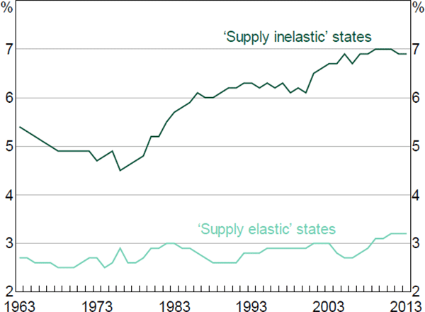
But the most striking feature of the state-level estimates is how the rise in housing capital income has been concentrated in the most supply-inelastic states. The share of housing capital income has generally grown the most along the eastern seaboard (where the supply of housing is typically inelastic) and the least in the midwest (where the supply of housing is more elastic).
To see this clearly, consider Figure 7 in which the states are divided into ‘elastic’ and ‘inelastic’ groups based on whether the Saiz measure of housing supply elasticity is above or below the median.[9] For 50 years, the contribution to total housing capital income of the supply-elastic states has been unchanged at about 3 per cent. In contrast, the contribution of the supply-inelastic states has risen from around 5 per cent in the 1960s to 7 per cent more recently.
Notes: Housing capital income measured as the gross operating surplus of the real estate sector; the analysis abstracts from changes in depreciation
Sources: Author's calculations; Bureau of Economic Analysis; Saiz (2010)
The estimates shown in Figure 7 are based on ‘contributions to growth’ which effectively give more weight to larger states. But the weights are not driving this key result; a similar picture emerges if we exclude large states like California and New York. If we ignore contributions to growth and just compare all the states in terms of the elasticity of housing supply and average (annual) growth in housing income, we observe a clear negative correlation (Figure 8). In other words, the states that are most constrained by housing supply (i.e. those with the lower elasticities) are those that have experienced the fastest growth in housing capital income over recent decades.
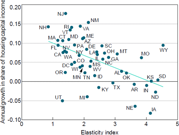
Notes: Share of housing capital income measured as housing gross operating surplus divided by GDP at state level; the estimated correlation coefficient shown is −0.52
Sources: Author's calculations; Bureau of Economic Analysis; Saiz (2010)
4.3 The Rise in the Share of Housing Income – Capital or Profit?
In standard long-run growth theory, the way in which capital investment is financed is not important because there are no financial frictions. It does not matter if the growing share of the economy going to housing capital is financed by higher debt or equity because both are equally costly. But financing frictions are pervasive in mortgage markets, even those of advanced economies. For example, potential home buyers typically cannot take out a mortgage equal to the full value of the home in most countries.
It could be argued that if the secular rise in the housing capital share is partly due to a relaxation of borrowing constraints then this has different implications for the distribution of income then if it were financed some other way. The relaxation of the borrowing constraints leads to higher (lifetime) consumption of housing services for owner-occupiers. But at least some of the associated rise in imputed rental income will not ultimately flow to home owners but will instead be absorbed by higher mortgage interest payments. In other words, what matters to the home owner is the net imputed rent (gross imputed rent less mortgage interest payments).
A comparison of the secular trends in net housing capital income and net housing profit income provides a gauge of the relative importance of changes over time in mortgage interest payments.
When measured as net housing capital income (κR − D), the share of the economy going to home owners rose from 3.1 per cent in 1980 to 4.9 per cent in 2014. In contrast, when measured as net housing profit income (πR), the share of the economy going to home owners rose from 0.2 per cent in 1980 to 2.9 per cent in 2014. The larger rise in net housing profit is due to the decline in interest rates over this period. As a result, measured on a net profit basis, the share of the economy going to home owners is currently at its highest level since the Great Depression (Figure 9).
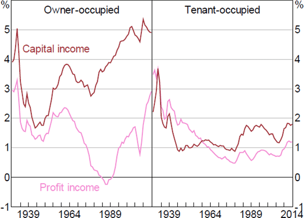
Notes: Housing capital income measured as the net operating surplus of the housing sector; housing profit income measured as the rental income of persons
Source: Bureau of Economic Analysis
This implies that there are at least two channels through which changes in interest rates can affect the distribution of net housing capital income. There is a direct effect as lower interest rates reduce the debt servicing costs of indebted home owners and increase net profits. But there is also an indirect effect as lower interest rates push up land prices (due to an increase in demand for owner-occupied properties). Both channels reinforce each other such that existing home owners will typically take a greater share of aggregate income as interest rates fall.
Overall, the graphical analysis suggests that the story of the secular increase in housing capital income is a story about relative housing prices, interest rates and constraints on the supply of new homes in the United States. I now turn to statistical evidence to further explore these issues.
Footnotes
The BLS estimates of the price of rent (both market and imputed) control for changes over time in dwelling characteristics, such as size and quality. So improvements in the quality of housing will show up as increases in the volume of housing services consumed. [7]
Interestingly, the national accounts indicate that the average age of the owner-occupied housing stock rose only slightly between 1925 and 2014 from 25.3 years to 26.5 years, while the average age of the tenant-occupied housing stock rose from 22.4 years to 41 years over the same period. It is not clear what is driving these different trends but they might be worth exploring in future research. [8]
A similar picture emerges if you instead use, say, the top 10 most inelastic states. [9]