RDP 9306: Inventories and the Business Cycle 3. Inventory Investment in Australia
June 1993
- Abstract
- Download the Paper 113KB
In this section we set out some of the characteristics of inventory investment in Australia. First, we examine the nature and size of the stock cycle. We then concentrate more specifically on the Australian evidence on the ‘stylised facts’ discussed in the Introduction. The results show a large degree of similarity with those from overseas studies. They also point to a marked change in the nature of the inventory investment cycle and its impact on the business cycle in Australia over the past decade and a half.
3.1. Inventory Investment Over the Cycle
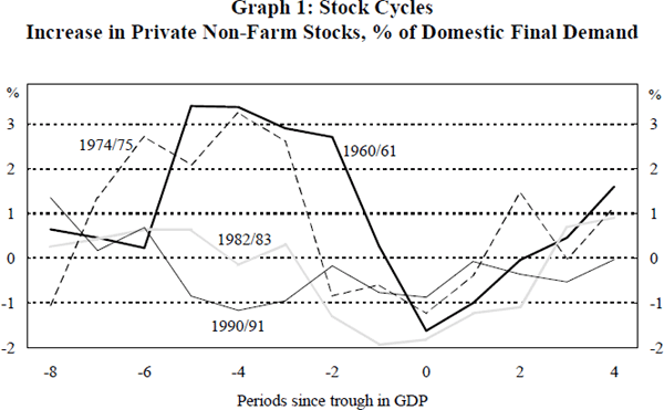
Four major downturns in economic activity have occurred since the beginning of the 1960s. These occurred in 1960/61, 1974/75, 1982/83 and 1990/91. Graph 1 illustrates the pattern of private non-farm inventory investment during these downturns. In each case the reference point ‘0’ on the bottom axis represents the trough in Gross Domestic Product (GDP).
Note.
- The troughs in GDP are in September 1961, September 1975, June 1983 and September 1991 respectively. The choice of September 1975 is somewhat arbitrary since this period was characterised by slow growth rather than a clear recession.
It is clear from this graph that during the 1960s and early 1970s inventory behaviour followed a quite marked cyclical pattern. A sharp increase in inventory accumulation occurs as activity slows. At its peak, inventory investment accounts for around 3 per cent of domestic final demand. After several quarters of strong build-up, inventories begin to be run down again. This run-down in stocks ceases after several quarters and gradual inventory accumulation resumes. This pattern of inventory investment is similar to that illustrated in Figure 2 (case 1). It is consistent with negative shocks to demand causing inventories to first rise and then to fall as firms attempt to work off the additional unwanted stocks. It suggests a degree of permanence to the demand shocks and a fairly small role for production smoothing.
While the cycles in inventory investment in 1960/61 and 1974/75 are pronounced, this is certainly not the case in 1982/83 and 1990/91. At no stage in the latter episodes is there substantial inventory accumulation, but rather, inventory investment declines gradually as the economy slows. The running down of stocks is at its greatest at around the time activity bottoms. As activity increases, inventory investment also gradually recovers. This change in pattern suggests that firms have an increased ability to avoid the large swings in unplanned inventory investment that characterised the business cycle of the 1960s and 1970s.
Movements in inventory investment have potentially large effects on short-run GDP growth and hence this apparent change in the nature of the inventory cycle has major implications for the business cycle more generally. Table 1 shows the contribution of private non-farm stocks to GDP growth during the past four major downturns. The first column shows the peak-to-trough change in GDP and the second shows the contribution to GDP growth from private non-farm stocks over the relevant periods. The third and fourth columns show corresponding figures for the first year of recovery.
| Peak to Trough | First Year of Recovery | |||
|---|---|---|---|---|
| Peak – Trough | Change in GDP | Contribution From Stocks |
Change in GDP | Contribution From Stocks |
| Sept. 60 – Sept. 61 | −2.9% | −5.0% | +6.9% | +3.4% |
| Mar. 74 – Sept. 75 | +1.6% | −4.0% | +4.5% | +2.5% |
| Sept. 81 – June 83 | −2.4% | −2.3% | +9.9% | +2.9% |
| Mar. 90 – Sept. 91 | −2.4% | −1.4% | +2.4% | +0.4% |
| Notes. 1. The period from March 1974 to September 1975 was not technically a recession. A clear cycle in stocks is, however, evident. 2. The contribution from private non-farm stocks to growth in GDP over the period shown is calculated as the difference between inventory investment in the later period and investment in the earlier period, expressed as a percentage of GDP in the earlier period. |
||||
During the first two downturns, the decline in stocks made large negative contributions to GDP – in 1960/61 the contribution from stocks was nearly double the fall in GDP, while in 1974/75 stocks fell by 4 per cent of GDP during a period when GDP rose by 1.6 per cent. In the first year of recovery from the 1960/61 and 1974/75 episodes, the contribution from stocks was around half the rise in GDP. In contrast, during the 1982/83 and 1990/91 episodes, the contribution from stocks during the downturn is less than the total decline in GDP and the contribution during the first year of recovery is a relatively small fraction of the total. This marked difference between the two periods confirms the smaller role stocks appear to have played in the business cycle in recent years.
One reason for firms' improved ability to avoid the large swing in stocks during the cycle is that they are able to respond more effectively and quickly to changes in activity. This quicker reaction reduces any unanticipated build-up or run-down in stocks in response to an unexpected change in demand. A likely cause of this change in the speed of adjustment is the spread of improved inventory management techniques. These improvements reflect the application of inventory management systems such as ‘just in time’ and the spread of computer technology that allows better monitoring of stocks and sales levels.[5] Improved inventory management could also be expected to lead to the holding of lower stock levels, since a more rapid response means that the likelihood of running out of stocks is reduced. Increases in real interest rates are also likely to have reduced desired stock levels. Over the period from 1960:1 to 1982:2 the real prime rate averaged 2.2 per cent while over the period from 1982:3 to 1992:3 it averaged 8.7 per cent. This increase in real interest rates made the holding of inventories more expensive and is likely to have played some role in the development of new inventory management techniques.[6]
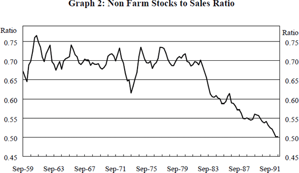
Graph 2 shows the traditional private non-farm stocks to sales ratio (SSR) from the National Accounts. Over the course of the 1960s and 1970s, the stocks to sales ratio fluctuated around a level of about 0.7. From the early 1980s, however, there was a marked decline in the ratio to a level just above 0.5. At least part of this decline is the result of changes in composition. The measure of sales used to derive this stocks to sales measure includes expenditure on services. Given that the service sector holds relatively small stocks and that the share of services in GDP has been increasing in recent times, it is natural that the stocks to sales ratio should have declined.
The Australian Bureau of Statistics has recently begun publishing a new stocks to sales ratio that excludes services from the definition of sales. This ratio also shows a decline during the 1980s, falling from around 1.2 in 1982 to just over 0.9 at the end of 1992. This downward trend in the stocks to sales ratio can also be seen in those sectors for which stocks to sales ratios can be derived. This is illustrated in Graph 3 which shows the stocks to sales ratio in the manufacturing and retail sectors since 1977.
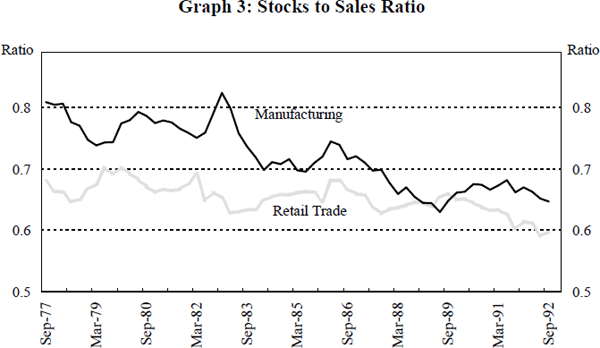
A marked decline is evident during the 1980s in the ratio for manufacturing, while a more modest decline has occurred in the retail sector. It is unlikely that the wholesale trade ratio has declined as markedly as these other sectors, if at all, since the real increase in wholesale inventory levels since 1977 has been far greater than the increases in these other two categories. It would appear, then, that the manufacturing sector is primarily responsible for the decline in the overall stocks to sales ratio. This is in line with the findings of Morgan (1991) for the United States. He concluded that this decline was consistent with the spread of ‘just-in-time’ inventory management throughout the manufacturing sector.
The discussion in Section 2.2 suggested that a decline in the stocks to sales ratio should reduce the impact of inventories on the business cycle. A lower stocks to sales ratio means that firms will change production by a smaller amount when demand changes, as the required inventory response is smaller. This decline in the stocks to sales ratio has helped contribute to the smaller inventory cycle seen in Graph 1.
3.2. The Relationship Between Stocks, Output and Sales
Blinder and Maccini (1991), in their comprehensive survey of the inventory investment literature, point to three stylised facts that are important for understanding the forces driving the inventory cycle. These are:
- manufacturers' stocks of finished goods are less variable than wholesalers' and retailers' inventories and manufacturers' inventories of raw materials;
- the variance of production exceeds the variance of sales; and
- sales and changes in stocks are not negatively correlated.
Below we present Australian evidence on these issues.
3.2.1. The Variance of Inventory Investment
Blinder and Maccini find that retail stocks and manufacturers' stocks of raw materials make the greatest contributions to the overall variability in stocks in the United States. Manufacturers' stocks of finished goods are the smallest component. Table 2, below, presents similar data for Australia using constant 1984/85 price measures of inventories. The first two columns show average inventory levels in 1991/92 while the third and fourth show the variance of inventory investment over the period from September 1977 to September 1992.
| Average Inventory Level 1991/92 $m |
% of Total | Variance of Detrended Inventory Investment $m |
% of Total | |
|---|---|---|---|---|
| Mining | 2,636 | 6.6 | 5,139 | 2.6 |
| Manufacturing | 15,845 | 39.4 | 45,139 | 22.4 |
| Raw materials | 5,404 | 13.4 | 17,637 | 8.8 |
| Work in Progress | 3,180 | 7.9 | 7,318 | 3.6 |
| Finished Goods | 7,269 | 18.1 | 12,010 | 6.0 |
| Wholesale | 12,004 | 29.8 | 58,841 | 29.2 |
| Retail | 9,357 | 23.3 | 19,900 | 9.9 |
| Other | 389 | 1.0 | 347 | 0.2 |
| Total | 40,231 | 100.0 | 201,252 | |
| Notes. 1. In calculating the variance we have detrended inventory investment. If inventory investment is a constant share of GDP and GDP is growing, an unadjusted variance would be positive. The variance would, however, simply reflect the increasing size of the economy. To remove any distortion of the results from possible trend movements we followed the following procedure. First, log values of inventory levels were regressed on a constant and time trend. The exponential of the fitted value was then subtracted from the actual value to produce a detrended levels series. Finally, detrended inventory investment was calculated as movements in this series. The data are in constant 1984/85 prices. 2. The shares of the total variance do not sum to 100 per cent as we have not reported the covariance terms. 3. The data for the three components of manufacturing stocks are only available in current prices. To obtain constant price estimates, the current price data have been deflated by the deflator for manufacturing stocks. |
||||
The table indicates that in terms of levels, wholesale stocks is the largest single category, followed by retail stocks – together they account for more than half of overall stock levels. Manufacturers' stocks of finished goods rank third, with 18 per cent of the total. More importantly, in terms of the variance of inventory investment, manufacturers' stocks of finished goods rank behind wholesale and retail trade stocks and stocks of raw materials. The variance of finished goods inventory investment accounts for only 6 per cent of the total variance. Blinder and Maccini note that while the variability of manufacturers' stocks of finished goods is relatively small, this is the area that has been the subject of the most intensive theoretical and empirical work. They call for further work into the behaviour of other categories of stocks.
The fact that the variance of wholesalers' and retailers' stocks is greater than the variance of manufacturers' stocks of finished goods may, to some extent, reflect the fact that wholesale and retail stocks capture stocks of imports as well as stocks of domestic finished goods. In particular, the bunching of import deliveries may increase the variance of wholesalers' stocks. Nonetheless, the share of finished goods inventory investment in the total variance of inventory investment seems small given the level of finished goods stocks relative to wholesale and retail stock levels. A possible explanation is that manufacturers are able to push their stocks onto wholesalers with the result that wholesalers' stocks are more volatile than the finished goods stocks of manufacturers.
3.2.2. Variance of Sales and Output
The second point noted by Blinder and Maccini is that in virtually all cases the variance of output exceeds the variance of sales.[7] This was shown to be the case for the wholesale, retail and manufacturing sectors, and for all sub-categories of manufacturing. Australian data do not allow the calculation of such a comparison for wholesale trade, but data are available for manufacturing and retail trade.[8] The first three columns of Table 3 compare the variance of output and sales for the retail trade and manufacturing sectors, and for the sub-components of manufacturing since September 1977.
| Variance of Detrended Sales (S) |
Variance of Detrended Output (Y) |
Y / S | Correlation Between Detrended Sales & Detrended Inventory Investment |
|
|---|---|---|---|---|
| Retail Trade | 104,093 | 129,019 | 1.24 | 0.08 |
| Manufacturing | 842,771 | 938,450 | 1.11 | 0.41** |
| Food & Beverages | 47,236 | 48,625 | 1.03 | 0.01 |
| Textiles | 1,401 | 2,062 | 1.47 | 0.05 |
| Clothing | 6,691 | 7,755 | 1.16 | 0.33** |
| Wood & Furniture | 11,072 | 12,128 | 1.10 | 0.13 |
| Paper & printing | 7,708 | 7,981 | 1.04 | 0.04 |
| Chemicals & Petrol | 33,567 | 37,674 | 1.12 | 0.17 |
| Non-metallic Minerals | 22,145 | 22,850 | 1.03 | 0.07 |
| Basic Metal Products | 31,434 | 33,166 | 1.06 | 0.01 |
| Fabricated Metal Products | 24,863 | 26,855 | 1.08 | 0.18 |
| Transport Equipment | 36,911 | 45,001 | 1.22 | 0.29* |
| Other Machinery | 36,834 | 42,144 | 1.14 | 0.24 |
| Miscellaneous | 8,140 | 9,183 | 1.13 | 0.12 |
| Notes. 1. See Note 1 of Table 2 for a discussion of the detrending procedure. 2. * (**) indicates that the correlation coefficient is statistically different from zero at the 5 (1) per cent level. The significance levels are calculated by regressing sales on inventories and using the White correction for the variance-covariance matrix. |
||||
The Australian data are consistent with the US data. In every case, the ratio of the variances is greater than 1; that is, the variance of output exceeds the variance of sales. This evidence weighs against the basic production smoothing model. If firms really do attempt to maintain constant production in the face of stochastic sales, then production should be considerably less variable than sales. In fact, the ratio of the variances for the manufacturing sector as a whole is higher than Blinder and Maccini's ratio of 1.03 for the US, implying that the evidence against production smoothing is even stronger in Australia than in the United States. It should be noted that the data presented in this table begin in 1977. This is the period over which the inventory cycle appears to be more muted.
It is of some interest that two components of the manufacturing sector stand out as having much greater variability in output than sales. These are transport equipment[9] and textiles. In the case of transport equipment, the higher level of variability in output relative to sales may well reflect the periodic necessity to shut down production in order to change models, while sales continue relatively unaffected.
3.2.3. The Correlation Between Sales, Output and Inventory Investment
The fourth column of Table 3 provides Australian evidence on the third characteristic identified by Blinder and Maccini; that sales and changes in stocks are positively, rather than negatively, correlated. In the case of retail trade there exists a fairly weak positive correlation, whereas for the manufacturing sector the correlation is much stronger. Rather than run down stocks as sales increase, stocks are actually built up. Within manufacturing, all sub-groups have positive correlations, although only those for transport equipment and clothing are significantly different from zero.
This third piece of evidence is often seen as damaging to demand shock driven models of inventories and the business cycle. As the discussion in Section 2 highlighted, if stocks are being used as a buffer against stochastic sales, the change in stocks should be negatively correlated with sales. However, in Section 2 it was also noted that if the changes in demand were expected then sales, output and inventories might reasonably be expected to be positively correlated. To answer the question of whether unexpected changes in demand are correlated with unexpected changes in stocks it is necessary to have observations on expected outcomes. In the absence of direct observations on these expectations, a popular method of generating estimates of the expected change is to estimate a time series model. The residuals of this model are then treated as the unexpected change.
The justification for this approach is as follows. Denote demand by D and inventory investment by I. Suppose that both D and I can be represented by simple ARMA(1,1) processes:


where εt and μt are serially uncorrelated error terms with zero mean and are independent of both D and I. At time t-1, the expected value of demand at time t is φDt-1+ρεt-1. Thus, the forecast error, or the innovation in demand is εt. Similarly, the forecast error for inventory investment is μt. If εt and μt are positively correlated, then surprises in demand can be said to be typically associated with surprises in inventory investment of the same direction.
To examine the relationship between innovations in inventory investment and demand we follow a similar procedure to that used by Blanchard and Fisher (1989). This involves estimating ARMA models of transformed series for real seasonally adjusted domestic final demand and inventory investment. The transformation of inventory investment is made necessary by the fact that as the size of the economy increases over time, the absolute value of inventory investment might be expected to also increase. To remove any possible effect of this increase on the estimated model we first regress the absolute value of real seasonally adjusted inventory investment on a constant and a time trend.[10] We then divide the actual level of inventory investment by the predicted values of this equation. An ARMA model is then estimated for the adjusted inventory investment series. After some experimentation the selected model is an ARMA(2,2). For domestic final demand we estimate an ARIMA(1,1,2) model. The estimation period runs from 1960:3 to 1992:3. The correlations between It and Dt-j are shown in Table 4 for various values of j. Positive values of j represent innovations in inventories leading innovations in demand while negative values imply that innovations in inventories lag demand. The table also shows separate correlations for both the first and second halves of the sample period.
| Correlations between innovations in domestic final demand and innovations in inventory investment at time t =: |
|||||||
|---|---|---|---|---|---|---|---|
| Sample period | −3 | −2 | −1 | 0 | 1 | 2 | 3 |
| 1960:3 – 92:3 | 0.28** | 0.21* | 0.03 | 0.08 | −0.04 | −0.12 | 0.06 |
| 1960:3 – 76:3 | 0.26* | 0.03 | −0.12 | 0.10 | −0.14 | −0.26* | 0.11 |
| 1976:4 – 92:3 | 0.30** | 0.40** | 0.16* | 0.02 | 0.03 | −0.01 | −0.08 |
| Notes. 1. * (**) indicates that the correlation coefficient is statistically different from zero at the 5 (1) per cent level. The significance levels are calculated by regressing the domestic final demand innovations on the inventory innovations and using the White correction for the variance-covariance matrix. 2. The model for the adjusted inventory investment series is  εt
− 0.79εt-1 + 0.41εt-2.
The model for demand is ΔD = 0.01 + 0.50ΔD-1 + μt
− 0.43μt-1 + 0.16μt-2 εt
− 0.79εt-1 + 0.41εt-2.
The model for demand is ΔD = 0.01 + 0.50ΔD-1 + μt
− 0.43μt-1 + 0.16μt-23. Positive values of j indicate that inventory investment leads demand. Negative values indicate that inventory investment lags demand. |
|||||||
The contemporaneous correlation between innovations in inventory investment and innovations in demand are positive but not statistically significantly different from zero. Further, the results suggest that innovations in demand lead innovations in inventory investment. That is, an unexpected increase in demand will result in an increase in inventory investment in subsequent quarters. In contrast, there is no evidence that innovations in inventory investment lead innovations in demand.
These results provide little support for models which emphasise the role of demand shocks and production smoothing. They provide no evidence that unexpected falls (increases) in demand lead to unexpected increases (decreases) in inventory investment. While these results are consistent with international findings using the same technique, the technique has a potentially important flaw. That is, it assumes that the ARIMA innovations are a good measure of the true unexpected changes. Below we argue that this assumption is invalid, as the information set used in constructing the ARIMA forecasts is much smaller that the information set used by firms. Using a superior measure of unexpected changes, we show that unanticipated falls in demand have, in fact, historically lead to unanticipated increases in inventory investment.
Footnotes
‘Just in time’ systems involve the minimisation of stocks by producing and ordering in small quantities, as required. Such a system requires flexible production processes which can be rapidly switched between purposes. There is little documentary evidence of the spread of just-in-time inventory management in Australia. Morgan (1991) provides a summary of the evidence of its spread in the United States. [5]
The Australian Treasury (1991) also suggest that lower levels of industrial disputes, higher levels of import penetration and increased competitive pressures have also acted to reduce the stocks to sales ratio. [6]
Output here refers to gross output rather than the National Accounts measure which deducts costs. It is calculated in this case as sales plus the change in finished goods stocks. [7]
Both manufacturing sales and manufacturing stocks are taken from Stocks, Manufacturers' Sales, Australia (ABS 5629.0) whereas retail sales are taken from Retail Trade, Australia (ABS 8501.0) and have a slightly different coverage to the stocks data. [8]
In examining the behaviour of the US automobile industry Blanchard (1983) also finds that the ratio of the variance of production to the variance of sales is high, ranging between 1.23 and 1.43. [9]
This regression yielded an insignificant coefficient on the time trend. The subsequent results are essentially unchanged when the unadjusted inventory series is used. [10]