RDP 7701 abridged: A Preliminary Annual Database 1900/01 to 1973/74 Abridged Version II Facts and Figures
May 1977
A remarkable feature of many of the series presented in this paper is the quite different growth behaviour before and after World War II. Tables II.1 and II.2 present average annual growth rates for four periods for a selected number of variables.
| 1900/01 – 1938/39 | 1933/39 – 1948/49 | 1943/43 – 1973/74 | 1900/01 – 1973/74 | |
|---|---|---|---|---|
| Constant price U.K. GDP. | 1.3 | 1.2 | 2.8 | 1.6 |
| Constant price U.S. GDP2 | 2.2 | 4.9 | 3.7 | 3.2 |
| Constant price Australian GDP | 2.2 | 2.1 | 4.7 | 3.2 |
| Constant price Exports | 2.1 | -1.0 | 4.8 | 2.8 |
| Constant price Public Consumption | 3.0 | 4.2 | 4.7 | 3.7 |
| Constant price Public Investment | 2.3 | 2.1 | 5.0 | 3.1 |
| Constant price Private Consumption | 1.9 | 3.7 | 4.3 | 3.0 |
| Constant price Private Investment | 3.0 | 5.0 | 6.2 | 4.3 |
| Monetary Growth | 4.2 | 10.5 | 7.8 | 6.2 |
| Bonds held by Private Sector | 8.1 | 9.1 | 5.5 | 7.3 |
| Civilian Employment | 1.7 | 2.0 | 2.2 | 1.9 |
| Private Capital Stock | 1.8 | 1.9 | 6.0 | 3.2 |
| Public Capital Stock | 2.3 | 0.0 | 5.0 | 2.9 |
|
||||
| 1900/01 – 1938/39 | 1938/39 – 1948/49 | 1948/49 – 1973/74 | 1900/01 1973/74 | |
|---|---|---|---|---|
| U.K. GDP Deflator2 | 1.4 | 5.9 | 2.9 | 2.6 |
| U.S. GDP Deflator2 | 1.7 | 4.1 | 2.7 | 2.4 |
| Australian GDP Deflator | 1.7 | 5.4 | 5.2 | 3.4 |
| Australian Export Deflator | 0.9 | 13.9 | 2.0 | 3.1 |
| Australian Import Deflator | 1.2 | 10.4 | 2.2 | 2.8 |
| Average Earnings | 4.6 | 7.1 | 7.6 | 5.0 |
| Award Wages | 3.4 | 5.1 | 6.4 | 3.9 |
|
||||
Constant price product growth, for example, is in the period since 1948/49 more than double its value for the period 1900/01 to 1938/39. This phenomenon, which largely concerns growth of labor productivity is observed in most parts of the world, and the reasons for it are not fully understood. Explanations put forward in the economic history. literature in the Australian case include structural change and technical progress in production,[3] sustained growth in the world economy, the achievement of higher rates of capacity utilisation, greater flows of productive factors, and large scale foreign capital inflow associated with the import of technology.
Growth in Australian real product has been uneven, and on occasion significantly affected by world events such as the two world wars, the recession of the early twenties, and the depression of the thirties. An interesting point from figure II.1, which compares Australian, U.S. and U.K. GDP, is that the effect on Australian constant price product of the depression was less marked than in the U.S., but larger than in the U.K. In Australia, the main effect of the depression was on employment, wages and prices (see figures II.13 and II.14).
Real Gross Domestic Products Australia. U.K. and U.S.
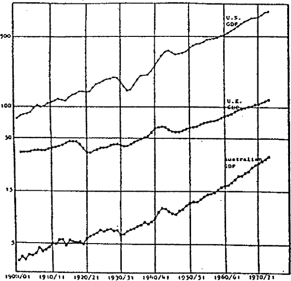
An interesting point underlying table II.1 and figure II.1 that the experience of Australia in respect of differential pre-and post-war real growth is not shared by the U.S. or the U.K. In the U.S.A. productivity growth continued at the pre-war pace, while in the U.K. the rate accelerated post-war, but much less than in Auatralia and in the rest of Europe.
Deflators for Australian, U.K. and U.S. product are shown in figure II.2. The U.S. has experienced the lowest average rate of inflation over the seventy-four years of the twentieth century, while the average U.K. and U.S. rates are similar as may be verified in table II.2. All three countries were subject to periods of substantial inflation during and immediately after World War I, in the late forties and early fifties and again in the seventies. The price level fell in all three countries in the early twenties and during the depression. Experiences differed somewhat, however, In that Australian prices reached a lower peak during, and fell much less than the others subsequent to, the World War I inflation, while the U.K. price fall during the depression was much less than in Australia and the U.S.
Real Gross Domestic Products Australia. U.K. and U.S.
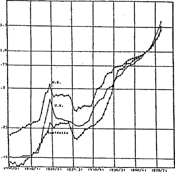
During world War II Australian prices grew at a much slower rate than U.S. or U.K. prices. After the war, however, Australian prices rose rapidly, and at a faster rate than elsewhere, for several years.
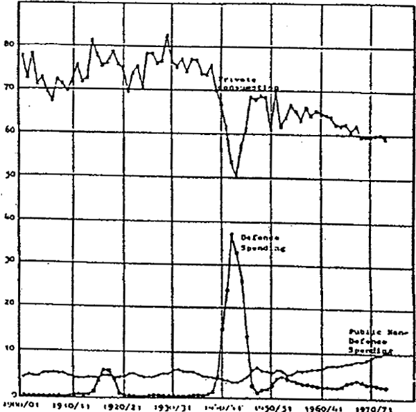
Ratios of public and private final consumption to GDP in current prices, are presented in figure II.3. Private consumption before world War II averaged about 75% of GDP, but fell to some 50% of GDP during world war II. After the war the ratio rose again, but to a lower average of about 65% of GDP. In recent years this ratio has fallen further to about 60%. Fluctuations in this ratio are partly mirrored by the behaviour of non-defence spending during the two world wars, when public consumption was a relatively constant 6–7% of GDP from 1900/01 to 1938/39. From then on, at first as a result of world war II (which rapidly boosted defence spending to some 33% of GDP in 1943/44), but later as a result of steady increase in public non-defence consumption, public sector total final consumption rose as a proportion of GDP to some 13% by 1973/74.
Public and Private Final Consumption as a Proportion of GDP
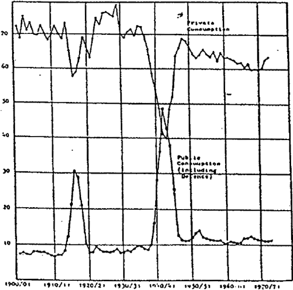
Real public and private final consumption as a proportion of real GDP are given in figure II.4.while much the same general picture is conveyed as in figure II.3, a number of Interesting additional points arise. First, real private consumption as a proportion of GDP fell further during the two world wars than during the depression, as a result of redistribution of resources away from civilian needs. Of the two wars, world war II had by far the greater effect; the ratio of private final consumption to GDP fell below that of real public final consumption (including defence) for two years, and the level of public final consumption expenditure exceeded 50% of GDP. Second, converted to real terms, government final consumption (including defence) is a remarkably stable proportion of GDP once the two world wars and the Korean war are omitted. After World War II there was a slight upward shift in real public consumption compared with the norm before 1938/39.
Real Public and Private Consumption is propotion of Real GDP
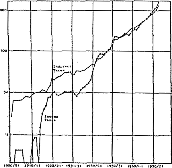
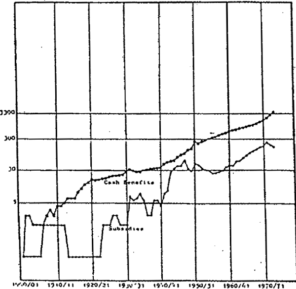
Other aspects of public sector involvement in the economy are brought out in figures II.5 and II.6, which, respectively, depict collections of income and indirect taxes, and direct transfers by the public sector to the private sector by all levels of government.
Tax Collections Income and Indirect
Cash benefits on Person and Other Direct Subsidies
Income taxes have increased in two major jumps during the world wars. In each case company tax rates were increased, and surcharges added, while personal income taxation became more comprehensive and rates raised. From the end of World War II, both income and indirect tax collections have grown at much the same rates, although the progressivity in the personal income tax scales, coupled with accelerating inflation from 1969/70, resulted in faster growth in income tax collections from that time. Indirect tax collections were initially larger than income tax collections, and with the exception of World War II and the Korean War period remained so until 1969/70. Thereafter income tax collections exceed indirect tax collections.
Figure II.6 depicts cash benefits to persons and other subsidies to the private sector. Transfers by governments have grown from virtually nothing in 1900/01 to about one quarter of the total outlays by the public sector in 1973/4. The first main expansion was associated with the introduction of invalid and old age pensions, maternity allowances and war pensions early in this century. A second expansion occurred during and after World War II following the referendum in 1946 granting to the Commonwealth government the power to undertake social welfare legislation. By far the larger component of direct transfers by the public sector to the private sector are cash benefits to persons, which in recent years represent approximately 90% of all subsidies to the private sector.
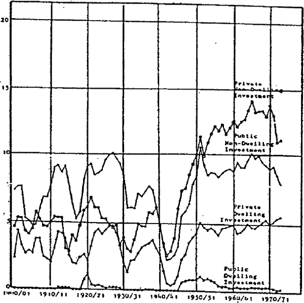
Prior to World War II private fixed non-dwelling investment varied from 2.7% of GDP in the depression to 6.5% of GDP in 1921/22; but with the rise in the saving ratio after World War II, coupled with accelerated private capital inflows (see figure II.19) the ratio or private fixed non-dwelling investment has not changed much as a proportion of GDP before and after World War II once exceptional events like the World Wars and the depression are taken into account. As a result, the pre-war dominance of public over private fixed non-dwelling investment has been reversed post-war.
Public sector involvement in dwelling construction began only during the second decade of the century, and at all times has been only a very minor proportion of GDP. Private investment in dwellings, once cyclical effects and major events like the World Wars are taken into account, has slightly increased its share of GDP from the end of the last world war.
All components of investment exhibit great sensitivity to cyclical events, such as the depression, to the drought in the first decade, and also to the two World Wars. In the case of private investment this is not surprising; in the case of the public sector this probably reflects the point that public sector capital formation was largely dependent on funds borrowed overseas.
Figure II.8 presents real public and private fixed non-dwelling investment, and real public and private dwelling investment as ratios of real GDP. The main effect of the deflation is to emphasise the increase in investment, by the private sector, in non-dwelling fixed assets in the post-war period, and to emphasise the stability (after cyclical adjustment) of real public sector fixed investment and real private sector dwelling formation over the twentieth century. All investment series appear to be strongly affected by cyclical disturbances, and major wars.
Public and Private Fixed Investment as a Proportaion of GDP
Real Public and Private Fixed Investment as a Proportion of Real GDP
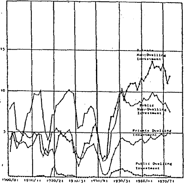
Figure II.9 graphs the nominal rate of exports and imports as a proportion of nominal GDP. Both exports and imports have fluctuated greatly in comparison with GDP, from about 10% in 1931/32 in the case of imports to some 33% in 1951/52, again in the case of imports. Generally the balance of trade has been in surplus throughout the century, the most notable exceptions being the twenties, especially in the years prior to the depression, 1951/52, and the late sixties.
Exports and Imports as a Proportion of GDP
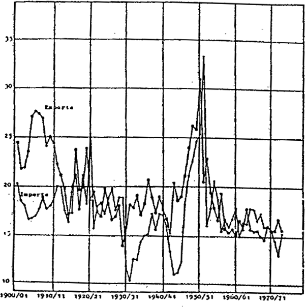
The effect of the wool boom, and of the following collapse of wool prices is apparent from figure II.9; in 1950/51 exports were at a level equal to about 30% of GDP, but ten years later the level was only some 15% of GDP. One can also see the effects of controls on imports in the depression (see also figure II.10) and during World war II, when the proportion almost fell as far as during the depression.
Real Exports and Imports as a Proportion of Real GDP
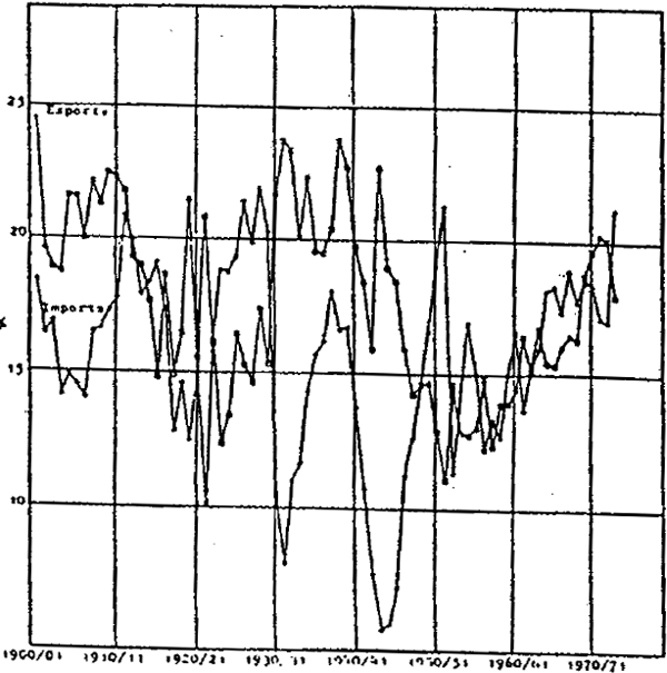
Figure II.10 depicts real imports and exports as a proportion of real GDP. Examination of figures II.9, II.10 and particularly II.15 indicates how Australia's terms of trade have moved. Adverse movements occurred during the end of the first decade, after World War I, during and Just prior to the depression, and during World War II. Figure II.10 clearly illustrates the effects of the depression and World War II on the physical volume of imports, and the effect of increased real incomes as a result of the post-war wool boom on the volume of imported goods and services.
Real GDP, total public capital stock, total private capital stock and employment (including defence) are presented in figure II.11. Prior to World War II, employment grew at an average annual rate (using compound growth rates based on period end points) of 1.6% p.a., while output per head grew at about 0.6% p.a. After World War II the growth rate of employment rose to 2.1% while product per head grew at 2.4% p,a. Part of the explanation is the application of more capital (particularly private capital) to the growing workforce, as may be seen in figure II.11; other possible explanations have already been mentioned.
Real GDP Public Capital Stocks (excluding Dwelling).Private Capital Stock (Excluding Dwellings) and Total Employment (including Defence)
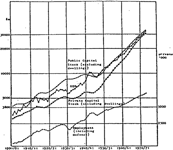
The public non-dwelling fixed capital stock has exceeded the corresponding private sector stock throughout the period. The difference between the two accelerated during the twenties, when the public sector was engaged in the large scale creation of social overhead capital, reached a peak during the thirties, after which time the gap narrowed. By 1973/74, after intensive non-dwelling fixed capital formation by the private sector in the post-war period, the two capital stocks moved much closer together. It is worth noting that the private capital stock grew at a faster rate than both GDP and the public capital stock (which grew at similar rates) in the post-war period.
Various components of the capital stock estimates shown in figure II.11 are presented in figure II.12. These series suggest that the main component of private fixed investment (excluding dwellings) in the post-war period has been plant and equipment, and that it is the rapid accumulation of equipment that is responsible for the rapid rise of the private capital stock. The estimates also suggest that plant and equipment was a relatively small component of both public and private total fixed capital in the early part of this century, compared with the end of the period. By the end of the period, plant and equipment stocks held by the private sector exceeded the stocks of private non-residential structures.[4] In the public sector the change in relativities is much less marked, despite rapid post-World War II accumulation of plant and equipment. The main effect of this rapid accumulation appears to have been replacement of stock run down during the war, thereafter the growth slowed down.
Capital Stocks Public and Private by Type of Asset
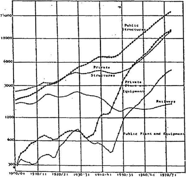
The railway capital stock showed little change between 1900/01 and 1973/74. After growing in cycles up to the depression, it declined to the late forties after which time it remained or less constant.
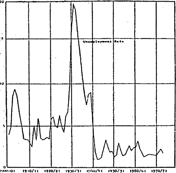
Figure II.13 graphs the unemployment rate, measured as the number of unemployed divided by the number of persons in the workforce (including defence employment). Self-employed persons are included in the workforce, and as a result the unemployment percentages given here for the period 1900/01) to 1946/47 are lower than the corresponding trade union unemployment figures which relate to employees only.[5] The most significant impact on unemployment was the depression, when at the trough some 20% of the Australian workforce was unemployed. As may be seen in figures II.1, II.11 and II.14, the main effect of the depression in Australia was felt in prices, wages and unemployment rather than in real GDP, in contrast to experience in the U.S. Other times of unusually low employment occurred in the first decade of the century, just prior to and just after World War I, just after World War II, in 1952/53, 1961/62 and in 1971/72. A further point is that there has been a marked change in average unemployment rates recorded; before 1938/39 3% unemployment was unusually low while after 1948/49 3% was unusually high.
Unemployment Rate
Prices, Average Earnings and Award Wages
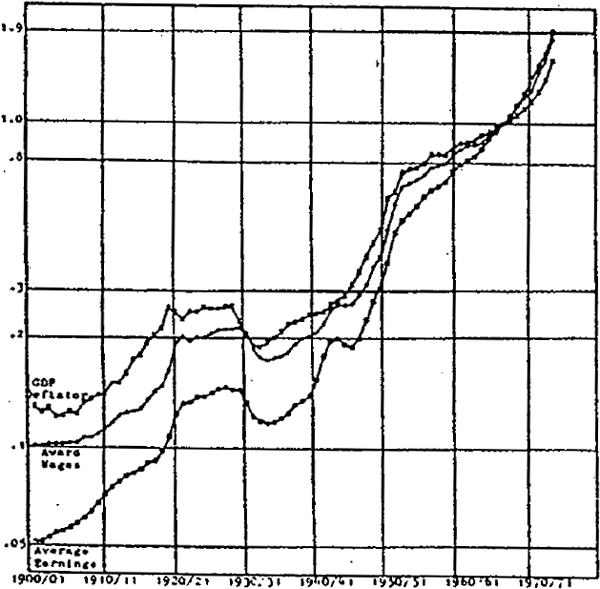
Figure II.14 illustrates movements in the implicit deflator of gross domestic product, and in an index of average weekly earnings. It is clear that the long period of relatively stable and low inflation rates such as experienced from 1953/54 to 1969/70, was the exception, not the rule. On three occasions, from 1914/15 to 1919/20, from 1945/46 to 1952/53, and from 1970/71 to the time of writing, there was a long period of price inflation at times in excess of 10% p.a. During two periods, from 1920/21 to 1921/22 and from 1929/30 to 1932/33, prices have fallen. Earnings have moved in the same direction as prices, but at a somewhat faster average rate with the result that real earnings have trebled since 1900/01. As may be verified from table II.2 most of the rapid growth in real wages has occurred since World War II and is consistent with the faster growth of labour productivity during this period.
In contrast to earnings, award wages have grown at a rate only slightly faster than the average inflation rate, while, nevertheless, exhibiting the same general cyclical behaviour as earnings. For example, both awards and earnings fell in the depression, with the reduction in awards preceding the fall in earnings.
An interesting point is that, at the outset of the depression, real earnings and real award wages rose in part as a result of the rapid decline in the GDP deflator; this effect coupled with an adverse movement in the terms of trade (see figure II.15) may have been a major proximate cause of the sharp rise in unemployment in the late twenties and thirties (see figure II.13).
Figure II.15 contains graphs of product, import and export prices. Product prices (measured by the GDP deflator) have similar average growth rates as import and export prices over the full period although growth of the GDP deflator was much smoother. The major inflations of product prices and wages were all associated with rapid increases in Australian import and export prices, although there were other periods during which marked fluctuations in external prices had little apparent relation to movements in domestic prices. Major Jumps in export prices occurred during World War II, the early twenties, the late forties and early fifties and the seventies. Major falls in export prices occurred in 1921/22, the great depression, the late thirties and after the korean war boom of the early fifties. Import prices were somewhat less variable than export prices, and were more closely correlated with domestic price movements. Output prices generally accelerated and decelerated with import prices, the major exception being the second world war when domestic prices were controlled, and import prices were not. Marked changes in Australia's terms of trade can be observed in figure II.15, with improvements in the first 15 years of this century.[6] in the early twenties, in the late thirties and in the late forties and early fifties. On the other hand the terms of trade moved against Australia during World War I, the late twenties and early thirties and during World War II. Figure II. 15 also suggests that the prices of non-traded goods have behaved significantly differently from the price of traded goods as reflected by export and import prices. In the early fifties to the present product prices rose faster than the prices of traded goods, suggesting that non-traded goods prices increased more quickly than traded goods prices.
Prices GDP, Export and Import
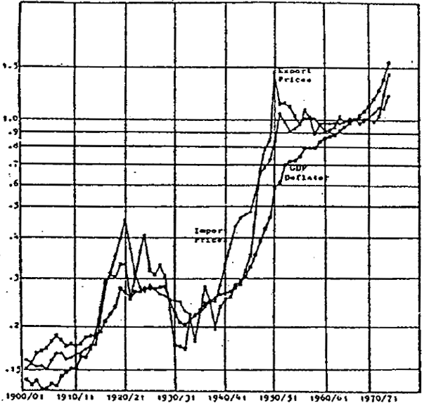
Figure II.16 gives the movements in the Australian/U.K. and Australian/U.S. exchange rates, the rates in each case being expressed as the number of $A required per unit of foreign currency, and being converted to an index with base 1966/67. For much of the period, given the pattern of Australian trade, and the structure of Australian financial institutions, the Australian/U.K. rate is the more relevant. Prior to 1966/67, there were only two periods when the Australian/U.K. rate changed, the first being in the first half of the twenties, and the second being in the depression when Australia devalued by a net 25% against sterling.[7] After 1966/67 sterling and the Australian dollar moved separately.
Exchange Rate Indonesian U.K./Australian and U.S./Australian
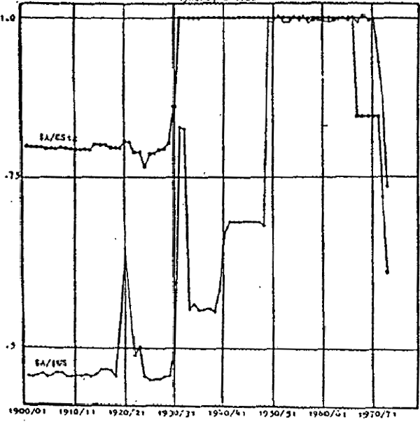
The effect of remaining linked to sterling for most of the period can be seen in the movements in the Australian/U.S. rate. Australia effectively devalued against the U.S. dollar at the beginning of World War II, during the early years of the depression (later largely offset by devaluation of the U.S. dollar) and in 1948/49. The 1949 devaluation augmented improvement in the terms of trade already occurring and added to the inflation experienced during the wool boom by direct boosting traded goods prices, and through the effects of rapid additions to international reserves. On the other hand, the devaluation during the depression offset, partially and with lags, falling export prices.
Australia's balance of payments is shown in figure II.17. Parts (a), (b) and (c) respectively depict the balance of trade, change in international reserves, and the implied total capital inflow. A fourth series, net property income paid abroad, is not depicted, but has been used to calculate (c).
Balance of Payments
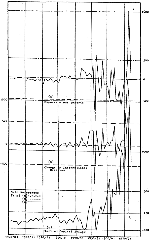
The variability of all three series is greatest in the post-war period. Major shocks in the post-war period include the wool boom (with a surplus on the trade balance, plus significant capital inflows) and its aftermath, as well as the 1961/62 recession and the period since 1969/70.[8] Surprisingly, the present estimates suggest that the pre-war behaviour of the balance of payments was much less volatile, despite major events such as the depression (when a small capital outflow was recorded; this being composed of a private capital inflow partly offset by public borrowing), and World War I. Further material is being investigated to determine whether the balance of payments as presented in figure II.17 and table IV.17 gives a reasonable picture of the late twenties and thirties.
Yields on long term government securities in Australia, the U.K. and the U.S. are given in figure II.18.[9] From 1900/01 to 1920/21, Australian government security yields generally follow yields on U.K. government securities, but during the twenties these are substantial divergences. Australian security yields fall only after 1931/32, considerably after the fall in U.S. and U.K. security yields (which occurred in 1929/30).[10] After the depression and World War II (during which time Australian bond yields were significantly higher than the corresponding rates for the U.K. and U.S.) Australia rates again generally followed the same pattern as British rates.
Long Term Bond Yeild Australian, U.K. and U.S.
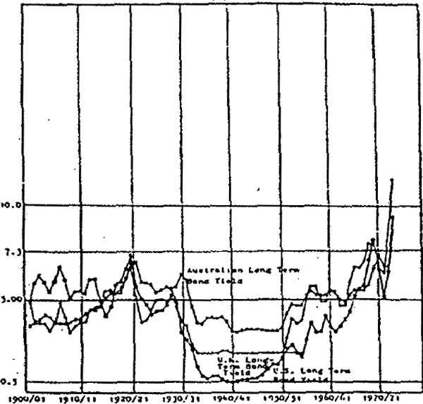
However, the Australian yield post-war[11] was substantially higher than the U.S. yield; given that much of the post-war capital flowing into Australia came from the U.S., and that the growth rate of real GDP[12] was greater than the U.S. and the U.K., these factors may together explain part of the very rapid growth of cumulated private capital net inflow in figure II.19. More recent movements were also affected by exchange rate expectations.
Cumulated Capital Flow Public and Private
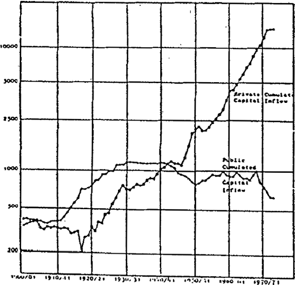
Figure II.19 shows the estimates of private and public cumulated capital inflow. The picture in respect of cumulated private capital inflow should be treated with caution, since all measurement errors in the balance of payments are included in the private inflow series, as this is treated as the residual in the balance of payments, and these errors are probably particularly significant in the period before 1928/29 when no official statistics exist on a basis comparable to post-war ABS concepts. Bearing in mind these qualifications, figure II.19 suggests the following picture. From 1900/01 to 1917/18 cumulated private inflow was constant, then declined, and then grew consistently, with only five brief interruptions. These were during the depression, World War II, after the 1950/51 wool boom, the 1961/62 recession, and from 1972/73 to the end of the period covered. The period of positive private capital inflow from 1917/18 thus falls neatly into three periods; from 1917/18 to 1929/30 and from 1946/47 to 1971/72 when the average growth rates were similar, and from 1931/32 to 1943/44 when the average growth rate was somewhat lower. By contrast, public cumulated capital inflow grew rapidly from 1911/12 to 1927/28, initially in response to the financing demands for World War I, and later to finance the expansion of the public capital stock during the twenties. From the late twenties to 1942/43 the level of public cumulated capital inflow remained more or less constant, then declined to 1950/51. From 1955/56 to 1968/69 the level remained constant, then fell to 1973/74. In part the reason for the slowdown, and decline, in public overseas debt was due to the domestic market for government securities supplanting the overseas market from the thirties onwards (see figure II.20).
Money, International Reserves and Government Securities Hold by the Australian Public
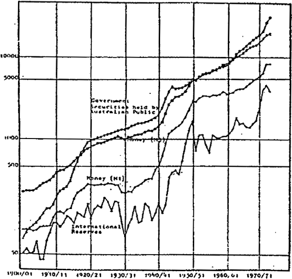
The money supply (M1 and M3), government securities held by the Australian public, and the market value of international reserves are presented in figure II.20. M1 and M3 grew at broadly the same rates over the period 1900/01 to 1973/74. and show much the same behaviour. The main differences occur from 1919/20 to the end of World War II. During the twenties M1 remained approximately constant in contrast to M3, and M1 fell further than M3 during the depression.
Substantial caveats apply to the early period covered by the remaining series. There are several breaks in the series for government securities, as a result of discontinuities in the data for public authority and central bank holdings of government securities. Furthermore, the series for local government securities held in Australia is unreliable before 1928/29. International reserves data are particularly deficient before 1927/28, being based on balance sheet data for the trading banks.
Despite these problems,[13] figure II.20 indicates a rapid increase in private sector holdings of government securities from 1900/01 to 1919/20, a process given extra impetus by World War I. From 1919/20 to end of World War II, growth in securities matches the growth in M3; thereafter the growth rate falls below M3.
Since 1961 , insurance companies have been required to divert a specified proportion of their portfolio into bond purchases as have savings banks for a much longer period; to some extent therefore, the post-war market is distorted by this requirement. It should be noted that this requirement would also have the effect of holding down the yields on government securities. This has implications for the interpretation of figure II.20.
International reserves fluctuate substantially prior to World War II, but are somewhat more stable thereafter. Rapid growth in international reserves occurred from 1941/42 to 1950/51, and in the late sixties and early seventies. Marked falls in international reserves occurred from 1904/05 to 1906/07, during the depression, and after the fifties wool boom.
The picture given by figures II. 1 to II.20 should be treated with caution, given the problems with some of the early data. Nevertheless, these graphs illustrate that the Australian economy has undergone substantial and far-reaching change. For example, the private sector now invests both much more (as a proportion of GDP) than it did before 1938/39, and than the public sector. Structurally, the private sector itself has changed substantially, moving away from farm production to non-farm production (particularly manufacturing). During this period the Australian capital market came into being, while simultaneously the was an increased dependence on private foreign capital. All those features suggest the presence of structural change, and it will be interesting to see how the projected models, for which the database is intended, cope with this problem.
Footnotes
This is associated with a rapid expansion in the industrial sector until the mid-sixties, coupled with a substantially expanding primary sector throughout the fifties as a result in part of improved pastures, the application of fertilisers, and the success of myxomatosis in reducing rabbit populations. From the mid-sixties these factors are succeeded by the mining boom. [3]
As a result of rapid post-war accumulation by the private sector of plant and equipment. [4]
This series is used by Boehm (1971), for example. A useful discussion of the value and reliability of the trade union data is in Forster (1965). [5]
There is a caveat concerning terms of trade movements before 1948/49. In particular, prior to 1936/37 the series for import prices and export prices, do not use the same base years weights. There may be some loss of comparability as a result. [6]
There were periods, in the early 1920's and again in the 1930's (not merely in 1931) when the reported rate set by the banks and used here) did not match market conditions, and on “outside” exchange market developed. Data on these “outside” markets have not been used in assembling the exchange rate series. [7]
This period was marked initially by a large surplus on the trade account, plus a substantial capital inflow; all this followed from 1972/73 by a reduced capital inflow and from 1973/74 a reduced trade surplus. [8]
U.S. and U.K. data are from Jonson op.cit. [9]
Professor Colin Clark in private correspondence has suggested that, in part, this was due to a considerable expectation of an Australian default in view of what J.T. Lang (then premier of New South Wales) was saying. [10]
Using this series as some indication of yields on other assets in the economy. [11]
Arguably a proxy for the yield on direct equity capital. [12]
The main problem is the varying balance sheet dates for different banks, and the inability precisely to identify all London funds of the trading banks. [13]