RDP 2024-03: Demand in the Repo Market: Indirect Perspectives from Open Market Operations from 2006 to 2020 4. Application to Reserve Bank Open Market Operations Data
May 2024
- Download the Paper 4.51MB
We identify several distinctive phases that can be identified as important developments in the repo market over the past decade or so. Since the average daily supply of cash to the system prior to March 2020 was largely dictated by the relatively stable liquidity needs of the payments and settlements systems, the net supply available did not tend to fluctuate as much as other market variables.[9] Many of the phases identified below are therefore mainly defined by different types of demand pressures.
Demand is estimated using the approach outlined above. In the figures below, each dot represents a unique set of coordinates associated with bids in open market operations on a particular day during the designated sample period. Pink dots are associated with the most competitive bids that were successfully filled during the auction. The blue dots represent less competitive bids which were not successful and remained unfilled. Our best estimate of demand is represented by the curve fitted to the data. The shaded region around the estimated demand curve represents the 95 per cent confidence interval. The average daily supply made available by the Reserve Bank during the sample period is represented by the vertical supply curve, which indicates that supply is exogenously determined by the central bank. The minimum and maximum auction value during the period is indicated by the grey range around the average supply curve.[10] Interactions between supply and estimated demand define the average repo rate outcomes in open market operations.
4.1 Before the crises: 2006 to 2007
Prior to the 2008–09 financial crisis, secured repo rates at Reserve Bank auctions traded around 2 basis points below the overnight indexed swap (OIS) rate (Figure 3).[11] This relationship between secured repo rates and unsecured rates can be largely explained by differences in default risk premia. Repo is typically collateralised by highly rated government and privately issued securities, while unsecured transactions are not collateralised. Because collateral reduces potential loss if the borrower defaults, the lender should be willing to accept a lower rate of interest on the loan for the reduction in risk. Hence, repo rates tended to be lower than swaps prior to the financial crisis.
Successful bids were tightly clustered in the segment of the demand curve that lies in the range of average supply during the sample period. Given that on almost all days the system required an injection of cash, demand is also relatively inelastic to changes in rates in this segment. However, demand becomes more elastic and flatter as the repo rate falls, indicating that when the repo rate is below other market rates, participants are increasingly willing to accept more cash. Supply averaged around $1.2 billion a day and ranged from zero to $2.9 billion. Unsuccessful bids exhibit an increasingly wide dispersion as the cumulative bid increases along the horizontal axis. This could reflect either unrealistic price formations or bids that contain an ambit or ‘wildcard’ element given that bidding is costless.
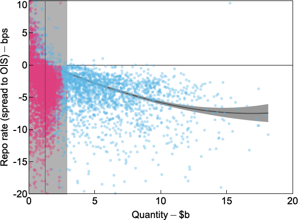
Notes: Pink dots represent successfully filled bids and blue dots represent unsuccessful bids that remained unfilled. The fitted curve represents our best estimate of demand with the shaded area showing the 95 per cent confidence interval. The vertical black line represents the mean supply of cash and the vertical shaded region represents the range between the minimum and maximum supplied.
Sources: Authors' calculations; RBA.
4.2 During the financial crisis: 2008-09
During the financial crisis, precautionary demand for liquidity rose and became more inelastic at lower quantities (Figure 4). The inelasticity of demand at low quantities reflected the high willingness to pay of most institutions. Amidst uncertain and unsettled financial market conditions, many institutions bid higher rates to secure liquidity for precautionary reasons. As a result, repo rates increased and became more variable. Notably, demand drove up the repo rate to be above the unsecured swap rate benchmark so that the spread was positive. During this time, the Reserve Bank supplied substantially more liquidity to meet precautionary demand and the largest amount of $6 billion provided was considerably larger than in the pre-crisis period described above. European markets exhibited a further bout of volatility in 2011 to 2012, which had some spillover effects around the world, but rates once again subsided relatively quickly in Australia. However, repo rates did not return to negative spreads to swaps for any length of time.
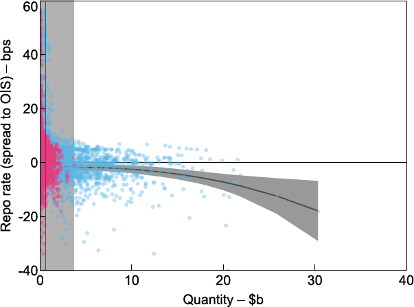
Notes: Pink dots represent successfully filled bids and blue dots represent unsuccessful bids that remained unfilled. The fitted curve represents our best estimate of demand with the shaded area showing the 95 per cent confidence interval. The vertical black line represents the mean supply of cash and the vertical shaded region represents the range between the minimum and maximum supplied.
Sources: Authors' calculations; RBA.
There was also a strong increase in demand for longer-term repo (Table 2). Even though the rates bid for longer terms were high, many of these remained unfilled because of the term offered by counterparties in their approach. Most of the unsuccessful approaches were for terms that were not consistent with the Reserve Bank's dealing intentions. Preferred terms are associated with those maturity dates that coincide with the liquidity management task undertaken by the central bank. On most occasions, the Reserve Bank nominated between one and three such terms. Non-preferred terms might have conflicted with liquidity management objectives and hence the approach might have been rejected, even at very high repo rates. This is also why we observe a cluster of unfilled bids at high repo rates during this period (Figure 4).
| Terms in days | Frequencies | Mean repo rate (spread to OIS) | |||
|---|---|---|---|---|---|
| All bids | Filled bids | All bids | Filled bids | ||
| term ≤ 90 | 2,995 | 935 | 1.73 | 5.01 | |
| 90 < term ≤ 180 | 57 | 3 | 9.61 | 4.70 | |
| 180 < term ≤ 270 | 15 | 1 | 22.61 | 22.60 | |
| 270 < term ≤ 360 | 58 | 0 | 39.46 | 0.00 | |
| term > 360 | 37 | 5 | 25.65 | 38.68 | |
|
Source: RBA |
|||||
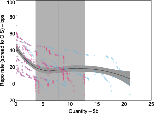
4.3 Escalating repo rates: 2016 to 2019
From 2016, there were renewed upward pressures on repo rates that were not related to the precautionary demand registered during the financial crisis. The source of demand for cash in this period appears to have been a more market-based phenomenon derived from funding investments in associated markets (Becker and Rickards 2017). This was particularly notable around the peak in repo rates in 2018 to 2019 (Figure 5).
The extra demand for cash is evident from the significant upward shift in the estimated curve as the average repo rate settled at around 40 basis points above swaps. Demand also became less stable and there was a much wider dispersion in bids during this time. This outcome may have reflected the link between demand in open market operations and developments in other markets which can often exhibit higher volatility in price outcomes.
Another notable observation relates to a significant flattening of demand. Compared to previous episodes, bids appear to have become considerably more price sensitive as elasticity increased around the elevated spread where supply meets demand. One possible interpretation of this is to consider the quantity implications. It is possible that auction participants were willing to accept a higher allocation of cash in open market operations because the willingness of their third-party clients to pay a high spread also indicated demand for larger quantities to be funded. There were more investments that needed to be funded, even at the higher rate, and repo dealers might have become more confident that they could on-lend large amounts of cash. In other words, liquidity demand rose for non-crisis related reasons and repo rates rose, but dealers were also confident that they could channel the funding they obtained into profitable investments without having to hold the cash in their exchange settlement accounts at the Reserve Bank.[12]
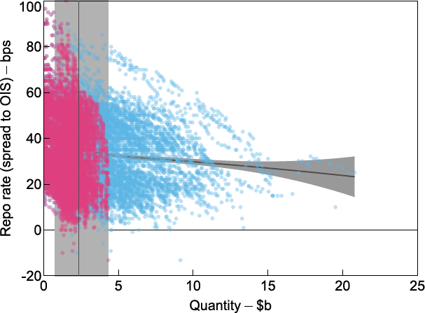
Notes: Pink dots represent successfully filled bids and blue dots represent unsuccessful bids that remained unfilled. The fitted curve represents our best estimate of demand with the shaded area showing the 95 per cent confidence interval. The vertical black line represents the mean supply of cash and the vertical shaded region represents the range between the minimum and maximum supplied.
Sources: Authors' calculations; RBA.
The source of this demand could have been related to banks reinvesting their repo funding, either directly themselves or possibly by on-lending cash to their clients who then entered into transactions that more than covered the rising cost of repo. The repo market might therefore have been part of arbitrage in money markets. Persistent price misalignments that occurred at this time, such as the bond futures and foreign exchange swap bases, are among some plausible sources for these developments (Becker et al 2016). We therefore observe a correlation between the repo rate, height of the demand curve, and its elasticity. See also Section 5 for more detail on estimating elasticity.
The height and shape of the demand curve in this sub-sample period also indicates that on any given day the supply of cash that would have been required to push repo rates back down to more normal spreads would have been significantly larger than previously.
4.4 The onset of the COVID-19 crisis in 2020
Market conditions were relatively benign just prior to the pandemic. In our estimations for February 2020, we see a number of interesting market features (Figure 6). The repo rate had declined from its peaks and bids in open market operations were once again more tightly clustered. We estimate that demand had declined and reverted to being more inelastic. Also of note is that demand was truncated at much lower quantities than observed earlier as cumulative bids petered out at around $7 billion. From Becker and Rickards (2017) one could imply that a reduction in bond futures- and foreign exchange bases-related trades may have contributed to these developments. However, we note that this explanation would benefit from further research to more formally link co-movements in markets.
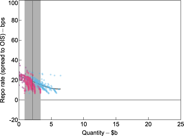
Notes: Pink dots represent successfully filled bids and blue dots represent unsuccessful bids that remained unfilled. The fitted curve represents our best estimate of demand with the shaded area showing the 95 per cent confidence interval. The vertical black line represents the mean supply of cash and the vertical shaded region represents the range between the minimum and maximum supplied.
Sources: Authors' calculations; RBA.
As the COVID-19 crisis spread in March, liquidity deteriorated and volatility spiked in several markets (Debelle 2020; Finlay, Seibold and Xiang 2020; Kent 2020). One effect was that it led to margin calls and demand for short-term liquidity to meet these calls. As such, financial institutions might have placed bids at higher rates and for larger quantities in open market operations (Figure 7). This bidding behaviour translated into a higher and more elongated demand curve than observed in February. In response, the Reserve Bank deviated from its previous target for exchange settlement balances and significantly increased the supply of liquidity, as indicated by the widening band around the supply curve. Another important response was to significantly extend the duration of repo terms to give market participants more certainty about their funding.
Notes: Pink dots represent successfully filled bids and blue dots represent unsuccessful bids that remained unfilled. The fitted curve represents our best estimate of demand with the shaded area showing the 95 per cent confidence interval. The vertical black line represents the mean supply of cash and the vertical shaded region represents the range between the minimum and maximum supplied.
Sources: Authors' calculations; RBA.
As total system liquidity was allowed to rise significantly, access to short-term liquidity quickly became less of a concern. Financial institutions were able to increase their holdings of cash to meet their precautionary demand. Beyond covering the need for short-term liquidity, increased supply of cash in open market operations, long-dated government bond purchases, and the Term Funding Facility provided assurance that access to liquidity would remain ample. This improved the financial outlook, demand shifted lower, and bids became smaller and less volatile (Figure 8). The liquidity supplied to the repo market successfully lowered the repo rate relative to indexed swaps.[13]
From 3 April 2020 until the November 2020 monetary policy decision, the Reserve Bank accepted only bids at, or above, 18 basis points. At the November 2020 monetary policy decision, the cut-off rate was set to 10 basis points. This led to a truncation of bids at this threshold. Under this new regime an increase in demand can only be observed through an increase in quantities. Hence estimated demand is flat.
Notes: Pink dots represent successfully filled bids and blue dots represent unsuccessful bids that remained unfilled. The fitted curve represents our best estimate of demand with the shaded area showing the 95 per cent confidence interval. The vertical black line represents the mean supply of cash and the vertical shaded region represents the range between the minimum and maximum supplied.
Sources: Authors' calculations; RBA.
Footnotes
The Reserve Bank manages net liquidity flows in a forward-looking manner to stabilise the daily provision of cash. For an explanation of how these operations were conducted in the pre-pandemic era see Domestic Markets Department (2019). [9]
Successful bids (pink) must always lie to the left of the maximum cash supplied. [10]
OIS are a bilaterally traded, or over-the-counter (OTC), derivative in which one party agrees to pay the other party a fixed interest rate in exchange for receiving the average cash rate recorded over the term of the swap. They therefore provide a useful benchmark to base the repo spread on to abstract from actual and expected monetary policy changes. [11]
Exchange settlement balances were a relatively unattractive investment as they earned the floor of the cash rate corridor operated by the Reserve Bank at that time. This deliberate design feature ensured that banks would aim to only hold the balances they required for settlement and payments system needs by the end of every day. [12]
Daily surplus system cash averaged around $2½ billion in February 2020 prior to the crisis but a variety of policies pushed this up to an average of around $45½ billion in the July-November 2020 period shown in Figure 8. This represents a substantial increase in the provision of cash, which increased significantly further to exceed $400 billion by the end of 2021. [13]