Speech “The Straight Line Belongs to Man, the Curved Line Belongs to God”

Andrew Hauser*
Deputy Governor
Sir Douglas Copland Memorial Lecture to the Economic Society of Australia (Victoria)
– Melbourne
Introduction
It is an honour to be asked to deliver this, the second Sir Douglas Copland Memorial Lecture.1 I must confess, however, that my topic owes more to the work of Bill Phillips than it does to Copland. Before you throw me out, let me try and convince you there are enough parallels to let me stay!
First, both Copland and Phillips came from rural backgrounds in New Zealand to become adopted sons of Australia. Copland was born in Otaio in the South Island but nearly his whole adult life was spent here, dominating economic affairs for a large part of the 20th century. He was the driving force behind the foundation of the Economic Society of Australia and New Zealand, serving as its first president in the 1920s, and he chaired the expert committee behind the Premiers’ Plan in the 1930s, led the Commonwealth Prices Commission during the Second World War, and served as the inaugural professor of economics at the University of Tasmania, the founding Dean of commerce at the University of Melbourne, and the first Vice-Chancellor of the Australian National University (ANU). In 1933, on the recommendation of Keynes, he gave the first Alfred Marshall Memorial Lectures at Cambridge, then the most prestigious lecture series in global economics.
Phillips was born in Te Rehunga on the North Island and was a more sporadic visitor to Australia. His first trip, in the 1930s, sounds a lively affair, in which – violin in hand – he worked odd jobs across Australia, including as a crocodile hunter, a gold-mine electrician and a cinema operator! And towards the end of his career, he returned to Australia to take up a chair at the ANU. It would be perfect symmetry if Copland and Phillips had met. Sadly, however, your President Alex Millmow – a font of wisdom on Australian economic history – tells me this never happened: they were different generations and moved in different circles.2
A second link is that both believed in a deeply practical conception of economics.3 Copland said ‘the economist must be an economist of the marketplace … he cannot afford the luxury of armchair theorising in a world that is crying out for practical guidance.’4 And Phillips was a life-long engineer: he was an apprentice on one of the earliest hydroelectric power stations in New Zealand at the age of 15; graduated from the Institute of Electrical Engineers in 1938; and built a secret radio in extraordinarily dangerous circumstances while a prisoner of war in the early 1940s. He converted to the dismal science at the London School of Economics, but retained a lifelong engineering bent, most famously in his water-powered MONIAC machine built to demonstrate the workings of the macro-economy.5
The third link, and the most important for my remarks today, is to the Reserve Bank of Australia (RBA). While Copland’s career largely predated the formation of the RBA, he was a passionate advocate for monetary activism. In the 1930s, he railed against the prevailing orthodoxy that placed the maintenance of external stability (i.e. the peg against sterling) above all else, arguing that achieving internal balance (including employment) should also have a role, through exchange rate flexibility and active (for which read expansionary) monetary tools. Later in his career, Copland came to have a more balanced view – recognising that demand could be too high relative to the economy’s productive capacity, as well as too low – driving higher inflation.6 Those two goals – of price stability and full employment – still shape the ‘dual mandate’ the RBA operates under today. And it was Phillips of course who became the first to describe the empirical relationship between those two goals, in his seminal 1958 paper. The RBA (or rather its predecessor, the Commonwealth Bank) was amongst the first to spot the importance of that finding, sponsoring Phillips to travel here in 1959 to lecture on his results and replicate them on Australian data.7
Today, I want to revisit Phillips’ work. But in doing so, my focus will not be on his most famous and widely-debated finding – that inflation and unemployment tend to be inversely correlated – but instead on his insight that this relationship is nonlinear.
For decades, the fact that Phillips drew a curve and not a straight line was neglected in many academic and policy circles around the world, in favour of an assumption that, to a first approximation, the relationship could be treated as relatively linear and flat. Yet that assumption proved problematic – to put it politely – when, in the wake of Covid, inflation around the world leapt sharply and unexpectedly upwards, amid conditions of near-full employment. Debate still rages about the relative contribution of supply and demand factors to the post-Covid inflationary surge. But on the assumption that excess demand was at least part of the explanation, there has been a surge of new interest in Phillips’ findings, and a raft of theoretical and empirical work aimed at providing more robust micro-foundations for nonlinearity and integrating them into macroeconomic models.
In my remaining remarks, I want to summarise our current state of knowledge on this issue, drawing on research carried out at the RBA and elsewhere, before concluding with some reflections on the implications for monetary policy strategy.
Why curves trounce lines
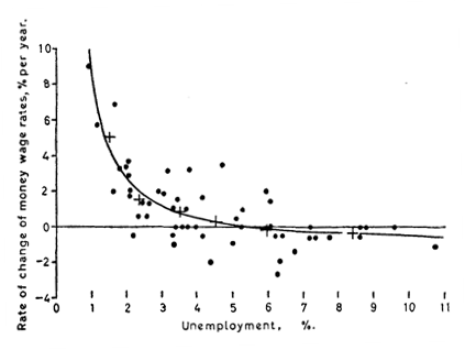
Phillips’ original curve is a thing of beauty (Figure 1).8 Constructed using United Kingdom (UK) data from the 19th and 20th centuries, it captures the economic intuition that, in a tighter labour market (with lower rates of unemployment), employers must compete more for workers and offer higher wages. It also shows that this relationship is nonlinear: when unemployment is very low, wages typically rise quite rapidly; when it is high, they are more stable.
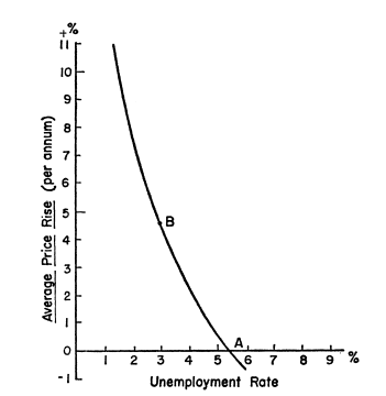
Phillips made little comment on the policy implications of his findings, preferring – as a lifelong engineer – to focus on the empirics. It was Paul Samuelson and Robert Solow, applying Phillips’ approach to United States (US) data, who fatefully called it a ‘menu of choice between different degrees of unemployment and price stability’ (Figure 2).9
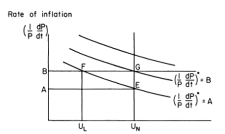
That led to one of the great showdowns of macroeconomic history, in which Milton Friedman argued that such policy trade-offs were an illusion in anything other than the short run. Attempts to hold unemployment persistently below its ‘natural rate’ would lead to a rise in inflation expectations, causing the curve to shift upwards. And that, in turn, would cause nominal wage growth to rise, returning unemployment to the natural rate, with higher inflation the only lasting effect (Figure 3).10 On this argument, the Phillips relationship was just a vertical line in the long run. Indeed, Robert Lucas and Thomas Sargent went on to argue that might hold even in the short run if expectations are formed rationally and prices are flexible.11 Such predictions proved uncomfortably prescient as inflation soared in the 1970s.
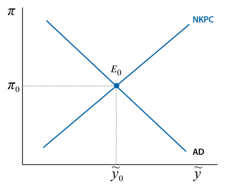
The downwardly-sloped Phillips curve was rehabilitated in the 1980s by the New Keynesians, who argued that, while the New Classicists might be right in the long run, a short-run trade-off could still exist if nominal prices and wages were sticky, or expectations were forward looking and people believed the central bank would provide a nominal anchor (Figure 4).12 Such principles continue to form the basis of most modern macroeconomic models today.
So Phillips’ legacy lived on? In part – but reflect for a moment on the contrast between his original curve in Figure 1, and the modern variants in Figures 2-4. While all four show some form of inverse relationship, only Phillips’ relationship is definitively a curve: suggesting that cost and price pressures rise more rapidly at lower levels of unemployment. The later descendants are all to a greater or lesser extent linear: suggesting that the trade-off is roughly the same at any level of unemployment.
How did this ironing-out happen?
There were multiple causes. In the 1970s and 80s, when the debate about inflation expectations dominated academic thinking, there seemed bigger things at stake than whether the relationship was curvy or straight. And during the so-called ‘Great Moderation’ that followed, relatively stable economic conditions suggested a function that was much straighter than Phillips found in a different era. Add in the fact that linear relationships were easier to integrate into quantitative models, and the case for sticking with lines rather than curves seemed sound.
But that proved a costly mistake. Persistently low and stable inflation in the pre-Covid period led many policymakers to conclude that the Phillips Curve they were facing was not only linear but also relatively flat. In other words, variations in activity and unemployment appeared to be associated with only limited changes in inflation. Any number of structural economic rationales were invoked to support the view that the curve had become flatter over time – including: the impact of globalisation and product market reform on competition; changes to labour market institutions; and well-anchored inflation expectations.13
So, when inflation in many countries picked up sharply after Covid against a backdrop of generally low unemployment and expansionary monetary and fiscal policy, it came as a nasty surprise – despite being exactly what a nonlinear Phillips curve would predict. Of course, this coincided with, and was potentially compounded by, a supply shock that elevated and potentially steepened the Phillips curve, as I will discuss shortly.
Australia, and the RBA, had not forgotten Phillips’ original insight. A seminal paper by Guy Debelle and James Vickery, building on work started at the IMF by Doug Laxton and colleagues, showed that a nonlinear model fitted the Australian data better than a linear one – a result corroborated in more recent work by RBA colleagues (Graph 5).14 The RBA’s forecasting suite was therefore adapted to include a nonlinear Phillips curve.

But even these models underestimated the post-Covid pickup in inflation. Part of the reason for that was the difficulty of identifying and scaling the underlying impulse in real time, including differentiating between demand and supply shocks. But it also reflected the fact that the models couldn’t capture the nature of the nonlinearities fully. This reflected the fact that they were estimated over periods in which the economy was mainly on the flatter part of the Phillips curve, and that they didn’t account for how different sources of nonlinearity could lead to quite different shifts and shapes in the curve.15
I draw two conclusions from this brief history. First, the nonlinearity of the Phillips curve is not a nerdy technical backwater: it has first-order implications for monetary policymakers. But, second, the details matter: it’s not enough to know the curve is nonlinear – we need to know how steep, what position, under what conditions it might shift or steepen, and how this interacts with policy.
Why is the Phillips curve nonlinear?
Recent research at the RBA and elsewhere has begun to throw more light on these crucial issues.16 Let’s start by assuming a Phillips curve with the following general form:
The slope and curvature of the Phillips curve comes from two sources: (a) the relationship f(.) between capacity pressures in the economy (proxied by the gap between unemployment and its natural rate, ) and firms’ labour and non-labour costs ; and (b) the pass-through from costs to inflation, g(.). The final term represents a cost shock (e.g. an increase in the cost of imported goods) that exogenously pushes up inflation or costs. While it is treated as separate here, such shocks have the potential to change f(.) or g(.) – as I will discuss later.17
But before I get to that, I should highlight the role of inflation expectations. While these don’t affect the shape of this simple Phillips curve, they can shift the curve up or down: Friedman’s key insight.18 That’s crucial for policy, since elevated inflation expectations can perpetuate inflationary shocks, raising the cost of returning inflation to target.19 But it also complicates empirical identification of the curve, since naïve estimates that fail to account for expectations might find signs of nonlinearity where none in fact exists.20 Debelle and Vickery’s early work tried to account for this directly using measures of expectations, while more recent RBA work used regional microdata, allowing them to partial out common expectations (Graph 5). Both found robust evidence for the Australian curve being nonlinear.
Nonlinearities in the relationship between capacity pressures and costs
One of the most widely cited rationales for nonlinearity in cost inflation is downward nominal wage rigidity, the observation that wages rarely fall in nominal terms. So, if the economy is already weak and wages growth very low, further weakening may have very little effect on wages growth. Conversely, when price inflation is higher or labour markets are tight, these constraints are less operative and wages may grow strongly in response to economic conditions. Phillips relied heavily on a version of this argument in his original paper, and it has been a mainstay of macroeconomic thinking ever since, including as a possible explanation for the apparent variation in the slope of the Phillips curve in recent years.21
A second set of reasons relates to how labour market tightness is measured. While we often focus on unemployment, another measure of labour market tightness that economists often consider is the ratio of job vacancies to those available to fill them (i.e. the unemployed).22 If unemployment is low, but there are also few jobs to fill, pressure on wages may be low. But if vacancies are high when unemployment is low, firms may need to offer higher wages to attract workers. The relationship between vacancies and unemployment is known as the ‘Beveridge curve’, and is typically highly nonlinear, with the number of vacancies picking up sharply at low levels of unemployment as it becomes increasingly hard to fill roles from such a small pool of potential candidates (Graph 6). The convex relationship between vacancies and unemployment has been put forward as an explanation for both the apparent flatness of estimated Phillips curves pre-Covid and the steepness since.23

A third potential source of nonlinearity is nonlinear hiring costs. By definition, hiring costs are zero when firms are not taking on new workers – whatever the unemployment level. But when firms start recruiting, hiring costs increase; and they may rise disproportionately as the labour market tightens, reflecting the increased effort required to find the right skills, and capacity constraints on recruiters and onboarding. As a result, marginal labour costs can accelerate quickly when labour markets are tight, but be quite flat when markets are weaker.24
Recent work at the RBA has integrated these three labour market drivers into a single micro-founded model for Australia.25 The results show that convexity in wage rigidities, matching and hiring costs can reinforce each other, generating pronounced non-linearities in the relationship between unemployment and price inflation. This helps explain why relatively small changes in labour market conditions can sometimes coincide with high inflation outcomes, and less at other times when unemployment is higher. But these and other labour market frictions may also mean that trying to bring down unemployment quickly can lead to a sharp rise in inflation, even if unemployment is still elevated (Graph 7). That echoes Phillips’ intuition in his 1958 paper that wage growth might depend not just on the level of unemployment but also on its rate of change – a point I will return to later.26

A final potential source of nonlinearity in the relationship between activity and firms’ costs comes from constraints in the supply of non-labour inputs. When such constraints bind, expanding output becomes very costly, causing firms to respond to stronger demand by raising prices, making the Phillips curve much steeper. Research from the US suggests that supply constraints may have accounted for as much as 2 percentage points of the pick-up in inflation following Covid.27 Recent work suggests that disruptions to critical supply nodes – or ‘bottlenecks’ – that are relied upon by a wide variety of industries can have a particularly pervasive effect, especially if they provide a focal point for inflation expectations.28
Nonlinearities in the pass-through of costs to prices
A nonlinear Phillips curve may also arise from nonlinearities in the relationship between costs and prices.
Such effects may arise if firms adopt so-called state-contingent pricing. For a long period, New Keynesian models typically assumed that firms would only change their prices at fixed frequencies, given the costs involved. In Guillermo Calvo’s seminal 1983 paper, a stable share of firms change their prices every period, giving a constant percentage pass-through of (actual and expected) cost changes into aggregate prices and inflation.29 In such circumstances, the Phillips curve will be linear: the impact of a large cost shock is simply a scaled-up variant of a small shock.30
However, empirical evidence using firm-level data sets suggests that the frequency of price changes depends on the state of the economy. Price resets are more likely during periods of higher inflation when firms’ costs are also rising quickly. Recent work at the RBA shows that the frequency of price changes in Australia increased substantially as inflation picked up post-Covid (Graph 8).31

Such results seem intuitive: as input cost inflation rises, so does the burden on firms of holding their prices unchanged. At some threshold, when the costs of delay outweigh the (largely fixed) costs of changing, firms will face a strong incentive to pass on their cost increases into higher prices to avoid making losses – regardless of any normal schedule for price reviews that they might have.32 That has two implications. First, as domestic cost and capacity pressures increase, inflationary pressures will tend to rise more than proportionately, tracing out a nonlinear Phillips curve. But, second, the slope of that curve may steepen, at least for a period, in response to any large cost shock, regardless of the level of activity and unemployment. Once firms are already having to bite the bullet and change their price in response to the large cost increases, any further change in their costs, including due to shifts in demand, may get passed straight through to prices.
This isn’t purely academic. RBA colleagues have shown that increases in price setting frequency may have accounted for between ½ and 1¼ percentage points of the post-Covid pick-up in Australian inflation.33
Advances in the theory and computing power available to model state-contingent pricing, coupled with the increasing availability of microdata evidence and recent inflationary episodes make this a very active area of research in academia and policy institutions.34, 35
Some reflections on the implications for monetary policy strategy
The preceding analysis of the sources of nonlinearity in the Phillips curve suggests that inflationary pressures are likely to be higher for a given change in activity in one or more of three specific cases:
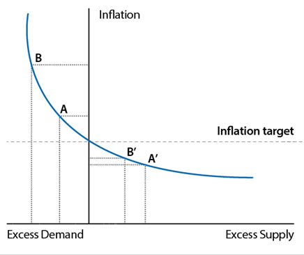
- Case 1: if domestic capacity pressures and inflation are already elevated. Less-binding downward nominal rigidities, the nonlinear Beveridge curve, hiring costs, supply constraints and state-contingent pricing may all contribute to outsized inflationary effects as we move along the steep part of the (nonlinear) Phillips curve (Figure 9, point A to B).
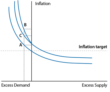
- Case 2: if cost shocks are large or persistent, the Phillips curve will shift upwards but it will also tend to steepen (Figure 10, point A to B) as firms pass through cost changes more fully and rapidly.
- Case 3: if inflation expectations are elevated, either independently or as a result of the changes in cases 1 and 2, that will affect actual inflation through the decisions of price- and wage-setters, as Friedman showed, shifting up the Phillips curve (Figure 10, point A to C).
These cases can be mutually reinforcing. For example, pre-existing capacity pressures can make firms more sensitive to additional unanticipated cost pressures, amplifying the speed of pass-through.
What implications does this have for monetary policy?
In general, the more nonlinear the Phillips curve is, the stronger is the case for central banks who believe they are on the steeper part of the curve to take pro-active policy action to reduce excessive capacity pressures (Case 1), thereby also reducing vulnerabilities to cost shocks (Case 2) and helping to anchor inflation expectations (Case 3).
This framework helps to elucidate the Monetary Policy Board’s decisions to increase the cash rate target at each of our February, March and May meetings. The decision in February reflected concerns that we were sliding up the steeper part of the Phillips curve (Figure 9), as unexpectedly rapid increases in demand growth, coupled with anaemic growth in the economy’s supply potential, reduced spare capacity and increased inflationary pressures. Similar considerations applied in March, but were coupled with early concerns that the conflict in the Middle East (which had been underway for about a fortnight) might add a material adverse supply shock to pre-existing capacity pressures, posing upside risks to costs, prices and inflation expectations, further raising and steepening the Phillips curve (Figure 10). By May those concerns appeared to be crystallising, motivating a further tightening in the monetary stance alongside upside risks to inflation and inflation expectations.36
The goal of tighter policy is to deliver a period of below-trend demand growth, reducing capacity pressures and returning inflation to target. But this is where being on the steeper part of the Phillips curve has a potential silver lining – because while it implies that increases in excess demand have a proportionally larger impact on inflation on the way up (Graph 11, red dots), it also implies that timely policy steps to reduce inflationary pressures, of the kind we have taken, should also have a proportionally smaller unemployment cost (or ‘sacrifice ratio’) on the way down. That beneficial effect should be further amplified if pre-emptive policy also helps anchor inflation expectations, preventing larger shifts upwards in the curve.37 Consistent with that, the baseline projection published in May suggested that inflation would return sustainably to the midpoint of the target range over the forecast period, with only a limited increase in unemployment (Graph 11, blue dots).38

Of course, time has moved on since the May meeting, and there have been a number of important economic developments – not least the prospect of a possible resolution to the Middle East conflict. By itself, lower global oil prices would be a welcome development, helping to lower and flatten the Phillips curve somewhat. But a full resolution is not yet assured, and we still have work to do to reduce inflation here in Australia, which remains far too high. Beyond that, I have nothing to add on the economic or policy outlook over and above last week’s Board statement and press conference.39
One important point that I do want to stress however is that the inflation nonlinearities that I have discussed in this speech are not the only nonlinearities in the economy. As I noted earlier, ongoing research at the RBA highlights that the same labour market frictions that lead to Phillips curve nonlinearities can also make it harder to bring unemployment down quickly, once it rises, without a sharp rise in inflation. That would be equivalent to an upward shift in the Phillips curve, with sustainable employment falling temporarily following a large negative demand shock (Graph 12). This work captures the old observation that ‘unemployment goes up by the elevator but down by the stairs’, something the downturn of the early 1990s vividly illustrated. The resulting labour market hysteresis effects can have long-lasting implications, particularly for young workers entering the labour market.40 Other nonlinear effects can also be important – including via household financial stress and nonlinear confidence effects.

In all of this, it is important to be humble. Much of this discussion assumes policymakers know the nature of the shock and the nonlinearity in real time. But that is a practical impossibility, even with a growing body of research. A decade later, for example, economists are still debating the cause of the apparent flattening in the Phillips curve over the 2010s – and I suspect we will still be debating the relative contribution of supply and demand shocks to the post-Covid inflation surge in a decade’s time. None of this is to dismiss the policy lessons from the literature on nonlinear Phillips curves, which proved so painful in the aftermath of Covid. Rather, it reinforces the importance of having as detailed an understanding of the mechanisms, and other factors that interact, when we make policy.
Conclusion
Let me conclude.
The resurgence of inflation after Covid was a painful reminder of one of Bill Phillips’ most important, but often neglected, insights: that the relationship between capacity pressures and inflation is nonlinear.
When an economy already near full capacity is hit by an inflationary shock, inflation may pick up quickly.
But knowing the curve is nonlinear is not enough: we also need to understand the underlying sources of that nonlinearity, and how that influences the curve’s position, shape and response to shocks. The RBA is making important contributions to this lively research effort.
We are also building those findings into our forecasting and policy thinking. In general, nonlinearities in the Phillips curve suggest that policy should respond proactively to an inflationary shock when we are already on the steep part of the curve – and that is what the Monetary Policy Board has done in recent months. The good news is that credible disinflation in such circumstances need not incur as large an activity cost as it would on a flatter part of the curve. But whether that transpires depends on the resolution of many other uncertainties. And, as I’ve discussed here, it is important to remember that there are many other nonlinearities in the economy, some of which work in the opposite direction (including hysteresis effects in the labour market).
Before I finish, I want to make one final link to Douglas Copland, in whose memory this lecture is being delivered. Copland was a lifelong advocate for the importance of deepening public understanding of economics. A charismatic and energetic writer and orator, he believed that economists who couldn’t (or wouldn’t) communicate were useless to society. Central banks, including the RBA, have made big strides on this front in recent years. But there’s always room for further improvement, especially in such uncertain economic times.
And that’s why we will shortly begin publishing a new ‘Insights’ series of notes authored by RBA staff – presenting their analysis on a range of topics relevant to our remit, showcasing more of the work done internally to underpin, test and challenge the assessments we make.41
The aim is to throw light on a range of topics relevant to monetary policy and central banking in shorter ‘bite-sized’ format, complementing our more detailed research and analysis outputs. The first set of notes will cover topics relating to inflation dynamics, including some of the themes I have touched on today. We hope they will help to enrich and deepen understanding of these and other important issues.
With that, I thank you again for the invitation to give this lecture, and I hope your next lecturer can return to a more faithful treatment of Copland’s legacy!
Endnotes
* I am grateful to Matthew Fink and Jonathan Hambur
for co-writing this speech with me. I also thank Michelle Bergmann, Anthony Brassil, Michele Bullock, Adam Cagliarini,
Anthony Dickman, Samuel Evangelinos, Katerina Gribbin, Kate Hickie,
Sarah Hunter, David Jacobs, Brad Jones, Chris Kent, Kevin Lane, Jenny Lui, Michael Plumb,
Josh Spiller, Tim Taylor and Michelle Wright for their comments and assistance with an earlier draft.
The title of the speech is a quotation attributed to Antoni Gaudi, the Spanish architect who
famously favoured organic curves to straight lines. It is ironic therefore that many of his most
apparently irregular or ‘organic’ designs, including Barcelona’s La Sagrada
Familia church, required linear mathematical techniques to ensure they stood up – see
Huerta S (2006), ‘Structural Design in the Work of Gaudi’, Architectural Science
Review, 49(4), pp 324-339. The lecture focuses on theoretical issues for an
academic audience and will not include discussion of live monetary policy issues; as such there
is no livestream or Q&A.
1 The first Copland Memorial Lecture was delivered by Bob Gregory in September 2025.
2 For more on Copland and Phillips’ time in Australia, see: Alex Millmow’s entry in King J.E. (ed) (2007), ‘A Biographical Dictionary of Australian and New Zealand Economists’, Edward Elgar Publishing, Cheltenham; and Cornish S and A Millmow (2014), ‘A.W.H. Phillips and Australia’, History of Economics Review, 63, pp 2-20.
3 Indeed, this is a defining feature of Australian economics in general, as discussed in Hauser A and J Hambur (2025), ‘What has Australian Macroeconomic Thought Achieved in the Past Century – and Where Can it Contribute in the Next?’, Economic Record.
4 The quotation is from Copland’s 1945 Godkin lectures at Harvard University, reproduced in Copland D.B. (1946), ‘The Road to High Employment: Administrative Controls in a Free Society’, Canadian Journal of Economics and Political Science, 12(4), pp 542-543.
5 For descriptions of MONIAC see: Science Museum (2018), ‘How Does the Economy Work?’, available at <https://www.sciencemuseum.org.uk/objects-and-stories/how-does-economy-work> Ng T and M Wright (2007), ‘Introducing the MONIAC: an early and innovative economic model’, Reserve Bank of New Zealand Bulletin, 70(4), pp 46-52; and Swade D, ‘The Phillips Economic Computer’, Computer Resurrection, 12, which includes a reproduction of Punch magazine’s 1953 satirical cartoon of the model.
6 See Copland D.B. (1951), ‘Inflation and Expansion: Essays on the Australian Economy’, F.W. Cheshire, Ltd. Copland came to believe that aiming for ‘full’ employment rather than ‘high’ employment posed upside risks to inflation, as discussed in Millmow A (2013), ‘Douglas Copland’s Battle with the Younger Brethren of Economists’, Australian Economic History Review, 53(2), pp 187-209. Indeed, Copland’s relationship with the Commonwealth (later Reserve) Bank was quite frequently fractious. The clashes were as often ones of style as substance: Copland’s ego and extrovert manner contrasted markedly with his more reserved central banking contemporaries.
7 Sadly, Phillips’ 1959 Australian study was never published, although there is a discussion of its contents in ‘The Melbourne Paper’, Chapter 27 of ‘A W H Phillips – Collected Works in Contemporary Perspective’ by John Pitchford, and the core insights were referred to in Nugget Coombs’ Edward Shann Memorial Lecture, ‘Some Ingredients for Growth’, delivered in August 1959 in the aftermath of the passage of the Reserve Bank Act 1959.
8 Phillips AW (1958), ‘The Relation Between Unemployment and the Rate of Change of Money Wage Rates in the United Kingdom, 1861-1957’, Economica, 25(100), pp 283-299.
9 Samuelson PA and RM Solow (1960), ‘Analytical Aspects of Anti-inflation Policy’, American Economic Review, 50(2), pp 177-194.
10 Graph 3 comes from Friedman’s 1977 Nobel Lecture: Friedman M (1977), ‘Nobel Lecture: Inflation and Unemployment’, Journal of Political Economy, 85(3), pp 451-472. His original paper contains no graphs, equations or data: Friedman M (1968), ‘The Role of Monetary Policy’, American Economic Review, LVII(1), pp 1-17. There have of course been endless debates about whether either Phillips or Samuelson/Solow really presented their analysis in the way characterised by Friedman. It is telling, for example, that the first reference to ‘menu’ in the main text of the Samuelson and Solow papers says ‘It would be wrong, though, to think that our […] menu that relates obtainable price and unemployment behaviour will maintain its same shape in the longer run. What we do in a policy way during the next few years might cause it to shift in a definite way.’
11 See for instance Sargent TJ (1973), ‘Rational Expectations, the Real Rate of Interest, and the Natural Rate of Unemployment’, Brookings Papers on Economic Activity, 2, pp 429-480.
12 See for instance: Gordon RJ (2018), ‘Friedman and Phelps on the Phillips Curve Viewed from a Half Century’s Perspective’, NBER Working Paper No. 24891; Blanchard O, ‘The Phillips Curve: Back to the 60s?, ‘American Economic Review: Papers & Proceedings, 106(5), pp 31-34; Gali J (2008), ‘Monetary Policy, Inflation and the Business Cycle: An Introduction to the New Keynesian Framework’, Princeton University Press, New Jersey. Figure 4 is based on the simple model laid out in Chapter 3 of the final reference for a given level of inflation expectations.
13 For a summary of some these arguments, see Del Negro M, M Lenza, GE Primiceri and A Tambalotti (2020), ‘What’s up with the Phillips Curve?’, European Central Bank Working Paper No 2435.
14 See: Laxton D, GM Meredith and D Rose (1994), ‘Asymmetric Effects of Economic Activity on Inflation: Evidence and Policy Implications’, IMF Working Paper No 1994/139; Laxton D and G Debelle (1996), ‘Is the Phillips Curve Really a Curve? Some Evidence for Canada, the United Kingdom, and the United States’, IMF Working Paper No. 1996/111; Debelle G and J Vickery (1997), ‘Is the Phillips Curve a Curve? Some Evidence and Implications for Australia’, RBA Research Discussion Paper No. 9706; and Bishop J and E Greenland (2021), ‘Is the Phillips Curve Still a Curve? Evidence from the Regions’, RBA Research Discussion Paper No 2021-09.
15 As discussed in RBA (2022), ‘Box C: What Explains Recent Inflation Forecast Errors?’, Statement on Monetary Policy, November.
16 For more detail on the internal work that has been undertaken in this area, see the first batch of staff notes released today (24 June) in the new publication, Insights: an RBA Staff Series.
17 The ‘primitive’ version of the Phillips curve underlying New Keynesian models includes marginal cost directly. Mapping to an output or unemployment gap makes several restrictive assumptions, but remains useful for this discussion. See Galiardone L, M Gertler, S Elnzi and J Tielens (2025), ‘Anatomy of the Phillips Curve: Micro Evidence and Macro Implications’, American Economic Review, 115(11), pp 3941-3974.
18 This is a simplification. In many models the shape of the Phillips curve can be influenced by the central bank’s policy rule, as it affects how much people expect inflation to change following an economic shock. And some recent literature argues that people might start paying attention to inflation only once it reaches high levels, creating nonlinearities: see for instance Pfauti O (2026), ‘The Inflation Attention Threshold and Inflation Surges’, March 2026, available at <https://www.oliverpfaeuti.com/website/IAT.pdf>.
19 Recent work at the RBA has explored how inflation outcomes can feed into persistently higher inflation expectations for a period, even when long-run expectations are anchored: Brassil A, Y Haidari, J Hambur, G Nolan and C Ryan (2024), ‘How do Households Form Inflation and Wage Expectations?’, RBA Research Discussion Paper No 2024-07; and Brassil A, C Gibbs and C Ryan (2025), ‘Boundedly Rational Expectations and the Optimality of Flexible Average Inflation Targeting’, RBA Research Discussion Paper No 2025-02. This is part of a broader literature that includes Carvalho C, S Eusepi, E Moench and B Preston (2023), Anchored Inflation Expectations, American Economic Journal: Macroeconomics, 15(1), pp 1-47, and O Coibion, Y Gorodnichenko and R Kamdar (2018), ‘The Formation of Expectations, Inflation, and the Phillips Curve’, Journal of Economic Literature, 56(4), pp 1447-1491.
20 These potential misidentification arguments are set out in Beaudry P, C Hou and F Portier (2025), ‘On the Fragility of the Nonlinear Phillips Curve View of Recent Inflation’, NBER Working Paper No. 33522, and Doser A, R Nunes, N Rao and V Sheremirov (2023), ‘Inflation Expectations and Nonlinearities in the Phillips Curve’, 38(4), pp 453-471.
21 From Phillips’ 1958 paper: “When the demand for labour is high and there are very few unemployed we should expect employers to bid wage rates up quite rapidly, each firm and each industry being continually tempted to offer a little above the prevailing rates to attract the most suitable labour from other firms and industries. On the other hand, it appears that workers are reluctant to offer their services at less than the prevailing rates when the demand for labour is low and unemployment is high so that wage rates fall only very slowly.” Recent work in this area includes: Daly MC and B Hobjin (2018), ‘Downward Nominal Wage Rigidities Ben the Phillips Curve’, Journal of Money, Credit and Banking, 46(52), pp 51-93; Mineyama T (2022), ‘Downward Nominal Wage Rigidity and Inflation Dynamics during and after the Great Recession’, Journal of Money, Credit and Banking, 55(5), pp 1213-1244; and Schmitt-Grohe S and M Uribe (2025), ‘Heterogeneous Downward Nominal Wage Rigidity: Foundations of a Nonlinear Phillips Curve’, October 2025, available at <https://www.columbia.edu/~mu2166/dnwrA/paper.pdf>.
22 The full set of measures used by the RBA to evaluate labour market conditions is set out in RBA (2026) ‘Update on the RBA’s Approach to Assessing Full Employment’, RBA Technical Note, February.
23 Formally speaking, the convexity in the Beveridge curve arises from diminishing returns in the labour market matching function. For recent work in this area, see for instance Benigno P and GB Eggertsson (2024), ‘Revisiting the Phillips and Beveridge Curves: Insights from the 2020s Inflation Surge’, NBER Working Paper No 33095, and Figura A and C Waller (2024), ‘What does the Beveridge Curve Tell us about the Likelihood of Soft Landings?’, Journal of Economic Dynamics and Control, 169.
24 See for instance Petrosky-Nadeau N and L Zhang (2017), ‘Solving the Diamond-Mortensen-Pissarides Model Accurately’, Quantitative Economics, 8(2), pp 611-650, and Chodorow-Reich G (2024), ‘Comment: The Dominant Role of Expectations and Broad-Based Supply Shocks in Driving Inflation’, NBER Macroeconomics Annual, 39, pp 291-301.
25 For an early version of this work, see Brassil A and C Ryan (2025), ‘A New Keynesian ‘Plucking’ Model of Unemployment and Inflation’, Proceedings of RBA Quantitative Macroeconomics Workshop, December.
26 From Phillips’ 1958 paper: “It seems possible that a second factor influencing the rate of change of money wage rates might be the rate of change of the demand for labour, and so of unemployment. Thus in a year of rising business activity, with the demand for labour increasing and the percentage unemployment decreasing, employers will be bidding more vigorously for the services of labour than they would be in a year during which the average percentage unemployment was the same but the demand for labour was not increasing. Conversely in a year of falling business activity, with the demand for labour decreasing and the percentage unemployment increasing, employers will be less inclined to grant wage increases, and workers will be in a weaker position to press for them, than they would be in a year during which the average percentage unemployment was the same but the demand for labour was not decreasing.”
27 See for example Comin DA, RD Johnson and CJ Jones (2024), ‘Supply Chain Constraints and Inflation’, NBER Working Paper No 31179, which considers domestic and foreign constraints on output, and Ozhan GK, N Sander, S Wende and S Yang (2025), ‘Monetary Policy under Network-level Bottlenecks’, Proceedings of RBA Quantitative Macroeconomics Workshop, December, which considers labour constraints..
28 See Gai P (2026), ‘Shipping Lanes and Inflation-at-Risk: Hub Shocks and Optimal Monetary Policy’, Guest Lecture at NZ Treasury, 4 May 2026 for a recent discussion of such effects in the context of the Middle East conflict. Earlier papers in this field include: Lie E (2019), ‘Industrial Policies in Production Networks’, Econometrica, 134(4), pp 1993-1948; and Jones CI (2011), ‘Intermediate Goods and Weak Links in the Theory of Economic Development’, American Economic Journal: Macroeconomics, 3(2), pp 1-28.
29 Calvo GA (1983), ‘Staggered prices in a utility-maximizing framework’, Journal of Monetary Economics, 12(3), pp 383-398.
30 Quadratic ‘Rotemberg’ price adjustment costs also lead to similar conclusions in linearised models. While these and Calvo models can have some nonlinearities in nonlinearised models, the extent is smaller than state-dependent pricing models, see for example Blanco A, C Boar, CJ Jones and V Midrigan (2025), ‘The Inflation accelerator’, NBER Working Paper No 32531
31 Fink M and J Hambur (2026), ‘Shifts in Australian Price-setting Behaviour Around Large Shocks’, RBA Research Discussion Paper No 2026-02. Similar results have been found in other countries: see for example Cavallo A, F Lippi and K Miyahara (2024), ‘Large Shocks Travel Fast’, American Economic Review: Insights, 6(4), pp 558–574; Montag H and D Villar (2025), ‘Post-Pandemic Price Flexibility in the U.S.: Evidence and Implications for Price Setting Models’, Federal Reserve Board Finance and Economics Discussion Series No 2025-024; and Gautier E, C Conflitti, D Enderele, L Fadejeva, A Grimaud, E Gutierrez, C Jouvanceau, JO Menz, A Paulus, P Petroulas, P Rodlan-Blanco, E Wieland, ‘Consumer Price Stickiness in the euro area during an Inflation Surge’, European Central Bank Working Paper Series No 3181.
32 When firms increase their prices more frequently, it does not imply that their profit margins are increasing. In many cases, this behaviour may only reduce the extent to which their margins compress: see Davis K, J Hambur, K Lane, D Megow, S Rafter and H Sullivan (2026), Margins, Mark-ups and Consumer Prices: Theory, Measurement and Implications’, RBA Bulletin, May; and Champion M, C Edmond and J Hambur (2023), ‘Competition, Markups, and Inflation: Evidence from Australian Firm-level Data’, proceedings of RBA Annual Conference, Sydney 25-26 September.
33 Fink M and J Hambur (2026), ‘Shifts in Australian Price-setting Behaviour Around Large Shocks’, RBA Research Discussion Paper No 2026-02.
34 See for instance Alvarez F, H Le Bihan and F Lippi (2016), ‘The Real Effects of Monetary Shocks in Sticky Price Models: A Sufficient Statistic Approach’, American Economic Review, 106(10), pp 2817-2851; Auclert A, R Rigato, M Rognlie and L Straub (2024), ‘New Pricing Models, Same Old Phillips Curves?’, Quarterly Journal of Economics, 139(1), pp 121-186; and Blanco A, C Boar, CJ Jones and V Midrigan (2025), ‘The Inflation accelerator’, NBER Working Paper No 32531.
35 Another source of nonlinearity posited in the literature is changing price sensitivity for consumers over the economic cycle. Under some formulations, this can lead to a nonlinear Phillips curve: see Harding M, J Linde and M Trabandt (2022), ‘Resolving the missing deflation puzzle’, Journal of Monetary Economics, 126, pp 15-34. A second area of recent focus is how competition could interact with these factors. In general, less competition is associated with weaker pass-through of cost changes to inflation and a flatter Phillips curve, as documented for Australia in Champion M, C Edmond and J Hambur (2023), ‘Competition, Markups, and Inflation: Evidence from Australian Firm-level Data’, proceedings of RBA Annual Conference, Sydney, 25-26 September. However, it is possible that periods of high inflation could also cause changes in competitive dynamics, through either an increase or a decrease in competition – see for example: Benabou R (1992), ‘Inflation and Efficiency in Search Markets’, Review of Economic Studies, 59(2) pp 299-329; Franzoni FA, M Giannetti and R Tubaldi (2024), ‘Supply Chain Shortages, Market Power, and Inflation’, Swiss Finance Institute Research Paper No 23-105; and Kharroubi E and F Smets (2024), ‘Monetary policy with profit-driven inflation’, BIS Working Paper No 1167.
36 See also Hunter S (2026), ‘Inflation and the Impact of the Middle East Conflict’, Speech to the Bloomberg Forum for Investment Managers, Sydney,19 May.
37 See for instance: Karadi P, A Nakov, G Nuno Barrau, E Pasten and D Thaler (2024), ‘Strike while the iron is hot: optimal monetary policy with a nonlinear Phillips curve’, BIS Working Paper No 1203.
38 RBA (2026), Statement on Monetary Policy, May.
39 RBA (2026), Statement by the Monetary Policy Board: Monetary Policy Decision, May and Bullock B (2026), Monetary Policy Decision, Media Conference, Sydney, 16 June 2026.
40 For Australian evidence, see Andrews D, N Deutscher, J Hambur and D Hansell (2020), ‘The career effects of labour market conditions at entry,’ Treasury Working Paper no 2020-01. For US evidence see Kahn LB (2010), ‘The long-term labor market consequences of graduating from college in a bad economy,’ Labour Economics, 17(2), pp 303-316.
41 It is important to underscore that Insights present the analysis and views of the authoring RBA staff; they do not represent the views of the RBA as a whole, or its Boards. Similar series from other central banks include: the New York Federal Reserve’s Liberty Street Economics; the Bank of Canada’s Staff analytical notes; the Banque de France’s Eco Notepad; and the Bank of England’s Bank Underground.
Underlying data
You can download the underlying data file for all data that are available for public release.
Some graphs in this article were generated using Mathematica.