Research Discussion Paper – RDP 2021-05 Central Bank Communication: One Size Does Not Fit All
1. Introduction
Central banking used to be a rather secretive business. As Janet Yellen (2012) noted in a speech ‘In 1977, when I started my first job at the Federal Reserve Board … it was an article of faith in central banking that secrecy about monetary policy decisions was the best policy’. But times have changed. There has been a gradual evolution towards greater transparency in central banking practice and an increasing emphasis on the quality of communication (Eijffinger and Geraats 2006; Filardo and Guinigundo 2008; Dincer and Eichengreen 2009).
This evolution has been driven by two primary forces. The first is a literature that has highlighted how expectations are central to the efficacy of monetary policy. If central banks communicate effectively, markets are able to anticipate the policy implications, and should respond to information contained in new economic data when it occurs rather than disruptively when central banks make policy announcements (Hawkesby 2019). Reflecting this, countries that are most effective in this practice tend to experience less interest rate volatility and smaller reactions to monetary policy changes (Blinder et al 2008).
The second force is the transition towards independent central banks and the associated need for transparency in support of democratic accountability (Blinder et al 2001). As independent public institutions, central banks are ultimately accountable to the public. To support this accountability they need to reveal enough about their analysis, actions and internal deliberations so that interested observers can understand each monetary policy decision as part of a logical chain of decisions leading to some objective and, thereby, assess their performance (Woodford 2005; Bernanke 2010; Preston 2020).
Central banks do, however, confront a trade-off. Monetary policy is not simple. A comprehensive explanation may not be simple or easily understood, but a simple explanation may not be accurate. In practice, central banks have tended to provide more explanation over recent years. For example, the length of the RBA's Statement on Monetary Policy (SMP) has increased from just over 10,000 words, in its first iteration in 1997, to over 30,000 words in the latest issues. A review of the Federal Reserve Bank's communication also reveals a general trend towards longer and more complex documents, to the point where the reader requires a university-level education to understand the content properly (Davis and Wynne 2016; Haldane 2017). A related challenge is that it can sometimes be difficult to decide who a central bank's audience is. Is it, for example, market economists who spend their time interpreting central bank actions for their financial market clients? Or is it the general public who are deciding whether to take out a mortgage or to invest in some new equipment for their business? Or companies and unions deciding how they will approach wage negotiations?
Despite the increased emphasis on communication and the many questions in the area, there has been relatively little study of the communication quality of central bank documents and even fewer answers on what makes for effective communication in this area.[1] To fill this gap we analyse central bank communications using surveys and a novel application of machine learning techniques. We focus on how different audiences, in particular economists and non-economists, perceive the readability of and the degree of reasoning in various economic communications. Ours is the first work that attempts to measure the degree of reasoning in central bank communication and, consequently, also the first that considers the relationship between readability, reasoning and audience. We discuss the reasons for this particular delineation, and related work, in more detail in the next section.
We have three main results. First, we find that simple readability indices, such as the Flesch–Kincaid (FK) grade level, are barely correlated with individuals' survey ratings of text readability. This suggests that a focus on simple readability metrics, as is common, may fail to increase a broad measure of readability. Furthermore, we find that the readability of a text is generally uncorrelated with the degree of reasoning in the text. Thus, a focus on readability alone runs the risk of undermining the achievement of transparency to the extent that it de-emphasises the importance of the content of a document.
Second, the way people comprehend a document depends on their knowledge of economics. We find that there is no correlation between the way the economists and non-economists in our sample perceive the readability and reasoning of the same piece of text. Our machine learning results reflect this observation: the textual elements associated with more readable paragraphs vary between economists and non-economists. Put another way, one needs to emphasise different techniques when writing for economists and non-economists; one size does not fit all.
Finally, there seems to be a trade-off between readability and reasoning – at least within a given paragraph. We find, for example, that the introductions of documents tend to be more readable but contain less reasoning while conclusions tend to be less readable but contain more reasoning. This highlights that different parts of a document have different objectives and it would be difficult to achieve these multiple objectives with a single style of writing within a single paragraph. Importantly, the application of any single metric to an entire document will fail to capture the need for different emphases at different points. Consequently, we emphasise that text quality metrics – including our own – should be used to inform rather than prescribe.
While this is the first study that we are aware of that systematically assesses these 3 aspects of central bank communication, our results are individually unsurprising. In other respects, however, they are new. In particular, we have not seen any previous work that considers the various aspects of effective central bank communication simultaneously and, in particular, that acknowledges the trade-offs that exist between the various individual objectives. No one document or style of writing is best for every paragraph, audience or communication objective.
2. What is Effective Central Bank Communication?
As mentioned in the above, we investigate 3 main aspects, or qualities, of central bank communication: the ease of reading and the degree of reasoning as assessed by different audiences. We discuss the reasons for our choice of these particular lenses in more detail here, along with a brief discussion of the existing literature.
Questions about readability and audience are natural ones when thinking about communication and there is a large literature on these topics. For example, the much-used FK grade level (Kincaid et al 1975)[2] embodies the concepts of readability and audience to the extent that it highlights how certain texts are more or less appropriate for different audiences based on their level of education.[3] The topic of reasoning is also common in the central banking literature, although it is not labelled as such. In particular, the literature on central bank transparency argues that not only does central bank communication have to be understood; it needs to reveal a central bank's analysis, reasoning and thinking. For the purposes of this paper, we label this concept ‘reasoning’. That is, we see transparency as combining the concepts of readability and reasoning. Finally, while issues of readability and reasoning are common in the central bank literature, there is surprisingly little explicitly on the topic of audiences; much of the literature implicitly approaches these issues from either the perspective of a trained economist or assumes that simpler communication is universally better. We discuss some relevant literature on these 3 topics in more detail below.
2.1 Readability
As implied above, there is a degree of fuzziness in the central banking literature. Some papers implicitly equate readability with transparency, while others treat the existence of information on policy objectives as there being transparency about the objectives. We would suggest that the existence of information is an example of providing the reasons while the manner of its expression is an example of readability – which could be either clear or incomprehensible.
Notwithstanding the fuzziness in the literature, there are a number of papers that explicitly consider readability (e.g. Haldane 2017). Among these studies, simple readability formulae, most notably the FK grade level, are commonly used. The principle of the FK grade level, and alternatives are very similar, is that longer sentences or words with many syllables make a paragraph more difficult to read and comprehend. While many researchers (Jansen 2011; Bulíř, Čihák and Jansen 2012; Luangaram and Wongwachara 2017) adopted this metric for its simplicity and objectivity, others (Redish 2000; Janan and Wray 2012) criticise it for its ignorance of communication content, of common stylistic elements and of format and text structure. Those elements are commonly considered more important to comprehension than the number of syllables in a word or the word count in a sentence (Janan and Wray 2012).
Importantly, easy reading is not an end in itself. More readable communications should lead to a better understanding of monetary policy decisions and less market shocks. Reflecting this ultimate objective, Fracasso, Genberg and Wyplosz (2003) investigated 19 central banks and found that more readable central bank monetary reports are indeed associated with smaller policy surprises. Similarly, Jansen (2011) and Davis and Wynne (2016) found that more readable central bank communication helped to reduce financial market volatility. So, despite debate about the most appropriate measures of readability, it seems that some central banks have managed to develop more effective communication practices – at least as measured by financial market volatility. But, the fact that readability and financial market volatility still varies across central banks and countries suggests that this is not a simple task. In part, this is because communication quality depends on more than just readability.
2.2 Reasoning
Effective communication also depends on conveying meaningful and useful information.[4] For independent central banks, accountability relies on a central bank being transparent about why it thinks what it does. Blinder et al (2001) argue that the relevant content should include central banks' economic analyses, actions and internal deliberations, so that the public is clear about what it is trying to achieve, how it goes about doing so, and its probable reactions to the contingencies that are likely to occur. This allows people to form accurate expectations about how the bank will act in the future, which can increase the effectiveness of monetary policy.
Few studies have assessed the nature of the content in central bank communication. Of those that do, they mainly focus on the existence or quantity of certain public information rather than assessing the quality of that information. For example, Fry et al (2000) developed a transparency index for 94 central banks by calculating the average of 3 elements: whether the central bank provides prompt public explanation of its policy decisions, the frequency and form of forward-looking analysis provided to the public, and the frequency of bulletins, speeches and research papers. Eijffinger and Geraats (2006) adapted this index to 5 dimensions: political transparency (openness about policy objectives), economic transparency (openness about data, models and forecasts), procedural transparency (openness about the way decisions are taken), policy transparency (openness about the policy decisions) and operational transparency (openness about the implementation of policy actions). Similar studies include Bini-Smaghi and Gros (2001), de Haan, Amtenbrink and Waller (2004) and Dincer and Eichengreen (2014). Implicit in these studies is that the idea that, for example, simply holding a press conference or publishing a model forecast is a demonstration of transparency. But, just because someone asks you a question, it doesn't mean you have to answer it and giving a press conference does not necessarily mean you are being transparent. For this reason, we want to probe the content of communications more deeply to see if we can identify the degree to which they explain the reasons behind decisions. We believe ours is the first paper to attempt something like this and is one of the novel contributions of this work.
2.3 Who is the audience?
Central banks communicate with a wide variety of audiences including economists, financial market participants, politicians, the media, and the broader public. Each has different needs for information. Economists, who understand the economic data and models better, are more likely to be interested in technical details about forecasts, while journalists and politicians may like to know more about the bottom line.
Reflecting this diversity of audiences, central banks have adopted a variety of communication strategies. One common strategy is to communicate via different channels. For example, the RBA's quarterly SMP provides a comprehensive economic summary that helps particular audiences, especially economists and financial market participants, understand the economic forecasts. RBA speeches tend to have a broader and more varied audience than monetary policy statements, but frequently contain similar information. A slightly different approach adopted by the Bank of England has been to add a visual summary to its Inflation Report. The visual summary includes the same key information as the traditional Inflation Report, but is written in less-technical language and contains a much heavier emphasis on visuals as a means of conveying information. The visual summary has been found to improve the comprehension of messages delivered in the Inflation Report for both members of the general public and economics students (Haldane and McMahon 2018).[5] Other publications, such as bulletins and research papers, may provide indirect insights into central bank thinking to more academic audiences. There are also an increasing number of central banks that use social media (such as Twitter, YouTube, LinkedIn, etc) to provide information and target their audiences in more accessible ways (Bjelobaba, Savic and Stefanovic 2017).
Nevertheless, despite a variety of approaches that reflect implicit views about audiences and needs, the audience of communication is the least studied aspect of the 3. Born, Ehrmann and Fratzscher (2011) found that financial stability reports and speeches and interviews have different effects on financial stability. But it was not clear how the various audiences of those products, and how well the products targeted their audiences, affected the results. The existing literature tends to take the audience as given. For example, when assessing the transparency of communications, Fracasso et al (2003) used economics PhD students to rate central bank reports. This choice implicitly defined the audience they were considering. We show in Section 4.4 that the choice of audience can affect how effective a particular communication is judged to be. What works for some audiences may not work for other audiences.
3. Data
As noted above, there are 3 main dimensions to central bank communication that we are interested in: what is being communicated, how clearly it is being communicated and who it is being communicated to. The most obvious way to gather this data is the one we choose here: we ask a variety of people to rate the ease of reading and degree of reasoning of economic communication. More specifically, our data consists of 1,000 paragraphs of economic communication that survey respondents rated for their ease of reading and their degree of reasoning.[6] We collect this data using an online survey that was completed by staff at the RBA with varying levels of economic training.[7] For simplicity, we divide the audience into 2 broad groups: economists and non-economists. While there will undoubtedly be a range of understanding within those groups, and we do gather more fine-grained estimates of people's economic literacy, the largest differences in perception are likely to exist between these groups, so we focus on that in this study.
We discuss the reasons for various choices we made in the survey below. You can find a sample survey in this link (https://www.surveymonkey.com/r/EC_G1).[8]
3.1 Survey design
3.1.1 Sample paragraphs
Our survey asks respondents to rate the ease of reading and degree of reasoning in 10 paragraphs that are randomly selected from a set of 1,000. We chose to focus on paragraphs as these are a natural unit of written communication that are meant to present a single thought or idea that is also not too long and not too short. It was felt that single sentences would strip too much context from the writing and make evaluation of the readability and reasoning more difficult.[9] On the other hand, asking people to read longer bodies of text would increase the response burden – consequently reducing the size of our dataset – and magnify the difficulties associated with converting the text into structured data.
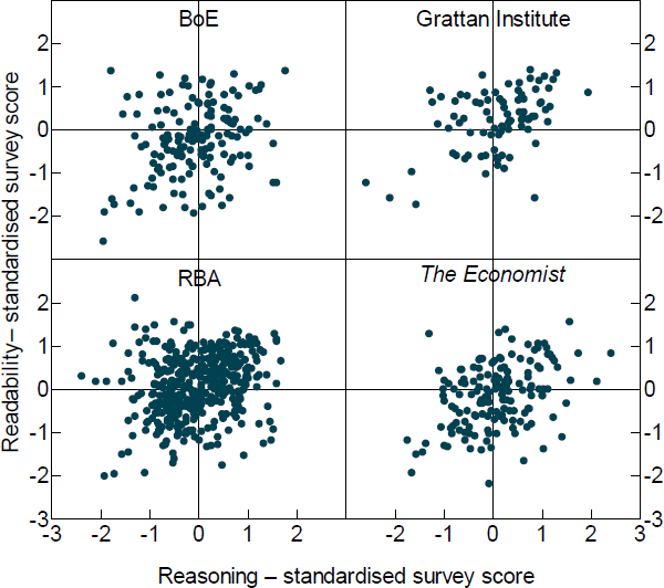
The corpus of 1,000 paragraphs was selected randomly from a large number of publications from different sources including both central bank and non-central bank documents. This was done to ensure that our sample paragraphs include a variety of writing styles and economic topics and, thus, could provide a good amount of variation in the data. Given our focus on RBA communication, half of the sample paragraphs are from RBA publications, which include the SMP (2006–19), speeches (2018 and 2019), and Bulletin articles (2017–19). Another 20 per cent of the sample is from Bank of England (BoE) publications, including the Inflation Report (2014–19) and speeches (2019). We chose to include writing from another central bank as a way of including a different style of writing in our sample while keeping the underlying content relatively similar. The remaining 30 per cent is from non-central bank documents, including a number of reports published by the Grattan Institute, an economic policy think tank, and various articles from The Economist. These documents allowed us to include a wider variety of economic topics as well as writing styles in our training sample. See Table 1 for more details.
| Number of paragraphs selected | Percentage of whole sample | External or internal | |
|---|---|---|---|
| RBA publications | 500 | 50 | Internal |
| Bulletin articles | 100 | 10 | |
| Speeches | 100 | 10 | |
| Financial Stability Report | 50 | 5 | |
| SMP Overview/Introduction | 100 | 10 | |
| SMP main body | 50 | 5 | |
| SMP boxes | 100 | 10 | |
| BoE publications | 200 | 20 | External |
| Inflation Report introduction | 50 | 5 | |
| Inflation Report main body | 50 | 5 | |
| Speeches | 100 | 10 | |
| Other economic publications | 300 | 30 | External |
| The Economist (a) | 200 | 20 | |
| Grattan Institute(b) | 100 | 10 | |
|
Notes: A full list of these paragraphs are available in the online supplementary information
|
|||
3.1.2 Survey design
For logistical and sampling reasons, we divided the 1,000 paragraphs across 5 online surveys. Each survey presented a random selection of 10 paragraphs for the respondent to rate.[10] Asking each respondent to rate 10 paragraphs helped to keep the response burden low while also allowing us to control for a degree of inter-rater variability – different people tended to have different default ratings. Respondents were asked to rate each paragraph on a scale from 1 to 5 on 2 aspects:
- Readability (ease of reading): how easy it was to read. Where 1 is a very hard to read paragraph and 5 is a very easy to read paragraph.
- Reasoning (what versus why): the extent to which the paragraph reveals the thinking, position or point of view of the author. Where 1 indicates a statement of facts (what) and 5 indicates that there is an obvious position being taken or explanation being given (why).
We measure readability using survey ratings rather than existing metrics of readability or reading time. This is because we want to capture a holistic measure of readability (that we can then analyse to see if it is correlated with existing metrics) rather than automatically assuming that shorter sentences, shorter words, or sentences that are read more quickly are necessarily ‘clearer’.
The concept of reasoning is harder to capture. The definition used reflects the result of a number of pilots where we refined the question to best reflect the concepts discussed in the theoretical literature on central bank transparency. All of these emphasise the need for a central bank to explain its reasoning and framework to allow informed observers to predict future behaviour and test past behaviour against the central bank's stated framework. Our definition also reflects some overlap with a wider literature that focuses on analysing persuasive texts (Cohen 1984; Olsen and Johnson 1989; Azar 1999; Ferretti and Graham 2019), from which we drew a number of ideas.
3.1.3 Survey participants
Survey participants for this study are all working at the RBA, but in different areas including both economic policy-related areas and non-policy areas.[11] To assess their economic knowledge and working background we asked 3 simple questions:
- How would you rate your overall level of economic literacy? (5 point scale from ‘below average’ to ‘above average’)
- What level of formal economics education do you have? (scale from ‘none’ to ‘post-graduate qualification’)
- Do you currently work in a job that involves economics in some way? (Yes/No)
Using these questions, we can test for the effect of economic knowledge on reader's judgements about the readability and reasoning of a given paragraph. Therefore, we sent the same survey (that is, a survey drawing from the same sub-sample of 200 paragraphs) to both economic policy and non-policy areas of the Bank in an effort to gather views from both economists and non-economists. In practice, the randomisation process meant that not every paragraph was rated by people from each area or by an economist and non-economist. In particular, some paragraphs were rated multiple times while some were not rated at all. We discuss the insights this duplication delivers and how we analyse these responses in Section 4. Other factors, such as age, gender, working experience (years) in economics, may also affect survey ratings. These were not included in our research for both privacy reasons and because we wanted to focus on high-level distinctions in our initial work. Notwithstanding this, the effect of these factors on the ratings would be a fruitful avenue of exploration for future work.
3.2 Limitation of the survey
While using a survey is an effective way to collect data in this study, we do face a number of limitations. Two particular ones we focus on here are selection bias and response bias.
3.2.1 Selection bias
The main selection issue is that the survey participants may not be representative of the general public or average central bank audiences. Indeed, this is undoubtedly the case. As such, the results should not be interpreted as indicating what a representative sample of Australians think about particular documents. Notwithstanding this, our primary objective is to obtain samples from different audiences with different levels of economics training. In this respect, the sample meets our needs.
While all participants in our survey are currently working at the RBA, the degree of familiarity with monetary policy among non-economists at the RBA is very limited. Many respondents had relatively short tenures at the RBA, do not work in the policy-related areas, and do not have any economics training. As such, they are generally unfamiliar with economic policy issues. Conversely, among the economists surveyed, we would expect that they would be much more familiar with the ideas associated with central banking and represent a particularly specialised audience. To the extent that our primary purpose is to identify differences between the way specialist and non-specialist audiences understand various communications, this bias is beneficial in highlighting such differences more clearly than a more ‘representative’ sample might.
A related observation about the sample is that the economist sample may, in fact, be reasonably useful for understanding the way financial market economists perceive RBA communications. It is common for financial market economists to have spent some time working at a central bank or treasury. As such, we think the differences between the way economists at a central bank and economists in the private sector would understand particular communications are likely to be limited. Notwithstanding this, differences in the way the Bank of England publications were rated, discussed further below, suggest that the results reflect the Australian financial market economists might view the communications. This may reflect a learned familiarity with the RBA ‘house style’. So, while Australian market economists are a relevant audience for RBA documents, UK market economists may perceive things differently and would be a more relevant audience to the Bank of England.
A second, less important, selection issue relates to the text samples chosen. Text selection bias may occur if sample paragraphs are not representative of the documents from which they are drawn. To the extent that this is an issue, it would limit the conclusions we could draw about the readability of or reasoning contained in the overall documents from the survey results alone. In practice, our main objective is to have a wide variety of paragraphs to train our machine learning algorithm rather than a representative sample of paragraphs. Nonetheless, given our selection was random, the survey averages should be a reasonable representation of the average characteristics of the various documents we sampled. In any case, while we present some summary statistics from our training sample, this is not the focus of our study and we do not draw particular conclusions about individual sources from these results alone.
3.2.2 Response bias
People's judgement about a given document can have subjective as well as objective elements. The subjective elements may vary based on people's personality, mood or opinion about the subject. For example, some survey respondents may be more generous or harsh than others and, thus, tend to give relatively higher or lower scores to the paragraphs they read. To control for this bias an effective (but not perfect) approach is to standardise the scores given by each person. That is, we calculate the mean rating a person gives to each of the 10 paragraphs they rate and the standard deviation of their ratings, and convert their raw scores into normalised scores by subtracting the mean and dividing by the standard deviation. Implicit in this approach is the assumption that the average objective quality of the 10 paragraphs assigned to each respondent is the same. While this is unlikely to be precisely true ex post, it is certainly true in expectation because of the random assignment we use. More practically, we found that the additional noise that resulted from not making this normalisation made it very difficult for our models to fit the data well. That is, we believe the random variation in average paragraph quality between questionnaires was substantially less than the random variation in respondent's default or average ratings.
An additional question related to inter-rater variability and response bias is what to do with paragraphs rated by multiple respondents where the normalised (or un-normalised) rating differs. One way to manage this variability would be to use the average scores for the paragraph to measure text quality. An alternative would be to include each response in the dataset so that the same paragraph is associated with 2 (or more) different ratings. We discuss these 2 alternative below and make our choice – to use the average – based on the distribution of the observed survey responses.
4. Survey Results
4.1 Summary
4.1.1 Survey respondents
The survey was sent to approximately 300 RBA staff and complete responses were received from 199. These respondents work in a range of areas including: IT, facilities management, the library, and various economic policy areas of the RBA. In terms of formal education in economics, about 45 per cent of our survey respondents had a bachelor's degree or above, 26 per cent had taken a high school course and about 30 per cent had not received any formal economic education. More details are in Table 2.
| Count | Share | |
|---|---|---|
| By economic literacy (Q1) | ||
| 1 | 23 | 12 |
| 2 | 32 | 16 |
| 3 | 62 | 31 |
| 4 | 37 | 19 |
| 5 | 45 | 23 |
| By education background (Q2) | ||
| Bachelor's degree in economics or a related discipline | 47 | 24 |
| Masters or PhD in economics or a related discipline | 42 | 21 |
| High school economics course | 52 | 26 |
| None | 58 | 29 |
| By economic-related job (Q3) | ||
| No | 111 | 56 |
| Yes | 88 | 44 |
|
Source: Authors' calculations using survey results |
||
Based on the answers to questions 2 and 3 we divide the 199 respondents into 2 broad groups: economists and non-economists. We define economists as those who have a university-level education in economics and whose work involves economics. Non-economists are those who are either working in a role that is not economics related or have no university-level education in economics. Using this division, 71 respondents are defined as economists, accounting for 36 per cent of the respondents, and 128 are non-economists (64 per cent).
We also asked each person to self-assess their economic literacy using a scale ranging from 1 to 5. Almost every economist assessed their economic literacy as somewhat above average (4) or above average (5). This is in line with their reported education background in economics as having a bachelor's degree or above. By contrast, most non-economists assessed their economic literacy as average or lower. More details on the distribution of economic knowledge in our sample are shown in Figure 1. The proportion of economists, as defined above, in each category of economic literacy and education background are shown in Figure 1 through the colour of the bubbles.[12]
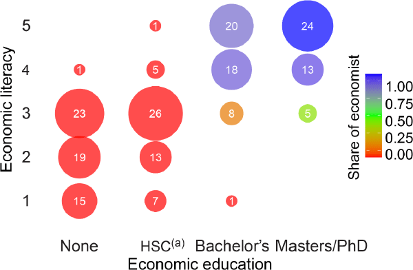
Notes:
Bubble size represents total respondents
(a) Higher School Certificate or equivalent
Source: Authors' calculations using survey results
4.1.2 Survey responses
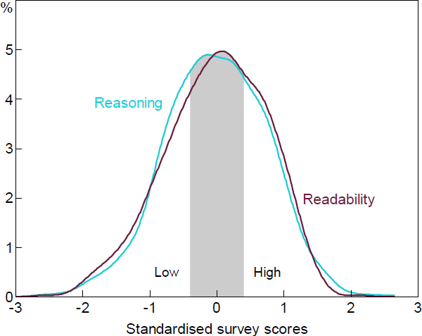
We received 1,695 valid responses covering 833 unique paragraphs. The left panel of Figure 2 shows the distribution of those scores for reasoning and readability. As can be seen, the modal score for both is 4 although the mean rating for readability is higher than for reasoning. As discussed above, however, different respondents appear to have different default scores – for example, some default to a score of 4 while others default to 3 – so we decided to standardise the scores. The distribution of standardised scores is shown in the right panel of Figure 2.
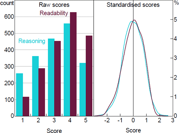
Note: The distribution panel is generated using the density function in R
Source: Authors' calculations using survey results
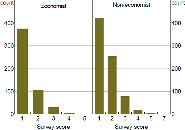
The fact that we have more valid responses than paragraphs partly reflects the design objective of getting both economist and non-economist ratings for the same paragraph. Of the 833 unique paragraphs, 465 were rated by both an economist and a non-economist, 53 by an economist only and 315 by a non-economist only. A second reason for the higher number of responses is that, due to the randomisation settings in the online survey, some paragraphs were rated by more than one person in each group. As shown in Figure 3, there were over 400 such paragraphs.
The overlapping ratings for a given paragraph, on the one hand, give us an opportunity to investigate the way people's ratings for a given paragraph vary. On the other hand, as mentioned above, they present a challenge in deciding the appropriate score for a given paragraph.
Source: Authors' calculations using survey results
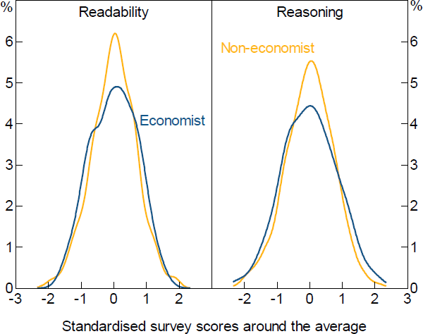
Figure 4 shows the distribution of scores around the average score for a given paragraph that is rated by 2 or more people . We can see that the scores generally cluster around the average – indicating that there is a degree of agreement across respondents about the quality of a given paragraph.[13] The results suggest somewhat more disagreement among economists than non-economists and more dispersion in the ratings for reasoning than readability. The wider dispersion of reasoning scores is unsurprising given that reasoning is a harder concept to define and possibly more subjective in its evaluation. We leave the reader to make their own judgement about the reason for the greater disagreement among economists than non-economists.
As discussed above, one interpretation of the divergence is that each paragraph has one ‘true’ rating and each observation we have is a noisy signal about that true quality. Under this interpretation, taking the average rating would give the best signal about the true paragraph quality. An alternative interpretation is that different people – perhaps reflecting different backgrounds, knowledge or attitudes – have different interpretations of any given paragraph. Under this interpretation, divergence of ratings about a given paragraph is a signal that the paragraph is inherently ambiguous. That would suggest that each observation should be included in our dataset but, absent information about the reader that might explain the divergence in ratings across multiple readers, it would not be possible to correctly classify all of these paragraphs.
While exploration of the dispersion of ratings for a given paragraph could possibly reveal some subtle insights about effective writing for different audiences, it would also make our machine learning task considerably harder and require significantly more data than we have. Additionally, the single-peaked distribution of ratings for a given paragraph (Figure 4) suggest that assuming there is a true rating for any given paragraph is a reasonable assumption. Thus, we use the simple average of survey scores from multiple respondents as the final score for those repeatedly rated paragraphs.
Source: Authors' calculations using survey results
4.2 Correlation between readability and reasoning
Figure 5 plots the distribution of reasoning and readability scores across sample paragraphs by text source. In general, all sources contain both high and low readability paragraphs as well as high and low reasoning ones and all combinations thereof. This wide distribution will be useful for training the machine-learning algorithm as it means we have examples of all possible types of paragraphs to help predict the quality of out-of-sample text.
Overall, what is most striking is the lack of correlation between readability and reasoning. There is only a slight positive correlation between reasoning and readability. The lack of close correlation between the scores emphasises how multidimensional writing is. This leads to one of our key observations: Trying to summarise the quality of a paragraph or document with any one metric must inevitably miss many important features of writing.
Source: Authors' calculations using survey results
4.3 Correlation with readability formula
Simple readability scores, such as the FK grade level, have been widely used in the literature as a measurement of text quality. However, as noted in Section 2, there are a number of criticisms of their accuracy. Given that we have a direct evaluation of readability from our survey, it is interesting to look at the correlation between one of these measures, the FK grade level, and our survey responses. Figure 6 shows the correlation between our 2 measures of text quality and the FK grade level.
We can see a significant, but weak, correlation between the FK grade level and readability scores from the survey. The coefficient is of the expected sign and the value of –0.021 indicates that an increase of 10 in the FK grade level is associated with a readability rating that is 0.21 standard deviations lower. However, the value of R2 is only 0.008. This is a very low value, indicating that the FK score may be a poor indicator of the readability of any given sample paragraph. There is no significant correlation between the FK grade level and the reasoning scores.
These findings lend some support to the criticisms of, at least, the FK grade level but are likely much more widely applicable. In addition to the fact seen above that single metrics can miss important aspects of communication, widely used readability metrics may not even measure readability well.
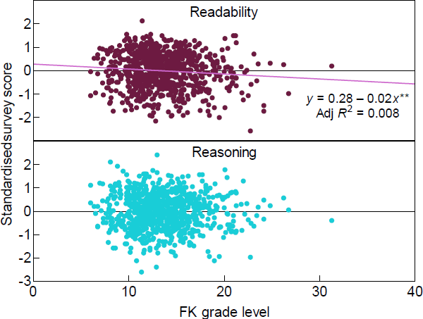
Note: ** denotes statistical significance at the 1 per cent level
Source: Authors' calculations using survey results
4.4 Economists versus non-economists
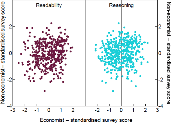
A key focus of this project is to look at how different audiences understand the same piece of text. This question of audience is another dimension that is missing from simple readability metrics – people with similar education levels but different backgrounds will understand communication differently. Given our focus, we look at the difference between economists and non-economists.
Figure 7 shows the correlation between economist and non-economist ratings for a given paragraph – each dot represents a paragraph that was rated by both an economist and a non-economist. As can be seen, there is very little correlation.
One possible explanation is that non-economists find the language used unfamiliar. As noted by Andy Haldane (2017): ‘“Inflation and employment” leaves the majority of [non-economists] cold. “Prices and jobs” warms them up. “Annuity” deep freezes [non-economists], whereas “investment” thaws’. Nonetheless, while jargon and word choice may explain some of the difference, the variation is more likely to arise due to the different ways people comprehend a paragraph based on their background knowledge. As noted by Goldman and Rakestraw:
Generally, in situations of high content knowledge, readers will be less reliant on structural aspects of the text than in low content knowledge situations because they can draw on preexisting information to create accurate and coherent mental representations. In low content knowledge situations, processing may be more text driven, with readers relying on cues in the text to organize and relate the information and achieve the intended meanings (Goldman and Rakestraw 2000, p 313).
Source: Authors' calculations using survey results
In other words, economists have sufficient background to understand the significance of pieces of information in a text without needing explicit pointers to their relationships. Conversely, non-economists may need the relationships between pieces of information spelt out explicitly through the structure of the text. A surprising implication is that non-economists might prefer longer sentences (with correspondingly higher FK grade levels) that provide the necessary structure for their understanding. They might find it harder to understand shorter sentences if these just stick to the facts and assume the reader can fill in the linkages. Alternatively, short sentences with sufficient explicit contextual information and a lot of attention to coherence between sentences might also achieve the same goal. More generally, this leads to a second key insight: one size does not fit all.
5. Methodology and Model Data
While the descriptive analysis above has highlighted a number of interesting features of economic communication, more insights can be gained through the application of machine learning (ML) algorithms. In particular, training an ML model to classify paragraphs will allow us to consider a much larger range of paragraphs – and gain insights from them – than we could through the survey alone. A second benefit is that, by observing which features the ML algorithm uses to predict paragraph scores, we can better understand some of the features that make for a higher quality paragraph of economic communication.
5.1 Introduction to ML
While machine learning has become quite popular in recent years, there is a lot of overlap between ML techniques and traditional statistical and econometric techniques. For example, one of the most fundamental ML techniques is regression analysis, particularly logistic regression, which has long been used in more traditional statistical and econometric areas. In its basic form, logistic regression is used to classify data, based on a range of observable variables, into one of two categories. An example might be predicting whether someone will buy a house in a given year based on attributes such as their age, income, job, sex, relationship status and so on. Machine learning, however, generally approaches problems in different ways and, consequently, asks slightly different questions than those commonly tackled by econometrics.
A common, though not universal, quality of ML problems is that there may be limited theory to guide the selection of appropriate explanatory variables, or features as they are called in ML models. Thus, they rely on big data and the associated techniques to learn underlying patterns that can then be used to predict other data rather than relying on theory in the way that more traditional statistics or econometrics tends to. As we have very limited existing theory that can guide us in selecting the set of features that will predict communication quality, we rely on ML techniques in this paper.
Within the field of ML there are a wide variety of techniques. At a high level, these techniques can be divided between supervised and unsupervised ML. In supervised ML the analysis starts with data that has previously been classified and labelled by experts and uses that data to ‘learn’ the basis for that classification. Unsupervised ML, such as cluster analysis, starts with unlabelled data and attempts to infer the underlying structure by identifying patterns. This study uses supervised ML techniques to build models that predict text quality based on the classifications provided by our survey respondents. Given our choice of this technique, there are 2 key elements to our approach that we discuss next: how we choose the labels for paragraphs, and how we convert the text into numerical data amenable to analysis.
5.2 Label paragraphs
While our survey asked people to classify paragraphs on a 5-point scale, we collapse these labels into 2 categories – ‘high’ and ‘low’. We do this because using this binary variable generates results that are more reliable. In practice, we also used a third implicit label – ‘ambiguous’ – that applied to paragraphs in the middle that we excluded from the training data. We found that paragraphs scored in the middle were very difficult for the algorithms to classify and the noise this introduced tended to degrade overall performance. Label noise is a well-known problem in machine learning and there are various techniques that have been proposed to deal with it (e.g. Karimi et al 2020). We adopt the simple technique of filtering out these ambiguous labels. More precisely, we exclude paragraphs with a normalised magnitude between −0.4 and 0.4. Excluding those ‘ambiguous’ paragraphs will reduce our sample size, but provide us with a higher quality dataset. [14] This is illustrated in Figure 8.
Note: Ambiguous paragraphs (denoted by the shaded area) scored between –0.4 and 0.4
5.3 Extracting text features using natural language processing
In addition to labelling our paragraphs, we need to convert the unstructured text into numerical data that can be analysed by the ML algorithms. That is, we need to compile a set of variables that numerically describe the individual paragraphs. A common approach to converting text into numeric data is using a dictionary mapping, also known as a ‘bag of words’ approach. This approach counts the frequency of particular words used in a sample of text but disregards grammar and word order. Text sentiment analysis, where the count of positive and negative words is calculated, is an example of this sort of approach.
The results using these approaches were, however, disappointing.[15] Consequently, we investigated and ultimately included more syntactic approaches. The syntactic features of a sentence, rather than the particular words themselves, can have a large effect on readability. As noted by Haldane (2017), paraphrasing Strunk and White (1959): ‘In general, the readability of text is improved the larger the number of nouns and verbs and the fewer the adverbs and adjectives’.
Therefore, we turn to a more advanced natural language processing approach that uses artificial intelligence to decompose text into its grammatical components. More specifically, we map each word in a sentence into a part of speech (PoS) using a PoS tagger and label each phrase using a parse tree.[16],[17]
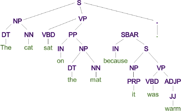
As an example, we can decompose the sentence ‘The cat sat on the mat because it was warm.’ into a syntax tree as shown in Figure 9. It identifies ‘The’ as a determiner (DT), ‘The cat’ as a noun phrase (NP), and ‘because it was warm’ as a subordinate clause (SBAR) introduced by the subordinating conjunction (IN) ‘because’. We then use counts of the various parts of speech as our variables of interest. You can see the full list in Appendix B, along with an example of how a particular sentence is converted to numerical data.
6. The Models
We have 4 different datasets to model: readability for economists, reasoning for economists, readability for non-economists and reasoning for economists. Consequently we develop 4 separate models.
6.1 ML algorithms
There are a number of popular ML algorithms, each with their own strengths and weaknesses. To choose our preferred algorithm we first tested a number of popular ML algorithms on the sub-sample of economist data. These algorithms included the generalised linear model (GLM), the elastic net generalised linear model (GLMNET), the support vector machine (SVM), the gradient boost machine (GBM), and the random forest (RF). We chose to use the RF algorithm because it performed the best in our sub-sample testing and because it is relatively robust to overfitting.
RF is a tree-based algorithm that predicts the classification of data by combining the results from a large number of decision trees (the forest part of its name). A decision tree is a flowchart-like structure that separates samples into 2 categories based on a sequence of yes/no decisions. To construct an individual decision tree, the algorithm first searches over all available variables and selects the variable that provides the best separation of the 2 categories as the top node. It then moves to the next layer and repeats the process to find the variables that give the best separation. The splitting stops when no further improvement can be made (Quinlan 1986). The RF algorithm builds its individual trees independently using a random sub-sample of the data and variables (the random part of its name).
6.2 Model training
In this project, to protect against overfitting, we randomly choose 75 per cent of our data as the training dataset to build the models and use the remaining 25 per cent as the validation dataset for testing model performance. A few approaches were used to improve model performance. First, we adopt an automatic feature selection method that selects the most relevant features for our model; including too many features may lead to overfitting. Second, the RF algorithm has many hyperparameters[18] that affect model performance and we tune these parameters using a grid search approach. Please refer to Appendix C for details about the feature selection and parameter tuning processes.
As our models return a probability prediction (pi)[19], we convert pi to a predicted class label using a threshold. We use the default value of 0.5,[20] so the prediction label for a paragraph is high if pi 0.5 and low otherwise.
We evaluate model performance using 2 standard evaluation metrics: the confusion matrix and the ROC-AUC curve. A confusion matrix is a 2-by-2 table that is calculated by comparing the predicted labels with the actual labels from the validation dataset. The ROC-AUC curve yields a measure of how well the model separates the two classes of data.
For our models, the accuracy (calculated from the confusion matrix as the proportion of labels that are correctly predicted) is around 70 per cent. The AUC ranges from 0.55 to 0.6 for our models. We report the full test results in Appendix D. Overall these results are modest, our model has reasonable accuracy in predicting whether a paragraph is more likely to be high quality than not, but does not yield definitive predictions about paragraph quality. Given that there is an inherent fuzziness to paragraph quality, we think it unsurprising that our algorithm can not cleanly separate high-quality paragraphs from low-quality paragraphs – we suspect humans would struggle to do so as well.
6.3 Feature importance
ML models are often considered to be ‘black boxes’ for their complex inner workings and plethora of opaque parameters. Our dataset has hundreds of features and it is often difficult to understand which features are driving the prediction accuracy of our models. One benefit of the RF algorithm, however, is that it has a built-in function that calculates the contribution of each feature.[21] This helps to discern some of the inner workings of the black box. However, we must emphasise that the underlying models are nonlinear and complex, so one should not over-interpret the results presented here – they are meant to give a heuristic impression about the models. They are not a precise linear representation of the workings of the model in the manner of linear regression coefficients.
Figure 10 illustrates the top 5 features for the readability models, and Figure 11 shows them for the reasoning models. These top features are ranked based on how much information each variable contains to discriminate between the 2 categories.[22]
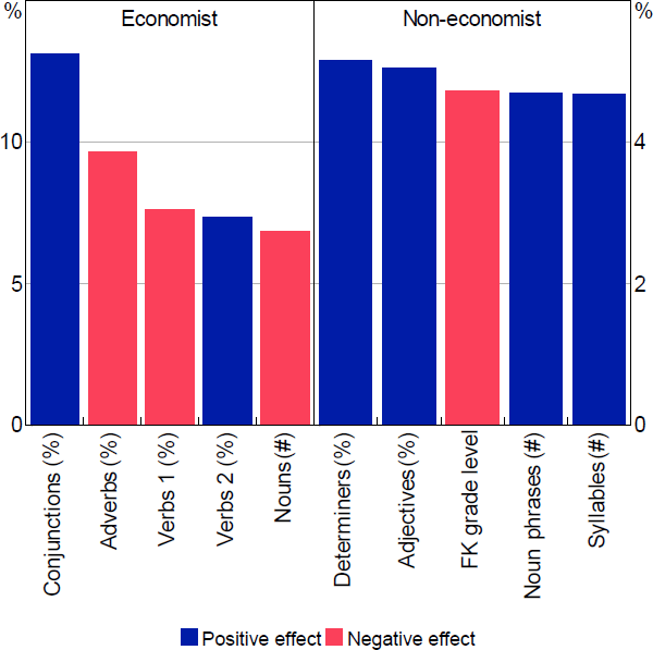
Note: ‘Conjunctions’ refers to coordinating conjunctions, ‘Verbs 1’ refers to all verbs, ‘Verbs 2’ refers to non-third person singular present verbs
Source: Authors' calculations using survey results
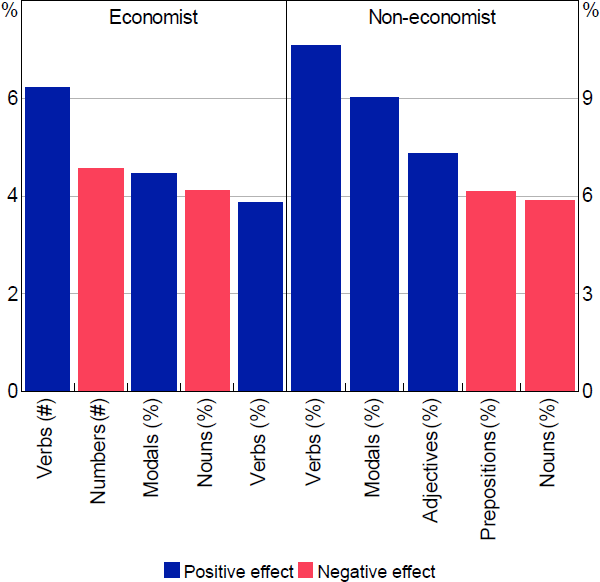
Note: ‘Prepositions’ refers to preposition or subordinating conjunction
Source: Authors' calculations using survey results
It is not typically possible to determine whether the effect of these variables on the results are positive or negative. This is because RF models are capturing complex nonlinear relationships in the data. Notwithstanding this, we can get an idea of whether the average effect of a particular variable is positive or negative. To calculate this we run the models for a sample of 1,424 paragraphs and remove the top 5 variables one by one and regenerate the model prediction. Based on the difference between the 2 results, we classify the partial effect of a variable as positive or negative.[23] There are some similarities in the top features list between the 2 reasoning models but surprisingly little across the readability models.
Looking at the readability models first, we see that the FK grade level appears in the top 5 features for the non-economist model. However, the number of syllables, which contributes to the FK grade level negatively, appears with a positive sign. More generally, the model suggests that non-economists prefer paragraphs with more noun phrases, adjectives and determiners. Conversely, simple metrics don't show up in the economist model. The top feature is the proportion of coordinating conjunctions[24] and there seems to be a preference for paragraphs with fewer nouns and adverbs. One possible explanation for this difference is that economists hold more economic knowledge and, thus, may rely less on linguistic clues in the paragraphs (such as adjectives and determiners) to understand the importance of and relationships between concepts. As noted by Gilliland (cited in Janan and Wray (2012, p 1)):
… in a scientific article, complex technical terms may be necessary to describe certain concepts. A knowledge of the subject will make it easier for a reader to cope with these terms and they, in turn, may help him to sort out his ideas, thus making the text more readable. This interaction between vocabulary and content will affect the extent to which some people can read the text with ease.
There is more similarity in the reasoning models. In particular, both economists and non-economists identify more verbs and fewer nouns with higher reasoning. This is natural because the verb phrase generally denotes eventualities, processes and states, and the roles that participants play in the events described (McRae, Ferretti and Amyote 1997). That is, the kind of terms you would use when expressing an argument or point of view rather than presenting facts. In addition, modal words, such as might, could, and should, are also important for both reasoning models. Modal words are normally associated with persuasive writing, and are often treated as an arguing feature in the study of linguistics (Farra, Somasundaran and Burstein 2015).
These findings are not too surprising but it is worth noting that in preliminary work we tried just using word lists to identify whether an argument was being made (e.g. counting uses of words like ‘because’) and this approach was relatively unsuccessful. That is, we have found that understanding the grammatical function of a word is more valuable in classifying text than the particular word that is used. Or, more poetically, and in the timeless words of Led Zeppelin, using word lists is more error-prone ‘Cause you know sometimes words have two meanings’.
To help gain a greater sense of how the model works in practice, Table 3 presents 2 sample paragraphs, one rated high and one rated low, for each model.
| Model | Paragraph | Model prediction label(a) | Survey scores(b) |
|---|---|---|---|
| Economist– Reasoning | The big question is whether we should expect these quirks to endure. Once a way to make above-market returns is identified, it ought to be harder to exploit. ‘Large pools of opportunistic capital tend to move the market toward greater efficiency,’ say Messrs White and Haghani. For all their flaws and behavioural quirks, people might be capable of learning from their costliest mistakes. The rapid growth of index funds, in which investors settle for an average return by holding all the market's leading stocks, suggests as much. | High (0.90) |
4.5 (1.01) |
| Most of the sectors that declined as a share of non-mining output were capital intense. Agriculture, forestry and fishing, electricity, gas, water and waste services, information, media and telecommunications, and rental, hiring and real estate services declined by nearly 3.5 percentage points of non-mining output. Manufacturing declined by almost ten percentage points of non-mining output. | Low (0.27) |
2.0 (−0.91) |
|
| Economist− Readability | While household dwelling investment continued to decline over the first half of the year, there have been signs in recent months of a prospective improvement, partly in response to reductions in interest rates. Private residential building approvals, dwelling prices and auction clearance rates have all increased. The overall demand for housing finance has been broadly stable over the course of the year and many home owners are taking advantage of lower borrowing rates to pay off their loans more quickly. | High (0.90) |
4.5 (1.35) |
| In any event, there is no strong economic rationale for a different tax rate for small companies. While compliance costs are higher for small companies (relative to their profits), it makes little sense to compensate them via a differentiated tax system. A lower tax rate compensates small companies with high profits much more than those with lower profits, for instance, even though the relative compliance costs are larger for companies with lower profits. The Government should ensure that the small and large company tax rate is equalised over the next few years. | Low (0.39) |
2.0 (−1.58) |
|
| Non-economist– Reasoning | But current planning rules make it hard to build homes in the inner and middle-ring suburbs of our major cities. Recent US studies estimate that GDP would be between 2 per cent and 13 per cent higher if enough housing had been built in cities with strong jobs growth such as New York and San Francisco. If planning rules push people to live on the edge of cities, then this will also push some employers to the edge who would prefer on commercial grounds to locate elsewhere. Influencing business decisions in this way is likely to lead to lower productivity. | High (0.87) |
4.0 (0.71) |
| The price of copper has declined by 13 per cent since its peak in February this year, broadly in line with declines in the prices of other base metals. These price falls occurred alongside expectations for a slowdown in the global economy, including in China. | Low (0.16) |
1.0 (−1.32) |
|
| Non-economist– Readability | In 2017, Australia's net foreign currency asset position amounted to 45 per cent of GDP (ABS 2017b). Around two-thirds of Australia's foreign liabilities were denominated in Australian dollars, compared with around 15 per cent of Australia's foreign assets. Since 2013, foreign currency assets and liabilities have both increased as a share of GDP. Since the dollar increase in assets has been greater than that in liabilities, there has been an increase in Australia's net foreign currency asset position of around 15 percentage points of GDP. | High (0.70) |
4.5 (1.05) |
| Looking at more detailed data on cross-border bank lending from the Bank for International Settlements, it is evident that cross-border lending by European banks both increased most rapidly going into the crisis and subsequently contracted most sharply. Given that financial stress was concentrated in industrialised economies it is also noteworthy that lending to other industrialised economies peaked earlier than lending to emerging markets, which was curtailed only much later into the financial turbulence. This pattern is also evident in the sharp reversal of (net) flows between the United States and the United Kingdom as a result of reduced cross-border lending by European banks headquartered in London as institutions sought to unwind their exposures. | Low (0.28) |
2.0 (−0.83) |
|
Notes:
|
|||
Overall, given that many of the identified features appear to make sense linguistically, at least based on our knowledge and brief reading of the linguistic literature, we are fairly confident that our model has identified meaningful features rather than latched on to idiosyncratic features that have little true explanatory power. A key observation is that, because each model emphasises different features, making paragraphs readable for both economists and non-economists is not simple. For example, the correlation between predicted readability for economists and non-economists is 0.54 in our sample. While there is some correlation it is not straightforward and one size does not fit all. That said, simple metrics such as the FK grade level don't seem to be a good guide to readability. They have little correlation for the non-economist readability model and none at all for the economist model. This implies that targeting a particular FK grade level is unlikely to improve readability for either group.
7. Results
With the models trained we now apply them to a number of economic documents to demonstrate how they can be used to evaluate a large body of work that would otherwise be time consuming to classify manually. Most of the document we focus on, such as monetary policy statements and speeches, are from central banks, but we also include a sample of 20 articles from The Economist for comparison.
For modelling a document, we first break all documents into paragraphs using text mining tools and then convert each paragraph into a structured dataset that includes all variables shown in Table B1. Then, we predict the quality of each paragraph using our 4 models, and classify each paragraph as ‘high’ or ‘low’ for both readability and reasoning from economist and non-economist perspectives. Last, we measure the text quality of a document using the proportion of high-quality paragraphs in it:
7.1 Evaluating a document over time: SMP overviews
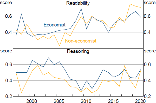
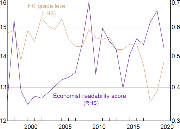
The most important documents that central banks use to communicate with external parties are typically the regularly released monetary policy reports. The RBA has published its SMP since 1997 and so the first texts we apply our models to are the SMP introduction section over the period from 1997 to 2020. This covers 87 issues of the SMP and 1,519 paragraphs. We choose the introduction/overview section because this section generally contains the explanation and justification for policy actions and, as such, is the most important section for understanding central bank policy. Other sections of the SMP tend to consist of more factual reporting of recent data. The results are shown in Figure 12.
Our model results on readability, as shown in the top panel of Figure 12, suggest that the overview section of the SMP has become easier to read over time. Interestingly, our measure picks up more variation in readability over the years than the FK grade level (see Figure A1 for a comparison of the readability score for the SMP introduction and the FK grade level).
Source: Authors' calculations using survey results
Conversely, the reasoning score has shown no particular trends over time. If anything, it has dropped in recent years. Indeed, there appears to be somewhat of a negative correlation between readability and reasoning with an obvious dip in reasoning around 2009 when readability scores jump higher. To the extent that transparency is affected by both readability and the degree of reasoning in documents, it does not necessarily follow that increases in the readability of the SMP have been associated with increases in transparency. While we can't make any statements about the absolute level of transparency in the SMP, these results suggest that evaluating the overall transparency of central bank documents requires a broader consideration than readability metrics alone can provide.
7.2 Comparing documents with each other
In addition to monetary policy statements, central banks also release other publications, such as speeches by senior staff, short articles and financial stability reports. In this section, we apply our models to some of these documents to see what they reveal about any variations in text quality across documents.
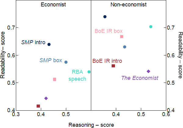
We choose a number of paragraphs from the Bank of England (BoE) Inflation Report introduction and boxes, RBA speeches and SMP introduction and boxes published in 2018 and 2019[25] and articles from The Economist[26]. Figure 13 shows the results. The correlation between readability and reasoning is not significant in both panels, but the pattern is clearly different between economists and non-economists.
As assessed by economists, speeches have the highest reasoning rating but an average readability rating. Conversely, the introduction to the SMP in 2018–19 has a low reasoning rating but the highest readability rating. When assessed by non-economists, however, RBA speeches are found to have among the highest average readability and reasoning ratings. This may reflect the fact that spoken communication is different to written communication, but could also reflect the different objectives of these different documents. Speech givers seem to be communicating particular positions and arguments that are relatively clearer to non-economists, while the writers of boxes and the SMP seem to be more focused on communicating facts clearly.
Another interesting feature is the change in the relative ranking of the BoE samples between economists and non-economists. While RBA economists rated RBA documents more highly than BoE documents, non-economists rated BoE documents relatively higher and their ratings were less dispersed overall. This points towards a preference among RBA economists for the RBA ‘house style’. We can't be certain, but given that topic and word choice do not affect our algorithms, this preference is unlikely to reflect greater familiarity among RBA economists with the topic matter of these publications – hence our suspicion that it reflects a ‘house style’ preference.
Source: Authors' calculations using survey results
Finally, we see that The Economist is rated highly for reasoning by non-economists but not particularly highly for readability. While this reflects the fact that The Economist primarily presents analysis and opinions it does not seem to reflect its well-founded reputation for plain language. We see two possible explanations for this. One, our algorithm is reflecting a preference for a particularly Australian idiom or house style that The Economist does not conform to – which may also explain the low ratings from economists. Or two, by averaging the rating of paragraphs over a whole document we may be overemphasising the role of body paragraphs in a document and underemphasising the importance of introductory and concluding paragraphs. That is, the subjective assessment of a document's overall quality may depend more heavily on the quality of the introduction and conclusion than our index does. We reflect on this point in the section below.
Notwithstanding these observations, the results are only preliminary and suggestive and are meant to be illustrative of the potential of these ML techniques rather than be definitive findings. Regardless, they re-emphasise our observation that: different documents are perceived differently by different audiences and this argues for clearly targeting one audience rather than attempting to reach multiple audiences with the one document.
7.3 The variation of readability and reasoning within a document
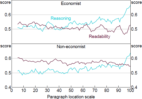
So far, we have only assessed text quality differences at the aggregate level across documents, but we have not analysed text quality within a document. To investigate this aspect of communication we analysed 99 speeches that were given by RBA senior officers in 2018 and 2019. We first calculate the percentile position of each paragraph based on its location in a document. For example, if there are 20 paragraphs in a speech, the first paragraph's percentile position is 5 per cent, and the second is 10 per cent and so on.
Figure 14 shows the results from our 4 models. We can see that reasoning scores are much higher for paragraphs at the end of a speech, but readability scores are relatively higher for those at the beginning. This pattern seems to reflect a natural structure of a speech. The introduction is usually pleasantries and broad ideas, which are easy to understand as speakers want to grab the audience's attention and ensure they listen to the rest of it. The conclusion, conversely, is usually where the main arguments or opinions presented by the speaker are summarised.
Source: Authors' calculations using survey results
This variation through the document, however, raises questions about the best way to assess overall document quality. Our method, by weighting paragraphs throughout a document equally, may penalise longer documents that contain more factual body paragraphs even though a human reader might judge them to be equally effective. We leave the question of which is the most effective way of rating the overall quality of a document for future research. Regardless, this suggests that targeting particular readability metrics may be useful for introductory paragraphs, but off target for conclusions. As with targeting different audiences with different documents, so too different rhetorical objectives should be targeted with different styles – one size does not fit all.
8. Conclusion
In this study, we developed a novel approach of using survey data and machine learning models to assess the communication quality of central bank publications. To the extent that an important part of central bank transparency is to communicate ideas, positions and arguments we introduced a measure of reasoning in addition to the more commonly considered readability measure. Finally, recognising the multiplicity of readers for central bank documents, we considered how different audiences perceive the readability and reasoning of documents.
While our results are preliminary and subject to a number of limitations, they all point in a similar direction: communication needs to be adapted for different audiences and no single measure can do justice to the multiplicity of objectives communication has. There is little agreement between the economists and non-economists in our survey about the readability of paragraphs; there is little correlation between the readability of paragraphs we analysed and the reasoning contained in them; and readability alone is insufficient to capture the essence of transparent communication. Consequently, central banks aiming to improve transparency may need to present their core arguments in a range of formats with different expressions of those arguments in each. This may present a challenge for those central banks that have tended to emphasise verbatim consistency of their key messages as a way of reducing confusion. Regardless, we hope that better awareness of the various trade-offs involved in crafting communications, through the use of tools like those introduced in this paper, should lead to more effective communication in the future. We also hope that this research can serve as a foundation and catalyst for further investigation of the way different audiences perceive the multiplicity of elements that comprise effective and transparent central bank communication.
Appendix A: Readability Index Comparison
Note: Readability is calculated as the annual average of FK grade levels of paragraphs in the Introduction/Overview of SMPs
Source: Authors' calculations using survey results
Appendix B: Text Features
| Category | Feature name | Description |
|---|---|---|
| Textual(a) | Paragraph length | The count of words in a paragraph |
| Sentence count | The count of sentences in a paragraph | |
| Number count | The count of numbers in a paragraph | |
| Comma count | The count of commas in a paragraph | |
| Other punctuation count | The count of any other punctuations except commas | |
| First sentence with numbers | A Boolean value indicating the first sentence contains numbers | |
| First sentence with ‘Table’ or ‘Figure/Graph’ | A Boolean value indicating the first sentence refers to tables, figures or graphs | |
| Readability | Syllables count | The count of syllables |
| Average word length | The average syllables of a word | |
| Count of complicated words | The count of words that have three and more syllables | |
| FK grade level | Flesch–Kincaid grade level | |
| Syntactic | PoS count | The count of tokens marked with a certain part-of-speech tag in a paragraph |
| PoS ratio | The percentage of tokens marked with a certain part-of-speech tag in a paragraph | |
| PoS count in the first sentence | The count of tokens marked with a certain part-of-speech tag in the first sentence of a paragraph | |
| PoS ratio in the first sentence | The percentage of tokens marked with a certain part-of-speech tag in the first sentence of a paragraph | |
| PoS count in the last sentence | The count of tokens marked with a certain part-of-speech tag in the last sentence of a paragraph | |
| PoS ratio in the last sentence | The percentage of tokens marked with a certain part-of-speech tag in the last sentence of a paragraph | |
| PoS for the first word in the first sentence | The type of PoS tag for the first word in the first sentence of a paragraph | |
| PoS for the first word in the second sentence | The type of PoS tag for the first word in the second sentence of a paragraph | |
| PoS for the first word in the third sentence | The type of PoS tag for the first word in the third sentence of a paragraph | |
| Parse tree types count for a paragraph | The count of parse tree types for each sentence in a paragraph | |
| Parse tree types count for the first sentence of a paragraph | The count of parse tree types for the first sentence of a paragraph | |
| Parse tree types count for the last sentence of a paragraph | The count of parse tree types for the last sentence of a paragraph | |
| Argument features | Count of each type of clue words | Count of clue words by each type (summarise, informative, etc) |
| Count of clue words in the first sentence | Count of clue words by each type in the first sentence of a paragraph | |
| Count of clue words in the last sentence of a paragraph | Count of clue words by each type in the last sentence of a paragraph |
- We deliberately exclude n-gram words in the feature list as our survey only includes economists working in the RBA, who have sufficient knowledge for all economic terms
| Number | Tag | Description |
|---|---|---|
| 1 | CC | Coordinating conjunction |
| 2 | CD | Cardinal number |
| 3 | DT | Determiner |
| 4 | EX | Existential there |
| 5 | FW | Foreign word |
| 6 | IN | Preposition or subordinating conjunction |
| 7 | JJ | Adjective |
| 8 | JJR | Adjective, comparative |
| 9 | JJS | Adjective, superlative |
| 10 | LS | List item marker |
| 11 | MD | Modal |
| 12 | NN | Noun, singular or mass |
| 13 | NNS | Noun, plural |
| 14 | NNP | Proper noun, singular |
| 15 | NNPS | Proper noun, plural |
| 16 | PDT | Predeterminer |
| 17 | POS | Possessive ending |
| 18 | PRP | Personal pronoun |
| 19 | PRP$ | Possessive pronoun |
| 20 | RB | Adverb |
| 21 | RBR | Adverb, comparative |
| 22 | RBS | Adverb, superlative |
| 23 | RP | Particle |
| 24 | SYM | Symbol |
| 25 | TO | to |
| 26 | UH | Interjection |
| 27 | VB | Verb, base form |
| 28 | VBD | Verb, past tense |
| 29 | VBG | Verb, gerund or present participle |
| 30 | VBN | Verb, past participle |
| 31 | VBP | Verb, non-3rd person singular present |
| 32 | VBZ | Verb, 3rd person singular present |
| 33 | WDT | Wh-determiner |
| 34 | WP | Wh-pronoun |
| 35 | WP$ | Possessive wh-pronoun |
| 36 | WRB | Wh-adverb |
|
Note: This table is adapted from Santorini (1990, p 6) |
||
| Number | Tag | Description |
|---|---|---|
| 1 | ADJP | Adjective phrase |
| 2 | ADVP | Adverb phrase |
| 3 | NP | Noun phrase |
| 4 | PP | Prepositional phrase |
| 5 | S | Simple declarative clause |
| 6 | SBAR | Subordinate clause |
| 7 | SBARQ | Direct question introduced by wh-element |
| 8 | SINV | Declarative sentence with subject-aux inversion |
| 9 | SQ | Yes/no questions and subconstituent of SBARQ excluding wh-element |
| 10 | VP | Verb phrase |
| 11 | WHADVP | Wh-adverb phrase |
| 12 | WHNP | Wh-noun phrase |
| 13 | WHPP | Wh-prepositional phrase |
Table B4 shows how these features would be expressed for a simple sentence ‘The cat sat on the mat because it was warm.’.
| Value | |
|---|---|
| Text features | |
| Count of words | 10 |
| Count of sentences | 1 |
| Count of syllables | 11 |
| Count of polysyllables (words with 3+ syllables) | 0 |
| Syllables per word | 1.1 |
| FK grade level | 1.29 |
| Count of clue words(a) | 1 (‘because’) |
| Syntactic features | |
| PoS tags feature | DT = 2, NN = 2, VBD = 2, IN = 2, DT = 1, NN = 1, PRP = 1, JJ = 1 |
| Syntactic parse features | S = 2, NP = 3, VP = 2, SBAR = 1, PP = 1, ADJP = 1 |
Note:
|
|
Appendix C: Model Tuning Process
C.1 Feature selection process
In this study we adopt an automatic feature selection method, called recursive feature elimination (RFE) (Guyon et al 2002), to select the relevant features for each model. This helps ensure that each feature included in the final model has a minimum degree of predictive power. Otherwise, the models may mistake ‘noise’ for ‘signal’. This algorithm is configured to explore all possible subsets of the features. The computing process is shown in Table C1.
| 1.1 | Train the model on training dataset using all features {X1,X2,…,Xn} |
|---|---|
| 1.2 | Calculate model performance |
| 1.3 | Calculate variable performance |
| 1.4 | For each subset size of Si,i = 1…n do
|
| 1.5 | End |
| 1.6 | Calculate the performance profile over the Si |
| 1.7 | Determine the appropriate number of predictors |
| 1.8 | Use the model corresponding to the optimal Si |
|
Source: https://topepo.github.io/caret/recursive-feature-elimination.html |
|
Our model includes 292 features in total, so in the first step of the RFE process we include all features. Then, we run the model using 30 different subset feature sizes, that is (10, 20,…, 290, 292). To minimising overfitting due to feature selection, we take the cross-validation resampling method to run the process listed in Table C1 on the testing dataset only and calculate the model performance using the validation dataset. We run this process 10 times and calculate the model performance (accuracy) for each subset of features using the average of the results from those 10 runs.
C.2 Tuning parameters process
To improve model performance, we tune 2 parameters:
- the number of trees that will be built for each model (ntree), and
- the optimal number of variables that will be selected for each node in a tree (mtry).
The default value of ntree is 500, and that of mtry is the root square of number of features. Different values of those 2 parameters may affect model performance. To find the optimal settings, we employ a grid search approach.
For the grid search, we choose 11 different ntree values (10, 100, 200, 300,…,1,000) and, for mtry, as suggested by Breiman (2001), we choose 3 values: the default value (mtry = 17), half of the default (mtry = 9), and twice the default (mtry = 34). For each combination, we build 10 models using 10-fold cross-validation and repeat the process 3 times. The best combination of ntree and mtry is selected based on the combination that returns the highest accuracy.
C.3 Top ten features for four models
| Rank | Reasoning model | Readability model | |||
|---|---|---|---|---|---|
| Features | Importance(a) | Features | Importance(a) | ||
| Economist | |||||
| 1 | Proportion of VB | 6.2 | Proportion of CC | 13.1 | |
| 2 | Proportion of NNS | 4.6 | Proportion of RB | 9.7 | |
| 3 | Proportion of MD | 4.5 | Proportion of VB | 7.6 | |
| 4 | Count of digits | 4.1 | Proportion of VBP | 7.4 | |
| 5 | Count of VB | 3.9 | Count of NN | 6.9 | |
| 6 | Proportion of NN | 3.6 | Count of NP | 6.8 | |
| 7 | Count of MD | 3.5 | Count of punctuation | 5.9 | |
| 8 | Proportion of IN | 3.5 | Proportion of MD | 5.5 | |
| 9 | Proportion of CD | 3.5 | Count of commas | 4.6 | |
| 10 | Proportion of VBN | 2.8 | Count of SBAR | 4.6 | |
| Non-economist | |||||
| 1 | Proportion of VB | 10.6 | Proportion of DT | 5.2 | |
| 2 | Proportion of MD | 9.0 | Proportion of JJ | 5.1 | |
| 3 | Proportion of JJ | 7.3 | FK grade level | 4.7 | |
| 4 | Proportion of IN | 6.1 | Count of NP | 4.7 | |
| 5 | Proportion of NN | 5.9 | Count of syllables | 4.7 | |
| 6 | Count of MD | 5.3 | Proportion of NN | 4.4 | |
| 7 | Proportion of VBN | 5.3 | Proportion of CC | 4.4 | |
| 8 | Count of VB | 5.2 | Proportion of VB | 4.3 | |
| 9 | Proportion of TO | 5.1 | Proportion of IN | 4.3 | |
| 10 | Proportion of CC | 5.1 | Proportion of NNS | 4.2 | |
Note:
|
|||||
Appendix D: Model Validation Results
D.1 Confusion matrix
We apply our fine-tuned RF models to the validation dataset and the prediction results are shown in the confusion matrices in Tables D1 and D2. Using the confusion matrix, we can calculate a number of performance metrics, such as:
- Accuracy: the proportion of the total number of predictions that were correct. That is the sum of true positive (TP) and true negative (TN) divided by the total observations (TP+TN+FP+FN). In Table D1 (reasoning panel), the accuracy is calculated as: (33 + 23) / (33 + 13 + 4 + 23) = 76.71%.
- Sensitivity: the proportion of postives that are correctly predicted. In Table D1, the sensitivity is calculated as (33) / (33 + 4) = 89.19%.
- Specificity: the proportion of negatives that were correctly predicted. In Table D1, the sensitivity is calculated as (23) / (13 + 23) = 63.89%.
Kappa is another metric that can be calculated from the confusion matrix using the formula:
where:
Accuracy is a fairly commonly used measure and it varies from 76.7 per cent for the economist content model to 65.2 per cent for the non-economist clarity model; 70 per cent is a threshold usually considered to indicate ‘fair’ performance.[27] A final validation measure included in these tables, but which can not be calculated directly from the confusion matrix because it focuses on the strength of the prediction, is LogLoss[28] – lower numbers are better for this metric. Overall, our results on this metric are relatively poor, reflecting the fact that our model does not make strong predictions about paragraph quality.
| Reasoning | Readability | |||||||
|---|---|---|---|---|---|---|---|---|
| Confusion matrix | Performance measures |
Confusion matrix | Performance measures |
|||||
| Reference | Reference | |||||||
| Prediction | High | Low | Accuracy = 76.71% | Prediction | High | Low | Accuracy = 72.37% | |
| High | 33 | 13 | 95% CI: (65%, 86%) | High | 28 | 11 | 95% CI: (61%, 82%) | |
| Low | 4 | 23 | Sensitivity = 89.19% | Low | 10 | 27 | Sensitivity = 73.68% | |
| Specificity = 63.89% | Specificity = 71.05% | |||||||
| Kappa = 0.53 | Kappa = 0.45 | |||||||
| LogLoss = 0.75 | LogLoss = 0.80 | |||||||
| Reasoning | Readability | |||||||
|---|---|---|---|---|---|---|---|---|
| Confusion matrix | Performance measures |
Confusion matrix | Performance measures |
|||||
| Reference | Reference | |||||||
| Prediction | High | Low | Accuracy = 69.91% | Prediction | High | Low | Accuracy = 65.22% | |
| High | 41 | 18 | 95% CI: (61%, 78%) | High | 48 | 27 | 95% CI: (56%, 74%) | |
| Low | 16 | 38 | Sensitivity = 71.93% | Low | 13 | 27 | Sensitivity = 78.69% | |
| Specificity = 67.86% | Specificity = 50% | |||||||
| Kappa = 0.40 | Kappa = 0.29 | |||||||
| LogLoss = 0.82 | LogLoss = 0.61 | |||||||
D.2 ROC-AUC
ROC is a probability curve that plots the false positive rate (FPR) on the x-axis and the true positive rate (TPR) on the y-axis for different probability cut-off thresholds. The area under the curve (AUC) is a measure of separability that is calculated as the area under the curve. The higher the AUC, the better the model is at definitively distinguishing between paragraphs with high quality and low quality. For a random classifier, such as a coin flip, there is a 50 per cent chance to get the classification right, so the FPR and TPR are the same no matter which threshold you choose. In this case the ROC curve is the 45-degree diagonal line and the area under the curve (AUC) equals 0.5. Thus, we would like to achieve an AUC of above 0.5. Our results, as shown in Figures D1 and D2, beat this benchmark but not substantially.
The fundamental problem we face in using the AUC metric is that the underlying quality of paragraphs is not cleanly separated into high and low, but has a large mass of inherently ambiguous paragraphs. What AUC requires is that a paragraph that is of ‘51% quality’ is always perfectly classified as high while a paragraph of ‘49% quality’ is always classified as low, regardless of the cut-off threshold you use with your algorithm. For example, our algorithm may report that there is a 51 per cent chance that a given (truly 51% quality) paragraph is of high quality. We use a threshold of 50 per cent and this paragraph would be correctly classified as high with that cut-off. But, the AUC also asks what if you used a cut-off of 55 per cent, of 60 per cent and so on – it is calculated for all possible cut-offs between 0 per cent and 100 per cent. The AUC will find that if you use any threshold above 51 per cent it will misclassify the paragraph and this leads to a low AUC measure for this problem. Thus, while AUC is a standard metric, it is not a good metric for our particular problem given the underlying data is not a binary variable but closer to a continuous variable. For the same reason, the LogLoss values – an alternative metric – are a bit high, ranging from 0.6 to 0.8. Notwithstanding this, we anticipate that further refinements of the algorithm should be possible that improve its performance on these and other metrics.
It is also important to note that our models report a relatively high accuracy when we set the threshold at 0.5. That is, while our model does not do a good job at neatly separating high- and low-quality paragraphs at every threshold, it does a reasonable job of identifying paragraphs that are more likely than not to be high or low quality. In this respect it is quite ‘human-like’. This suggests that the results for any given paragraph should not be given a large weight but, with a large enough sample, the results will still be useful.
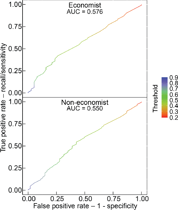
Note: The ROC curve as a matrix, where the first column contains the false positive rate, the second contains recall (sensitivity) and the third contains the corresponding threshold on the scores (shown as colour in each panel)
Source: Authors' calculations using survey results
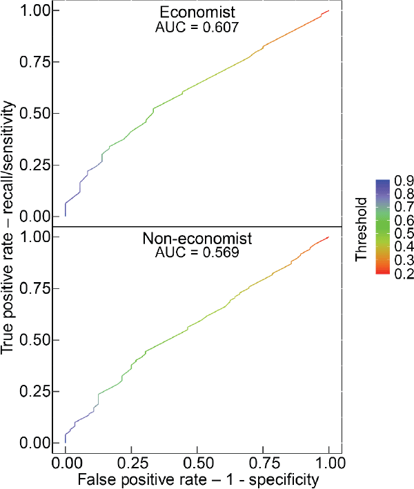
Note: The ROC curve as a matrix, where the first column contains the false positive rate, the second contains recall (sensitivity) and the third contains the corresponding threshold on the scores (shown as colour in each panel)
Source: Authors' calculations using survey results
References
Azar M (1999), ‘Argumentative Text as Rhetorical Structure: An Application of Rhetorical Structure Theory’, Argumentation, 13(1), pp 97-114.
Bernanke BS (2010), ‘Central Bank Independence, Transparency, and Accountability’, Opening Remarks at the Bank of Japan-Institute for Monetary and Economic Studies Conference ‘Future of Central Banking under Globalization’, Tokyo, 26-27 May.
Bholat D, J Brookes, C Cai, K Grundy and J Lund (2017), ‘Sending Firm Messages: Text Mining Letters from PRA Supervisors to Banks and Building Societies They Regulate’, Bank of England Staff Working Paper No 688.
Bholat D, N Broughton, J Ter Meer and E Walczak (2019), ‘Enhancing Central Bank Communications Using Simple and Relatable Information’, Journal of Monetary Economics, 108, pp 1-15.
Bini-Smaghi L and D Gros (2001), ‘Is the ECB Sufficiently Accountable and Transparent?’, European Network of Economic Policy Research Institutes, ENEPRI Working Paper No 7.
Bjelobaba G, A Savic and H Stefanovic (2017), ‘Analysis of Central Banks Platforms on Social Networks’, Paper presented at the UBT 6th Annual International Conference, International Conference on Computer Science and Communication Engineering, Durrës, 27-29 October. Available at <https://knowledgecenter.ubt-uni.net/conference/2017/all-events/81/>.
Blinder A, M Ehrmann, M Fratzscher, J de Haan and D-J Jansen (2008), ‘Central Bank Communication and Monetary Policy: A Survey of Theory and Evidence’, Journal of Economic Literature, 46(4), pp 910-945.
Blinder A, C Goodhart, P Hildebrand, D Lipton and C Wyplosz (2001), How Do Central Banks Talk?, Geneva Reports on the World Economy, 3, International Center for Monetary and Banking Studies, Geneva and Centre for Economic Policy Research, London.
Born B, M Ehrmann and M Fratzscher (2011), ‘Central Bank Communication on Financial Stability’, European Central Bank Working Paper Series No 1332.
Breiman L (2001), ‘Random Forests’, Machine Learning, 45(1), pp 5-32.
Bulíř A, M Čihák and D-J Jansen (2012), ‘Clarity of Central Bank Communication about Inflation’, IMF Working Paper No WP/12/9.
Cohen R (1984), ‘A Computational Theory of the Function of Clue Words in Argument Understanding’, in 10th International Conference on Computational Linguistics and 22nd Annual Meeting of the Association for Computational Linguistics, Association for Computational Linguistics, pp 251-258. Available at <http://www.aclweb.org/anthology/P84-1055>.
Davis JS and MA Wynne (2016), ‘Central Bank Communication: A Case Study’, Federal Reserve Bank of Dallas Globalization and Monetary Policy Institute Working Paper No 283.
de Haan J, F Amtenbrink and S Waller (2004), ‘The Transparency and Credibility of the European Central Bank’, Journal of Common Market Studies, 42(4), pp 775-794.
Dincer N and B Eichengreen (2009), ‘Central Bank Transparency: Causes, Consequences and Updates’, NBER Working Paper No 14791.
Dincer N and B Eichengreen (2014), ‘Central Bank Transparency and Independence: Updates and New Measures’, International Journal of Central Banking, 10(1), pp 189–253.
Eijffinger SCW and PM Geraats (2006), ‘How Transparent are Central Banks?’, European Journal of Political Economy, 22(1), pp 1–21.
Farra N, S Somasundaran and J Burstein (2015), ‘Scoring Persuasive Essays Using Opinions and their Targets’, in J Tetreault, J Burstein and C Leacock (eds), The Tenth Workshop on Innovative Use of NLP for Building Educational Applications, Proceedings of the Workshop, Association for Computational Linguistics, pp 64–74. Available at <https://www.aclweb.org/anthology/W15-0608>.
Ferretti RP and S Graham (2019), ‘Argumentative Writing: Theory, Assessment, and Instruction’, Reading and Writing, 32(6), pp 1345–1357.
Filardo A and D Guinigundo (2008), ‘Transparency and Communication in Monetary Policy: A Survey of Asian Central Banks’, Paper presented at the Bangko Sentral ng Pilipinas – Bank for International Settlements (BSP-BIS) High Level Conference on ‘Transparency and Communication in Monetary Policy’, Manila, 31 January, rev April 2008. Available at <https://www.bis.org/repofficepubl/arpresearch200801.3.pdf>.
Fracasso A, H Genberg and C Wyplosz (2003), How Do Central Banks Write? An Evaluation of Inflation Targeting Central Banks, Geneva Reports on the World Economy Special Report 2, International Center for Monetary and Banking Studies, Geneva and Centre for Economic Policy Research, London.
Fry M, D Julius, L Mahadeva, S Roger and G Sterne (2000), ‘Key Issues in the Choice of Monetary Policy Framework’, in L Mahadeva and G Sterne (eds), Monetary Policy Frameworks in a Global Context, Routledge, London, pp 1–216.
Goldman SR and JA Rakestraw, Jr (2000), ‘Structural Aspects of Constructing Meaning from Text’, in ML Kamil, PB Mosenthal, PD Pearson and R Barr (eds), Handbook of Reading Research: Volume III, Routledge, New York, pp 311–335.
Guyon I, J Weston, S Barnhill and V Vapnik (2002), ‘Gene Selection for Cancer Classification Using Support Vector Machines’, Machine Learning, 46(1–3), pp 389–422.
Haldane A (2017), ‘A Little More Conversation, a Little Less Action’, Dinner Address given at the Federal Reserve Bank of San Francisco Macroeconomics and Monetary Policy Conference, San Francisco, 31 March.
Haldane A and M McMahon (2018), ‘Central Bank Communications and the General Public’, AEA Papers and Proceedings, 108, pp 578–583.
Hawkesby C (2019), ‘Speaking, Listening and Understanding: The Art of Monetary Policy Communications’, Address given at the 11th Annual Commonwealth Bank Global Markets Conference, Sydney, 28 October.
Hornik K (2019), ‘openNLP: Apache OpenNLP Tools Interface’, R package version 0.2-7. Available at <https://CRAN.R-project.org/package=openNLP>.
Janan D and D Wray (2012), ‘Readability: The Limitations of an Approach through Formulae’, Paper presented at the British Educational Research Association Annual Conference 2012, Manchester, 4–6 September. Available at <http://www.leeds.ac.uk/educol/documents/213296.pdf>.
Jansen D-J (2011), ‘Does the Clarity of Central Bank Communication Affect Volatility in Financial Markets? Evidence from Humphrey-Hawkins Testimonies’, Contemporary Economic Policy, 29(4), pp 494–509.
Karimi D, H Dou, SK Warfield and A Gholipour (2020), ‘Deep Learning with Noisy Labels: Exploring Techniques and Remedies in Medical Image Analysis’, Medical Image Analysis, 65, Article 101759.
Kincaid JP, RP Fishburne, Jr, RL Rogers and BS Chissom (1975), ‘Derivation of New Readability Formulas (Automated Readability Index, Fog Count And Flesch Reading Ease Formula) for Navy Enlisted Personnel’,Naval Technical Training Command, Millington, Research Branch Report 8-75. Available at Institute for Simulation and Training, University of Central Florida <https://stars.library.ucf.edu/istlibrary/56/>.
Luangaram P and W Wongwachara (2017), ‘More Than Words: A Textual Analysis of Monetary Policy Communication’, Puey Ungphakorn Institute for Economic Research Discussion Paper No 54.
McRae K, TR Ferretti and L Amyote (1997), ‘Thematic Roles as Verb-Specific Concepts’, Language and Cognitive Processes, 12(2-3), pp 137–176.
Olsen LA and R Johnson (1989), ‘Towards a Better Measure of Readability: Explanation of Empirical Performance Results’, Word, 40(1-2), pp 223–234.
Preston B (2020), ‘The Case for Reform of the Reserve Bank of Australia Policy and Communication Strategy’, The Australian Economic Review, 53(1), pp 95–104.
Quinlan JR (1986), ‘Induction of Decision Trees’, Machine Learning, 1(1), pp 81–106.
Redish J (2000), ‘Readability Formulas Have Even More Limitations Than Klare Discusses’, ACM Journal of Computer Documentation, 24(3), pp 132–137.
Santorini B (1990), ‘Part-of-Speech Tagging Guidelines for the Penn Treebank Project (3rd Revision)’, University of Pennsylvania, Department of Computer & Information Science Technical Report No MS-CIS-90-47. Available at <https://repository.upenn.edu/cgi/viewcontent.cgi?article=1603&context=cis_reports>.
Strunk, Jr W and EB White (1959), The Elements of Style, The Macmillan Publishing Company, New York, p 58.
Taylor A, M Marcus and B Santorini (2003), ‘The Penn Treebank: An Overview’, in A Abeillé (ed), Treebanks: Building and Using Parsed Corpora, Text, Speech and Language Technology, Vol 20, Kluwer Academic Publishers, Dordrecht, pp 5–22.
Woodford M (2005), ‘Central Bank Communication and Policy Effectiveness’, NBER Working Paper No 11898.
Yellen J (2012), ‘Revolution and Evolution in Central Bank Communication’, Speech given at the Haas School of Business, University of California, Berkeley, 13 November.
Acknowledgements
For helpful comments and suggestions we thank James Bishop, James Brookes, Adam Cagliarini, Iris Chan, Luci Ellis, Katherine Fitzpatrick, Adam Gorajek, Judy Hitchen, Gianni La Cava, Amanda Martz, Callan Windsor, and seminar participants at the Reserve Bank of Australia. We would also like to thank the many RBA staff who participated in our online surveys. The views expressed in this paper are those of the authors and do not necessarily reflect the views of the Reserve Bank of Australia. The authors are solely responsible for any errors.
Footnotes
There is, of course, a huge literature on effective communication in general. [1]
The FK grade level is calculated as: . [2]
Although an implicit assumption in much of the literature, and certainly practice, is that a lower grade level is better regardless of the topic or audience. We touch on this implicit assumption later where we note that communication is multifaceted and more of one quality in writing can lead to less of another. [3]
A simple example may help illustrate the point. ‘The cat sat on the mat’ is a very clear sentence. It is, however, purely factual and leaves a lot of information out. In contrast, ‘The cat sat on the mat because it was warm’ is still clear but now provides information on why the cat sat on the mat. This information could, for example, allow a reader to form expectations about what the cat might do in the future. [4]
Haldane and McMahon (2018) also found that the visual summary of the Inflation Report improved economics students' reported perceptions of the Bank, but this is not the case for the general public. Furthermore, Bholat et al (2019) found that the increase in public comprehension is mainly due to the reduction of complexity of language rather than the inclusion of icons in the summary. [5]
Due to the randomisation setting in the online survey there were some paragraphs that were not selected, thus only 833 paragraphs were actually rated. [6]
The sample of RBA staff was a sample of convenience. Notwithstanding the non-representative nature of the sample, it had some useful aspects. The first was that, given we were trusted by the recipients, we obtained a higher response rate than would be the case with a survey sent to the general public. Indeed, we achieved a response rate of almost 70 per cent that would be unheard of in a survey sent more broadly. Also, because the issue was of particular interest to the respondents, they should devote more effort to providing accurate responses – leading to a higher quality dataset. Finally, the fact that the sample is non-representative is, for our purposes, not a particular problem. The primary requirement is that our sample include a range of different ‘audiences’ – which, because of the diversity of staff at the RBA, it does. [7]
You may note that the concepts in the survey are referred to as ‘clarity’ and ‘content’. This reflects the fact that earlier versions of this work used the label ‘content’ rather than ‘reasoning’ to refer to the extent to which particular text revealed the author's thinking or point of view. On the basis of feedback received on an earlier draft, we decided that the label ‘reasoning’ better captured the particular aspect of a text's content that we were focusing on and ‘readability’ better captured the ease of reading. [8]
As it is, a tendency for some people to write very short or even one sentence paragraphs did create some problems. [9]
The corpus of 1,000 paragraphs was divided into 5 randomly selected sets of 200 paragraphs. Each respondent would receive 10 randomly selected paragraphs from the subset associated with the particular survey they were sent. [10]
Economic policy area generally refers to departments in Economic Group, Financial System Group and Financial Markets Group. Non-policy generally refers to the Information Technology Department (IT) and Business Services Group. Some departments, such as Note Issue, have both economists and non-economists working in them. As discussed below, we use the answers to questions 2 and 3 to distinguish between economists and non-economists. [11]
Some responses appear anomalous (which is one of the reasons we adopted the definition we use). For example, one respondent reported holding a bachelor's degree in economics but having a very low economic literacy. We think this response (and a couple of others who rated their economic literacy as average despite also reporting holding a postgraduate degree in economics) points to the possibility that some respondents may have overlooked the term ‘in economics’ when answering the question on education background. That is, they hold a bachelor's or masters degree, but not in economics. [12]
We tested normality using the Shapiro-Wilk test, and the results suggested that the distributions, except for the economist–readability data, are not significantly different from a normal distribution. For the full results, please refer to the online supplementary information. [13]
For the readability model, 320 sample paragraphs are removed, 264 paragraphs are labelled as high, and 241 as low; for the reasoning model, 326 sample paragraphs are removed, 248 paragraphs are labelled as high, and 251 as low. [14]
We tested model performance using a number of approaches, such as counting words (after removing stop words and lemmatisation) and mapping words to a clue words list, but found the model accuracy was not good enough to make any reliable predictions for out-of-sample data. [15]
We use the openNLP package in R (Hornik 2019) for this exercise. [16]
Bholat et al (2017) deployed a similar approach to analyse central bank communication. [17]
For instance, ntree and mtry are 2 important parameters for the RF algorithm. ntree represents the number of trees that will be built and mtry is the number of variables that will be randomly sampled for each node in a tree. [18]
In tree-based algorithms, the probability is calculated as the proportion of trees assigning a label of high to a given paragraph. For example, if there are 500 trees in an RF model and 300 of them rate an observation as ‘high,’ it returns a probability of 0.6. [19]
There are other ways to set the threshold and, if the data set is unbalanced – with more of one label than the other – the default 0.5 may not be a good threshold. For this study, 0.5 is a reasonable threshold as our datasets are roughly balanced (for the readability model, 264 paragraphs are labelled as high and 241 as low; for the reasoning model, 248 paragraphs are labelled as high while 251 are labelled as low). [20]
The feature importance is extracted as a part of model outputs that is generated using the caret package in R. The importance value for each variable is calculated as the contribution of each variable based on the mean decrease in impurity (Gini) after removing this feature. Another way to calculate the feature importance is based on the mean decrease of accuracy. [21]
The exact ranking for each variable may vary with different settings of parameters. However, the lists of top 5 variables for the models in this study are relatively stable based on our experiments. [22]
The partial effect of a variable on the target variable is positive if the prediction probability for ‘high’ is lower after removing this variable, and otherwise negative. We should not draw a conclusion on the effect of each feature on the final prediction results as the relationship between a feature and the output from the RF model is often nonlinear. [23]
A coordinating conjunction is a word that joins two parts of a sentence. According to the ‘Part-of-Speech Tagging Guidelines for the Penn Treebank Project’ (Santorini 1990), the coordinating conjunction list includes and, but, nor, or, yet, as well as the mathematical operators plus, minus, less, times (in the sense of ‘multiplied by’) and over (in the sense of ‘divided by’), when they are spelled out. The proportion of coordinating conjunctions is also an important feature for both readability and reasoning models of non-economists. As shown in Table C2, this features ranks seventh for the non-economist readability model and tenth for the reasoning model. [24]
We restrict the SMP sample to the years 2018–19 to match the approximate time period covered by all the other sources considered. To the extent that the economic environment may affect the way content is communicated, this means that there is some comparability between the underlying documents, particularly those from the same institution. [25]
We randomly selected 20 articles from the ‘Finance & economics’ section of The Economist that were published between 2019 and 2020. [26]
We also applied the other algorithms discussed in Section 6.1 to our validation dataset for the economist content model and their accuracy was worse than our final model (the fine-tuned RF model). For more details, please refer to the online supplementary information. [27]
LogLoss is another metric that is widely used for assessing prediction performance of ML models. It is calculated as: where yi is the label and p(yi) is the predication probability. LogLoss penalises false classification, especially heavily on those that are confidently wrong. It ranges from zero to infinity. [28]