Speech Watching the Invisibles

Luci Ellis[*]
Assistant Governor (Economic)
The 2019 Freebairn Lecture in Public Policy
University of Melbourne –
It's great to be back at one of my alma maters to deliver the Freebairn Lecture in Public Policy. John Freebairn's extensive publication record and long history of contributions to public debate speak to his abiding interest in public policy across a broad range of areas. It is indeed an honour to be invited to speak as part of a lecture series named for him.
My lecture tonight is motivated from the point of view of someone tasked with advising on the setting of monetary policy. In doing so, we should occasionally step back and consider how we think about what we are trying to achieve. It has long been known that the effects of monetary policy occur with a lag. Less appreciated is that some of the crucial concepts in our analysis are in some sense invisible and therefore not directly observable. So it can be a question of how we can even know if monetary policy is achieving its goals. So that is the focus of my talk tonight.
The objectives of monetary policy are given in the Reserve Bank Act 1959 and further elaborated in the Statement on the Conduct of Monetary Policy. We have an inflation target. The Board is seeking to set monetary policy so that inflation averages between 2 and 3 per cent over the medium term. We are also charged with pursuing ‘full employment’, and contributing to the economic prosperity and welfare of the people of Australia.
Taking the inflation target first, to know what to do we need to know what drives inflation and how monetary policy can influence those drivers. This is an issue of causal relations. There are many factors influencing the pricing decisions of firms and other participants in the economy. A core influence, however, is surely the balance of supply and demand or, in other words, the amount of spare capacity.
When demand is strong and begins to outstrip supply, firms raise their prices. Taking this micro-level behavioural response up to the macro, economy-wide level, economists have often represented this dynamic as a relationship between inflation and unemployment (Graph 1).
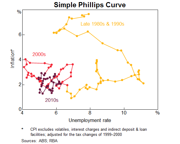
At first this graph looks like a random scatter of points with no real structure. Things become clearer when we connect the dots through time. There are a few short periods where inflation increases temporarily, even though I have used an inflation series that excludes ‘volatile items’, namely petrol, fruit and vegetables. Abstracting from those brief periods, we see two distinct down-sloping relationships – one with high inflation in the late 1980s, and one with much lower inflation that continues to the present day. Those two distinct phases are connected by a period where both unemployment and inflation declined.
Observations of this shifting relationship, both here and abroad, spurred the economics profession to recast how they thought about it. The seminal intervention on this was Milton Friedman's presidential address to the American Economics Association in 1968 (Friedman 1968). Friedman argued that it was not a relationship between unemployment and inflation themselves. Rather, the connection concerned the gap between actual unemployment and a notion of full employment on the one side, and unexpectedly low or high inflation on the other. Inflation was high in the 1980s and lower more recently – even with lower unemployment – because that's what people expected. And if you wanted to lower unemployment, there was a limit to how far you could go without creating ‘surprise’ inflation. To keep unemployment below that limit, you would end up creating ever-higher inflation as people were no longer ‘surprised’ by its new higher rate. The rate of unemployment consistent with ‘full employment’ was the ‘non-accelerating inflation’ rate of unemployment, or ‘NAIRU’.
According to this reasoning, the relationship between unemployment and inflation was therefore an ‘expectations-augmented Phillips Curve’, and it looked something like this:
There was just one problem. There were things on both sides of this equation that you can't directly observe.
Neither expected inflation nor the NAIRU can be directly measured. If this is really how we think the world works, it means making monetary policy on the basis of things that are invisible.
Four Kinds of Invisible
In grappling with this issue, I've found it helpful to categorise economic concepts and quantities according to how ‘visible’ they are: whether they can be directly observed, indirectly inferred, or neither.
The easiest quantities to deal with are those that are directly observable. The price of the coffee many of you bought this morning was observable. So was its volume, if you had been inclined to measure that. There are many such quantities in economic life, including the current exchange rate between the Australian and US dollars, the most recent transacted price on an asset such as a particular house, the legal minimum wage, the interest rate charged on a particular loan, or my bank balance.
A somewhat less straightforward set of concepts are those that aren't quite directly observable, but are measurable, perhaps with some effort. Often these are collective measures of related individual quantities that are not completely homogeneous. They include things like the unemployment rate or inflation. Individual employment statuses and individual prices can in principle be directly observed. But you have to make choices about how to combine those individual states into an economy-wide statistic.
Harder still are the things that are unobservable but are inferable, because they can be detected indirectly. This might be because of the effect they have on something that is more easily observed. A good example here is the NAIRU – the rate of unemployment below which wages growth starts to pick up. You can't observe it directly, but you can guess that you are below it if wages growth is accelerating.
Another kind of inferable is the subjective view someone has about an observable or measurable quantity. Expectations and forecasts fall into this category. You can't directly observe the expectation inside somebody's head, but you can ask about it. And because it's a belief about something more concrete, people should be able to elicit those beliefs.
So the two unobservable things in our Phillips Curve are, at least in principle, inferable. But they aren't directly measurable and it is reasonable to expect that they might be estimated with considerable error.
Finally, though, there are important economic concepts for which measurement can only be regarded as impossible. Sometimes this is because they are complete abstractions, where measurement depends entirely on an assertion that some observable thing is ‘really’ the abstract thing. Think of things like ‘social capital’, ‘ease of doing business’, or ‘animal spirits’. What are they, and how would you know if they are changing?
Other impossible concepts include qualities of people's preferences or beliefs that they can't reasonably be expected to elucidate. These include time preference, risk preference, and elasticities of substitution. If a pollster called you tonight and asked you about your rate of time preference or the curvature of your utility function, could you tell them? Now, maybe you could elicit somebody's time preference or risk appetite indirectly by watching people's behaviour as circumstances changed. This is what we mean by ‘revealed preference’. But it's not something you can learn from them by asking. This feature distinguishes these concepts from the ‘inferable’ ones that I already mentioned.
Invisibility and Public Policy
If something is not fully observable, this has many implications for its role in public policymaking. This is true for any policy realm, whether it be health, education, defence, macroeconomic management or anything else. I suspect that many of these implications are underappreciated.
The less visible something is, the harder it is to use as an objective of policy
Most people would be familiar with the adage, originally a quote from Peter Drucker, ‘what gets measured gets managed’. Others frame the idea as ‘you become what you measure’. A whole industry of KPI design and dashboard creation has grown up to serve industry and government's needs to define objectives and hold people accountable for achieving them. But some things are hard to measure. And, indeed, the negative version of the statement – that ‘you can't manage what you can't measure’ is almost as popular as the positive framing.
It is easy to measure a firm's leadership on meeting quantitative objectives such as sales, profits or staff turnover. It is much harder to measure many qualities that might matter more, like those leaders' judgement, ability to manage a crisis or inspire and engage staff. So it is with public policy. Concrete, measurable metrics are easier than abstractions.
This is also true for the people charged with achieving the objectives as well as those holding them accountable. It is far easier to know if you are succeeding at a goal of reducing maternal mortality than a goal to foster social harmony, or indeed to preserve financial stability. That doesn't mean you shouldn't try to achieve these more abstract goals, but it does make it harder to know if you are on the right track. You might need to be a bit humbler about what is achievable.
If objectives must be measured, not directly observed, some judgement is needed
If an objective is measurable, but not directly observable, things are easier than if the objective must be inferred, let alone if it is a complete abstraction like ‘social harmony’ or ‘confidence’. But the way these ‘observables’ are measured is still a matter for judgement.
Take the case of inflation as an example, where this is defined as the rate of change in prices of goods and services that households buy. To measure this, many different prices must be collected and combined into an index. A number of decisions need to be made. These include what prices to put in the index, how these prices should be collected, how they should be combined, and over what time period their rate of increase should be calculated.
There are principles of good statistical practice that apply here, such as whether a particular approach yields an index that is representative, robust and verifiable.
Other decisions will be shaped by what is feasible with current technology and resources. As more goods and services are sold online and not in stores, it becomes less costly to collect those prices. Supermarket scanners capture both price and quantity of goods sold at a highly granular level. This makes it easier for statistical agencies to combine prices according to current spending patterns rather than older patterns that might no longer be representative. Indeed, it is one of the developments that has helped reduce substitution bias in the CPI, giving the Bank and other stakeholders a more accurate view of current inflation pressures. This has complemented the improvement in this area coming from the Australian Bureau of Statistics' recent shift to updating the weights in the CPI more frequently than in the past.
Sometimes, though, there is more than one right answer. For example, when measuring consumer price inflation, statistical agencies exclude asset prices, such as existing homes, because purchases of these are generally transfers between households. But there is a genuine choice to be made about whether to measure housing costs by imputing a rental payment to all households, as is done for the US measure of the CPI, or to do so using an ‘acquisition method’ to capture the cost of newly built homes, as in Australia's CPI.
Measurement of objectives involves social licence
Because of the need for judgement in measurement, use of a ‘measurable’ objective becomes a social process. The credibility of that objective is a form of social licence. This kind of social licence affects both the compiler of that measurement and those held accountable for achieving it.
Often we hear claims that the cost of living is rising much faster than the actual inflation figures would imply. Part of this is a salience issue. There is longstanding literature showing that people are more likely to notice inflation in the prices of things they buy frequently, like groceries, than in things they purchase rarely, like cars, appliances or newly built homes.[1] And they notice certain prices, like petrol, more than the multiple prices of other things that add up to the same share of their budget, like pet food. People also tend to notice the big increases in a few prices more than they notice smaller increases, or even declines, in many prices.
It's also the case that the price that people pay isn't necessarily the way the price is recorded in official statistics. This can also lead to misperceptions of the current inflation rate. In particular, if a firm starts selling a higher-quality good at the same price, this is recorded as a fall in prices. The faster computer, the car with more features, the project home with better appliances – these are all examples of this issue. But people won't necessarily perceive these as a fall in prices. The price they actually pay is the same. They're just getting more for it.
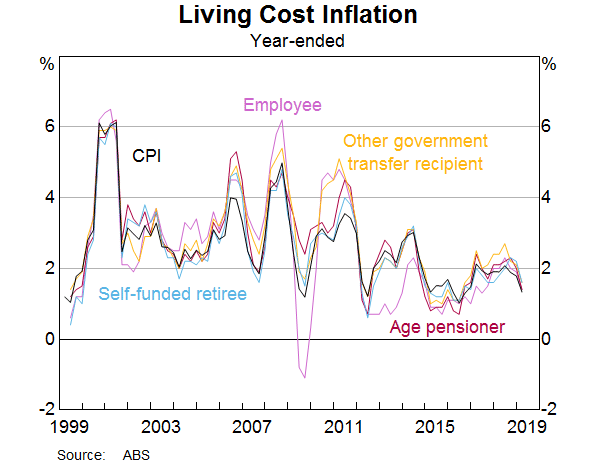
These issues are all challenges for inflation measurement, but they're also challenges of communication for central banks. To meet this challenge, the best response is transparency. The inflation measure that the Bank is mandated to target is not, strictly speaking, a measure of the cost of living, but it is close to it. In practice, measures of increases in the cost of living are similar to CPI inflation (Graph 2). That similarity is important for social licence: if we are going to be mandated to target something, that target should be relevant to the welfare of the Australian people.
Thus it is important for inflation-targeting central banks to be transparent about the nature of the target, how it relates to the prices people see in their daily lives, and how we interpret the various forces affecting inflation and the cost of living over time. Furthermore, it is important to be able to communicate those messages in a range of forums.
Inferring the value of an invisible quantity amounts to assuming a particular theory is true
When we move from the observables, like CPI inflation, to the inferables, like the NAIRU, even more issues arise. One is that inferring some invisible quantity from the behaviour of some more visible one amounts to an assertion that these things are related in a particular way. You are in essence asserting that a particular theory, a particular model of how the world works, is true.
In the case of the NAIRU, at least, that assertion is based on reasonably solid grounds. The exact relationship might change over time, and the uncertainty of measurement might complicate things, but across many countries and many decades, there is a level of unemployment below which wages growth starts to pick up meaningfully. You can see when an economy has reached that point. That is all that the NAIRU is – the label we give to that point.
The strength here is that the definition of the NAIRU is framed in terms of things that are more visible and measurable – actual unemployment and wages growth (and inflation). For other concepts, such as risk appetite or uncertainty, the connection to measurable quantities is far more nebulous. That is partly because the theory in these areas is less settled.
Many inferable quantities are emergent properties of the system
Taking the example of the NAIRU again, we should note that its precise value is not a number handed down from the heavens. It is an outcome. It is the result of individual decisions of a large number of workers and firms. Those decisions do not depend on people knowing the current level of the NAIRU, or even that such a thing exists. Rather, people make decisions about the level and rate of change in wages to offer; those decisions are presumed to relate in some systematic way to the state of the labour market.
It really helps to think about the economics here, and specifically about the human behaviour aspect. Think about what is happening when a firm decides to offer a larger wage increase than before – or when workers successfully demand one. A firm might decide to offer higher wages if they can't find a suitable candidate at the current wage. It's easy to see why that decision might depend on the overall level of unemployment, because the unemployed represent an important part – though not the entirety – of the pool of potential candidates. That said, it's also easy to see why it might depend on other things as well. For example, it could depend on how well the skills of the candidate pool match the requirements of the jobs on offer, and on how easy it is to find those candidates.
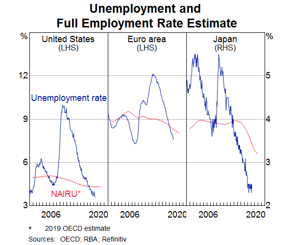
What this means is that the level of the NAIRU is an emergent property of the system. It is not baked in. It can change. In a number of advanced economies, it has indeed changed. The unemployment rate has reached multi-decade lows in several economies. Wages growth has been picking up for a while, suggesting that the unemployment rates in these countries are now below whatever their NAIRU is. But they also reached much lower levels of unemployment before this happened than they would have expected based on historical estimates of the NAIRU. Accordingly, official estimates of these countries' NAIRUs have declined (Graph 3).[2]
Invisible quantities relating to subjective beliefs or preferences are inherently harder to rely on than emergent system properties
We can't directly observe the NAIRU – we don't know exactly where it is – but we can infer how far above or below it we are from the behaviour of wages growth and inflation. We can't even be sure if it is a sharp line or a more gradual and amorphous transition to a different state of the labour market. But at least we know when we have crossed that threshold.
It is much harder to rely on our estimates of a subjective belief or preference, such as inflation expectations. How do we know if these have risen or fallen? How do we know where they sit relative to the target for inflation that the Bank has been charged with achieving? Well, we can keep asking people about their expectations, but this presupposes that the measures we have are capturing the views of the people whose decisions matter for economic outcomes. It also presupposes that the people we ask are telling the truth about their beliefs. And the fact that we are asking at all presupposes that people's expectations about this outcome even matter for the decisions they make.
So it's no wonder that in economics, we make much of the usefulness of ‘revealed preferences’ – observing people's actions rather than asking their opinions. You can tell me how much you think a thing is worth, but you reveal your preference when you actually pay money for that thing. And in the case of financial market pricing, you reveal your beliefs about future inflation when you are prepared to stake money on the outcome. But your beliefs could still be biased, and they might not affect actual outcomes much, so some caution is warranted here.
Trends are also invisible
Much of economic forecasting and analysis is all about extracting signal from noise. It's about abstracting from the temporary bumps and one-offs that pervade economic data, and getting at the trend. The team at the Bank spends a lot of time trying to identify these one-offs – whether it's the effect of a cyclone on iron ore exports or the effect of petrol prices or policy changes on particular components of the CPI. For inflation, at least, there are established techniques for abstracting from outliers.
Assessment of where the trend lies is especially important for forecasting. Our assessment of trend growth in productive capacity will affect our view of how quickly spare capacity might be absorbed. Our assessments of trend growth in the population and in productivity both affect our view of trend growth in productive capacity. And so on.
You can bring data to bear on these questions. In the end, though, you also have to make a call about how fast trends can change. Again, that is complicated because the trend is invisible and has to be inferred.
Given that much of my talk has used the NAIRU as an illustration of the issues surrounding invisibles, it's worth noting that another important, yet invisible, trend is the trend in inflation expectations, the other invisible in the Phillips Curve. There are many different measures of expectations, capturing different horizons of the future and the views of different groups in society. There will inevitably be both measurement noise and a variety of biases in these individual measures. It is important to cut through that noise and estimate a sensible measure of the trend. Again, both data and a judgement about the smoothness of that trend must be brought to bear on that assessment.
When Invisibles are Consequential
No matter what kind of invisible something is, there are clearly times when invisible things can be consequential. The NAIRU is the perfect example of this. The Bank's estimate of the level of the NAIRU is important for our assessment of the state of the economy and the appropriate stance of monetary policy.
The unemployment rate is currently around the lowest it has been in recent decades. Only in the mid 2000s, in the midst of the mining boom, was unemployment lower than the 5 per cent rate that it reached late last year. In that previous episode, wages growth and inflation were picking up strongly and some parts of the economy showed signs of overheating. In contrast, wage and price pressures are low at present, even though unemployment is only a bit higher than during the mining boom. We infer from this that there is still spare capacity in the labour market.
One might want to conclude that the reason wages growth has remained low is that some special factor is preventing it from increasing. There are all sorts of factors one might point to, including government wages caps, changes in competitive pressures or bargaining power, or increased feelings of job insecurity. And maybe they do matter separately from the level of the NAIRU. But a more comprehensive explanation – and in my view a more plausible one – is that the NAIRU is lower than it used to be, possibly because of some of these factors. So even though unemployment is low, the unemployment gap is still positive. This seems like a plausible explanation because we've already seen it happen elsewhere. As I already mentioned, official estimates of the NAIRU for other advanced economies have come down over the past decade. It seems reasonable to think that this could happen in Australia, too.
The most basic way to infer the NAIRU is simply to observe actual unemployment, wages growth and inflation. For example, if wages growth is low and not picking up materially at the current unemployment rate, we infer that this rate is above the NAIRU; the NAIRU must be lower than wherever we are now.
We can also use statistical models to make this assessment, but in essence these are just more sophisticated approaches for making the same comparison. The statistical model used by the Bank to estimate the NAIRU assumes that the unemployment gap affects inflation and wages growth in a consistent manner over time, but the NAIRU itself is allowed to vary over time. Similar models are used at other advanced economy central banks. There are judgements to be made about, for example, how smoothly and slowly you expect the NAIRU to change. There are technical decisions about exactly how you calculate a trend. But the model we use to estimate the NAIRU is broadly in line with those used elsewhere.
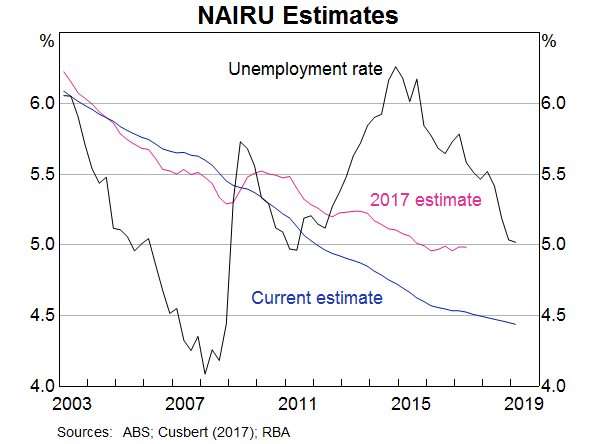
We last published our standard statistical model for estimating the NAIRU in 2017 (Cusbert 2017). We have made some technical changes to the model since then. In particular, we have allowed for the possibility that the data have become less volatile since the 1980s. This is a known feature of the macroeconomic data, and allowing for this structural change means that we can be a bit more confident in our estimate for the more recent period. We have also refined our estimate of the trend in inflation expectations to better account for the biases in some of the survey measures that are inputs to it. The technical changes have not driven the recent change in our assessment, though: the data have.
As new data on unemployment, wages and inflation is received, the Bank's estimates of the NAIRU can be updated. For example, if wages growth and inflation are lower than expected, a possible explanation is that the NAIRU was lower than previously thought and the unemployment gap was larger. Given the uncertainty of such an assessment, the NAIRU estimate would typically only move gradually in response to lower-than-expected wages or inflation. This very gradual adjustment of the NAIRU means that changes in the actual unemployment rate are generally a pretty good gauge of short-term movements in the unemployment gap.
Larger revisions to NAIRU estimates can occur over a number of years. Over the past five years wages growth has been slower than would have been expected based on past behaviour. We have therefore gradually revised down the estimate of the prevailing NAIRU from 5¼ per cent a few years ago to 4½ per cent now.
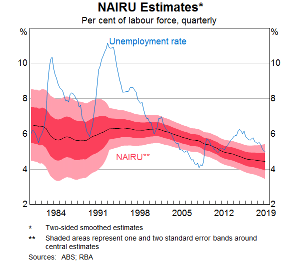
There is substantial uncertainty around our estimate of the NAIRU. First, there is uncertainty around the estimate of the NAIRU even when assuming this model of the relationship between wages, inflation and the unemployment gap is the best model. This is because even with the best choice of statistical approach, it is difficult to be precise about that relationship. The model estimates that there is a two-thirds chance that the current NAIRU is between 4 and 5 per cent, and a 95 per cent chance it is between 3½ and 5½ per cent (Graph 4). But given what we are seeing in the data, right now we feel comfortable about being a bit more specific than that.
A second source of uncertainty around our current estimate is uncertainty about whether the model has been specified correctly. The main choice here is the economic variables to be explained by the unemployment gap and the ways the unemployment gap affects those variables. For instance, the model assumes that the unemployment gap affects unit labour costs growth and inflation in a nonlinear manner. That is, the inflationary effects of an unemployment rate below the NAIRU are larger than the disinflationary effects when the unemployment rate is above the NAIRU.
A third source of uncertainty, as I've already mentioned, is that one of the inputs into this exercise – inflation expectations – are also unobservable. The more uncertain our assessment of inflation expectations, the less confident we can be in our assessment of the NAIRU. The more sensitive we think inflation expectations are to recent inflation outcomes, the less the NAIRU would move. Put another way, if we thought the recent period of low inflation had resulted in expectations becoming de-anchored, we would conclude that the NAIRU was higher than we currently think.
A fourth source of uncertainty is that we are necessarily estimating the NAIRU on the presumption that it moves fairly slowly. As a consequence, as new data come in, it doesn't just change our estimate of the latest value of the NAIRU. It can also affect the recent past. This ‘end-point’ problem means that our prior estimates will be revised.
A year or so ago, we were saying that we thought the NAIRU was around 5 per cent. The point estimate at the time was rounding to 5 per cent. Given the uncertainties in estimation, it is probably best to talk in round numbers. So that is what we did. With the benefit of the incoming data, not only has the estimate for the current value of the NAIRU changed, but so has that for the recent past (Graph 5). This sensitivity of the past to subsequent data is called the ‘end-point’ problem. It is a generic problem with many kinds of trend extraction procedures, and it is a reason to be cautious about over-interpreting the latest estimate.
Interpreting the Invisible
The NAIRU is estimated to have declined over the past 40 years. Simple observation of the data also supports this conclusion. But our usual methods for estimating the NAIRU don't tell us why that happened. They are statistical methods, so they are simply not designed to explain changes in the NAIRU, only to identify those movements. We must instead seek to understand the causes by using other information about the labour market, such as the composition of unemployment.
One way to think about this question is to think of the NAIRU as capturing the types of unemployment that would remain, even when there is no spare capacity in the labour market and inflation is sustainably at target. For example, there would still be some frictional unemployment; the people who are ‘between jobs’ for a short time. The short-term unemployment rate – the share of the labour force who have been unemployed for four weeks or less – should be a good proxy for this. Short-term unemployment has declined slowly since the mid 1990s (Graph 6). This suggests that frictional unemployment may have declined and the labour market has become more efficient at matching workers and jobs. It isn't hard to imagine that the shift to online job advertising has had something to do with this. So there's one reason why the NAIRU might be lower nowadays.
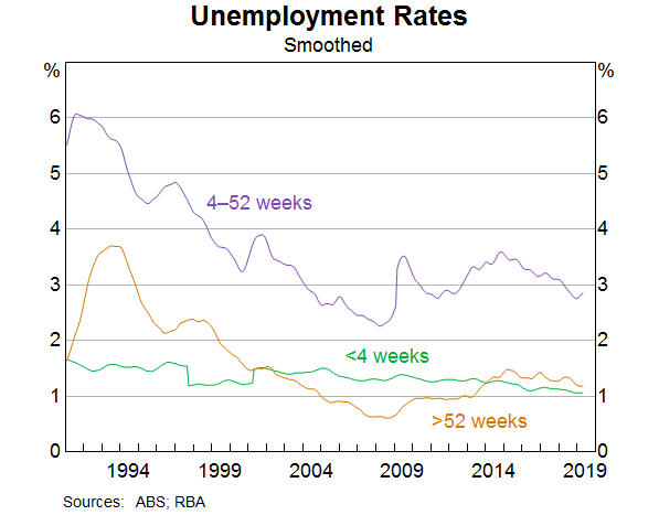
The textbooks also talk about ‘structural unemployment’ as being part of the NAIRU. These are the people who for a variety of reasons cannot find any kind of job at prevailing wage rates. This might be because they lack the appropriate skills, or they have caring responsibilities, disabilities, or other circumstances that make it hard to find a suitable position. The long-term unemployment rate is a good proxy for this concept. People who have been unemployed for more than a year are much less likely to find a job (and to keep it) than people whose unemployment spell is much shorter.
Here, too, we see evidence supporting the idea that the NAIRU has fallen. Long-term unemployment has also declined substantially since the early 1990s. It increased a bit around the end of the mining investment boom. More recently, though, it has fallen for those who have been unemployed for more than one year but less than two. However, the share of the labour force who have been unemployed for two years or more has not declined in the same way.
Finding explanations for the decline in one-to-two-year unemployment is a bit less straightforward than for the short-term variety. It might be that increasing flexibility in job design makes it easier for some people to combine work with caring responsibilities, or for firms to accommodate workers with disabilities. But perhaps more importantly, it might well be that when labour markets are tight, firms start seeing more people as employable. The labour market literature is full of discussion of the problem of ‘hysteresis’, or path-dependence, where the scarring experience of unemployment damages people's future employment prospects. In this way, higher unemployment begets a higher NAIRU.
In my observation, this process can also go the other way: when labour markets tighten progressively, previously long-term unemployed people are given a go. This helps them build up skills and experience that improves their future employment prospects. Policies to reduce barriers to employment might help here. But probably the single most effective policy would be to run the labour market a bit tighter so that there are more jobs to be filled.
Could we look back in a few years and realise that the NAIRU is even lower than we thought today? There's no way to know for sure until we get there, but I can't rule it out. And if that turns out to be the case, that would be an excellent outcome. It would mean that more people were in jobs. It would probably mean that the long-term unemployment rate has fallen further. Both of these factors would mean that fewer people were facing the kinds of disadvantage and economic exclusion that long-term unemployment can involve.
The Implications of the Invisible
I'd like to conclude by drawing two main lessons from this journey amongst the invisibles.
First, many things that society takes to be important are in some sense invisible. They might be valued in their own right, like financial stability or social harmony. Or, like the NAIRU, they might be something important to our understanding of how the world works and how we can achieve our goals. Their invisibility makes it harder to conduct policy, and to know if we are on the right track, but it doesn't make it impossible, so we should still try.
Second, and more specific to our monetary policy mandate, as the data have unfolded, it has become apparent that the unemployment rate that Australia can feasibly sustain is lower than it has been in at least the past 40 years. This is great news. Along with low and stable inflation, one of the Bank's mandates is full employment. If it turns out that full employment is even ‘fuller’ than we thought, getting there would be a real contribution to our third mandate, the economic prosperity and welfare of the Australian people. The level of unemployment consistent with full employment might be an invisible, but it is crucial. If Australia truly can have lower unemployment – sustainably – policy should be used to try to get there. As the Governor explained last week, that was one important consideration motivating the Board's recent decision to lower the cash rate.
Thank you for your time.
Endnotes
This talk has benefited from the work and helpful assistance of Natasha Cassidy, Blair Chapman, Ewan Rankin, Mike Read and Dan Rees. [*]
See, for example, Trehan (2011), Georganas, Healy and Li (2014), and, closer to home, Ballantyne et al (2016). [1]
This might not surprise John, who has published research showing that equilibrium unemployment (not quite the same concept as the NAIRU) can change, and relates those changes back to the more micro-level behaviour of the flows into and out of unemployment. (Dixon, Freebairn and Lim 2007). [2]
Bibliography
Ballantyne A, C Gillitzer, D Jacobs and E Rankin (2016), ‘Disagreement about Inflation Expectations’, RBA Research Discussion Paper No 2016-02.
Cusbert T (2017), ‘Estimating the NAIRU and the Unemployment Gap’, RBA Bulletin, June, pp 13–22.
Dixon R, JW Freebairn and G Lim (2007), ‘Time-Varying Equilibrium Rates of Unemployment: An Analysis with Australian Data’, Australian Journal of Labour Economics, 10(4).
Friedman M (1968), ‘The Role of Monetary Policy’, American Economic Review, 58(1), pp 1–17.
Georganas S, PJ Healy and N Li (2014), ‘Frequency bias in consumers' perceptions of inflation: An experimental study’, European Economic Review, 67(1), pp 144–158.
Trehan B (2011), ‘Household Inflation Expectations and the Price of Oil: It's Déjà Vu All Over Again’, Federal Reserve Bank of San Francisco Economic Letter, 2011(16).