Speech What's Up (and Down) With Households?

Luci Ellis[*]
Assistant Governor (Economic)
Address to Housing Industry Association March Industry Outlook Breakfast
Sydney –
Thank you to the organisers of this breakfast event for the opportunity to speak with you and share with you some of our thinking about current economic developments.
For a little while now, the team at the Bank has been grappling with how one might reconcile apparently weak national accounts figures with the noticeably stronger labour market data.
The disconnect can be traced to the household sector. Many other parts of the national accounts measure of output – gross domestic product (GDP) – are actually doing reasonably well. Outside the mining sector, where some large projects are still winding down, business investment is growing at a solid pace. Transport and renewable energy projects have been quite important. Public demand, both consumption and investment, is supporting growth.
There are also some areas of weakness outside the household sector, such as the drought-affected rural sector, which is weighing on exports at the moment. Droughts and other recent natural disasters clearly pose difficulties for those directly affected. But the underlying trends in the broader economy are not determined by these events. So in the main, outside the household sector, the economy is not doing too badly.
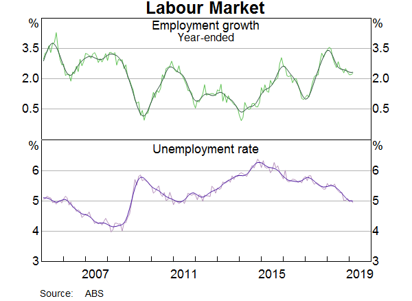
The Labour Market has Unambiguously Improved
This makes sense, because employment has been strong and someone must be hiring all those extra workers. Over the past year, total employment has increased by more than 2 per cent. The unemployment rate declined by ½ percentage point over 2018, reaching the level of 5 per cent before our forecasts implied it would (Graph 1). This is a good outcome. Youth unemployment has declined and most measures of underemployment have also come down a bit.
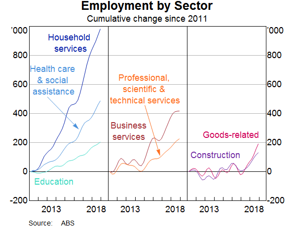
Some industries are doing better than others, but overall the strength in employment has been across a diverse range of sectors (Graph 2). We can see this either by looking at the industry that people say they work in, or we can use the ABS's new Labour Account to triangulate this information with what firms say their industry is. Either way, we see jobs being added in a range of industries. Employment in health care and social assistance has been increasing for a while; the rollout of the NDIS is an important driver of this, but not the only one. More recently, we have also seen employment increase in a number of business services industries. Construction employment had also been strong for a while, reaching the highest share of total employment in more than a century of records.
One can be reasonably confident in the steer the labour market data are giving us, because it is coming from multiple, independently collected data sets. The employment and unemployment data come from the ABS's survey of households. But a survey of businesses, also from the ABS, tells us that the number of job vacancies has been a very high share of the total jobs available. Separate private-sector surveys of businesses tell us that many firms plan to hire more workers. Many of our own liaison contacts also tell us that they are hiring.
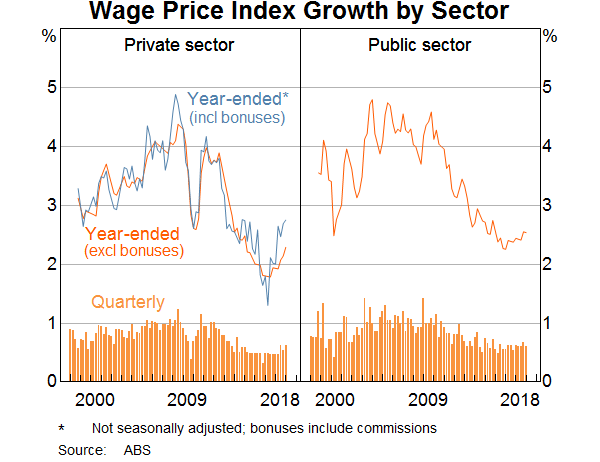
And as the labour market gradually tightens, we are beginning to see the effects in wages growth. This has been low for some time, but is gradually trending up now, especially in the private sector (Graph 3). Part of this shift is that fewer workers are subject to wage freezes than was the case a year or so ago. Minimum and award wage rises have also increased. Along with other countries, it's taking longer and a lower unemployment rate to start seeing faster wages growth than historical experience might have suggested. Indeed, we still think Australia is a little way off the levels of the unemployment rate that would induce materially faster wages growth. But as the experience of other countries has also shown, if the labour market tightens enough, wages growth does eventually pick up.
Household Consumption Spending is Slowing
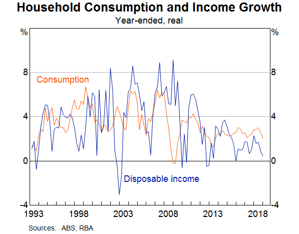
In contrast to the positive picture implied by the labour market, growth in household income has been slow, and growth in consumption has weakened recently (Graph 4).
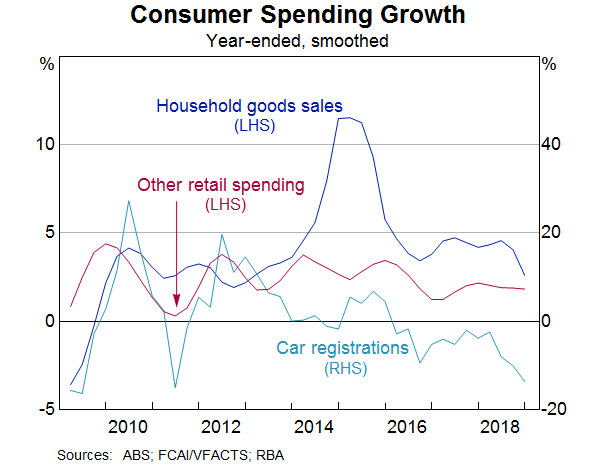
If we drill down to see which kinds of spending have slowed the most, we can see that spending on cars and household goods has been particularly affected (Graph 5). Spending on less discretionary items like food has been less affected.
There has been a deal of talk about the possibility that ‘wealth effects’ from declining housing prices might be weighing on spending. It's important to remember, though, that people's reaction to a fall in prices is likely to depend partly on how far prices had increased previously.
Some recent work by colleagues at the Bank suggests that the link is a bit more subtle than simply that increases in wealth boost spending directly (May, Nodari and Rees 2019). It isn't so much that people wake up one morning, realise their home is worth more, and decide to go out shopping. Rather, if their home is worth more, they can borrow more against it, which matters for some people's decisions to buy a car. And because rising housing prices usually occur in the context of high rates of transactions in the market, spending on home furnishings tends to rise and fall with housing prices. So when housing prices decline, turnover also declines. This means there are fewer people moving house and realising their old couch doesn't fit or they need new furnishings in the extra bedroom.
Slow Income Growth is a Drag on Household Spending
Beyond this specific link to housing turnover, some slowdown in consumption spending is not entirely unexpected. For several years now, we have been calling out the issue of weak income growth and how it might test the resilience of household consumption spending. This is a particular issue in the context of high household debt and the need to service that debt.
One aspect of economic theory that actually works in practice is the observation that people try to smooth their consumption in the face of fluctuating incomes. Income growth is noticeably more volatile than consumption growth. So the usual pattern is that gaps between the two resolve with shifts in income growth, not shifts in consumption growth.
But there might be limits to how long households can continue expanding their consumption faster than their income is rising. People are still saving, and they can do so at a slower rate. But at some point they might conclude that this is not temporary and that low income growth will persist. At that point they would be likely to adjust their spending plans. Consumption growth would then slow.
So we need to establish how household income growth might indeed return back towards current rates of consumption growth or even higher. To do that, we need to understand why it has been so weak.
Labour Income Growth Has Recovered Somewhat
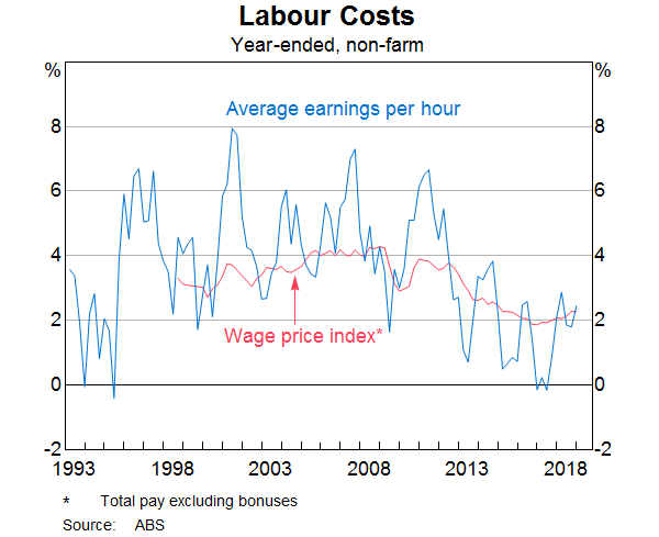
For some time, part of the story had been that labour income growth was weak. This has been true across several dimensions. First, the growth of wage rates for particular jobs has been slow (Graph 6). This is the measure of wages growth captured by the ABS's Wage Price Index (WPI). It captures changes in wages paid for a fixed pool of jobs. As I already mentioned, growth in this measure has started increasing, though only gradually. It is still well below what one might expect in the longer run, if inflation is to average between 2 and 3 per cent and if productivity maintains a similar average growth rate to its average over the past decade or so.
People's actual incomes include bonuses and other non-wage labour income, and average labour income depends on whether the mix of jobs in the economy is changing. For a number of years, these factors combined to make average earnings per hour, as recorded in the national accounts, increase much more slowly than the mix-adjusted WPI measure. It isn't unusual for growth in this measure of earnings to differ from growth in the WPI. They are compiled on different bases. But in the years following the end of the mining investment boom, this gap was persistently negative, and quite large.
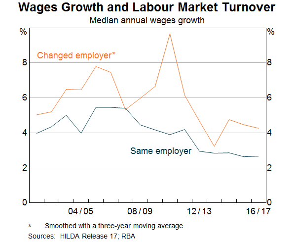
Some of the compositional change might have been because people were moving out of higher-paid jobs in mining-related activity, and had gone back to lower-paying work. It's hard to pinpoint how important this effect was, because the weakness in average earnings growth was seen in some industry-level data as well. So at least some people would have had to be switching to lower-paid jobs in the same industry. Another factor that might have been at work was that fewer people were actually switching jobs than in the past. Surveys that track people through time, such as the HILDA survey, show that people who change jobs often see faster income growth in the year they switched, than people who didn't change jobs (Graph 7).
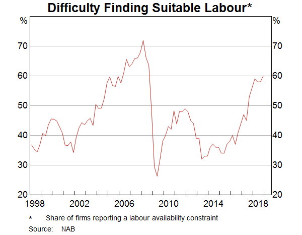
This lower rate of job churn accords with some of the evidence we see in business surveys and the messages coming out of our business liaison program. Many firms report that they find it hard to find suitable labour, at least for some roles, and that this is a constraint on their businesses, though usually not a major one (Graph 8). But when we ask our contacts what they are doing about this problem, paying people more is not the first solution they think of. Even poaching someone from another firm by enticing them with higher pay is not that common. The evidence from our liaison program suggests that it has long been the case that firms first resort to other strategies to deal with labour shortages, and only turn to faster wage increases when the shortages are severe and persistent (Leal 2019).
But whatever the underlying drivers, the gap between the growth rates of the WPI and average earnings has closed more recently. Slow wages growth is still a concern, but in terms of its contribution to income growth, it is less of a puzzle than it was a few years ago. Instead we need to seek the source of the more recent weakness elsewhere.
Non-Labour Income Remains Weak
If we break household disposable income growth into its components, we can see the drivers of the more recent weakness (Graph 9). Labour income is not especially strong, but it no longer seems at odds with growth in employment and other information about wages growth. Rather, growth in other sources of income has been weak for some time, and this has continued more recently.
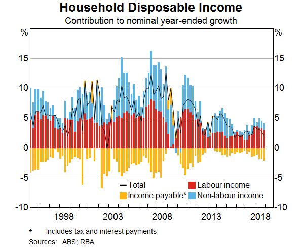
Within non-labour income, the main components are social assistance, rental income, other investment income, and the earnings of unincorporated businesses. It turns out that a confluence of factors has resulted in growth in most of these categories of income being weak recently. In some cases, this is a trend change that is likely to persist. Some others are driven by shorter-term factors that could reverse in coming years.
Social assistance payments have been relatively flat for a number of years (Graph 10). As the labour market has strengthened and unemployment has come down, it is not surprising that some forms of social assistance have not been growing. But there are a few other things going on at the same time. Firstly, the rate of growth of age pension payments has slowed, though it is still positive. There are a number of probable drivers of this, including the increase in the eligibility age, as well as more people above the (higher) eligibility age remaining in the workforce rather than drawing a pension. It is also possible that, as time goes on and the people who are retiring have had longer to accumulate superannuation balances, more people are receiving a part-pension together with an income stream from their superannuation.
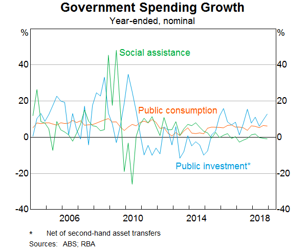
Secondly, in recent years, growth in social welfare spending by the government has come from new programs (like the NDIS) that are counted as government consumption, not household income, in the national accounts. So while both disability payments and other payments to families with children have been broadly constant in dollar terms for several years, government consumption has been growing strongly over the same period. If we adjusted for this, the growth in the social assistance component of household income would look much closer to its average over the past, rather than well below average.
These factors all relate to the design of programs assisting households, and how they are classified in the national accounts. So we would not expect them to reverse all of a sudden. This implies that we should also not expect that measured household income from this source will bounce back strongly any time soon.
Rental income has also been a bit weak (Graph 11). This is not surprising considering that rents have been rising only slowly in most cities, and falling for a few years in Perth. But rental income is only earned by 15 per cent of taxpayers, and lower cash rental income for landlords is also lower rent paid by renters, leaving them with more money to pay for other things.[1] So the weakness in rental income is unlikely to be a large driver of any slowdown in consumer spending. Income from other kinds of investments has also been a bit weak, but has recovered a bit lately.
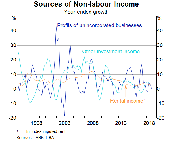
Unincorporated business income has also been weak of late. This can be a volatile type of income and sensitive to conditions in particular sectors. The farm sector represents a large share of unincorporated business income, compared with their share of the economy. So one reason this type of income has fallen has been the effect of the drought on farm incomes. A recovery here will depend on how soon normal seasonal conditions return. Much of the rest of unincorporated business income comes from sectors related to the property market, including building tradespeople and real estate agents. They are also seeing lower incomes, as both construction activity and the volume of sales of existing homes decline. Again, it can be envisaged that these sources of income might recover at some point, but not in the very near term.
Tax and Other Payments are Dragging on Disposable Income
When we think about household income available for consumption and saving, economists usually talk about household disposable income. This is income net of taxes, net interest payments and a few other deductions like insurance premiums. Income payable – the things deducted from gross income to calculate disposable income – increased by nearly 6 per cent in 2018. This was significantly faster than growth in gross household income.
Despite the relatively weak picture for household income growth, the tax revenue collected from households has grown solidly in recent years. It's normal for growth in tax revenue to outpace income growth a bit: that is how a progressive tax system works. A useful rule of thumb is that, in the absence of adjustments to tax brackets to allow for bracket creep, for every one percentage point of growth in household income, taxes paid by households will on average increase by about 1.4 percentage points. That's an on-average figure, though. The actual ratio can vary quite a bit.
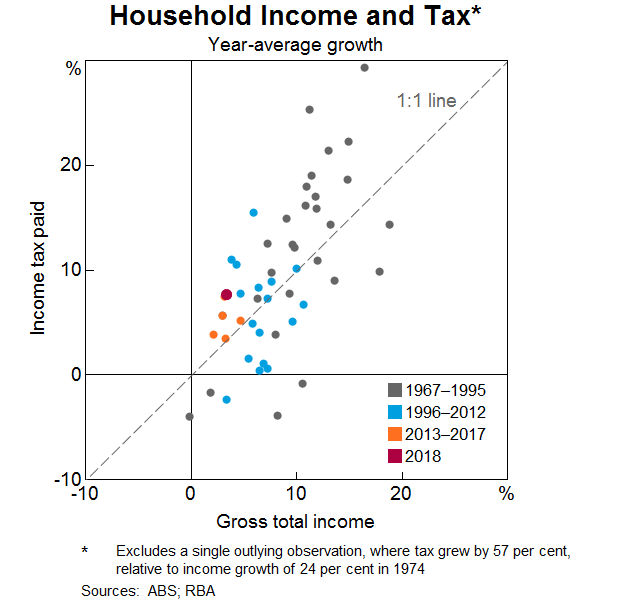
In the past year, taxes paid by households increased by around 8 per cent, more than double the rate of growth in gross household income of 3½ per cent. So the ratio is more like a bit over two-to-one at the moment, rather than 1.4 to one. That is at the high end of the range this ratio reaches, but as this graph shows, it is not unprecedented (Graph 12). But this effect has cumulated over time, so that the share of income that is paid in tax has been rising (Graph 12, bottom panel).
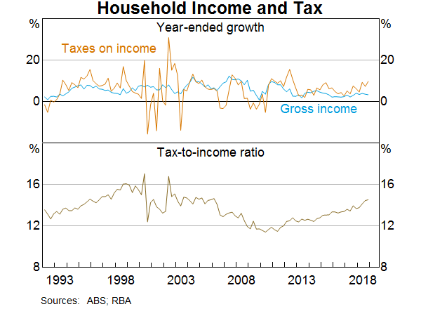
What is noteworthy is that for all of the past six years, growth in tax paid has exceeded income growth by an above-average margin, at a time when income growth itself has been slow (Graph 13).
There are likely to be several things going on here. Aside from the usual bracket creep, some deductions and offsets have declined, boosting the overall tax take. Interest rates on investment property loans are now higher than for owner-occupiers, but overall the interest rate structure on mortgages is lower than it was a few years ago. So landlords will have lower tax deductions for interest payments on loans on investment properties. At the same time, the significant run-up in housing prices in some cities over the past decade will have increased the capital gains tax liability paid by investors selling a property. Turnover in the housing market has declined. But as best we can tell, the price effect has dominated the effect of declining volumes, and total capital gains tax paid has increased.
Compliance efforts and technological progress in tax collection have boosted revenue collected from a given income. The Tax Office reports that its efforts to raise compliance around work-related deductions have boosted revenue noticeably (Jordan 2019). The next wave of this effort, focused on deductions related to rental properties, could result in further boosts to revenue.
Some of these drivers boosting tax paid could persist for a while, but they aren't permanent. For example, the earlier period of strong housing price growth will only increase capital gains tax revenue if the asset was owned during that period. It can be expected to become less important, the further into history it passes. Similarly, increased compliance increases the level of tax paid on a given level of income. It is not a change in the trend growth rate in tax paid. That said, the effect could last for a while as efforts shift to different aspects of compliance.
Some Recent Policy Changes Might Mitigate the Drag on Consumption
The net of all these effects is that household income growth has remained slow even as labour market conditions have been improving. Unlike slow wages growth, though, it is less clear how much weak non-labour income growth will weigh on consumer spending. As I already noted, slow growth in rental income for landlords means that tenants have more money to spend on other things. Some of the weakness in social assistance payments is because new programs are being delivered differently from existing ones, and so they are classified as government consumption. The net benefit to the recipients could be the same or higher.
So there might be reasons to think that weak non-labour income growth is less worrisome than weak wages growth. But you would not want to rely on that possibility to underpin your views on the outlook for consumption. So this is an area we need to watch closely. Household consumption spending is a large part of economic activity. A significant retrenchment there would lower growth and feed back into a weaker labour market, as well as into decisions to purchase housing.
Parting Thoughts
My talk today has deliberately not overlapped with what the Bank has recently said about the housing market. But I think it's clear that conditions in the household sector more broadly are highly consequential for the housing sector and thus this audience. Whatever other forces might be affecting housing market developments, fundamentally demand for housing rests on the household sector's confidence and capacity to take on the financial commitments involved in the purchase or rental of a home. Without enough income, and so without a strong labour market, that confidence and capacity would be in doubt. This is not the only reason we are watching labour market developments closely. But the nexus between labour markets, households and housing are crucial to our assessment of the broader outlook.
Thank you for your time.
Bibliography
Jordan C (2019), ‘Taxing times: positioning the ATO as an instrument of democracy’, Address to The Tax Institute 34th National Convention, Hobart, 14 March. Available at <https://www.ato.gov.au/Media-centre/Speeches/Commissioner/Commissioner-s-address-to-the-Tax-Institute-National-Convention-2019/>.
Leal H (2019), ‘Firm-level Insights into Skills Shortages and Wages Growth’, RBA Bulletin, March.
May D, G Nodari and D Rees (2019), ‘Wealth and Consumption’, RBA Reserve Bank of Australia Bulletin, March.
This document uses unit record data from the Household, Income and Labour Dynamics in Australia (HILDA) Survey. The unit record data from the HILDA Survey was obtained from the Australian Data Archive, which is hosted by The Australian National University. The HILDA Survey was initiated and is funded by the Australian Government Department of Social Services (DSS) and is managed by the Melbourne Institute of Applied Economic and Social Research (Melbourne Institute). The findings and views based on the data, however, are those of the authors and should not be attributed to the Australian Government, DSS, the Melbourne Institute, the Australian Data Archive or The Australian National University and none of those entities bear any responsibility for the analysis or interpretation of the unit record data from the HILDA Survey provided by the authors.
Endnotes
Thanks to Tomas Cokis for his invaluable help in putting together the material in this speech. [*]
The series in the graph shows total rental income, including both cash rents paid by tenants to landlords, and the rental income imputed to owner-occupiers. Owner-occupiers' imputed rent is imputed using movements in cash rents as a guide, although the (slow-moving) relative quality of the owner-occupied housing stock relative to the rental stock also matters. Over shorter periods, changes in this series reflect developments in the rental housing market. [1]