Speech Developments in Australian Retail Finance

Ric Battellino
Assistant Governor (Financial Markets)
Address to Retail Financial Services Forum
Sydney –
It is a pleasure to be here today.
This is the fourth year that this conference has been held and in that time it has become a key event for people engaged in the provision of retail financial services.
Over the next couple of days, industry practitioners will discuss a wide range of issues that are critical for businesses in the financial services industry. As a central banker, that is not my comparative advantage. Rather I thought it might be more useful for me to draw together some of the broad trends in the industry, focussing on questions such as:
- How big is the industry and how quickly is it growing?
- Who are the main users of financial services?
- How is the structure of the industry changing? and
- What are some of the implications of the changes taking place?
How Big is the Industry?
The financial services industry is large, and it is growing quickly.
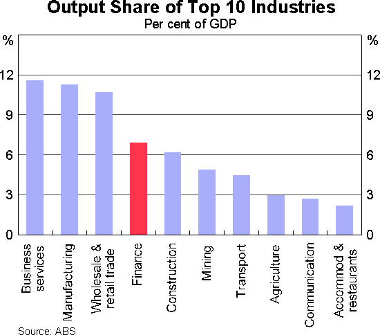
There are various ways in which one can measure its size, but the most comprehensive is that used by the Australian Bureau of Statistics in putting together the National Accounts. This shows that the finance and insurance sector is the fourth biggest sector in the economy, accounting for 7 per cent of GDP (Graph 1).
In terms of employment, the sector accounts for a smaller share of the total – 4 per cent – which makes it the eleventh biggest source of employment in the economy.
The fact that the sector accounts for a bigger share of output than it does of employment indicates that productivity in the sector is significantly higher than average. It is, therefore, an attractive industry in which to work and invest.
Another feature that makes this industry attractive is that it is growing rapidly. Over the past decade it has been the fastest growing sector of the Australian economy, with the value of its output growing 40 per cent faster than nominal GDP.
The reason for this fast growth is that demand for financial services seems to be quite income elastic – i.e. as income grows, demand for financial services grows more than proportionately. We can see this in various ways:
- If we compare across countries, we can see that high-income countries tend to have higher ratios of financial assets and liabilities to national income than do low-income countries, a process sometimes referred to as financial deepening.
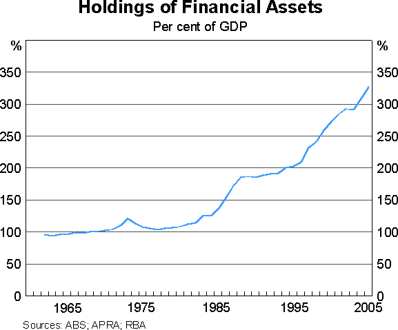
- Within countries, holdings of financial assets and liabilities tend over time to rise faster than national income. This has certainly been the case in Australia , particularly in the period since financial deregulation (Graph 2).
- The available evidence also suggests that households with above-average incomes tend to use more financial services than do lower-income households. They have more financial assets and they hold a wider range of financial assets. While this is hardly surprising, what is probably not so well known is that the proportion of households with debt also tends to rise with income.
Users of Financial Services
An indication of how the use of financial services varies with income and other household characteristics is provided by the Survey of Household, Income and Labour Dynamics in Australia (HILDA). This is a household survey conducted by the Melbourne Institute of Applied Economic and Social Research. In 2002, the survey included detailed questions on household finances, providing a good snapshot of how households use financial services. Let me run through some of the results from that survey.
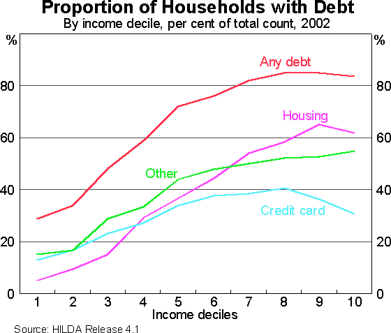
Graph 3 illustrates the point that the proportion of households with debt tends to rise with income. Over 80 per cent of households in the top income decile have some type of debt, whereas only about one-third of those in the first decile do so. This tendency for the use of debt to rise with income is true not only for housing debt, but also for credit card and other forms of debt.
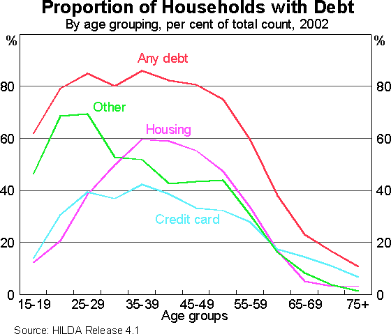
Graph 4 shows how the distribution of debt varies with age. About 80 per cent of households whose head is of working age have debt of some type. This proportion tends to be relatively constant for households through to their mid 50s, but then falls sharply as people approach retirement. Among people of retirement age, the incidence of debt is relatively low.
If we break the figures down by various types of debt, we see that the proportion of households with housing debt peaks – at around 60 per cent – for those in their 30s and 40s, whereas younger households are more likely to have other forms of debt.
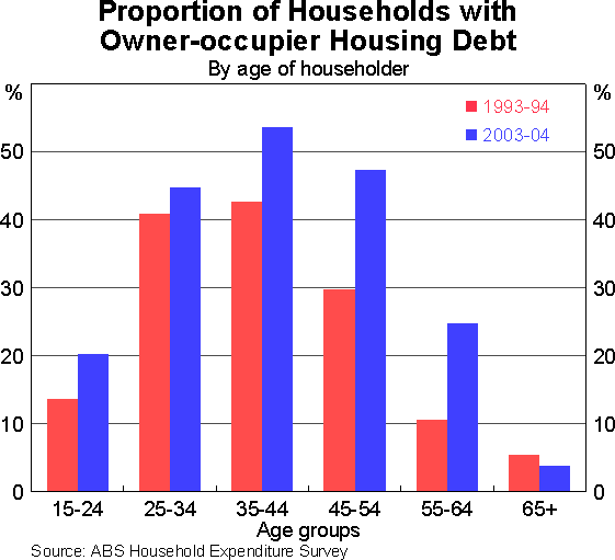
One interesting development in recent years has been that older households are making greater use of debt. Time series data on the age distribution of housing debt from the ABS Household Expenditure Survey show that the tendency for debt to rise over time has been greatest for households aged between 45 and 64 (Graph 5). For example, ten years ago, the incidence of housing debt among 45–54 year olds was significantly lower than that of younger age groups, but now it is just as high. Various factors have no doubt contributed to this, including the increased tendency for households to trade up their houses over time, the rise in house prices and financial innovation which is allowing households to access existing equity in houses. Longer life expectancy and the financial security that comes from having accumulated significant amounts of superannuation and other financial assets may also be allowing households to remain geared up for longer.
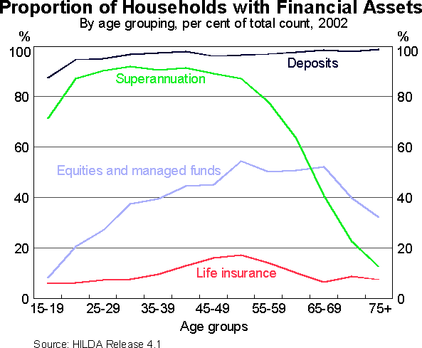
Let me turn then to households' holdings of financial assets. Graph 6 shows the proportion of households holding various types of financial assets, classified by the age of the head of the household. The main points are that:
- Virtually all households, irrespective of age, hold deposits with some type of financial institution.
- About 90 per cent of households of working age have superannuation. The proportion falls for older households and only about 10 per cent of households aged 75 have superannuation. This is mainly because people who are currently in their 70s had largely left the workforce before compulsory superannuation was introduced. As existing generations of workers move into retirement over time, it is likely that superannuation assets will be sustained into older age cohorts.
- The proportion of households directly holding equities and managed funds rises with age, peaking around 50 per cent for people in their 50s and 60s. This ratio is high by international standards, matched only by the US.
- The proportion of households with life insurance is relatively low, peaking at less than 20 per cent for 50-year olds.
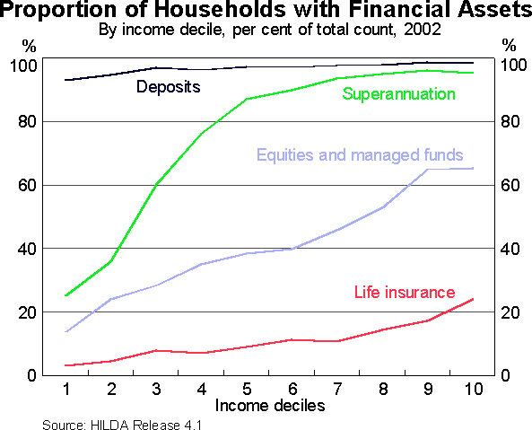
Graph 7 shows the same data, this time classified by income. Again, we can see that virtually all households, irrespective of income, hold some type of deposit. However, the proportion holding superannuation, equities and life insurance rises with income. For the upper-income deciles, the incidence of superannuation is over 95 per cent, and the proportion holding equities and managed funds is around 65 per cent.
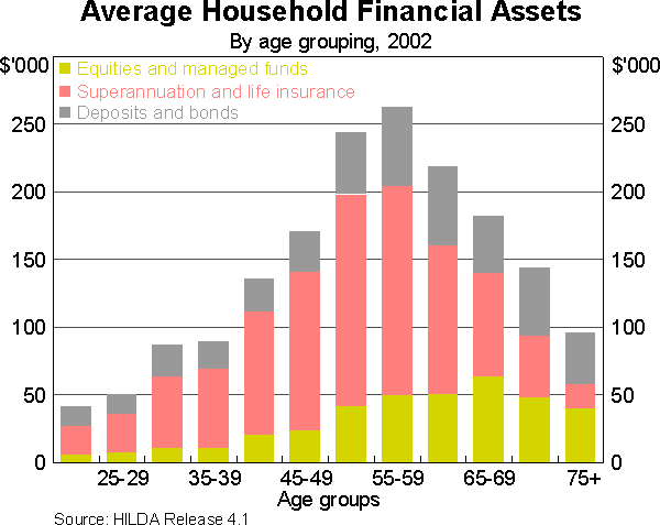
As would be expected, holdings of financial assets tend to peak around retirement age. In 2002, the average amount held in financial assets by households whose head was aged 55-59 was a little over $250,000, equivalent to about 4.5 times this group's average disposable income (Graph 8). The bulk of this was superannuation. Holdings of financial assets were lower for older age groups, mainly because, for reasons noted earlier, holdings of superannuation assets declined. By contrast, older households' holdings of deposits and equities were more sustained.
Structural Change
Let me now turn to the question of structural change.
I am sure that nobody here will be surprised to hear me say that tremendous structural change has been taking place in the Australian financial sector over the past 20 years, and that process is still continuing.
At the core of this change has been the shift away from the use of intermediated finance to finance sourced directly from capital markets. In part, this is a natural outcome of financial development. Most countries start off relying heavily on banks for their financing and, as they grow, they put in place the financial infrastructure that is necessary to support the operation of capital markets. I am talking here about trading and settlement systems, financial information systems, credit ratings agencies, brokers, analysts and so on. For example, in the United States , which probably has the most developed financial markets, only about one quarter of overall financing takes place through the banking sector. In Australia , a little under 50 per cent of financing is still done through the banking system, though it is declining.
Contributing to the trend towards direct capital market financing has been the growth of the superannuation industry, which is simultaneously creating an avenue for household saving outside of bank deposits and a demand for securities by the superannuation funds.
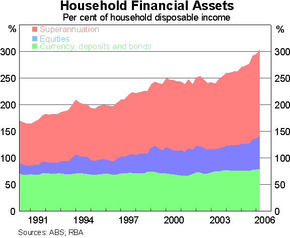
One consequence of this can be seen in the changing composition of household financial assets. Australian households now hold only 25 per cent of their financial assets in deposits and bonds, down from 40 per cent 20 years ago. This is quite low by international standards, and on a par with US households. The largest increases in households' financial assets have been in direct equity holdings and superannuation (Graph 9). In essence, Australian households, like US households, are moving their savings away from instruments with low risk and low returns, to those where returns are on average higher, but also more variable.
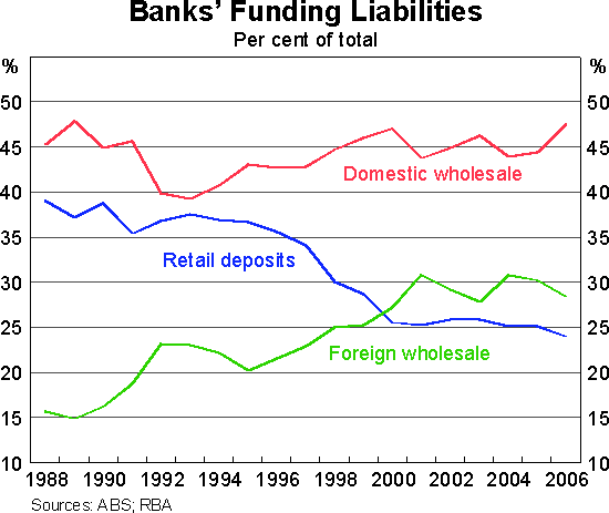
This change in the composition of households' financial assets has produced corresponding changes in the way banks fund themselves. The share of their funding coming from retail deposits has fallen from 40 per cent twenty years ago to 25 per cent today. This decline has mainly been accommodated by increased use of offshore bond raisings by banks (Graph 10).
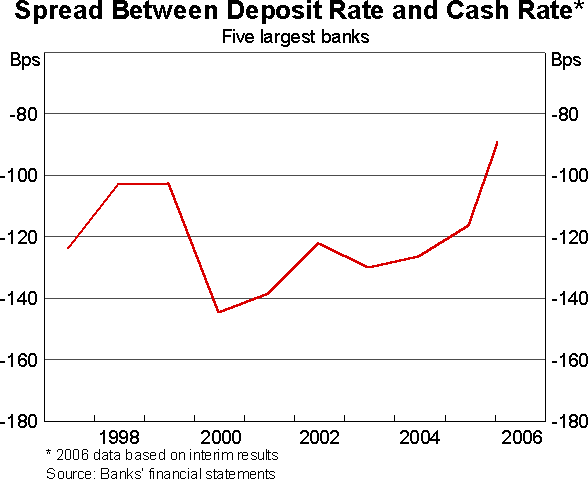
It is interesting to note that, in recent years, the decline in retail deposits has levelled out. Competitive behaviour by banks, including more widespread offerings of high-interest, on-line accounts, is on balance lifting the interest rate paid on retail deposits and therefore making them more attractive to households. Five years ago, the average interest rate paid on retail deposits was about 140 basis points below the cash rate; recently, this margin has narrowed to about 90 basis points (Graph 11).
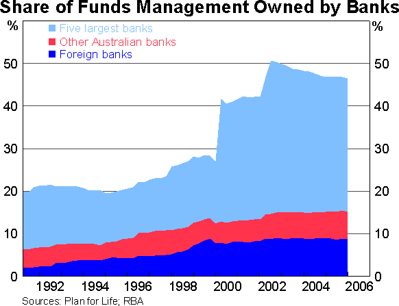
Banks have also responded to the shift of household savings from bank deposits to superannuation and other managed funds by moving into the funds management industry. Around half of funds under management are now controlled by banks, up from 20 per cent 10 years ago (Graph 12). However, since the last major acquisition of a funds manager by a bank in 2002, banks' share of funds management has been edging down again as new players continue to enter the industry.
I should also say something about the housing loan market because this has been an area of immense change.
There have been major changes in the way loans are priced, in the way they are marketed and in the way they are funded. And, of course, there has been a marked expansion in the range of products available. The RBA has documented this in detail in the Bulletin on various occasions, but let me summarise a few of the key changes.[1]
Over the past decade:
- the average margin between housing interest rates and the cash rate has declined from 250 basis points to 120 basis points (Table 1);
- the share of loans approved by the four largest banks has fallen from 67 per cent to 55 per cent;
- the share of loans that are now funded through securitisation vehicles, as opposed to intermediaries' balance sheets, has risen from 5 per cent to 23 per cent. (This is another example of the shift from bank financing to capital market financing);
- the share of approvals sourced through brokers has risen from less than 5 per cent to about 30 per cent; and
- the share of low-doc and sub-prime loan approvals has risen from less than 1 per cent to 9 per cent.
| 1996 | 2006 | |
|---|---|---|
| Interest margin on housing loans | 2.5 | 1.2 |
| Share of four major banks | 67 | 55 |
| Share of securitised loans | 5 | 23 |
| Share of broker approvals | <5 | 30 |
| Low-doc and sub-prime shares | <1 | 9 |
In short, the intense competition in this market has resulted in lower costs and increased diversity and availability of loans.
While this has been overwhelmingly favourable for households, a word of caution is in order. In circumstances where loans are readily available at relatively low cost, borrowers need to take care that they are not tempted into over-extending themselves. Similarly, lenders need to be alert to the possibility that attempts to gain, or even maintain, market share can lead to their taking on unintended risk.
Some Implications
Finally, let me end by saying something about the implications of the changes which I have outlined. I want to focus particularly on the question of what they mean for the interpretation of trends in household finances.
As you know, the popular representation of Australian household finances is that they are in poor shape. In particular, three facts are usually put forward:
- household debt levels are rising relative to household incomes;
- household debt servicing costs, relative to incomes, are at record levels; and
- the household saving rate is low, and in fact negative of late.
There are, however, grounds for believing that household finances are in better shape than suggested by this depiction.
First, rising ratios of debt to income are not necessarily a sign that something is amiss. The evidence I showed earlier suggested that it is quite normal in a growing economy for the level of debt outstanding to rise relative to income. Financial variables typically rise faster than GDP.
In saying this, I don't want to give the impression that the rate of increase in debt doesn't matter; clearly it does, as households can become over-exuberant in their use of debt. Rather, the point I am making is that, in judging the health of household finances, we should not look at trends in debt in isolation; we need to look at the overall financial position of households.
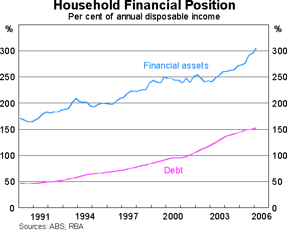
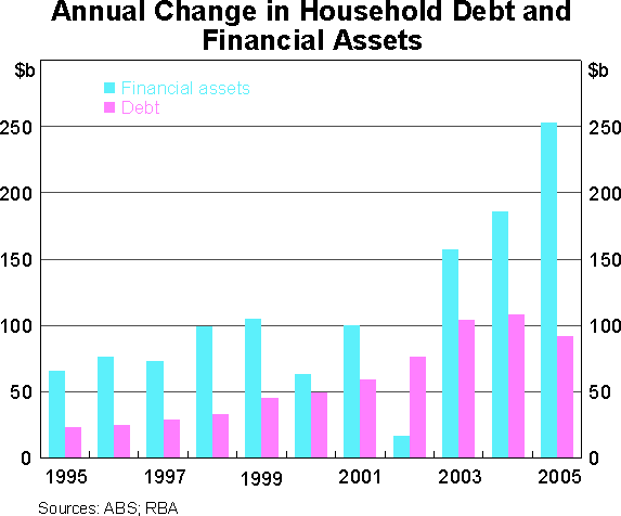
If we do this, we see that households' financial assets have increased by substantially more than their debt (Graph 13). There has been only one year during the past decade when they have not done so (Graph 14). As a result, even though household debt has increased, the net financial position of households has improved noticeably.
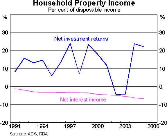
Let me now turn to household interest payments. Again, the point I want to make is that these should not be viewed in isolation. In a situation where households are increasing both their debt and their holdings of financial assets, it is the net interest position that is important. More precisely, because Australian households have debt liabilities but hold equities and superannuation as assets, we need to look at a broader concept than net interest income – namely, net investment income. The often-stated fact that Australian households have now become net payers of interest is only true because households have shifted their financial assets from bank deposits (on which they earned interest) to equities and superannuation where returns accrue largely in non-interest forms. Taking account of interest, dividends and capital gains, the net investment returns of households, though variable from year to year, on average have remained strong (Graph 15).
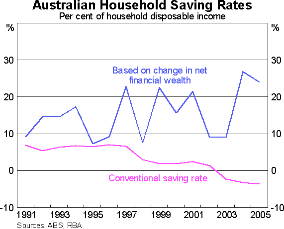
These considerations also have bearing on how we should interpret developments in household saving. As I mentioned, the household saving rate as conventionally measured has recently become negative, implying that households are running down their assets. Yet when we look at households' net financial assets, we see that they have in fact been rising quickly.
For those of you who want to understand this puzzle, I would recommend an excellent paper prepared by the Australian Bureau of Statistics in 2003[2] which outlines some of the shortcomings of conventional saving measures if they are used to make broader assessments of household finances. The RBA has also recently commented on this issue in some detail in the May 2006 Statement on Monetary Policy and in a recent Research Discussion Paper.[3]
The key point is that conventional measures of saving do not take into account capital gains. This has a particular bearing on Australian households because, as noted, they now hold a high proportion of their financial assets in investments such as shares and superannuation on which a significant part of the return is in the form of capital gains. In the May 2006 Statement on Monetary Policy, we showed that once allowance is made for capital gains, the saving rate of Australian households (broadly defined) is neither low nor falling (Graph 16).
Conclusion
The financial system is growing, and its structure is changing. It is both responding to, and helping to reshape, the way that households conduct their financial affairs. These developments in turn have the potential to change the meaning and significance of some of the measures that we have typically used to benchmark the economy's financial health. We need to be alert to this and not take these measures at face value.
Overall, I think we can remain positive about how the financial system is evolving and how households are responding to these changes. Of course, for this to be sustained, continued vigilance is necessary on the part of both borrowers and lenders against taking on excessive risk.
Endnotes
See, for example, ‘Innovations in the Provision of Finance for Investor Housing’ Reserve Bank Bulletin, December 2002. [1]
‘New Analytical Measures of Income Saving and Wealth’ (Feature Article), Australian System of National Accounts 2002-03, Australian Bureau of Statistics Catalogue 5204.0, 5 November 2003. [2]
Paul Hiebert (2006) ‘Household Saving and Asset Valuations in Selected Industrial Countries’, Reserve Bank of Australia Research Discussion Paper No. 2006-07. [3]