Speech Aspects of Australian Economic Performance in 2000

Glenn Stevens
Assistant Governor (Economic)
Address to the Australian Industry Group – PricewaterhouseCoopers ‘Industry Outlook Forum 2000’
Sydney –
I am pleased to be invited to speak to you today. It is early in a new year (and, depending on one's point of view on calendars, a new century and millennium), and so people's attention is naturally on the year ahead, with all the opportunities and uncertainties it holds. There is no shortage of prognostication, at this conference and others like it, at this time of year.
I am not going to attempt a detailed description either of the economy's recent trends, or of the outlook over the coming year. As it happens, the timing of this meeting is shortly after the release of our most recent review of the economy and financial markets, last Wednesday. That document gives a comprehensive run-down on the key events of the recent past, and a general treatment of some of the issues important for the year ahead.
What I would like to do today is to point out some of the highlights of recent developments, as I see them, and to offer some perspective on the way in which things may be changing. Allow me to begin with a brief comment about the global economic scene.
The World Economy
1999 was a better year for global output growth than had been expected, by a sizeable margin. A simple way of showing this is to look at the evolution of forecasts prepared and published by the IMF (Graph 1). In late 1998, the IMF had forecast that global growth, which was 2½ per cent in 1998 (a lot lower than earlier expected), would fall to 2¼ per cent in 1999. If you recall, at that time there had been serious concerns about the state of financial markets in the major countries, in the wake of the LTCM episode. Central banks were easing interest rates in response to these concerns. Many people felt that 1999 could be a very weak year indeed for the world economy.
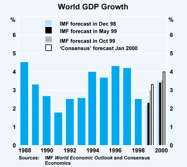
But things did not turn out that way at all. Far from declining further, it now looks like world growth increased in 1999. As of October, the Fund had increased its growth forecast/ estimate to about 3 per cent. Even that is looking a bit on the low side, and more recent estimates produced in the private sector suggest world output expansion may have been about 3¼ per cent in 1999, almost up to the average rate of growth for the past 30 years. Concerns about credit crunches abated, the US economy continued to power ahead, Europe picked up, Asia recovered much faster than expected, and even Japan (surprisingly to many) recorded some growth, in the first half of the year at least.
Forecasts made for 2000 suggest, at this stage, some further pick-up in global growth. The US economy has been expected to slow a little (although we should note that identical predictions for the past four years have been wrong). But with ongoing recovery in Asia, positive growth in Japan, a turnaround of modest proportions in Latin America, and some improvement in European growth, there should be quite respectable global growth. In fact, if we update the IMF's forecast from last October with the more recent forecasts in the private sector, we find that world GDP growth of something like 4 per cent is envisaged. If that occurred, it would be a performance like those of the mid 1990s, and above the long-term average growth rate. Without doubt, it would be a markedly better outcome than would have been envisaged at this time last year.
Of course one can point to risks to this outlook. It is easy to think of downside ones. Equally, one has to observe that almost all the surprises for the past 12 months have been upside ones – it is not inconceivable that this could continue, for a time at least.
But if something like this central view comes to pass, the changed environment has important implications for Australia. It means that the trade sector of the economy, which was a drag on output growth for a while, won't be acting as a brake in the period ahead. Over the year to the September quarter of 1999, real net exports fell by the equivalent of 1½ per cent of GDP (Graph 2). Export volumes were quite weak from late 1998 until mid 1999, despite a good deal of success by exporters in diverting products to alternative markets. But they are now recovering, as is quite clearly seen in the run of data in the second half of 1999. The stronger world outlook gives some confidence that this will continue, which means that the blue negative bars in the graph will get much smaller, or perhaps even turn positive. If growth in domestic demand were to continue at the same pace as in 1999, this would imply a marked pick-up in growth of GDP. The bulk of forecasters (myself included) anticipate some moderation in growth of domestic demand, such that overall activity will not accelerate.
Generally speaking then, the world economy is more likely to be helping the Australian economy along in the coming year or two, rather than holding it back as it has done for the past year or two. This is one of the most important reasons why we do not think that a pronounced decline in overall growth is likely, even though some areas of domestic demand are widely expected to come off the boil a bit at some stage during 2000.
Regional Dispersion
A common theme we have heard of late is that of differences in economic performance between various parts of the nation and, to a lesser extent, between various industries. In a medium-sized, reasonably diversified economy like Australia, there are bound to be some differences on a regional or industry basis. This is likely to be more so when the country is as physically large as Australia.
I might add that when a particular shock comes along – say a drought, or a collapse in a price for some commodity, or even serious economic problems in a particular region or city – a degree of diversification is helpful in cushioning the aggregate performance. It is the same logic as employed in managing a financial portfolio: a degree of diversification can lessen the extent to which idiosyncratic risk affects overall performance. Australia's lesser reliance on individual commodities, for example, is one part of the explanation which has been offered for why el nino plus the Asian crisis did not affect Australia in 1998 to the same extent as it did New Zealand, a smaller and less diversified economy. (That is not to say that this explains all the difference between the two countries, or that the Asian crisis and climatic conditions did not affect Australia.) The fact that Australia is a federation, moreover, with quasi-automatic redistributive mechanisms, means that the stronger areas help to support the weaker during periods when a shock affects one region more than others.
There are clearly some differences across the cities and States and Territories of Australia. This has been an issue for some critics of recent policy moves. But differences have been present for a long time, and have many causal factors. It is worth examining the evidence on whether they are at present any more substantial than they have been before. When we look at the available information, we find some interesting features.
One is that, contrary to what has been said in a few places, the strength of the economy is not all Sydney. In our recent review of the economy we included several statistics to demonstrate this, and so I shall recount a few of them.
A dominant feature of the economy over the past year has been the strength of consumer demand. Retail sales (Table 1) nationally rose by nearly 7 per cent in real terms over the year to the December quarter – as strong a figure as has been seen any time in the past fifteen years. Growth in New South Wales was actually slightly below the national average; the strongest performance, by far, was in Victoria, followed by the two Territories and Queensland. The weakest growth was in Western Australia. Yet in employment growth (Table 2) over the same period, Western Australia saw one of the strongest results, exceeded only by that in the ACT. The largest fall in the rate of unemployment over 1999 was in South Australia, the smallest in Queensland, but unemployment rates in all States have fallen over the past year, although unemployment did rise in the Northern Territory.
| Australian Capital Territory | 8.6 |
|---|---|
| New South Wales | 6.4 |
| Northern Territory | 7.5 |
| Queensland | 6.8 |
| South Australia | 3.9 |
| Tasmania | 4.3 |
| Victoria | 10.0 |
| Western Australia | 2.6 |
| Australia | 6.8 |
| Employment growth Per cent | Change in unemployment rate Percentage points | |
|---|---|---|
| Australian Capital Territory | 5.2 | −0.5 |
| New South Wales | 3.1 | −1.2 |
| Northern Territory | −2.6 | 0.4 |
| Queensland | 2.1 | −0.1 |
| South Australia | 3.4 | −1.6 |
| Tasmania | 2.8 | −1.1 |
| Victoria | 2.4 | −0.7 |
| Western Australia | 3.6 | −0.5 |
| Australia | 2.8 | −0.8 |
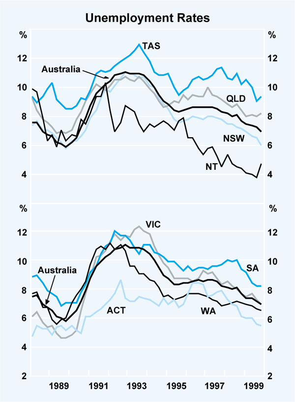
There are, of course, some persistent differences between the States and Territories in unemployment rates (Graph 3). What is striking, however, when one looks at the data, is the commonality of the recent trends in unemployment rates by State/Territory. Again, this indicates that growth at the macro level is not just a phenomenon affecting only one area.
Another key feature of the economy in 1999 was the strength of demand for housing, both the building of new dwellings and the purchase of existing ones. This has been associated with strong growth in borrowing, and a tendency for house prices in many places to rise. Was this all Sydney? No. Six of the eight States and Territories recorded growth in the value of loan approvals of 30 per cent or more (Table 3). Granted, New South Wales was exceptionally strong, but this was equalled in South Australia (and exceeded in the ACT). Approvals to build dwellings rose strongly over the year in all States except NSW, where they were about unchanged, at a relatively high level, and the Northern Territory. House prices (Table 4) rose most strongly in Melbourne, followed by Adelaide. Rises in Sydney were slightly below the national average over this period, though they had been above it in earlier periods.
| Private building approvals(a) | Loan approvals(b) | ||
|---|---|---|---|
| Number | Value | ||
| Australian Capital Territory | 19.9 | 41.3 | 53.3 |
| New South Wales | −0.2 | 36.2 | 45.6 |
| Northern Territory | −22.5 | 19.9 | 21.5 |
| Queensland | 17.9 | 26.3 | 34.7 |
| South Australia | 52.7 | 35.8 | 46.3 |
| Tasmania | 43.0 | 7.7 | 3.9 |
| Victoria | 28.5 | 21.8 | 43.5 |
| Western Australia | 25.6 | 19.2 | 29.9 |
| Total | 16.1 | 27.7 | 41.8 |
| (a) Number; houses and medium density dwellings (b) For owner occupation |
|||
| Adelaide | 13.3 |
|---|---|
| Brisbane | −2.1 |
| Canberra | 5.3 |
| Darwin | 4.3 |
| Hobart | 7.1 |
| Melbourne | 20.7 |
| Perth | 4.8 |
| Sydney | 9.6 |
| Australia | 10.3 |
|
Source: Real Estate Institute of Australia |
|
There are other statistics we could look at. No one State or Territory is strongest in every case, nor is any consistently at the bottom.
Another issue is whether there are big differences between what happens in the capital cities, and what happens in regional centres and small towns. This is an important issue and I cannot hope to cover it in detail. But one or two observations can be made.
Graph 4 shows two measures of employment growth, and two unemployment rates. The first in each case is the average of the State capital cities and their immediately surrounding metropolitan areas. The other is the average for all the other regions for which statistics are available across the six States. This includes some substantial cities like Newcastle, and regional centres.[1]
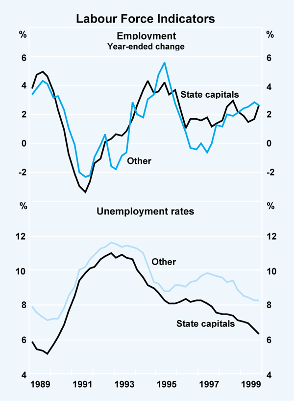
Employment growth sometimes differs between the two aggregates, although not always in the same direction. Of late, employment growth in the major cities has been about the same as in the regions.
It is true the aggregate unemployment rate outside the capitals is higher than the average in the capitals. This has been true over the entire period of this graph, which shows all the history I could find on this basis. Unemployment rates have come down, however, and like the national average unemployment rate have retraced most, but not all, of the rise which occurred in the recession.
It is also interesting to note that the differences between ‘big city’ unemployment rates and the others was smallest in the recession, and in the early and (weaker) phase of the recovery. That is because unemployment rose more quickly in the capital cities than elsewhere when the economy contracted.
In summary, there is no doubt that there are difficult problems in some regions (as indeed there are in parts of the major cities). But it is also clear that the growth in the economy overall has been widely enough spread that most parts of the country have been benefiting in recent years. The benefits of growth have not been confined to Sydney, to Sydney and Melbourne, or to the capital cities at the expense of the regional areas. If the expansion can be sustained, there is no reason to think that further benefits cannot flow.
Industry Differences
What about differences between industries? Some sectors are clearly doing very well, while others are having more difficulty. The ABS publishes estimates of GDP by industry, which suggest that the strongest growing sector of the economy over the past year was property and business services – with output up by 12 per cent over the year. The weakest output growth was in the category ‘government administration and defence’. But, again, a degree of dispersion is likely to be present most of the time in a diverse economy like Australia. A period in which every industry was growing very strongly would be a very strong (and probably unsustainable) boom. Such periods have been exceptionally rare, and never longlasting.
Rather than a long dissertation on these details, I will offer a simple perspective, by taking from these data the weakest and strongest performing sectors over a long period. Graph 5 shows the result.
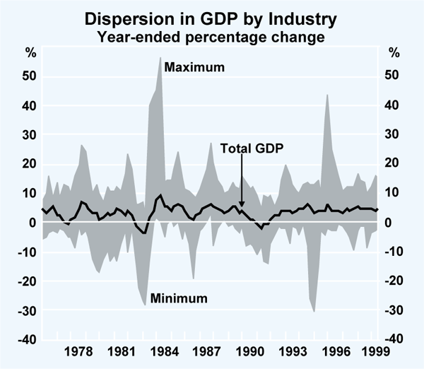
As you can see, the lower line – the weakest performance – is usually below zero. That is, there is almost always one sector whose output is measured as having fallen over the preceding year. It is not always the same sector, of course. The big spikes are farm production, alternately falling sharply in droughts and then rising when rainfall improves. The main point from the graph is that the dispersion across industries does not seem any bigger than normal: the gap between the weakest and the strongest – while reasonably substantial – does not seem to have changed much. We could do some more sophisticated measures of dispersion which show that it has increased a little recently, but it is still well within the range of earlier experience.
I argue, then, that while there are economic differences between regions and between industries, these are always present in a medium-sized economy, particularly one covering an entire continent, and that they are generally no more marked now than they have been in the past. To repeat, this is not to deny for a moment that specific regions, in particular, encounter very difficult problems. But to the extent that such problems can be helped by macroeconomic policies, it will be by seeking to elongate the periods of expansion the economy enjoys overall.
What is New About the Current Expansion?
There are, however, some features of the economy in 2000 that are different to what we have seen in the past, and these are worthy of some consideration. I would like to use the remainder of my time to talk about some of them.
One feature that is worth pointing out is the increase in the size of the balance sheet of the Australian household sector, with consequent effects on household spending behaviour. This is something that we have talked a good deal about recently, but it is sufficiently striking, and important, that it bears a little repetition.
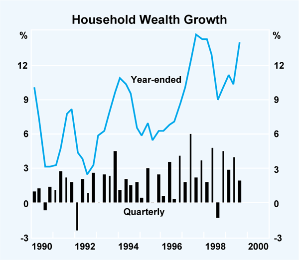
In brief, household wealth has increased quite quickly over recent years. For the past four years in particular, its average increase has been about 10 per cent per annum (Graph 6), which is a substantial increase in real terms, given that inflation has been running at around 2 per cent.
Graph 7 shows a long-run perspective, comparing wealth, income and consumption. In the top panel, we have the ratio of household wealth to current disposable household income. The wealth estimates are put together by the RBA staff based on ABS financial accounts data and housing data from the ABS and the Commonwealth Bank's dwelling price series for both metropolitan and non-metropolitan areas. Disposable income is taken from the national income accounts.
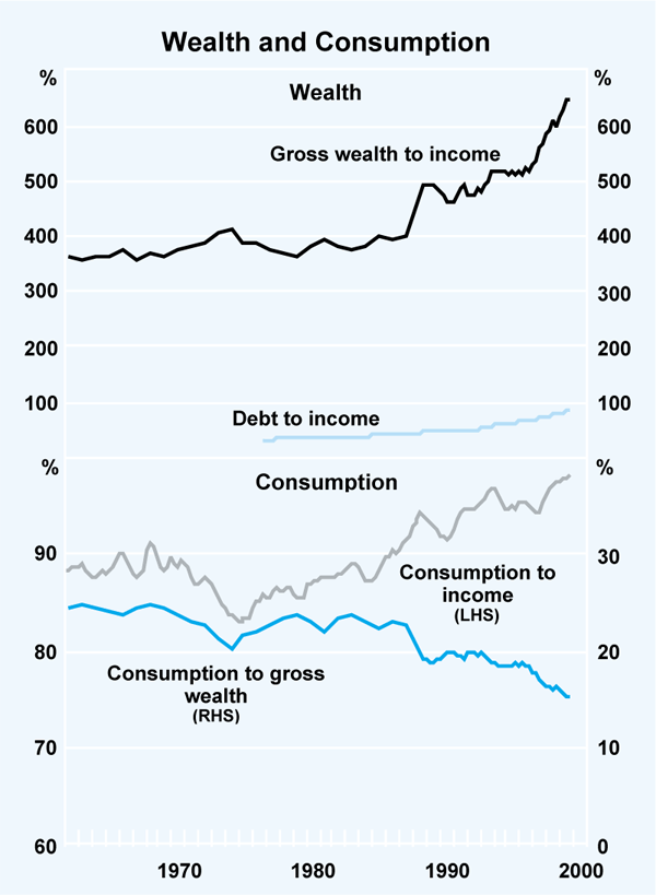
The figures for the very early part of the graph are less reliable than those in more recent years. With that caveat stated, the extent to which wealth has risen in the past decade, relative to current income, is striking. For many years, gross wealth was about 3 to 4 times income; in 1999 it was more than six times.
Rises in the value of dwellings have been a major part of this increase. The value of financial assets held by households, both indirectly through superannuation and in direct holdings, has also increased, and at about the same pace as dwelling assets over the past several years. Direct equity holdings appear to have increased faster than other forms of wealth, rising by 15 per cent per annum for the past four years. Some of this growth, of course, is due to rising prices, but it is well documented that share ownership has become more widespread among Australians.
The debt/income ratio is seen in the top panel as well. It has risen, but signals only a slight increase in the household sector's leverage: the ratio of debt to assets has risen only a little. Net wealth, which deducts debt from gross assets, has risen quite strongly.
These trends have their genesis in a few powerful and complementary forces. The first is low inflation, which has brought with it a decade of low interest rates. Interest rates still go up and down, as they must since they are part of the economy's adjustment mechanism, but over the past eight years or so, interest rates have seen their lowest levels since the 1960s. This could occur only with the ending of Australia's long period of high inflation, which lasted from the early 1970s until 1990.
Secondly, not only did the cost of borrowing decline, but the availability of credit has increased as a result of financial liberalisation, innovation and competition. While the availability of credit to the corporate sector increased dramatically in the 1980s, in the 1990s it was the household sector that was the beneficiary. Compared with the last time housing loan rates were so low, the supply of credit is much wider. Banks and other lenders are much more willing to supply these services, at finer margins, and it is now possible to borrow for a range of purposes against the equity in housing. Households, for their part, have been keener, and more able, to support higher debt levels, given the low level of interest rates. With this combination, a tendency to borrow to purchase assets, with an accompanying rise in the prices of those assets, is no surprise.
A third factor at work may have been the higher productivity growth sustained through the present expansion. It is clear from the official statistics that productivity growth has been on a different trend over the past eight years or so from that recorded in the previous decade. This might be a permanent shift in the growth rate, or it may be a one-time adjustment, to the level of productivity, albeit spread over many years, as productivity in key areas moves up to world standard levels. In that case it would be harder to increase productivity at the same rate once that frontier is reached. But either way, the better productivity performance has helped to underpin corporate profitability and higher equity values (even if not to quite the same extent as in the United States). The relevance of this to the household sector is indirect, but important. Households stand to gain as owners of a more productive business sector from better returns on investment, or as consumers from lower prices for goods and services.
These sorts of forces, then, help to explain a combination of rising debt, but also rising wealth. The same trends are manifested in a divergence of two ratios, namely the consumption/income and consumption/ wealth ratios, shown in the lower panel. The higher wealth has allowed spending to rise ahead of growth in income, so that the share of current income consumed, rather than saved, has increased. That is, the measured saving rate has fallen. But the consumption/ wealth ratio has fallen almost as steeply as the wealth/income ratio has risen. Hence while the higher asset values which make up higher wealth may be a sign that income in the future is expected to be higher than present income, households clearly do not believe that fully. If they did, they might well be consuming more than they are now.[2]
This poses some interesting questions for the course of the economy over the coming year or two.
On the one hand, to the extent that rising asset values have sustained spending growth ahead of income, there is obviously the possibility that a sharp reversal of asset values, if it occurred, could lead to a marked reduction in confidence about future income, and a substantial slowing in consumption. In cases where individual households were highly leveraged, the adjustment could be quite marked indeed – although these would be the exceptions rather than the rule. This risk has been identified for the US, and to some extent it exists in Australia – although I think probably not to the same extent as in the US.
On the other hand, were asset values to keep rising, the probability would be high that we would observe a continuation of the trends of the past couple of years, in which consumption spending grew by more than expected. Again, there would be some echoes of US experience if this occurred.
A third possibility, where asset values and wealth neither fall nor rise much, is intriguing. If the higher asset values we see are an accurate signal of higher future income, presumably as that income comes through, and households become more confident of it being persistent, their spending could well increase further. This outcome would lead to a stronger growth trajectory for the economy than most people currently anticipate, although not as strong as in the case where asset values keep rising quickly.
We cannot know, of course, how things will turn out. In the year ahead, moreover, the picture may be harder to see because of temporary effects of things like the GST, and perhaps the Olympics.
The important point, however, is that these interactions between the balance sheet of the household sector and the real economy are potentially larger than they have been in the past, and this is likely to persist beyond the life of short-term special factors. In the late 1980s, the action was all in business balance sheets. It is much more likely to be in the households' balance sheets in the next few years.
Conclusion
In early 2000, the outlook for the Australian economy is generally quite positive. For the first time in several years, there is not the spectre of a regional or global financial or economic crisis hanging over Australians as they make their plans. The global economy, while not without its problems, is likely to be giving the Australian economy more assistance than it has been for a few years.
That being so, attention is being focused more on the obvious domestic issues which will need to be managed over the period ahead. This is no bad thing – it is far better to be asking how to convert a ninth year of expansion into a tenth and eleventh, against a benign world backdrop, than to be facing the international conditions we confronted in the second half of 1998. With some good sense and good management, coping with the year or two ahead should be quite feasible. I wish you every success in it.
Endnotes
These data are substantially the same as those released recently by the Department of Employment, Workplace Relations and Small Business. [1]
An additional factor may be that for some households, a rise in the value of assets they own cannot be realised unless the asset is sold, and they may be reluctant to borrow against it if there is no income to service the loan. Thus for retired people, a rise in wealth may take a much longer time to be reflected in spending. [2]