Speech Notes for talk to CLSA Investors’ Forum

I.J. Macfarlane
Governor
Notes for talk to CLSA Investors’ Forum
Hong Kong –
It is a pleasure to be in Hong Kong talking to the CLSA Investors' Forum. This conference has built up quite a reputation over the years and I am honoured to be invited to address such an impressive group of investors. I will try my best to avoid presenting you with a ‘sales pitch’, but that is easier said than done. If you think that I am concentrating too much on the favourable side of the Australian economy, you can always redress the balance when it comes to question time.
The Australian economy has attracted a fair bit of favourable attention lately because it has performed so well during the Asian economic and financial crises. Whilst this favourable publicity is very gratifying for people like myself who have been around during the lean years as well as the good ones, I do not intend to spend much time today talking about recent economic events. This is because I think the good performance of the Australian economy is not just a recent event, but something that has been unfolding over the past decade. In other words, the recognition may be recent, but the underlying story has been around for a lot longer.
We have now nearly completed the decade of the 1990s, with nine of the ten years already behind us. Over this period of nine years, Australia has grown faster than other comparable OECD countries (Table 1). Only Ireland and Norway, which taken together are only a little over half the size of Australia, have done better, and there are special reasons in each case.
| Ireland | 6.8 |
|---|---|
| Norway | 3.5 |
| Australia | 3.2 |
| Netherlands | 2.8 |
| United States | 2.5 |
| Denmark | 2.5 |
| Germany | 2.2 |
| Spain | 2.2 |
| New Zealand | 2.1 |
| Canada | 1.9 |
| United Kingdom | 1.9 |
| Belgium | 1.9 |
| Japan | 1.8 |
| France | 1.7 |
| Finland | 1.2 |
| Italy | 1.2 |
| Sweden | 1.1 |
| Switzerland | 0.8 |
|
Source: OECD |
|
This is the first decade to my knowledge where Australia has put in such a strong growth performance relative to other OECD countries. While there have been other decades – such as the 1950s and 1960s – where Australia grew faster in absolute terms, we did not exceed OECD average growth rates in those periods. The 1990s stands out as the first decade of the post-war era where Australia's growth would put it in the first quartile of performers.
I should also add, of course, that this economic growth was achieved against a background of very low inflation. Over the same nine-year period, Australia had an average rate of inflation of 2.8 per cent per annum. This is slightly higher than the average of OECD countries but within the range of 2-3 per cent as specified in our inflation target. If we deleted the first two years (1990 and 1991) from our comparison, our average inflation rate would fall to about the OECD average. Of course, the thing that stands out when we look at inflation in the 1990s is not the difference between the countries, but the uniformity in that they all have achieved very low inflation rates.
The question I want to address today is this – why has Australia done so much better relative to other countries in the 1990s than it had in previous decades? I will attempt to answer this question by starting with those aspects of the economy I know most about, namely macro-economic policy, and then moving on to other areas which are a little more speculative. By doing it in this order, I do not wish to imply that improvements in macro-economic policy are the main explanation. They may be, but on the other hand, it is entirely possible that the biggest improvements have come from the structural side.
Macro-economic Policies
Monetary policy has been put on a much sounder footing in the 1990s than in earlier decades. The inflation targeting regime has been a success in Australia, as it has in other countries that have adopted this approach. The Government's recognition of the independence of the Reserve Bank has also been an important factor. Monetary policy has, in effect, become depoliticised, and decisions can now be based more on medium-term considerations than in earlier decades. Low inflation, and the fact that it has been maintained without forgoing economic growth, is the clearest testimony to this improvement.
Fiscal policy is also in much better shape. The Budget is in surplus and projected to stay there during the period covered by the forward estimates. Perhaps the best medium-term measure of a country's fiscal position is the ratio of government debt to GDP. Instead of showing one year's position, this measure summarises the effect of all previous years' surpluses or deficits. As you can see by the next slide, Australia has the lowest ratio of any OECD country, and it is still declining.
One aspect of Australia's recent economic performance that has received favourable comment is the behaviour of the exchange rate. When the Asian crisis erupted, the exchange rate fell so that at its low point in August last year it had fallen by a very significant amount. Unlike a number of countries in the region, interest rates were not raised to defend the exchange rate. I would like to make two observations about the exchange rate:
-
The first is that under our floating exchange rate regime, the exchange rate is allowed
to vary quite a lot with cyclical developments in the world economy. One of
the reasons that we are comfortable with this degree of variability is that
we know that it takes place around a basically flat trend. This can be seen
from Graph 1 which shows the Australian dollar against the US dollar.
Graph 1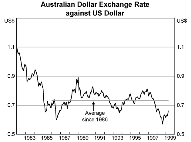
-
My second point is that some people have tended to exaggerate the size of the fall
in the Australian dollar over 1997/98 by looking only at the Australian dollar/US
dollar rate. At least half of the story over that period was US dollar strength
rather than Australian dollar weakness. This is illustrated in Graph 2 which
shows the Australian dollar in trade weighted terms, where the fall was much
less pronounced. Again, I would not want to place too much weight on this
measure either, because it tends to be pushed up by the large depreciation
in a few Asian currencies. The truth probably lies somewhere between the two.
Graph 2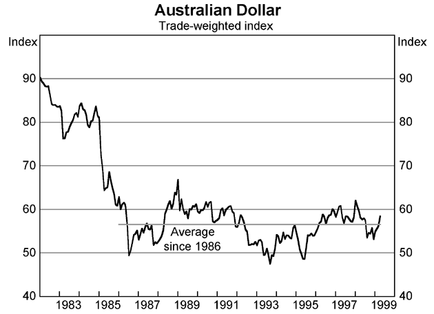
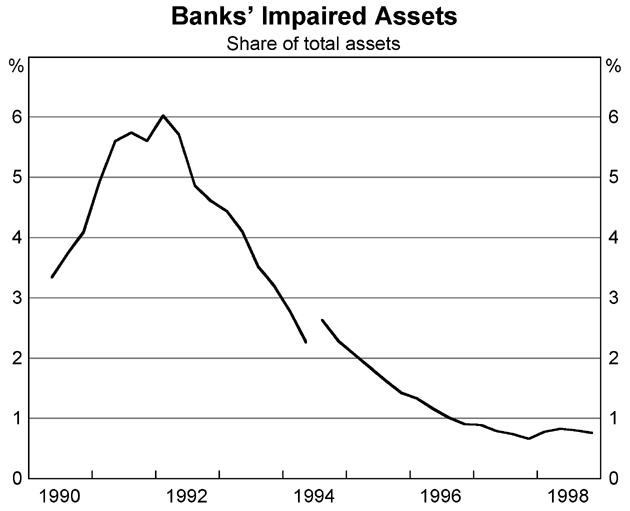
Recent events in Asia and elsewhere have highlighted how important financial stability is in determining macro-economic outcomes. Although there are many factors which underlie financial stability, one very important one is the prudential supervision of the banking system. In Australia, we learnt quite a lot about that in the late 1980s and early 1990s, and that learning experience has served us well over the past decade. The best single measure of this aspect of financial stability is shown by the level of bad debts of the banking sector. As you can see from Graph 3, these have fallen from their peak of 6 per cent in 1992 to less than 1 per cent at present. This is about as low as they can realistically be expected to go.
Structural Policies
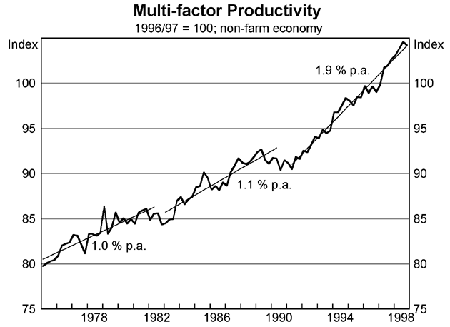
Turning to structural policies, I would like to start by showing a graph of productivity. This graph shows the average increase in productivity in each of the last three economic expansions, i.e. the 1970s, the 1980s and the 1990s. The measure of productivity used is multi-factor productivity. This measure of productivity cannot be increased simply by shedding labour and replacing it with capital. It can only be increased by using both labour and capital more productively. As you can see from Graph 4, productivity growth has been much faster in the 1990s – nearly 2 per cent per annum – than the rates of increase achieved in earlier expansions – about 1 per cent per annum. Whilst we cannot draw very specific conclusions from this improvement, it seems to me that it tells us that we must have been doing something right. My guess is that the main things behind this improvement have been the various micro-economic reforms that have been aimed at increasing the competitiveness of the Australian economy. These include:
- the substantial lowering of tariffs;
- the deregulation of financial markets;
- the introduction of a more stringent regime for competitive policy;
- the privatisation of a lot of public utilities, banks, insurance companies; and
- the introduction of a good deal more flexibility into wage bargaining.
I think we made a lot more progress in these areas than we were ever given credit for internationally. Each of these changes met with resistance, and in many cases compromises were made which would not please the purists. But taken together, along with the private sector restructuring that was occurring at the same time, they have amounted to a major set of reforms, and have made the Australian economy leaner, more flexible and more competitive.
Whilst these measures make the economy more efficient and competitive in the longer run, they of course have short-run costs. There is always an increase in uncertainty in an economy where change is occurring, and there are often job losses involved, such as when a large over-staffed public utility is privatised. Of course, there are also enormous benefits which are often overlooked, such as cheaper electricity, cars, telephone calls, airline flights, new export industries, etc. But because the complaints and resistance tend to receive more publicity than the successes, the impression is given that there is a lot of resistance.
I think this is a misleading impression and that Australians are actually very adaptable people. Some historical examples of this adaptability include:
- the ease with which Australia replaced the old British system of weights and measures with the metric system (compared with the limited success the United States and United Kingdom have had in the same endeavour); and
- the ready acceptance of such measures as random breath testing and compulsory seatbelt wearing to reduce the road toll. These were introduced in Australia many years ago, and I think we were the first country to do so. These measures are still resisted in a number of countries.
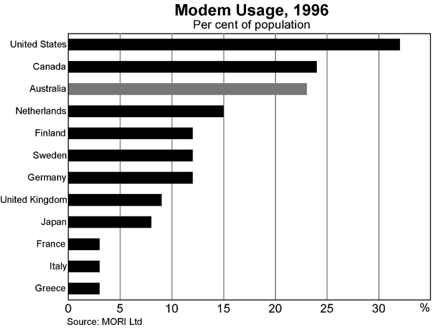
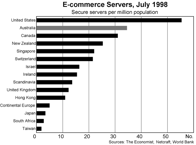
Another aspect of this adaptability is the speed with which Australians have taken up new technology, particularly computer-based communications technology. I have two graphs to illustrate this. The first on modem usage per head of population, and the second on electronic commerce servers per head of population. Both measures, not surprisingly, show the United States, at the top of the table, but Australia is also very highly placed, coming third in modem usage and second in electronic commerce servers. In particular, it is notable that Australia, along with Canada, makes considerably greater use of these technologies than European countries, for example.
Risks
The picture I have painted is, not surprisingly, a very rosy one. This is partly because I am talking to a group of international investors, but it is mainly due to the fact that the numbers themselves have been very good ones. But the outlook cannot be perfect; every economy has some vulnerable points. Even the Americans, who have done so well over recent years, worry about the level of the stock market and the possibility of incipient inflationary pressures. What are the Australian equivalents?
We think that our expansion is going to slow down at some point because that is what business cycles do. We are still forecasting a slowdown even though our previous forecasts of slowdowns have not eventuated. But I would hardly classify a mild slowing of the economy as being a major problem for us. The only way we could get into a major problem on this front is if there is an outright contraction in the world economy, and that does not seem to be a likely outcome.
We do not think that our asset markets are over-heated, nor do we see inflationary pressures at present. Credit growth has been very strong, but it has not interacted with asset prices as it did in the 1980s. That could all change in the future, of course, but for the present this sort of over-heating seems a long way off.
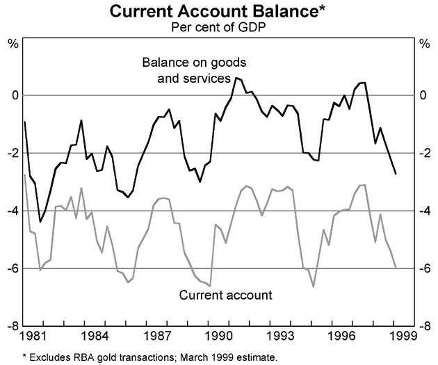
The usual area that people point to as a danger point for Australia is the balance of payments. Naturally, our current account deficit has widened over the past two years. This is what you would expect, given the buoyancy of the Australian economy and the contraction in so many of our major export markets. This widening is thus more a reflection of the strength of the Australian economy rather than its weakness.
If you look back over the past 20 years, you will see that the Australian current account deficit has fluctuated between about 3 ½ per cent and 6 ½ per cent of GDP. On four occasions, it has exceeded 6 per cent, and it seems likely that when the final figures come in for the March quarter of 1999, this will have happened for the fifth time. In the past, this has often rung alarm bells, but it is not doing so on this occasion. Why is that so? I think there are basically two reasons for this:
- The first reason is that in the past the widening current account deficit was partly a reflection of domestic imbalances such as a large Budget deficit or a higher rate of inflation than the rest of the world. Neither of those are present on this occasion, and the widening current account deficit can be fully explained by differing growth rates between the Australian economy and its trading partners.
-
The second reason is that in the 1980s the widening current account deficit raised
doubts about its sustainability. People thought that the debt to GDP ratio
would keep on rising forever and that debt servicing could become an intolerable
burden. Neither of these two eventualities occurred. As Graph 8 shows, the
debt to GDP ratio stabilised at around 40 per cent, which is high by world
standards but not excessively so (for example, New Zealand, Canada and Sweden
all have higher rates). A similar story can be told with regard to debt servicing
(Graph 9). Its ratio as a percentage of exports reached a peak of 20
per cent in the late 1980s, but is now less than half of that level.
Graph 8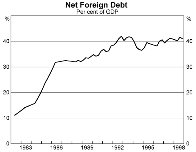 Graph 9
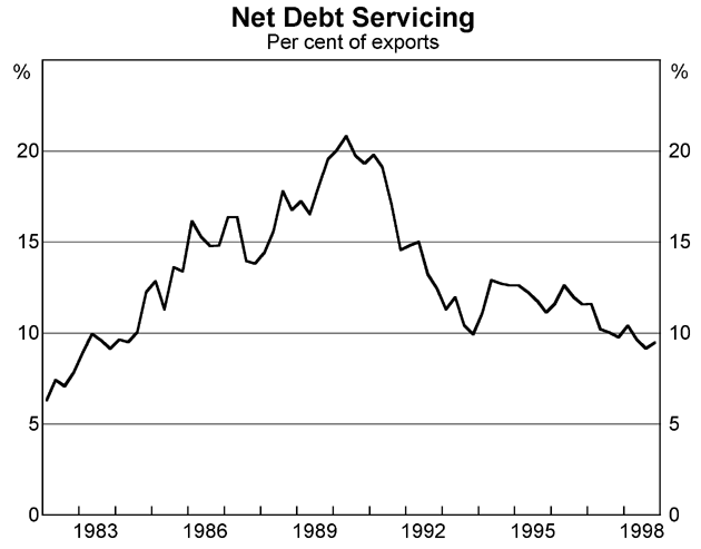
In Australia, we always have to keep a weather eye on the balance of payments, but it does not seem to represent quite the same constraint now that it did in the 1980s. Of course, it is not really up to me to make these judgments. It is really up to the market. It does seem, however, that the market is much more prepared to give the Australian economy the benefit of the doubt than it formerly was. To return to my earlier theme, I think that is because the totality of policies in Australia are now judged much more favourably than they were in earlier years. Virtue does seem to have its own rewards.
| Italy | 119.4 |
|---|---|
| Belgium | 117.3 |
| Japan | 99.9 |
| Canada | 90.0 |
| Sweden | 73.1 |
| Spain | 72.0 |
| Netherlands | 67.9 |
| France | 66.4 |
| Germany | 62.6 |
| Denmark | 59.3 |
| Ireland | 56.6 |
| United States | 57.4 |
| United Kingdom | 57.2 |
| Finland | 52.5 |
| New Zealand | 37.6 |
| Norway | 37.1 |
| Australia | 37.0 |
|
Source: OECD |
|