Speech Talk to Australian Business in Europe

I.J. Macfarlane
Governor
Talk to Australian Business in Europe
London –
It is a great pleasure to be in London again speaking under the auspices of Australian Business in Europe. The last time I spoke to this group in London was in mid-1998, which was very close to the low point of the Asian crisis. My main purpose on that occasion was to reassure investors in the City that Australia would get through the Asian crisis in reasonable shape. As you are, no doubt, all aware, the results were better than any of us could have predicted at the time. The economy continued to grow at 4 per cent plus, inflation remained low and, although the balance of payments deteriorated, it was temporary and not all that different to what has occurred on a number of other occasions in the past 20 years.
The international situation is a lot different now. Most of the Asian economies are growing again and world output growth is a good deal stronger than in 1998. At the same time, the structure of world interest rates has moved up, as has Australia's. Whereas two years ago the focus of attention was on Asia and other emerging markets, the focus now seems to be more on the United States than in any earlier stage I can remember.
I would like to take the opportunity today to update some of the things I said two years ago, but to do so in a way which focuses on medium-term developments. I will take as my starting point a comparison of economic growth rates of developed countries over the most recent decade. These figures from the OECD show that except for Ireland, which everyone in this audience would know is a very special case, the Australian growth rate has been higher than for any comparable OECD country. (Incidentally, each of the countries in this list experienced a recession at some stage earlier in the decade, which helps explain why the decade averages look a bit lower than the growth rates that we have been accustomed to over the past few years.)
| Average annual rate (over 1990s) | |
|---|---|
| Ireland | 6.7 |
| Australia | 3.5 |
| Norway | 3.3 |
| United States | 3.2 |
| Netherlands | 2.9 |
| New Zealand | 2.6 |
| Spain | 2.4 |
| Canada | 2.3 |
| Denmark | 2.2 |
| Germany | 2.1 |
| Belgium | 2.0 |
| United Kingdom | 2.0 |
| France | 1.7 |
| Finland | 1.5 |
| Italy | 1.4 |
| Japan | 1.3 |
| Sweden | 1.3 |
| Switzerland | 0.9 |
|
Sources: National Statistics agencies, IMF and OECD. |
|
For me, however, the interesting thing about this table is that this is the first decade in my working life where Australia has figured in the top half of the table, let alone being virtually in the top position. We must have been doing something right.
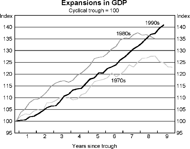
One of the things that we are doing right is that we have kept the 1990s expansion going longer than the expansions of the 1970s or the 1980s. The 1980s expansion was quite a strong one but it turned down midway through its seventh year. The 1970s expansion was a much weaker one even though it lasted a bit longer. The 1990s expansion shown in the diagram covers the eight-and-a-half years to December 1999, but we are confident that it has continued through the ninth year, and by the time we reach the September quarter we will be in our tenth year. So, sustainability of the expansion is the first key to our improved performance.
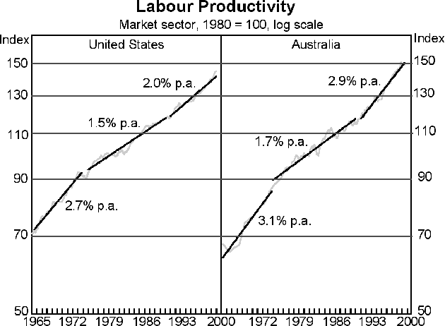
The second key is improvements in productivity. Here, if we use the simplest measure of productivity, which is labour productivity, the pattern in Australia is very similar to the pattern in the United States: strong growth in the 1960s, a flattening out in the 1970s and 1980s, followed by a pick-up in the 1990s. But the pick-up in the 1990s in Australia has been more pronounced than in the United States. We have gone from 1.7 per cent per annum to 2.9 per cent per annum, whereas the United States went from 1.5 per cent per annum to 2 per cent per annum. I do not want to suggest that this means we have higher productivity than the United States; remember we are only talking here about rates of change of productivity. The fact that we have been able to speed up more than they have is, in large part, because we were starting from a lower base.
Whilst I am on the subject of productivity, I want to make two general points:
The first is the obvious one which I have made on numerous occasions that the main reasons behind the pick-up in productivity growth have been structural changes made over the past 15 years in the Australian economy which have increased flexibility and competitive pressures. These changes include:
- further tariff reductions;
- financial deregulation;
- labour market deregulation;
- privatisation; and
- a more stringent regime of competition policy.
It has not been easy to put these changes in place, even though there has been for most of the decade considerable bipartisan political support for change. Inevitably, compromises have had to be made and, viewed in isolation, some of the individual changes do not look to be all that thorough. But taken together, I think the total is larger than the sum of the individual parts. Of course, one aspect of the economy that was not reformed during this period was the tax system. But that will change in about a month's time when a Goods and Services Tax is introduced to replace the old wholesale sales tax and to take some of the weight off income taxes.
The second point about productivity I want to make concerns the new economy/old economy divide. Some people tend to judge a country's technological sophistication by, for example, the number of listed companies in the IT sector. Although Australia has a number of companies that fit this description, about 70 or so in fact, their combined share of the stock market is not large by international standards. But that is only one measure of technological sophistication. Another equally important one is the country's or the business sector's willingness to embrace new technology. This may be a better guide to productivity improvements than focusing only on the IT sector. I have two measures of the spread of technology:
- The first is Internet usage per cent of population, which shows Australia in a relatively high position of the countries compiled by the Consulting Group, NUA.
| Per cent of population | |
|---|---|
| Norway | 49.8 |
| United States | 45.3 |
| Sweden | 44.3 |
| Canada | 42.8 |
| Finland | 38.1 |
| Australia | 36.4 |
| Denmark | 35.5 |
| Netherlands | 28.5 |
| UK | 26.6 |
| Switzerland | 23.4 |
| Slovenia | 23.0 |
| Austria | 22.7 |
| Taiwan | 21.7 |
| South Korea | 21.3 |
| Belgium | 19.6 |
| Germany | 19.4 |
| Japan | 16.8 |
| Italy | 16.4 |
| Ireland | 16.3 |
| New Zealand | 15.8 |
|
Source: nua.ie. Most data from late 1999-early 2000 surveys. |
|
- A measure that is more specific to the business sector is the number of e-commerce servers per head of population. On this measure, Australia is second only to the United States.
| Country/Region | Servers per million population |
|---|---|
| United States | 55.3 |
| Australia | 34.5 |
| Canada | 31.0 |
| New Zealand | 25.3 |
| Singapore | 22.0 |
| Switzerland | 21.5 |
| Israel | 16.3 |
| Ireland | 15.4 |
| Scandinavia | 13.6 |
| UK | 12.2 |
| Hong Kong | 10.9 |
| Continental Europe | 5.0 |
| Japan | 3.4 |
| South Africa | 2.8 |
| Taiwan | 1.9 |
|
Source: www.netcraft.com |
|
So, in terms of willingness to adapt to new information technology, Australia would get a very high score. This, along with the measures I mentioned earlier, helps to explain why there has been such a significant lift in the rate of growth of productivity over the last decade.
A big lift in productivity growth has a beneficial effect on many areas of the economy. A lot of it is passed through to consumers and, in the process, this makes it easier to maintain low inflation. Some of it can also make businesses more profitable, which is, after all, the incentive that drives much of the efforts towards improving productivity in the first place. The two broadest measures of corporate profits as a percentage of GDP in Australia have been trending up over the past decade, with profits after interest showing a much sharper rise than profits before interest, again another indirect benefit of low inflation.
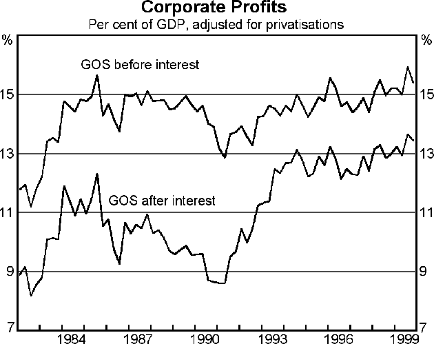
You will note that this measure of corporate profits is adjusted for privatisations. If that had not been done, the lines would have trended up more sharply because of the significant number of privatisations that have occurred over the last decade. Largely as a result of these privatisations, the percentage of the population in Australia who are now direct shareholders has risen sharply and is exceptionally high by world standards. The proportion who hold shares directly is 41 per cent. I have not got a table of comparisons with me, but I believe this figure is now about as high as in the United States. If we added to the number who directly hold shares, the number of people who voluntarily hold shares through equity unit trusts (or mutual funds, to use US terminology), the number would go to about 54 per cent. And, of course, if we added in those who contribute to an accumulation pension fund, exposure to shares would be almost universal.
Can I turn now to inflation? If we look at an international ranking of inflation rates over the past decade comparable to the one I showed for real GDP growth, Australia finishes in the middle of the field with an average inflation rate of 2.3 per cent per annum. This is a huge improvement on previous decades, but, of course, virtually every country has also shown a significant improvement. There are a number of factors behind this improvement, but the one I would like to mention today is our monetary policy regime. Like a number of English-speaking countries – the UK, Canada, New Zealand – Australia has a monetary policy regime which is based on the trilogy of an inflation target, an independent central bank and a floating exchange rate. Our inflation target is not all that different from that of the UK in that we aim for an average inflation rate of somewhere between 2 and 3 per cent over the long term, recognising that it could go above or below that range from to time, but like the UK, it is the average that matters.
| Average annual rate (over 1990s) | |
|---|---|
| Spain | 4.0 |
| United Kingdom | 3.5 |
| Sweden | 3.0 |
| United States | 2.9 |
| Germany | 2.5 |
| Netherlands | 2.4 |
| Norway | 2.4 |
| Ireland | 2.3 |
| Australia | 2.3 |
| Switzerland | 2.2 |
| Belgium | 2.1 |
| Canada | 2.1 |
| Denmark | 2.1 |
| Finland | 2.0 |
| France | 1.8 |
| New Zealand | 1.8 |
| Japan | 1.1 |
|
Source: OECD |
|
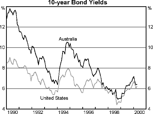
One consequence of lower inflation in Australia is the convergence of our bond yields to international norms, or at least the US norm. Some of you may have been able to remember that as recently as a decade ago, Australian government bonds were 400 basis points higher than US government bonds. We think of that as the bad old days, but if you were an international funds manager, you may look back on it as the good old days.
Another factor that has contributed to the improved acceptance of Australian government paper is the recognition that our fiscal policy is very responsible by international standards. The Budget has been in surplus for some time now. This, together with the proceeds of the privatisations I referred to earlier, has meant that the outstanding stock of government debt has fallen in absolute terms, and as a percentage of GDP is now the lowest among developed countries.
| Per cent of GDP; 1999 | |
|---|---|
| Italy | 117.7 |
| Belgium | 114.1 |
| Japan | 105.4 |
| Canada | 86.9 |
| Spain | 70.4 |
| Sweden | 68.3 |
| France | 65.2 |
| Netherlands | 62.9 |
| Germany | 62.6 |
| United States | 59.3 |
| Denmark | 55.4 |
| United Kingdom | 54.0 |
| Finland | 44.9 |
| New Zealand | 34.8 |
| Norway | 34.3 |
| Australia | 31.3 |
|
Source: OECD Economic Outlook, December 1999 |
|
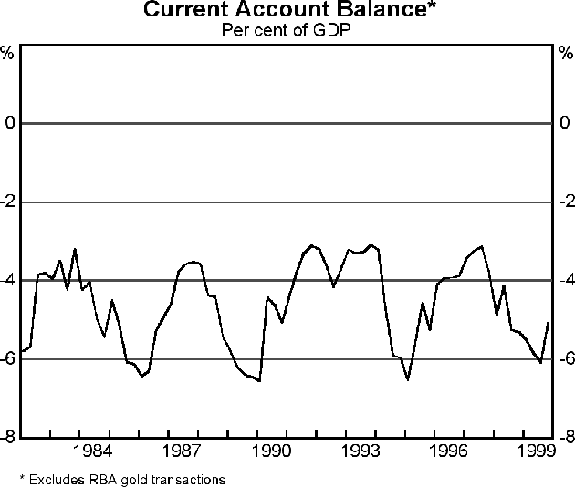
I am not sure how fully aware international investors are of these excellent figures on growth, inflation, productivity, public debt, etc., so I have taken the liberty today of indulging in a bit of trumpet blowing. One economic fact, however, that markets are aware of is that Australia always runs a substantial current account deficit and, therefore, is a net importer of capital. I have nothing very new to say on this subject other than to point out that it is the result of private agents' decisions rather than government's demands on capital markets, and that its magnitude has not changed very much in the last 20 years. It has varied cyclically, of course, but around a basically flat trend. At its cyclical low points it tends to be about 3 per cent of GDP, and at its high points a bit over 6 per cent. In this cycle, which was heavily influenced by the contraction of our Asian markets, the deficit touched 6.1 per cent of GDP in the September quarter of 1999, but has since fallen noticeably. The conditions are right for further falls over the next year, given that exports are now growing rapidly again (up 19 per cent over the last 12 months). The medium-term issue, of course, is whether the capital we are importing is being put to good use. The output growth, the productivity growth and corporate profit story suggest that it is.
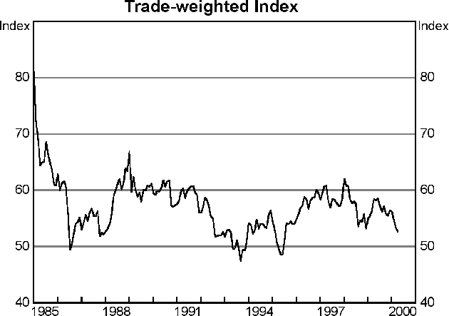
So far this year, exchange rates have been in the forefront of attention. For the first few months of this year, the Australian dollar declined quite sharply against the US dollar, more so than other major currencies. More recently, it has been a bit steadier, while a number of other currencies have weakened more noticeably against the US dollar. With firstly the euro, then the pound, then some other smaller currencies joining in, the position of the Australian dollar is now not so lonely. With the United States being perceived as the country most likely to need higher interest rates, we should not be surprised by an international adjustment mechanism which has seen other currencies all falling by a somewhat similar amount against a rising US dollar.
Turning to the medium term, these developments have meant a fall in the Australian Trade-Weighted Index or effective exchange rate over the course of 2000. The more noticeable thing, however, is that since about the second year of the period of floating in Australia, i.e. since about 1985, the Australian dollar in effective terms has fluctuated around an essentially flat trend, with its present value being near the low end of this range.
I think I have taken enough of your time on the medium term. Turning briefly to the period ahead, we expect that the current expansion will continue into a tenth and eleventh year, i.e. for the length of our current forecasts. Beyond that, the outlook is too distant for us to forecast. We are conscious that the reason we have done so much better this time than in previous expansions is that we did not let the usual late-cycle imbalances develop. The most common of these, of course, is inflation. We are confident that our early action on monetary policy, plus our adherence to the discipline of the inflation targeting regime, will mean that we continue to maintain low inflation in the years ahead.