Bulletin – December 2012 Dwelling Prices and Household Income
- Download the article 226KB
Abstract
This article analyses trends in dwelling prices over the past four decades through the prism of the price-to-income ratio. Exactly which measures of dwelling prices and household income are the most appropriate depends on the question being analysed, but the various measures considered here all show broadly similar trends. Comparing equivalently defined price-to-income ratios across countries, Australia's experience appears to be broadly in line with those of other advanced economies, with the exception of the United States and Japan which both have particularly low ratios.
Introduction
The purchase of a dwelling is, for many households, the largest financial decision they will make, and their home is their most valuable asset. Household net worth is therefore closely linked to dwelling prices, while a sizeable share of household income is devoted to mortgage interest payments. Developments in the housing market can also have significant effects on the wider economy, while residential mortgages constitute the majority of Australian banks' assets, making a sound housing market important for financial stability. More broadly, dwellings are valuable as they provide an essential service – that of shelter – so the affordability of housing has important implications for welfare. For all these reasons the Reserve Bank analyses the housing market and tracks various housing market indicators, including prices, auction clearance rates, turnover and arrears.
This article analyses dwelling prices over the past four decades, concentrating on prices relative to household income. This ratio helps to take account of growth in real incomes and overall inflation, and is an intuitive measure because income is a major determinant of how much a prospective buyer can afford to pay for a dwelling. In other words, the price-to-income ratio gives an indication of the relative expense of a home for a typical household. It is also widely cited by commentators, and is often taken as a summary statistic of over- or undervaluation in the housing market. However, many other relevant valuation metrics exist. The ‘user cost’ framework, for example, compares the cost of home ownership (consisting primarily of mortgage interest payments, maintenance, depreciation, insurance costs and property taxes, offset by any expected capital gains), with the alternative cost of renting.[1] A related measure is the ratio of dwelling prices to rents, which is analogous to the price-to-earnings ratio for equities. Other measures of housing affordability include the deposit gap (the gap between a household's borrowing capacity and the purchase price, as a share of disposable income) and the ratio of interest payments to income.[2]
Measures of Dwelling Prices and Incomes for Australia
One complicating factor for this type of analysis is that there are many different measures of dwelling prices and household income. Table 1 lists a number of such measures, from which a few broad points stand out. The distributions of dwelling prices and incomes are skewed, with average measures higher than median measures. For the measures of dwelling prices and incomes considered, however, averages are around 15 to 25 per cent higher than medians, so that the ratio of prices to income is similar whether averages or medians are used.
| Median | Average | |
|---|---|---|
| Dwelling prices(a) | ||
| Australia wide – dwellings | 408 | 502 |
| Australia wide – houses | 411 | 517 |
| Australia wide – units | 387 | 453 |
| Capital cities – dwellings | 487 | 564 |
| Regional areas – dwellings | 319 | na |
| Household income(a),(b) | ||
| Australia wide – national accounts | na | 111 |
| Australia wide – survey measure | 61 | 74 |
| Capital cities – survey measure | 66 | 80 |
| Regional areas – survey measure | 53 | 65 |
|
(a) Regional areas refers to areas outside of capital cities Sources: ABS; APM; RBA; RP Data-Rismark |
||
Regarding dwellings, prices in capital cities tend to be higher than those in other areas, while house prices tend to be higher than unit prices. This implies that a price-to-income ratio constructed using capital city dwelling prices and Australia-wide incomes, say, will be higher than one constructed using Australia-wide dwelling prices and Australia-wide incomes. The former ratio is likely to be overstated, since part of the reason that dwelling prices are higher in capital cities is that incomes are higher in capital cities, so a ratio that compares capital city dwelling prices to Australia-wide incomes is not comparing like with like.
Even starker than the difference between incomes in capital cities and regional areas, however, is the difference between income as measured in the national accounts and as measured in household surveys conducted by the Australian Bureau of Statistics (ABS).[3] Income as captured in surveys includes only income that is actually received by households over the survey period, typically ‘cash’ income such as wages and salaries. Income as measured in the national accounts includes a number of non-cash or non-received items, such as the income earned within employee superannuation accounts.
For some purposes it is important to take account of the various non-cash and non-received items included in national accounts income. More generally, the appropriate measures of dwelling prices and household income to consider will be influenced by the question that is being examined. For example, to assess how easily a typical household from Adelaide could purchase a typical Adelaide house, it would be appropriate to use the median Adelaide house price and compare that to the median disposable income of households living in Adelaide. Here a ‘typical household’ is taken as a household earning a median income. Similarly, a ‘typical dwelling’ is taken as a median-priced dwelling. Medians are more appropriate than averages in measuring what is ‘typical’, since averages can be heavily influenced by a small number of very high income earners or high-priced dwellings. Conversely, to compare price-to-income ratios across different countries, it is important to use internationally comparable measures of prices and incomes. The best internationally comparable measure of income is average household income from the national accounts (discussed in more detail below), which has the added advantage that it provides a longer time series than alternatives. In this case, for consistency, average dwelling prices should be used rather than median dwelling prices.[4]
Price-to-income Ratios for Australia
Nationwide dwelling prices in Australia have risen significantly over the past four decades, with particularly rapid increases over the periods 1987–1988 and 2001–2003. Over 1987 and 1988, average dwelling prices increased by around 30 per cent relative to consumer prices, while from 2001 to 2003 they increased by 50 per cent relative to consumer prices. Moreover, the cumulative rise in dwelling prices since 1970 has been more than twice that for construction costs, indicating that factors besides the cost of building a dwelling have driven up dwelling prices.
A major determinant of how much a household is willing and able to pay for a dwelling is the household's income. Thus one might expect dwelling prices to move in line with incomes. Graph 1 shows dwelling prices as a ratio to income, calculated in two different ways. The lower ratio is based on average dwelling prices together with average household income from the national accounts, while the higher ratio is based on median dwelling prices together with median income from surveys. There is a clear difference in levels between the two series. Nevertheless, the series move together so that analysis of the evolution of the ratio is largely unaffected by the particular series used. According to both measures, the ratio of dwelling prices to income was relatively stable over the early to mid 1980s, but rose considerably during the late 1980s, the 1990s and the early 2000s, driven by rising dwelling prices. Since 2003, the ratios flattened and then trended lower.

Price-to-income ratios are often used in isolation to assess ‘affordability’, that is, to assess how easily a typical household can purchase a typical dwelling. However, this only makes sense if other factors affecting borrowing capacity are unchanged. As borrowing capacity increases, households have greater ability to purchase housing and so prices can be bid up more than the increase in incomes. So in this case, higher price-to-income ratios do not imply less affordable housing, but are a consequence of households' greater ability to pay for housing.
The rise in the price-to-income ratio through the late 1980s, 1990s and early 2000s reflected a range of factors besides income that affected households' ability and willingness to pay for housing.[5] For example, financial market deregulation in the 1980s meant less credit rationing, increasing the amount households could borrow and opening the borrowing market to a wider set of households. The effect of this increase in credit supply was amplified by falling inflation, which declined from an average of 10 per cent in the 1970s to around 2–3 per cent by the 1990s. This fall in inflation flowed through, with a lag, to lower nominal interest rates, particularly from the late 1980s – between 1989 and 2002 the standard variable housing rate fell from 17 per cent to 6 per cent – which in turn meant that mortgage payments did not rise as much as dwelling prices (Graph 2).

Lower nominal interest rates also reduced the degree of ‘front-end loading’ in housing loans – whereby the servicing and repayment burden is disproportionately large in the early years of the loan – thus increasing the maximum possible loan serviceable with a given level of income, and therefore increasing prospective buyers' spending capacity over and above any rises in their income (Stevens 1997; RBA 2003). Since the late 1990s, changes in capital gains tax may have served to make dwellings more attractive to investors, while subsidies for first home buyers have supported their capacity to pay for dwellings.
Although Graph 1 appears to suggest that from the late 1980s to the mid 2000s it became harder for a typical household to purchase a typical house, and that more recently it has become a little easier, other factors have been at play, and the higher price-to-income ratio is as much a consequence of these other factors as independent evidence on ‘affordability’.
The analysis contained in Jääskelä and Windsor (2011) also suggests that housing is a superior good; that is, households have been prepared to spend proportionally more on housing as their incomes increased. Given this, one might expect prices to rise faster than incomes, and so for the price-to-income ratio to increase over time. Between 1980 and 2010, household disposable income has grown by almost 50 per cent after accounting for inflation, partly driven by rising female participation in the labour market. This has allowed households to devote a greater share of their income to housing while still improving their standard of living.
The observation that households spent proportionately more on housing as their incomes increased is evident along two dimensions: Australians have been prepared to spend more to increase the size and quality of their homes over time, with this quality improvement in the dwelling stock explaining around a third of the overall increase in dwelling prices by some estimates (Abelson and Chung 2005); and Australians have bid up the price of land, which is in ‘fixed’ supply.[6] This is perhaps most clearly seen in households' willingness to spend proportionally more purchasing inner-city and waterfront dwellings, the prices of which have tended to rise faster than other dwellings. Inner-city and waterfront dwellings are in limited supply (since inner-city and waterfront land is in limited supply), and bring with them lifestyle benefits such as proximity to work and amenities. As such, their prices might be expected to increase disproportionately as cities grow and newly built housing is constructed further from the centre (Kulish, Richards and Gillitzer 2011).
Comparisons within Australia
In 1981/82, Australia-wide median after-tax household income was around $15,000 according to the Income and Housing Survey collected by the ABS, while the Australia-wide median dwelling price was around $48,000, implying a price-to-income ratio of close to 3 (Graph 3). As discussed in the previous section, median incomes and dwelling prices grew at broadly similar rates during the early to mid 1980s, leaving the price-to-income ratio unchanged over this period. The ratio increased from the late 1980s to the early 2000s, and has declined slightly more recently.

Although incomes tend to be higher in capital cities than regional areas (by around 25 per cent on average according to the ABS surveys considered), median dwelling prices tend to be proportionally higher still (by around 50 per cent on average), leading to a higher price-to-income ratio in capital cities than in regional areas. Nevertheless, price-to-income ratios in capital cities and in regional areas have tended to move together closely.
Comparing the ratio of median capital city dwelling prices to median capital city incomes by state shows a broadly similar evolution to that seen in Graph 3, with price-to-income ratios remarkably similar across state capitals, notwithstanding a couple of notable exceptions (Graph 4). Most obviously, the ratio in Sydney has tended to be above those of the other state capitals, and Sydney's cyclical variation has been larger over the period shown. In the late 1980s, the price-to-income ratio in Sydney first rose, then fell, by more than the ratio in the other state capitals, driven by rising then falling dwelling prices. Between 2003/04 and 2009/10, the ratios in Brisbane and Sydney fell, the ratio in Perth rose (though it has fallen more recently), and the ratios in the other mainland capitals were relatively unchanged. Apart from Brisbane, this divergence was driven by differences in the growth of dwelling prices: between 2003/04 and 2009/10, prices in Sydney grew by around 10 per cent, whereas prices in Melbourne, Brisbane and Adelaide grew by 50 to 60 per cent, and prices in Perth grew by almost 100 per cent (for Brisbane, the lower ratio is explained by relatively high median income growth as measured by the survey data). The differential dwelling price growth in turn was likely to have been driven by differing expectations about income growth and economic prospects more generally, with prices in Perth during this period benefiting from optimism about the future, given the mining boom, as well as possible differences in the response of the supply of housing.
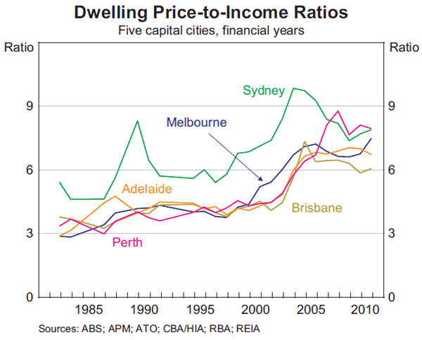
Finally, the capital that has historically had the highest price-to-income ratio – Sydney – has also historically had the highest median income.
International Comparisons
Price-to-income ratios are often used as a way to compare dwelling prices in different countries, with the implication often being that if the ratio in one country is significantly above that in another, then that country's dwellings are potentially overvalued (or the other's are undervalued). While median income is the most appropriate measure of a ‘typical’ household's income, it is not well suited to international comparisons. This is because measures of median income are generally not very timely (the surveys used to estimate median income are usually only conducted once every few years), are not likely to be available for the same point in time for all countries, and are often hard to construct on a comparable basis across countries. Median dwelling prices are also not readily available for a wide range of countries.
In order to construct price-to-income ratios for different countries that are as comparable as possible, the most readily available measure of household income is that from the national accounts. Most countries' statistical authorities follow the System of National Accounts, which is an internationally agreed set of standards for compiling economic statistics, overseen by the United Nations Statistics Division. This means that income data obtained from different countries' national accounts will measure the same economic concept and be compiled on a broadly comparable basis, allowing for more meaningful cross-country comparisons to be made. National accounts data are also timely, with data typically available within a few months of the end of each quarter.
As well as being compiled on a comparable basis, the national accounts measure of income has a number of conceptual advantages over survey measures when conducting cross-country comparisons. The national accounts use a very broad definition of household income, including for example income paid into and earned on assets in superannuation accounts that are held to fund retirement. Although households may not typically think of this as income, excluding it would lead to biases in cross-country results. For example, if the citizens of one country save for retirement via superannuation accounts that cannot be accessed until retirement, while the citizens of another country save by directly investing in mutual funds or depositing savings in bank accounts, then capturing the income flows and investment returns from one group, but not the other, would bias cross-country comparisons of income.[7]
The inclusion of earnings on superannuation in the national accounts measure of income, as well as a number of other non-cash or non-received items, has the mechanical effect of raising the measured level of income relative to survey measures, which typically include only ‘cash’ income. Nonetheless, price-to-income ratios based on national accounts measures of income behave in a similar way to ratios based on median ‘cash’ incomes.
Graph 5 shows price-to-income ratios for a range of advanced economies, based on average household disposable income from national accounts data, together with average dwelling prices (Appendix A describes the construction of the ratios in more detail). Based on these data, the price-to-income ratio for Australia is now broadly in line with other comparable countries, having risen relative to other countries since 1980 when it was at the lower end of the distribution.[8] The increase in most countries' price-to-income ratio over the period shown reflects the international nature of many of the factors discussed in relation to Australia, including financial sector deregulation and innovation, falling inflation and nominal interest rates, and rising real incomes (see Kent et al (2007) and Bloxham and Kent (2009) for a more detailed discussion of these factors).
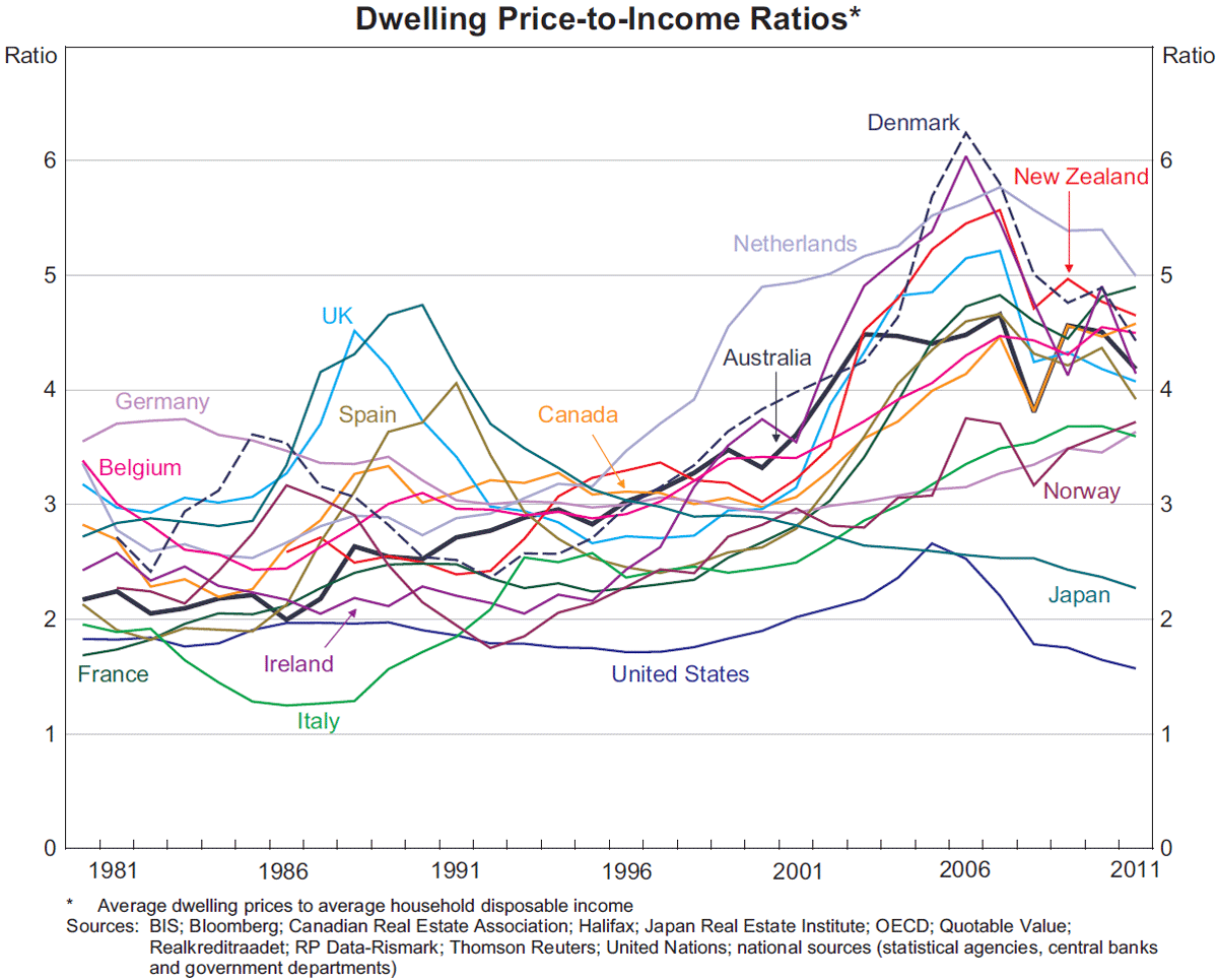
The United States, which has often been used as a comparison for Australia because of easy data availability, has an unusually low ratio of average dwelling prices to incomes in comparison to most other advanced economies, as does Japan.[9] The price-to-income ratio in Japan was quite high in the late 1980s, but since the collapse of the asset price bubble there in the early 1990s prices have fallen almost continuously. The United States has had an unusually low and stable price-to-income ratio over the entire sample. In part, this is likely to reflect the relatively dispersed nature of the US population, which is spread across the country over a large number of cities, in contrast to Australia where the majority of the population live in just a handful of coastal cities. Land prices, and therefore dwelling prices, tend to be higher in larger cities, a phenomenon that is amplified in coastal cities, which are limited in their capacity to expand (Ellis 2008). Related to this, the responsiveness of housing supply to changes in prices appears to be higher in the United States than a lot of other developed countries. For example, Sanchez and Johansson (2011) estimate that the United States had, by a considerable margin, the most responsive (or ‘elastic’) housing supply in the OECD, while Glaeser and Gyourko (2003) estimate that dwelling prices were quite close to construction costs in many US cities.
Conclusion
This article has analysed trends in dwelling prices over the past four decades using price-to-income ratios. The appropriate price-to-income ratio to use depends somewhat on the economic question being analysed, although those considered here all show broadly similar trends, albeit with differences in levels. In particular, price-to-income ratios in Australia were relatively stable over the early to mid 1980s before rising over the late 1980s, the 1990s and the early 2000s. From the mid 2000s, price-to-income ratios have fallen a little. The earlier rises corresponded with a period of financial deregulation and falling nominal interest rates, both of which increased households' borrowing capacity. It appears that households used this extra borrowing capacity to bid up dwelling prices, which is perhaps not surprising given the earlier period of financial regulation and the fact that households appear to be prepared to spend proportionally more on housing as their incomes rise.
Comparing similarly defined price-to-income ratios across countries, the price-to-income ratio in Australia appears to be broadly in line with those of other advanced economies, although substantially higher than the ratio in the United States or Japan, both of which appear to have unusually low ratios.
Appendix A
When constructing price-to-income ratios, the preferred measure of income is household disposable income before the deduction of interest payments.
- Household income is preferred to individual worker income. Using the income of a single wage-earner does not account for the structural rise in female participation in the labour force, and therefore does not reflect a household's increased willingness and capacity to service loan repayments. The household is also the standard grouping used in most analysis of income, and it is typically a household that purchases a dwelling rather than an individual within a household. (For reference, the 2011 Census suggests that on average there are 2¾ people per household and 1¼ employed people per household.)
- After-tax income is more relevant than before-tax income, as this is money that can be allocated towards mortgage repayments. Interest payments are not subtracted from income as these are payments that are predominantly being used to service housing loans.
Given the above, when using national accounts data the appropriate measure of income is gross disposable income (GDI) plus interest payments, where GDI equals total sources minus total uses of income (in the national accounts, interest payments are subtracted from gross income when computing disposable income). When making international comparisons, profits from unincorporated enterprises are included in household income, which is slightly different from the measure the Bank would typically use when focusing just on Australia. Table A1 shows the components of GDI plus interest payments in Australia for 2011.
| Component | Per household |
|---|---|
| Total sources | 144 |
| Primary | 123 |
| Compensation of employees | 80 |
| Gross mixed income | 14 |
| Imputed rent for owner-occupiers | 12 |
| Property income | 17 |
| Secondary | 21 |
| Social assistance benefits | 13 |
| Workers compensation | 1 |
| Non-life insurance claims | 4 |
| Other current transfers | 4 |
| Total uses | 34 |
| Primary | 11 |
| Interest expenses | 10 |
| Property income payable | 1 |
| Secondary | 23 |
| Income tax payable | 17 |
| Contributions to workers compensation | 1 |
| Non-life insurance premiums | 3 |
| Other current transfers | 1 |
| Gross disposable income(a) | 110 |
| Plus interest payments | 120 |
|
(a) Total sources minus total uses Source: ABS national accounts |
|
For the international comparisons, each country's dwelling price data includes all regions (both urban and regional areas) and all manner of housing (detached house, semi-detached and units). Average dwelling prices are used so as to align with average income, and also because these data are easier to source. Three methods are used to calculate average prices, depending on the country:
- An average transaction price index – Australia, Belgium, Canada, Ireland, the Netherlands and the United Kingdom.
- The market value of the entire dwelling stock (from national balance sheet data) divided by the number of dwellings (interpolated from the Census) – France, Germany, Italy, Japan, New Zealand and the United States.
- Average floor area multiplied by the price per square metre – Denmark, Norway and Spain.[10]
Public housing, which can constitute a relatively large share of dwellings in some European countries, is included in the dwelling stock where possible (see Table 5 of Ellis (2006) for information on the share of public housing in selected developed countries).
Footnotes
The authors are from Economic Analysis Department [*]
See, for example, Himmelberg, Mayer and Sinai (2005) and Brown et al (2011) for user cost studies applied to the United States and Australia, respectively. [1]
Yates (2011) provides further information on some of these metrics, as well as analysis on particular age cohorts, tenure types and income quintiles. [2]
Throughout this article we use a number of ABS household surveys, all of which survey a representative sample of Australian households and provide income data on these households. The surveys are: the 1981/82 Income and Housing Survey; the 1986 Income Distribution Survey; the 1990 Survey of Income and Housing Costs and Amenities; the 1999/00 and 2000/01 Survey of Income and Housing Costs; the 1994/95, 1995/96, 1996/97, 1997/98, 2002/03, 2005/06 and 2007/08 Survey of Income and Housing; the 1988/89, 1993/94 and 1998/99 Household Expenditure Survey; and the 2003/04 and 2009/10 Household Expenditure Survey and Survey of Income and Housing. Although the names of these surveys have evolved, there are essentially only two distinct surveys, one focusing on income and housing, and the other focusing on expenditure (but also collecting data on income). [3]
In addition to those listed above, there are a number of other sources one can look to for data on incomes. The Household, Income and Labour Dynamics in Australia (HILDA) Survey is a household survey that is broadly similar to the ABS surveys, although its history is shorter. Median Australia-wide household income as recorded in HILDA in 2010 was $65,000, similar to that recorded in the ABS survey. The Census also provides data on incomes, with the 2011 Census suggesting that median before-tax household income was $64,000. The Australian Taxation Office (ATO) provides data on individual, although not household, income. In 2009/10, the median taxable income of individuals lodging tax returns was $69,000. Finally, the ABS provide data on average wage and salary earnings, again for individuals as opposed to households. These data imply average before-tax earnings from wages and salaries of $50,000 in 2010. The measures of income we use have a number of advantages over these alternative income measures. For median income, the ABS surveys provide a longer time series than HILDA does, are more frequent than the Census, and capture household income rather than individual income as per the ATO data. For average income, the national accounts capture income from sources other than wages and salaries, and again allow us to look at household income, not just individual income. Dwellings are typically purchased by households, rather than individuals within households, so it makes sense to consider household income rather than individual income. Nonetheless, price-to-income ratios based on these alternative income measures show broadly similar dynamics to those we concentrate on, with the ratios generally rising between the late 1980s and early 2000s, and stabilising more recently. [4]
See Kent, Ossolinski and Willard (2007) and Bloxham and Kent (2009) for a detailed discussion of factors leading to a greater ability of households to pay for housing. [5]
See Hsieh, Norman and Orsmond (2012). [6]
Another large item recorded in the national accounts measure of income is imputed rent, which is the notional rental income an owner-occupier household earns by ‘paying’ rent to itself, or equivalently the income saved by not having to pay rent to someone else. Again, although households may not typically think of imputed rent as income, excluding it would lead to biases in cross-country results. For example, if the citizens of one country tended to rent and invest their savings in financial assets, then their incomes would be boosted by the returns on those financial assets but they would have greater rental expenses to meet. If the citizens of another country tended to invest their savings by purchasing a home, they would receive less investment income, but also pay less in rent. In both cases, households would have similar disposable incomes, and including imputed rent in income removes the distortion caused by differing home-ownership preferences across countries. [7]
See Stevens (2012) for further discussion. If one instead compares dwelling prices to before-tax income, Australia is still within the main group of countries but is closer to the top of the distribution; comparing dwelling prices to GDP puts Australia around the middle of the main group of countries. [8]
The United States does not in fact follow the System of National Accounts, although the Bureau of Economic Analysis does release supplementary SNA-compliant data, available from <http://www. bea.gov/national/sna.htm>. For the United States, Graph 5 uses the US definition of income rather than the SNA definition; under the SNA definition, income is around 10 per cent higher, shifting the US price-to-income ratio lower by around 10 per cent. [9]
In order to obtain a longer time series than is available from these data, the indices are extended using growth in an appropriate dwelling price index. [10]
References
Abelson P and D Chung (2005), ‘The Real Story of Housing Prices in Australia from 1970 to 2003’, Australian Economic Review, 38(3), pp 265–281.
Bloxham P and C Kent (2009), ‘Household Indebtedness’, Australian Economic Review, 42(3), pp 327–339.
Brown R, R Brown, I O'Connor, G Schwann and C Scott (2011), ‘The Other Side of Housing Affordability: The User Cost of Housing in Australia’, Economic Record, 87(279), pp 558–574.
Ellis L (2006), ‘Housing and Housing Finance: The View from Australia and Beyond’, RBA Research Discussion Paper No 2006-12.
Ellis L (2008), ‘The Housing Meltdown: Why did it Happen in the United States?’, Bank for International Settlements Working Paper No 259.
Glaeser E and J Gyourko (2003), ‘The Impact of Building Restrictions on Housing Affordability’, Federal Reserve Bank of New York Economic Policy Review, June, pp 21–39.
Himmelberg C, C Mayer and T Sinai (2005), ‘Assessing High House Prices: Bubbles, Fundamentals and Misperceptions’, Journal of Economic Perspectives, 19(4), pp 67–92.
Hsieh W, D Norman and D Orsmond (2012), ‘Supplyside Issues in the Housing Sector’, RBA Bulletin, September, pp 11–19.
Jääskelä J and C Windsor (2011), ‘Insights from the Household Expenditure Survey’, RBA Bulletin, December, pp 1–12.
Kent C, C Ossolinski and L Willard (2007), ‘The Rise of Household Indebtedness’, in C Kent and J Lawson (eds), The Structure and Resilience of the Financial System, Proceedings of a Conference, Reserve Bank of Australia, Sydney, pp 123–163.
Kulish M, A Richards and C Gillitzer (2011), ‘Urban Structure and Housing Prices: Some Evidence from Australian Cities’, RBA Research Discussion Paper No 2011-03.
RBA (Reserve Bank of Australia) (2003), ‘Household Debt: What the Data Show’, RBA Bulletin, March, pp 1–11.
Sanchez A and Å Johansson (2011), ‘The Price Responsiveness of Housing Supply in OECD Countries’, OECD Economics Department Working Paper No 837.
Stevens G (1997), ‘Some Observations on Low Inflation and Household Finances’, RBA Bulletin, October, pp 38–47.
Stevens G (2012), ‘The Lucky Country’, RBA Bulletin, September, pp 75–83.
Yates J (2011), ‘Housing in Australia in the 2000s: On the Agenda Too Late?’, in H Gerard and J Kearns (eds), The Australian Economy in the 2000s, Proceedings of a Conference, Reserve Bank of Australia, Sydney, pp 261–296.