Speech What is Normal?

Philip Lowe
[*]
Deputy Governor
Address to the Australian Business Economists Annual Dinner
Sydney –
Thank you for the invitation to speak at tonight's dinner. This is the second time that I have participated in the ABE's annual forecasting conference and it is a pleasure to be here once again.
The title of my remarks this evening is in the form of a question. And that question is, ‘What is Normal?’
The Oxford Dictionary defines the word ‘normal’ as ‘conforming to a standard; usual, typical or expected’.[1] The question of ‘what is normal’ therefore seems an appropriate one for an annual forecasting conference. For many of us, our days are spent looking at economic and financial developments and asking whether they are ‘usual, typical or expected’. And if we conclude they are not, we ask ourselves will things return to normal, and if so when, or has normal changed? Like many of you, I often get asked if what we are seeing is ‘normal’, ‘the new normal’, ‘the old normal’ or is it something different?
In many areas of life our perceptions of what is normal are crucial to how we feel about what is going on around us. There are, for example, a range of human behaviours that were once considered normal but would cause many of us considerable angst if we saw them today. What is considered normal, and entirely unremarkable in one context, can be viewed very differently in another.
So context and experience are important. With that in mind, my remarks tonight are split into two parts. First, I would like to look back over Australia's recent economic performance and what it means for people's perceptions of what is normal. And then second, I would like to talk about some issues related to monetary policy and what is considered normal.
Australia's Recent Economic Performance
On a number of fronts, the past 20 years have been very good ones for the Australian economy. During the early part of this period, the economy was recovering from the sharp downturn of the early 1990s recession. We then had the boom in housing prices and credit. That was followed by the sharp rise in the terms of trade, which was only temporarily interrupted by the financial crisis in the North Atlantic. And most recently, we have seen a boom in investment in the resources sector.
Over these 20 years, we have experienced almost uninterrupted growth, a feat not matched by any other developed economy. The banking system has remained strong. The fiscal accounts have been kept in good order. And inflation has remained under control.
It is fair to say that these outcomes are better than was widely expected 20 years ago. If we use our own history or overseas experience as a guide, these outcomes, collectively, could hardly be described as usual, typical or expected. Indeed, they have been better than what might reasonably be described as normal.
Importantly, this experience leaves us with a very positive legacy.
More of us have jobs than ever before. Our incomes are noticeably higher. We are wealthier. And our economy has moved up the global league tables.
But this experience has also affected how Australians view our current economic situation. After such a good run, there is a sense of dissatisfaction in parts of the community that we are not repeating all aspects of this earlier experience. Twenty years of good economic performance and rising asset prices raised our expectations of what is normal and many in the community are a little disappointed that these higher expectations are not being met fully. I suspect that this is one factor that explains why the public mood has been a bit flat over recent times, despite many observers outside our country viewing the Australian economy with some envy.
This change in what is considered normal is adding to the adjustments that are going on in the economy. To illustrate this change and the unusual nature of the events that preceded it, I would like to show you six graphs.
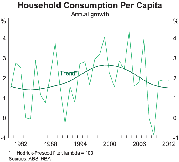
The first graph is of growth in consumption per capita (Graph 1). If the volatility in the data is smoothed out, you can see that the period from the mid 1990s to the mid 2000s was an unusual one. Consumption growth per person was consistently strong; it was faster than over the preceding years and faster than over recent years. This is true for both retail trade and for the consumption of services.
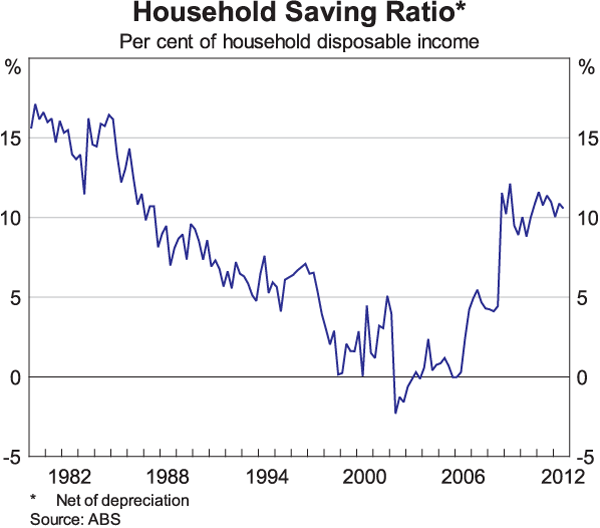
The second graph is really a corollary of the first and is of the household saving rate (Graph 2). From the mid 1980s up until the mid 2000s, the saving rate was on a downward trend. Put differently, growth in consumption was consistently faster than growth in income. For part of this period we spent every extra dollar we earned, and then a bit more. This could hardly be said to be normal, or sustainable. More recently, the saving rate has increased and it is back to the level it was in the mid 1980s.
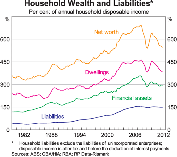
The third graph shows household debt and household wealth relative to household disposable income (Graph 3). Here, the story is similar. From around the mid 1990s to the mid 2000s, the value of both our assets and our liabilities grew much more quickly than our incomes. But because the value of our assets increased at a faster rate than the value of our liabilities, there was a large increase in measures of household net wealth relative to income. Again, such a large adjustment is unusual. In recent times, the steady rise in the various ratios has stopped and they are now roughly back to where they were a decade ago.
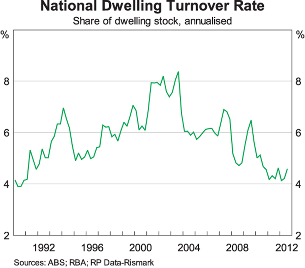
The fourth graph is of the share of the dwelling stock that is sold each year (Graph 4). During the latter part of the 1990s and the first part of the 2000s, turnover in the property market was much higher than average. More than ever before, we moved houses or bought and traded second properties, either as an investment or as a holiday property. The high rate of turnover boosted many parts of the economy, including the real estate sector and parts of the retail sector. It also boosted state government finances due to higher stamp duty revenue. Over the past few years, turnover has declined and has been around half the rate that it was in the early 2000s.
The fifth graph is of the share of the working-age population that has a job (Graph 5). Again over the period from the mid 1990s to the mid 2000s, employment consistently grew much more quickly than the working-age population. While this partly reflects a rise in labour market participation by females, this type of experience, sustained over a long period, is unusual. And, as in some of the other graphs, we see a levelling out in this ratio over recent years.

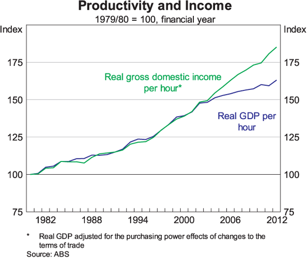
Finally, the sixth graph shows the increase in our living standards – measured by the rise in real income per hour worked – together with the increase in productivity (Graph 6). Something rather unusual has happened here too, although the timing is a little different from that in the previous graphs. Over the past decade there was a decoupling of the link between advances in our living standards and growth in productivity, with living standards increasing more quickly than productivity. We found ourselves in this favourable situation because of the very material rise in Australia's terms of trade that occurred over this period.
The developments in these six graphs have their roots in a number of influences. The first is financial liberalisation and the return to low interest rates in the 1990s after the high inflation of the 1970s and 1980s. And the second is the large increase in Australia's terms of trade, due to strong growth in Asia, and China in particular.[2] The strong productivity growth in the 1990s and the recovery from the early 1990s recession also played some role.
Importantly, financial liberalisation and lower nominal interest rates gave households increased access to debt, with many households taking advantage of this. This pushed up the price of housing, and some households used their increased equity to fund higher consumption. Financial liberalisation and rising house prices were also associated with the greater turnover in the property market. Financial institutions were among those that benefited from this, with rapid balance sheet growth and unusually low levels of problem loans. Collectively, these developments also helped generate strong employment growth. This boosted fiscal revenues, as did the large increase in the terms of trade, and this boost to revenues made possible frequent cuts in personal income tax rates.
The process of adjustment to financial liberalisation and lower interest rates took a long time to play out – at least a decade and probably longer. This long period of adjustment made it more difficult to determine what was normal. If something happens year after year, there is a tendency to think it can continue to happen and some people start to make their plans accordingly. However, when the adjustment is finally complete there can be a period of disappointment when previous trends do not continue. At least with hindsight, the response to financial liberalisation and lower interest rates looks to have run its course around the mid 2000s. At the time we largely avoided a sense of disappointment because of the second influence I mentioned earlier – that is, the large run-up in the terms of trade that was then starting to take place.
One concrete example of how the past influences the interpretation of current developments is our interpretation of the behaviour of consumers. In particular, it has become commonplace to talk about the ‘cautious’ consumer, and I myself have done this frequently, including when I last spoke at this dinner. But increasingly, I wonder whether or not this is the best description.
Certainly, using these earlier years as our benchmark, consumers do look to be cautious; consumption growth is slower than it was previously; the saving rate is higher; and credit growth is lower. But are these earlier years the most suitable benchmark? I suspect they are not. Over the past couple of years, consumption has been growing broadly in line with income. That does not look to be particularly cautious, although it is different. Growth in household borrowing has also been broadly in line with household income. Again, this does not look to be particularly cautious, but it is different. It may be more appropriate to describe this type of behaviour as ‘prudent’, rather than ‘cautious’. Indeed, it might be described as ‘normal’.
The general point here is that there is a recalibration going on regarding what is considered normal. Having consumption, credit and asset prices grow broadly in line with incomes should probably be viewed as usual, typical or expected. So too should the rate of increase in our living standards being determined by productivity growth.
I want to make it clear that I am not saying that we have to accept inferior economic outcomes from those that we have had on average over the past 20 years. Indeed, Australia is very well placed to continue to benefit from the growth of Asia and we have many advantages, including our skilled workforce. But, on the financial side, we are unlikely to repeat this previous experience, and nor should we aspire to. There was an adjustment to take place and that adjustment has occurred. Whether we can take advantage of the opportunities that lie ahead and continue to enjoy the rate of increase in our living standards that we have become used to depends upon productivity growth. The contribution the Reserve Bank can make here is to maintain low and stable inflation and to keep the economy on an even keel. Beyond that, it is in the hands of businesses, workers and governments to deliver the type of changes that will drive the next round of productivity improvements. As a number of people have noted recently, this needs to be high on our national agenda.
Monetary Policy
I would now like to talk about the concept of normal as it applies to four issues related to monetary policy.
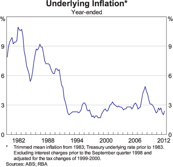
The first of these is inflation. The key point here is that low inflation has become normal in Australia (Graph 7). Most consumers and businesses now view it as usual, typical or expected that inflation will average 2 point something over time. Australians, and those doing business here, can make their investment and spending decisions without having to worry about the possibility of rapid and unexpected increases in the general level of prices. This is quite different from the 1970s and 1980s. It is perhaps the most important benefit of the medium-term inflation target that has been in place in Australia for the past two decades.
The second issue is one where the news is not so good, particularly for many in this audience. The unfortunate reality is that in the area of forecasting it is normal for forecasts of economic activity to be wide of the mark. This is evident in work recently undertaken by two of my colleagues at the RBA who looked at the history of our own forecasts.[3] They conclude that ‘the RBA forecasts explain very little of the variations in GDP growth, medium-term changes in unemployment, or the medium-term deviations of underlying inflation from the target’. This conclusion is obviously challenging for those of us involved in the forecasting process!
The reason I raise this issue is that we are very cognisant of the limits of forecasting, and that it is normal for outcomes to vary materially from what was expected. Outcomes often deviate from what was considered usual, typical or expected as global events occur and the structure of the economy changes. This means, as Glenn Stevens said in a speech to this audience last year, that monetary policy decisions should not be rigidly and mechanically linked to forecasts.[4] Of course, this does not imply that the process of forecasting is unimportant. This process forces questions to be asked and issues to be analysed, and is a central part of good monetary policy. But because it is commonplace for there to be fairly high levels of uncertainty around the point forecasts, there is also an important role for judgement by policymakers.
The third issue that I would like to touch on is the normal level of interest rates.
For much of the decade or so before the financial crisis it was normal for headline mortgage rates to move in near lock step with the cash rate. This has obviously changed over recent years, as bank funding costs – and hence mortgage rates – have risen relative to the cash rate. As we have noted many times, the Board of the RBA has taken account of this in its monthly policy decisions. As a result, the cash rate today is around 1½ percentage points lower than it otherwise would have been. The fact that the Bank has offset the effect of higher funding costs on lending rates means that the normal level of the cash rate is lower than it otherwise would have been. A 3 per cent cash rate today is not the same as a 3 per cent cash rate in the past.
A more difficult issue to assess is the normal level of lending rates, as opposed to the normal level of the cash rate. It is difficult to be definitive here, but there are a couple of reasons why the normal level of lending rates may be lower, at least for a time, than was the case over the past two decades.
The first reason is the international environment. As I talked about in another speech recently, many of the countries that avoided the financial crisis are experiencing uncomfortably high exchange rates and low interest rates.[5] Australia is one of these. With the major economies of the world quite weak, most other countries would see themselves as benefiting from a lower exchange rate to boost their exports. But, of course, given that exchange rates are relative prices, not every country can simultaneously have a lower exchange rate. It should not really come as a surprise that countries that are in relatively good shape and have not seen large-scale expansion of the central bank balance sheet are experiencing stronger currencies than those that are in relatively poor shape. This is one of the mechanisms through which the weak conditions in most of the advanced economies are transmitted to the rest of the world. And in response to this, interest rates are lower than they otherwise would be to offset some of the effects of an uncomfortably high exchange rate.
The second factor that might have an influence on the normal level of lending rates is related to the issues that I spoke about at the outset. For most of the past 20 years we were benefiting from either the credit boom or the terms of trade boom. Under the influence of these two factors, one might expect, all else constant, higher average lending rates than otherwise, as both factors boost aggregate demand relative to supply at least for a period. Another way of thinking about this is that in the earlier period there was an increase in the rate of time discount and correspondingly an increase in the normal level of interest rates. Although the high terms of trade are still boosting aggregate demand, the aftermath of the credit boom and the gradual realisation that this experience is unlikely to be repeated is working in the other direction. All else constant, this might be expected to lead to lower average lending rates than during the earlier period.
Of course, all else is not constant, including the amount of spare capacity in the economy, the nature of capital flows and the rate of productivity growth. But it is possible that normal lending rates will be somewhat lower for a period owing to the combination of global factors and the legacy of the credit boom. Whether or not this turns out to be the case depends upon a whole range of factors, including how cost and price pressures in the economy evolve.
This brings me to the fourth and final issue. And that is whether we are seeing a normal response of the economy to the reductions in interest rates that have occurred over the past year or so.
Assessments in this area are difficult, not just because there is a very wide range of historical experience, but also because of the challenge of determining what is the normal level of lending rates. However, the current response, across a large number of indicators, is falling within the range of outcomes that we have seen in the past. There do appear though, to be some differences in the behaviour of the household and the business indicators. In particular, while a number of household indicators have picked up somewhat, business confidence and conditions have not. This difference will obviously bear close watching over the period ahead. One other area where the response has been smaller than typical is the exchange rate, which has remained high. The more important conclusion, though, is that monetary policy still looks like it is working. There are lags and different parts of the economy respond differently, but lower interest rates are still effective in providing a boost to the overall economy.
Conclusion
So to conclude, I wish you all the best of luck on your journey of discovery of what is normal; of what is usual, typical or expected. One difficulty that I suspect we all face is when we think we have found the answer, it seems to change again. Perhaps the one constant is that uncertainty is normal!
Thank you.
Endnotes
I would like to thank Jonathan Kearns for valuable assistance in the preparation of this talk. [*]
See <http://oxforddictionaries.com/>. [1]
The effect of the large increase in the terms of trade is discussed in more detail in Stevens G (2012), ‘Producing Prosperity’, RBA Bulletin, December, pp 81–88. [2]
See Tulip P and S Wallace (2012), ‘Estimates of Uncertainty around the RBA's Forecasts’, RBA Research Discussion Paper No 2012-07. [3]
See Stevens G (2011), ‘On the Use of Forecasts’, RBA Bulletin, December, pp 91–95. [4]
See Lowe P (2012), ‘Australia and the World’, RBA Bulletin, December, pp 97–102. [5]