Bulletin – June 2019 Finance The Australian Equity Market over the Past Century
- Download 576KB

Abstract
This article describes developments in the Australian equity market over the past century, drawing in part from a newly compiled historical dataset which begins in 1917. Over the past one hundred years, the market has increased in size relative to the economy, while its composition by industry also changed substantially. The data also provide new evidence that historical returns on Australian equities – and therefore the equity risk premium – are lower than previously thought.
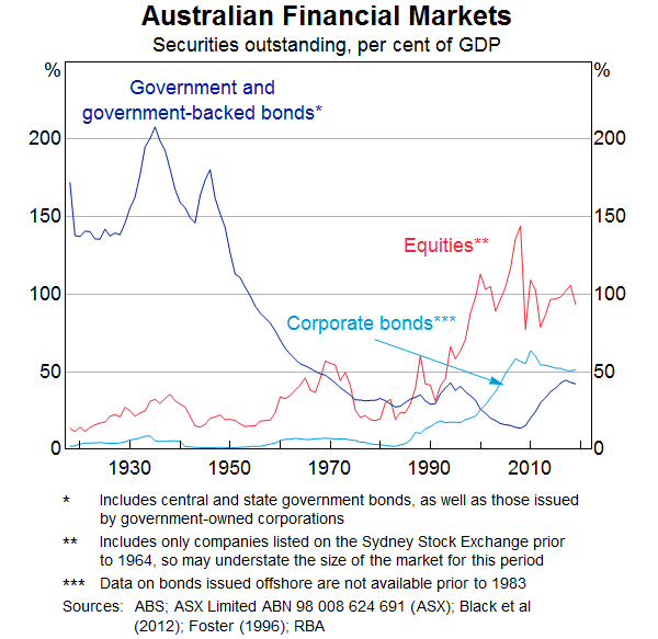
The equity market is one of Australia's most important and high profile financial markets. It is an important source of funding for Australian companies and a destination for a large share of households' retirement savings. The total capitalisation of listed companies in Australia at the end of 2018 was just under $2 trillion, or around 100 per cent of GDP (Graph 1). Around $5 billion in shares are traded every day. Most large, well-known companies in Australia, such as the major banks and resources firms, are listed on the Australian Securities Exchange. They account for a large share of Australian output and employment, meaning there is an important relationship between the market and real economic activity.
Historical data are important for placing equity market developments in context. An example is share price valuation metrics, such as price-to-earnings and price-to-book ratios. These are often compared to their own long-run averages by investors and market commentators to determine whether at a particular point in time they could be considered high or low. Alternatively, understanding how historical economic developments, such as mining booms or recessions, have affected the share market can help us interpret both how the market might react in future should similar events occur and the importance of current developments in light of historical experience.
Despite the importance of the equity market, historical data for Australia are somewhat limited. Many time series begin in the 1980s or 1990s, a period during which, among other things, interest rates were very high relative to historical averages and the financial sector was expanding rapidly. This might affect their use as benchmarks for interpreting modern data. Additionally, several existing equity market time series do not extend far enough back to cover a period of economic recession, limiting our ability to interpret how they might react if one happened in the future. In contrast, in countries where comprehensive data do exist, long-run comparisons can be informative. In the United States, for example, the Shiller price-to-earnings ratio (a measure of market valuation) in recent years reached levels comparable to the period just before the Great Depression. This led to some commentary that US equities were overvalued, or that there was excessive investor exuberance (Shiller 2017). Such comparisons are more difficult to make in the context of Australia primarily due to limited data.
Other data gaps have also made recent Australian developments difficult to place in historical context. For example, reliable data on the relative sizes of different sectors of the market mostly start in the 1990s or early 2000s (depending on the source). This period does not include the deregulation and expansion of the financial sector, the decline of the manufacturing sector, nor the late 1960s/early 1970s mining boom. Therefore, it has been difficult to say how remarkable more recent shifts – such as the most recent mining boom – have been in a historical context.
This article presents some extended time series on the Australian equity market, filling some of these data gaps by drawing from a newly compiled dataset on the equity market which begins in 1917. The data were constructed primarily from stock gazettes published by the Sydney Stock Exchange, one of the predecessors of the modern Australian Securities Exchange. They cover quarterly company-level data from 1917 on a range of variables of interest. Further discussion of the data collection process, and its limitations, can be found in the Research Discussion Paper Mathews (2019).
As with all datasets, particularly historical ones, some caveats should be made about interpretation. The data were largely hand-entered, and market reporting conventions have changed over time, which introduces the possibility of errors. Nonetheless, the data have been carefully collected and checked, and we judge them to be of sufficient quality for research purposes. The remainder of this article highlights some interesting findings based on this dataset.
Shareholder Returns
The average return on equities – particularly when compared with the return on other assets – is a useful statistic for retirement planning and portfolio allocation, as well as some regulatory purposes. Since equity markets are quite volatile, however, it is appropriate to look at realised returns over very long periods of time. The length of the new dataset allows us to calculate average returns on Australian stocks over the past 100 years, providing a more accurate representation of returns.
Share Prices
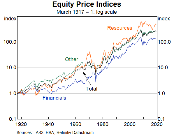
Australian share prices have increased by a geometric average of around 6 per cent per year over the past 100 years, or by around 2 per cent after accounting for inflation.[1] Over the long run the different industrial sectors have generally performed quite similarly, although there have been periods of over and underperformance (Graph 2). For instance, banking stocks underperformed for several decades following the Great Depression, while resources stocks outperformed the rest of the market in the late 1960s and then did quite poorly afterward, during the so-called ‘Poseidon Bubble’.[2]
Dividends: Payout ratios and yields
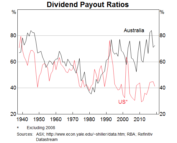
When measuring the returns on Australian equities, it is important to take dividend payments by companies into account. This is because dividends on Australian equities are higher than in many other countries due in part to their tax treatment (Bergmann 2016). This can be observed through changes in dividend payout ratios (the share of profits paid out as dividends in any given year). Before the introduction of franking credits (where shareholders receive a rebate for the tax already paid by the company on the profits being distributed as dividends) in 1987, Australian dividend payout ratios used to track those in the United States very closely (Graph 3). Since companies have to decide between using profits to pay dividends or invest in productive assets, the similarity in Australian and United States payout ratios before 1987 is likely to reflect broadly similar economic conditions. Following the introduction of franking credits, the ratios diverge; dividend payments in Australia have remained very high even as they have declined in the United States, likely reflecting their tax treatment here. In contrast, US companies have increasingly chosen to return capital to shareholders by buying back shares instead, which in Australia would not generally receive the same tax treatment as dividends.
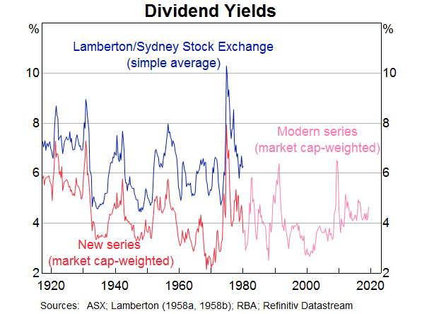
An arguably more important statistic from the point of view of an equity investor, however, is the dividend yield: the ratio of dividends per share to share price. This shows the return on investment generated by the payment of dividends, which accounts for around half of the total return on holding Australian equities over the past century (Kohler 2018).[3] Existing data on historical Australian dividend yields, originally published in Lamberton (1958a&b) (and continued by the Sydney Stock Exchange) tend to overstate the actual dividends shareholders would have received, particularly for the first half of the 20th century.[4] This is because, historically, they were calculated as a simple average of all companies' dividend yields, giving undue weight to smaller companies which tend to have higher dividend payout ratios. Hence, historical dividend yields based on this simple average tend to be higher than on a market capitalisation-weighted portfolio.[5] The Lamberton data also excluded companies paying zero dividends. The company-level data used here allow us to calculate a dividend yield based on a market capitalisation-weighted portfolio, to more accurately reflect the yield earned by a typical investor. The result is that dividends are about 200 basis points per year lower than implied by existing data. Nonetheless, the changes over time are very similar to those shown in the Lamberton data (Graph 4). The RBA series also lines up quite closely with modern data where they overlap.
Total return and the equity risk premium
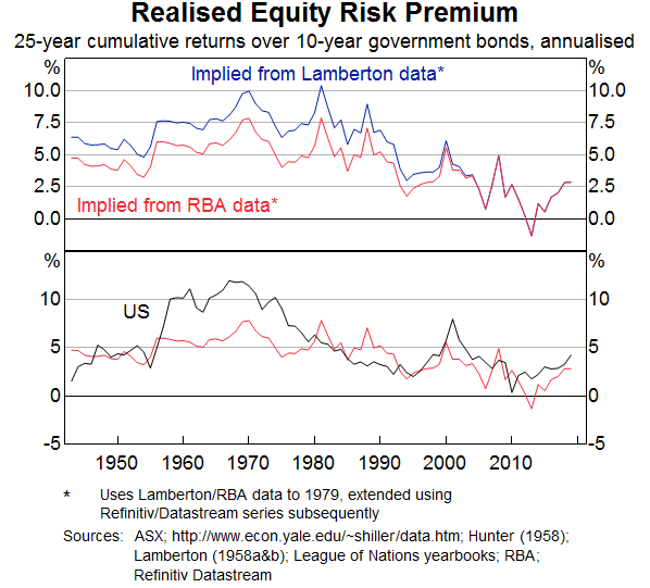
Using the updated dividends data, the new historical series (extended with available data for more recent time periods) imply that the total nominal return on equities (i.e. the sum of capital gains and dividends) has been around 10 per cent per year over the past 100 years (based on a geometric average which allows for compounding over time) (Table 1). In real terms – i.e. after accounting for inflation – the average annual return was about 6 per cent. There have not been material differences in returns across sectors over this time, although of course there have been periods in which sectors have performed differently. Over the same period, the total nominal return on long-term government bonds has been around 6 per cent, implying an average equity risk premium (excess return of equities over safe assets) of around 4 per cent.[6]
| Total market | 10.2 |
|---|---|
| – Resources | 10.2 |
| – Financials | 10.3 |
| – Other | 10.4 |
| 10-year government bonds | 6.2 |
| Consumer price inflation | 3.9 |
|
Sources: ABS; ASX; Foster (1996); Hunter (1958); Lamberton (1958a&b); League of Nations Yearbooks; RBA; Refinitiv Datastream |
|
Due to the lower dividend yields, this estimate of the equity risk premium is a bit lower than using the Lamberton data implies (Graph 5). It also suggests that the realised risk premium in Australia was materially lower than that in the United States for the period 1955–80, while similar at other times. It does bring historical estimates of the premium closer to more recent realised values in Australia, however.
Composition of the Listed Equities Market
The composition of the stock market – in terms of the types of companies listed – is very similar to its composition of 100 years ago. Financial corporations (particularly banks) and resources companies (particularly miners) account for about half of the market by market capitalisation, which was also true in 1917 (Graph 6). Indeed, it is often the very same companies (albeit following several mergers and acquisitions) that comprise most of the stock market. This reflects the historical importance of colonial-era banks and of mining companies founded during the resources booms of the 19th century. Nonetheless, the similarity in composition masks substantial changes that have taken place in the interim, due in part to changes in the structure of the Australian economy.
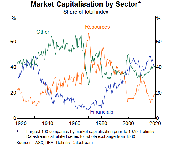
Resources
The resources sector, which includes mining and energy companies, is currently about 20 per cent of the stock market by market capitalisation. During the mining boom of the 2000s, it more than doubled in size (relative to the other sectors). However, the sector expanded much more rapidly during the mining boom of the late 1960s/early 1970s, where it reached a peak of over 65 per cent of the market.[7] Even so, mining has never accounted for more than 10 per cent of employment (Connolly and Lewis, 2010) or gross domestic product (ABS 2005) so it has always accounted for a larger share of the stock market than of the real economy.
Financials
Financial stocks were among the first traded in the Australian colonies in the 1800s, and by the early 20th century they still accounted for over a third of the stock market by market capitalisation. These companies were the predecessors of today's large banks (excluding Commonwealth Bank, which was set up by the government in 1911 and publicly owned until the 1990s). These banks underwent many mergers in the interim, which has reduced their number. The financial sector shrank substantially in relative terms in the mid 20th century, in substantial part owing to stricter regulation following the Great Depression. As a result, for most of the past 100 years, financial corporations were a much smaller part of the stock market than is the case now. As the role of the financial sector in the economy has expanded in recent decades, however, it has accounted for an increasingly large share of the stock market. The modern listed financial sector is also much more diversified than it was 100 years ago, as insurance companies and diversified financial corporations have grown in size relative to banks.
Other
The ‘other’ sector – everything except financials and resources – has historically been dominated by manufacturing, consumer goods and infrastructure companies. The sector reached its peak share of about 65 per cent of the index around 1960, but declined over the next two decades and has been around 40 per cent since then. The timing of these changes aligns fairly closely with the peak and decline of Australia's manufacturing sector relative to broader measures of economic activity (ABS 2005). Large manufacturing companies such as Tooth and Co. (a brewery) and British Tobacco had been either the second or third largest companies on the market (the largest being BHP) for around 20 years, ending in the 1950s. Moreover, before the 1960s large manufacturing conglomerates like Australian Consolidated Industries (glassware and plastics), ICI (chemicals) and Australasian Paper and Pulp were among the largest listed companies as well. The value of all of these companies declined in relative terms through the mid 1960s and 1970s, and many have since ceased trading or been acquired by other enterprises.
Consumer stocks have also historically made up a large share of the market. This reflects a high number of listed department stores in the early part of the century, but newspaper companies also featured prominently. Agricultural and forestry companies, which historically accounted for quite large shares of Australian output, have never been particularly important in the stock market. This may reflect the prevalence of small-to-medium enterprises (such as farms) which would not have been big enough to list publicly.
Infrastructure companies have also been prominent on the stock market since its inception but, over time, railway and steamship companies have mostly been replaced by those focusing on roads and airports. Shipping, in particular, was still a very large industry on the stock market at the start of the 20th century. This reflects its important role in the economy through the 1800s when the value of listed shipping companies rivalled that of the banks and miners. Companies like the Union Steam Ship Company of New Zealand (the ‘Southern Octopus’) and Sydney Ferries were among the largest companies on the market at various times and, at its peak, the Southern Octopus was the largest private sector employer in New Zealand. Shipping overall is only a minor share of the market now, although transport companies like Transurban, Qantas and Sydney Airport remain large and significant companies.
Valuations
Market participants and observers calculate equity price valuations for a range of reasons. For instance, for market participants, knowing when a company's share price is high or low relative to some metric (for example, compared with its realised profits) might be taken as a sign to buy or sell its stock.
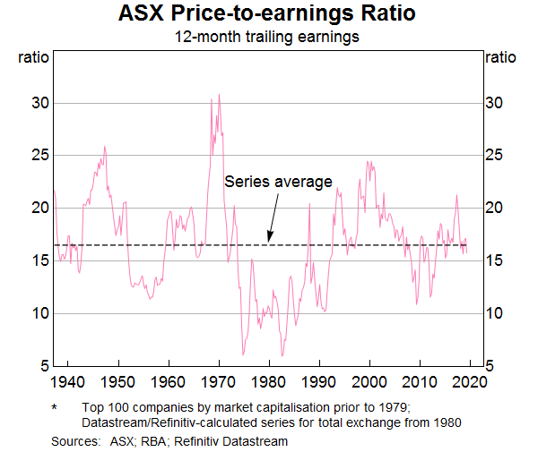
One simple measure of the valuation of equities is the price-to-earnings ratio. A share price should, in theory, be the discounted present value of expected future payments to shareholders. A price-to-earnings ratio above average implies that investors anticipate above-average growth in company earnings, or are discounting those earnings at a below-average rate, or both. For these reasons, the ratio is commonly used as a measure of investor optimism regarding the prospects of listed companies and their willingness to bear risk associated with investing in them. The new data suggest that in Australia, price-to-earnings ratios are very close to their long-run average (Graph 7). This is true for the index as a whole, and for the three main subsectors. This is quite striking, since price-to-earnings ratios overseas – particularly in the United States – have been above their long-run averages of late (when considered over this horizon).[8] And given that interest rates are quite low, we might expect price-to-earnings ratios to be above average all else being equal, since the present value of discounted future earnings will be higher with lower discount rates.
Conclusion
The Australian equity market has grown over the past century to be an important part of the financial system. Understanding it in historical context is important, and the new data presented here provide insight into a range of topics on the market and on listed companies more broadly. Readers with further interest are encouraged to read the Research Discussion Paper (Mathews, 2019) this article summarises, which covers many other topics over the same long-term perspective.
Footnotes
The author is from Domestic Markets Department. This article summarises a recently released Research Discussion Paper, and interested readers should refer to Mathews (2019) for further detail. Some of these data were also presented in Kohler (2018). [*]
This is calculated from an index which includes the top 100 companies by market capitalisation for 1917–1979, and for the total market from 1980. See Mathews (2019) for further information. [1]
See Simon (2003) for further discussion of this period. [2]
The other half is attributable to increases in share prices. [3]
The data referred to here are from Lamberton (1958), who calculated historical dividend yields and share prices on behalf of the Sydney Stock Exchange, and continued to produce measures using his methodologies for some years following. This is the most widely used dataset on historical equity prices in Australia. [4]
Brailsford, Handley and Maheswaran (2008) discuss this issue in depth, and some adjustments that can be made to existing data. [5]
Different choices such as the safe asset series (i.e. long-term bonds or short-term bills), the time period, and whether to use geometric or arithmetic averages, will affect the estimate of the premium. Mathews (2019) discusses some of these issues in further detail. [6]
Battellino (2010) discusses this mining boom – and others – in more depth. [7]
See Graph 9 in Kohler (2018). [8]
References
ABS (Australian Bureau of Statistics) (2005), ‘100 Years of Change in Australian Industry’, Year Book Australia, 2005, No 87, ABS Cat No 1301.0, Australian Bureau of Statistics, Canberra, pp 427–435.
Battellino R (2010), ‘Mining Booms and the Australian Economy’, Address given to The Sydney Institute, Sydney, 23 February.
Bergmann M (2016), ‘The Rise in Dividend Payments’, RBA Bulletin, March, pp 47–56.
Black S, J Kirkwood, A Rai and T Williams (2012), ‘A History of Australian Corporate Bonds’, RBA Research Discussion Paper No 2012-09.
Brailsford T, JC Handley and K Maheswaran (2008), ‘Re-Examination of the Historical Equity Risk Premium in Australia’, Accounting and Finance, 48(1), pp 73–97.
Connolly E and C Lewis (2010), ‘Structural Change in the Australian Economy’, RBA RBA Bulletin, September, pp 1–10.
Foster RA (1996), Australian Economic Statistics: 1949-50 to 1994-95, Occasional Paper No 8, rev 1997, Reserve Bank of Australia, Sydney.
Gizycki M and P Lowe (2000), ‘The Australian Financial System in the 1990s’, in D Gruen and S Shrestha (eds), The Australian Economy in the 1990s, Proceedings of a Conference, Reserve Bank of Australia, Sydney, pp 180–215.
Hunter JSH (1958), ‘Interest Rates in Australia, 1931-1956: Post-Mortem on an Era of Cheap Money’, Masters Thesis, The Australian National University.
Kohler M (2018), ‘The Long View on Australian Equities’, Speech at the 31st Australasian Finance and Banking Conference, Sydney, 13 December.
Lamberton DM (1958a), Security Prices and Yields 1875–1955, Pamphlet, Sydney Stock Exchange Research and Statistical Bureau, Sydney.
Lamberton DM (1958b), Share Price Indices in Australia: An Examination of the Measurement and Significance of Changes in Share Prices Together with New Indices for the Period July 1936–December 1957, Law Book Co. of Australasia Pty, Sydney.
Mathews T (2019), ‘A History of Australian Equities’, RBA Research Discussion Paper No 2019-04.
Shiller R (2017), ‘The Coming Bear Market?’, Project Syndicate site, 21 September. Available at <https://www.project-syndicate.org/commentary/us-stock-volatility-bear-market-by-robert-j--shiller-2017-09>.
Simon J (2003), ‘Three Australian Asset-Price Bubbles’, in A Richards and T Robinson (eds), Asset Prices and Monetary Policy, Proceedings of a Conference, Reserve Bank of Australia, Sydney, pp 8–41