Speech The Long View on Australian Equities

Marion Kohler[*]
Head of Domestic Markets Department
31st Australasian Finance and Banking Conference
Sydney –
Good morning and thank you for the opportunity to speak here. Today, I want to talk about long-term developments in the Australian equity market.
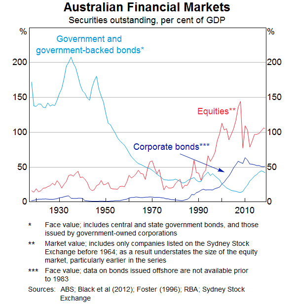
Equities are important for the Australian economy. Today, the equity market is one of Australia's largest financial markets. The total value of companies listed here is a bit under $2 trillion; as you can see in Graph 1 this is more than 100 per cent of GDP. This has not always been the case: the equity market has rapidly grown as a share of GDP over the past 20 years. Before the 1960s, the government bond market was by far the most important financial market in Australia.[1]
Equities are also an important part of Australians' retirement savings. While most people don't own shares directly, anyone with superannuation usually holds equities indirectly through their fund's investments. Payments from listed companies, in the form of dividends and share buybacks, were worth almost $100 billion dollars in the past twelve months. By way of comparison, this is equivalent to about 5 per cent of household income.[2]
Listed companies employ a substantial number of people and many of Australia's well-known companies are listed on the stock exchange. This doesn't mean that the performance of the stock exchange is the same thing as the performance of the economy. But by understanding developments affecting listed companies, we can gain timely insights into what's happening in the economy more broadly.
And, the Reserve Bank pays close attention to the equity market in particular because it is a transmission channel for monetary policy. When interest rates go down, share prices tend to increase, and this increases the wealth of households who hold those equities.[3] Higher share prices, in turn, make it relatively cheaper for companies to issue shares, allowing them to expand.
Today I would like to take a step back and look at the Australian equity market through a longer-term lens. I will focus on returns of equities and the composition of the equity market through time. I will conclude with some observations on price to earnings ratios. Many of the graphs and numbers in this presentation draw, in part, from historical datasets compiled by staff at the RBA. These data – like all historical data – should be interpreted with some caution. Nonetheless, we think that they are of a sufficient quality to provide some useful insights and we will soon make them more widely available to interested researchers.
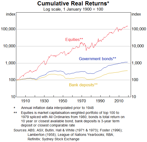
So how do the returns on equity investments compare to other financial assets in Australia? The return on equity includes gains from both share price changes (or ‘capital gains’) and dividends paid out. Graph 2 shows cumulative returns on financial assets from $100 invested in 1900, adjusted for inflation. Over the long run, equities have been worth much more to investors than other investment options: they have returned about 5 percentage points more than long-term bonds on average each year. This accumulates to a very large amount of money over a long period of time.[4] If you had put $100 into the equity market in 1900 in a portfolio that tracked the stock market index, you would have over $100,000 today after adjusting for inflation; this is more than 100 times what you would have earned from a Government bond or a bank deposit. Perhaps more relevant to our own investment decisions, if you had put $100 into the equity market when you were 20 years old, given average returns it would have been worth more than $1,000 when you retired at age 65. If you had invested it in government bonds, it would have been worth only a quarter of that.
But investing in the equity market comes with risk. The equity market is more volatile than many other markets: average volatility in the returns generated by equities in Graph 2 is double that of bonds. This means that at any point in time, investors get a return that can be very different from the average return. Developments such as the global financial crisis have emphasised this. In the middle of the financial crisis, share prices fell by around 50 per cent. If you had a superannuation portfolio based on equities, the value of your retirement funds would have declined significantly, and remained lower for quite some time. If you were in, or close to, retirement, you may have had to lock in some of these lower share prices. This emphasises the value of a diversified portfolio but also the importance of taking a longer-run view on the equity market.
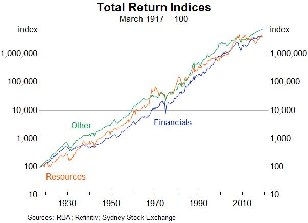
There are of course different sorts of companies on the stock exchange, and you might expect that they would provide different return profiles. This is true for some: companies like utilities, for example, generally have more bond-like properties (and so are quite correlated with bond prices). At the same time, returns in broader sectors have been remarkably similar over the past century. You can see this in Graph 3 which shows the cumulative returns on equities in three broad sectors over the past 100 years – the Reserve Bank often looks at the broad sectors resources, financials and ‘others’. Indeed, the average annual returns over that period across the three sectors have been within ½ percentage point of each other. Of course, resources stocks have been a bit more volatile, in part reflecting their exposure to volatile commodity prices.
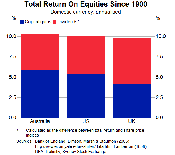
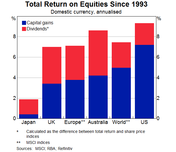
What about compared with overseas? Graph 4 shows the average annual returns on stocks in Australia, the United States and the United Kingdom since 1900. (The total return is the dividends – the red bars – and the capital gains – the blue bars – taken together.) At around 10 per cent, the average annual returns are very similar.[5] The pattern is not much different if you look at capital gains and dividends separately.
Over shorter periods there is more divergence, as you can see in Graph 5. In particular, over the past 25 years Australian stock prices have gone up a bit less than the rest of the world, particularly the United States, as you can see in the blue bars in Graph 5. But Australian companies pay high dividends, due in part to the specific tax treatment they receive; I am referring to franking credits, which were initially introduced in 1987.[6] Taking this into account, Australian stocks have generated above-average returns (the combined red and blue bars) over the past 25 years.
Let's have a closer look at the companies that make up the Australian securities exchange (or, abbreviated, the ASX). Graph 6 compares the concentration of the stock exchange for different countries. The bars show what share of the total market capitalisation is accounted for by the top 10 companies. On this metric, the ASX is quite concentrated in large companies, with the top 10 companies accounting for a bit less than half of the market capitalisation of the ASX.
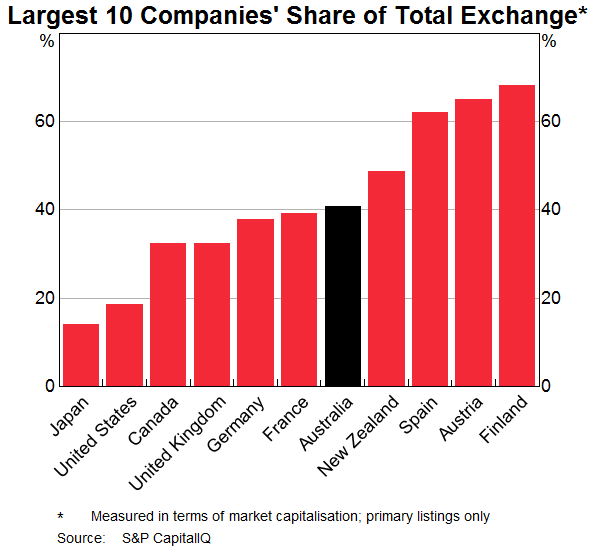
You will notice that the countries with the larger concentrations (on the right-hand side of the graph) tend to be smaller economies.[7] Among similar-sized exchanges, the level of concentration seen at the ASX is not unusual. It means, however, that an investor in a market capitalisation-weighted portfolio of equities is exposed to developments in a smaller set of companies.
This concentration has been a feature of the Australian stock exchange throughout its existence. In fact, it has been largely the same set of companies that have comprised most of the universe of Australian stocks over its history. Graph 7 tries to illustrate this point. The top panel takes all companies listed at the ASX (weighted by market capitalisation) and then distributes them according to the year the company (or its immediate predecessor) was founded. The purple section marks companies that are currently in the top 100 companies of the ASX. The bottom panel does the same aggregated across a number of developed economies. What stands out, is that for the ASX there are a lot of high purple bars on the left hand side of the panel, that is a lot of the top 100 companies are old and they are large in terms of market capitalisation. In fact, the average listed Australian company when weighted by market capitalisation is about 100 years old. This makes our listed companies, on average, substantially older than those in the United States or Japan (which make up a large share of the graph in the bottom panel). But it is comparable to the United Kingdom, France and Germany, although stock exchanges there existed several hundred years before ours.
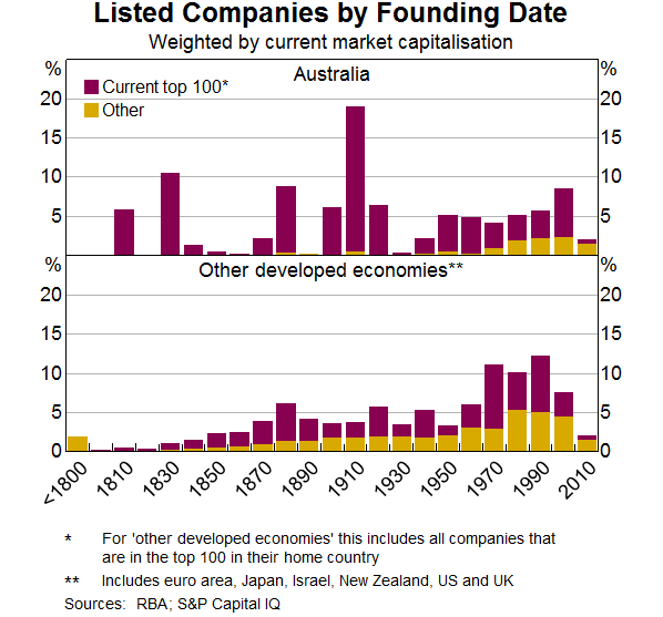
A striking number of large, still-existing Australian companies were founded in the 1800s, in many cases before the existence of stock exchanges in Australia. These are mostly the predecessors of the banks and mining companies, which have their origins in colonial banks and 19th century mining booms, respectively.[8] By contrast, very few large public Australian companies have been founded in the past 50 years (and many of the large listings, such as the Commonwealth Bank of Australia and Telstra, have been privatisations). In this respect, Australian markets are something of an outlier globally.
That said, the stock exchange has not been completely static over the past century, and there have been substantial compositional shifts at times. Graph 8 shows the ASX shares of the three large sectors – financials, resources and ‘others’ – through time.[9]
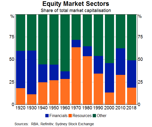
The resources sector (in orange) has tended to expand and contract with mining booms and commodity prices. During the mining boom of the 2000s, the share of the stock market capitalisation accounted for by resources companies doubled over a period of about five years: at their peak, resources companies made up about a third of the ASX 200. But this pales in comparison with the experience of the late 1960s boom, where the resources sector was worth at its peak in 1970 around 65 per cent of the exchange by market capitalisation.[10] Of course, resources booms tend to be followed by busts, and so the large share shrunk within a few years. On average, the resources sector has a larger weight on the stock exchange than it has in the real economy.[11] This could reflect that financing mines can be a speculative, risky investment; equity can be a more attractive way to finance such investment, allowing investors (with a matching risk appetite) to share in the potentially large upside without saddling the company with large debt repayment obligations if the resources discovery (and the associated revenue) disappoints.
The ASX is bank-heavy and the financial sector (in blue) more broadly makes up about a third of the exchange by market capitalisation: almost exactly the same share as it did 100 years ago. But, in fact, through most of the 20th century the sector was quite small, reflecting the regulation following the Great Depression, and only regaining its historical share in the 1980s and 1990s. The sector has also diversified quite a lot since its early days, with diversified financials and insurance companies accounting for a much larger share than they used to.
Other sectors (in green) have reflected changes in the industry composition of the Australian economy over the past 100 years. The rise and fall of manufacturing was reflected on the exchange, with manufacturers frequently featuring in the top 10 companies through the 1940s and 50s; most of these have since delisted. A company that ferried people across Sydney Harbour was in the top 50 companies on the exchange for decades, until its business model was disrupted by the construction of the Harbour Bridge. More generally in the transportation sector, ferries, steamships and railroads have largely been replaced by road infrastructure and air travel. On the other hand, some sectors played a significant role in the economy but not on the stock exchange. Agriculture, forestry and fishing is one example, which for the first half of the 20th Century accounted for up to 30 per cent of GDP, but has rarely featured in much size on the stock exchange.
More generally, the size of the equity market relative to GDP – one measure of capital market development – has fluctuated around about 100 per cent of GDP over the past two decades. This is broadly in line with the markets of other developed economies. Australian companies have continued to raise capital on the stock market, and the number of listed companies has continued to increase, albeit a bit more slowly of late. All this suggests that equities remain an important source of funds for Australian companies in a wide range of industries.
Finally, I would like to touch on valuations. In the global low-interest environment of recent years, some commentators (including the Reserve Bank) have raised the prospect that this has led to a ‘search for yield’ by global investors, where they bid up the price of risky assets and thus increase the risk of a sharp correction down the road. One simple way of measuring this for the equity market is a price-to-earnings ratio, shown here in Graph 9 for both Australia and the United States. By this measure, Australian equities are not showing signs of heightened valuations.
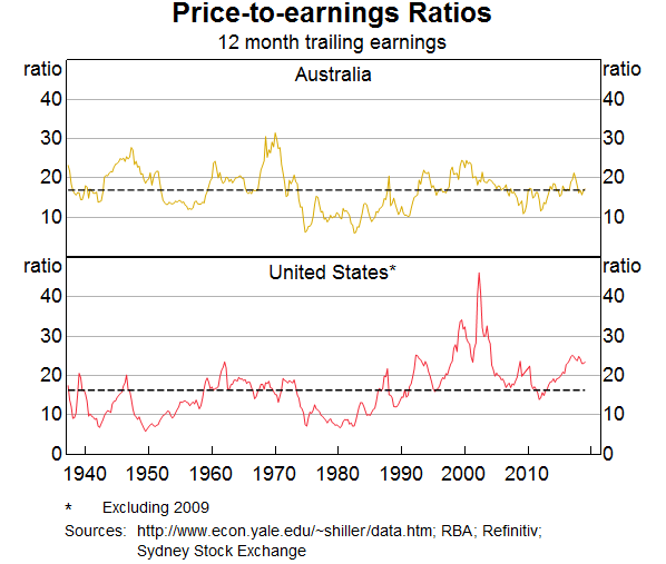
This graph also emphasises that, in the long run, share prices are driven by fundamentals, that is, company profits or ‘earnings’. The Australian share market will likely be dominated in the future by companies able to sustain profit growth over long periods of time, as it has been in the past. This may be the current large listed companies, many of whom have managed to play a role in Australia's listed equity market for a very long period of time, as I discussed. Or it may be others.
Some of the points I've discussed today are unlikely to change. The stock market will most likely remain both an important source of funds for Australian corporates, and an investment vehicle for Australian households and foreign investors. Equities will be more volatile than safer assets, but will very likely yield higher returns over the long term, and the composition of the market will continue to broadly reflect the structure of the real economy.
Thank you.
Endnotes
I want to thank Thomas Mathews for invaluable assistance in preparing these remarks, which also draw upon research he has undertaken. [*]
The data shown under government and government-backed bonds also includes bonds issued by government-owned corporations, which were mostly used to fund public works programs, see Black S, J Kirkwood, A Rai and T Williams (2012), ‘A history of Australian corporate bonds’, RBA Research Discussion Paper No 2012-09 for further information. Corporate bonds and equities include securities issued by domestic Australian companies (which includes all companies that have a listing at the Australian Securities Exchange). It is worth noting that Australian households own a significant amount of foreign equities, and a substantial share of securities issued by Australian companies are held by foreign residents and – in the case of the corporate bond market – issued offshore. [1]
Not all of these dividends and buybacks accrue to Australian households (directly or indirectly), since a significant share of Australian equities are owned by foreign residents. Similarly, Australian households accrue income from foreign equity holdings. [2]
Rigobon R and B Sack (2003), ‘Measuring the reaction of monetary policy to the stock market’, The Quarterly Journal of Economics, 118(2), pp 639–669. [3]
The difference between the returns on equities and bonds, and its relationship to volatility, is a topic of much discussion, see Mehra R and EC Prescott (1985), ‘The Equity Premium: A puzzle’, Journal of Monetary Economics, 15, pp 145–161. The exact difference of this equity premium depends on the time period and data source; see Brailsford T, JC Handley and K Maheswaran (2008), ‘A re-examination of the historical equity risk premium in Australia’, Accounting and Finance, 48(1), pp 73–97 for some Australian estimates. The 5 per cent quoted here is slightly lower than other estimates for Australia, due in part to the fact that the RBA dataset implies lower dividend payments in the first half of the 20th Century than do other sources. [4]
Real annual average returns since 1900 across the three economies were also quite similar, with average annual inflation rates for Australia, the United Kingdom and the United States at around 3¾, 4, and 3 per cent per annum, respectively. [5]
Bergmann M (2016), ‘The rise in dividend payments’, RBA Bulletin, March, pp 47–56. [6]
It is beyond the scope of this speech to analyse in depth why this is the case. One reason could be economies of scale. Smaller economies may need to concentrate production on fewer large companies than large economies, in order to achieve economies of scale. Also, in smaller economies, the small companies may not be large enough to make it economical to attract funding by listing on a stock exchange. [7]
Where a company is the result of the merger we use the date of the older predecessor operating in that country, where available. [8]
Two of Australia's large resources companies (BHP and Rio Tinto) have also had shares listed on overseas exchanges since 1995 (Rio Tinto) and 2001 (BHP), as a result of mergers with foreign companies; the weights here represent only the value of their Australian shares. [9]
Battellino R (2010), ‘Mining booms and the Australian economy’, Address to The Sydney Institute, Sydney, 23 February. [10]
Between 1900 and 2000, the mining sector accounted for an average of around 5 per cent of Australian gross domestic product, see Australian Bureau of Statistics (2005), ‘100 years of change in Australian industry’, available at <http://www.abs.gov.au/AUSSTATS/abs@.nsf/lookup/1301.0feature+article212005>, Year Book Australia, ABS Cat No 1301.0, January. [11]
Some data used in these charts are copyright 2018, S&P Global Market Intelligence (and its affiliates, as applicable).