Bulletin – March 2014 Australian Economy The Distribution of Household Spending in Australia
- Download the article 733KB
Abstract
This article uses household-level data to examine the distribution of spending and saving in Australia and how that has changed over time. The distribution of spending and saving is important as, among other things, it can affect the way that the household sector responds to economic shocks. The data indicate that households headed by older people have increased their share of total spending over the past two decades, reflecting both an ageing population and an increase in the average spending of older households compared with other households. The household survey data also indicate that spending is more equally distributed than income across households due to their ability to borrow and save. Moreover, consumption inequality has been little changed, despite an increase in income inequality over recent decades.
Introduction
Real per capita consumption and disposable income in Australia have both risen by an average of close to 2 per cent annually since the early 1980s. However, aggregate trends can mask important changes in the distribution of income and spending across households over time. Further, an examination of how spending and saving are distributed can be important to understanding the overall state of the economy. The sensitivity (or resilience) of the household sector to shocks can be affected by which households are saving and which are borrowing at a given time. For example, an unexpected increase in income will cause a relatively large increase in aggregate spending if the shock is concentrated among a segment of households whose spending is particularly sensitive to changes in income.
The ABS recently released new distributional data on household income and consumption for 2009/10.[1] For the first time, these data integrate household-level information – from the Household Expenditure Survey (HES) and the Survey of Income and Housing (SIH) – with aggregate data from the national accounts. This has produced data on the distribution of household income and consumption that are consistent with national accounts concepts and aggregates. This article uses the new survey data to document some facts about the distribution of household spending and income in Australia; earlier versions of the HES are also used to examine how the distribution has changed over time.[2]
The Distribution of Spending and Saving
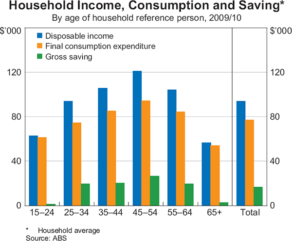
The distributional results from the new data are consistent with several well-established stylised facts about consumption (see Deaton (1992)). For instance, the data clearly show that (on average) income, consumption and saving each follow a hump-shaped pattern over the life cycle. All three peak for households with the reference person aged between 45 and 54 years – that is, in the prime of their working life (Graph 1).[3] Consumption, however, is more evenly distributed across age groups than income, reflecting the ability of households to smooth consumption over their lifetimes by borrowing and saving. This is broadly consistent with the life-cycle hypothesis of consumption, which states that young households tend to increase their consumption by borrowing against their future income, middle-aged households tend to save during their peak earning years and older households tend to run down savings they may have accumulated. The smoothness of consumption relative to income can also be explained in terms of the permanent income hypothesis, which postulates that consumers spend in line with their permanent level of income and borrow or save to offset temporary fluctuations to income, so that consumption varies by less than income.
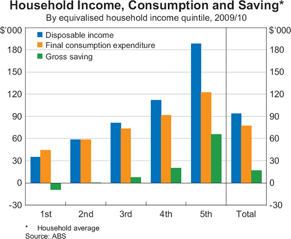
Looking at household consumption and saving across income groups, it is clear that both rise with income (Graph 2).[4] More notably, consumption rises by less than income, which implies that saving increases with income: in 2009/10, the highest income quintile accounted for 80 per cent of total saving, while the lowest income quintile were dis-savers – that is, they spent more than they earned, on average. Again, this suggests that these households are able to offset temporary shocks to their income by borrowing and saving, at least partially.
Total consumption expenditure of households can also be disaggregated into different categories of goods and services. It is then possible to examine how these components of spending vary with household characteristics, such as age and income.
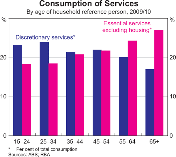
Older households tend to allocate a smaller proportion of their spending to durable goods than do younger households, perhaps because they have already accumulated such goods over their lifetime.[5] On the other hand, older households tend to spend proportionately more on essential services, such as health care, than younger households. In contrast, younger households spend proportionately more on discretionary services such as travel, hotels and restaurants, and recreational services (Graph 3).[6]
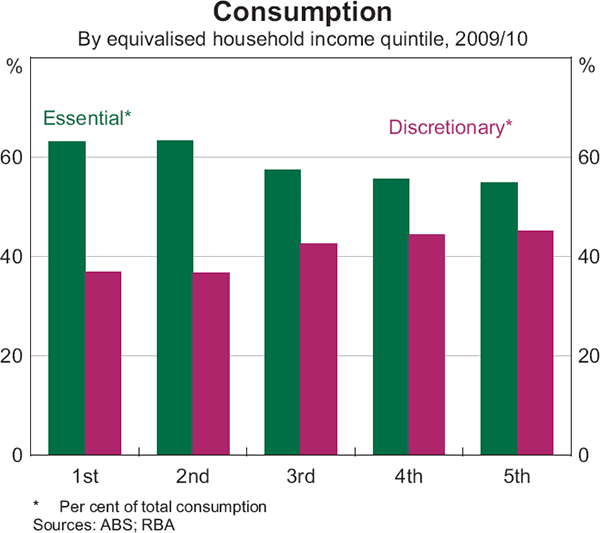
Looking at the breakdown of spending across income quintiles, the share of consumption allocated to necessities tends to decrease with income, while the share spent on discretionary items tends to increase with income, as would be expected (Graph 4).[7] In particular, compared with low-income households, high-income households tend to allocate a larger share of their spending to discretionary services such as travel and recreation, as well as durable goods. In contrast, low-income households tend to allocate a larger share of spending to non-durable goods and rent.[8]
Long-term Trends in the Distribution of Household Spending
Concentrating first on the distribution of spending across different categories of goods and services, the most prominent trend over recent decades has been the reallocation of nominal spending away from goods (mostly durable) and towards services (mostly dwelling and other essential services, such as education). Between 1986 and 2013, household spending on goods decreased from around half to one-third of total spending, while the share spent on services increased from around half to two-thirds (Graph 5).
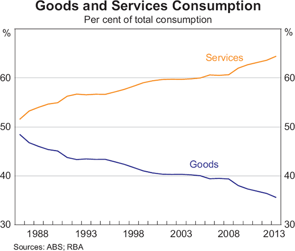
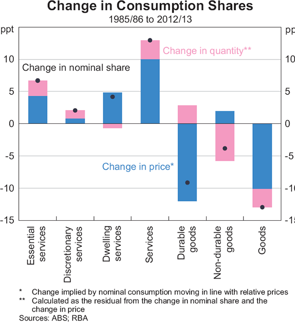
At the aggregate level, the rising share of nominal expenditure on services reflects a small rise in the volume of services consumed as a share of total consumption, and a larger rise in the relative price of services compared with that of goods (Graph 6).[9] The increase in the volume of services consumed has occurred despite an increase in relative price, suggesting that services are a ‘superior good’: as incomes rise, consumers spend a greater share of income on them (Jääskelä and Windsor 2011). Conversely, the relative price of goods has fallen substantially over the past few decades, driven by a sharp decline in the relative price of durable goods. Consistent with this, as a share of total consumption, the volume of durable goods consumed has increased, while that of non-durable goods has fallen substantially. The household-level data indicate that these aggregate trends have been broad based across household types, although there is some evidence that the largest reallocation of spending away from goods and towards services has occurred for households in the top income quintile. These trends are common to many advanced economies: as households grow richer they tend to spend proportionately less on items such as food (a non-durable good) and proportionately more on services.
Turning to the distribution of spending across different household types, the data suggest that, on average, older households spend less than other households. For example, in 2009/10 households headed by a person aged 55 years and above consumed goods and services to the value of $57,000 on average, compared with $67,000 for all households, a ratio of around 85 per cent. But, over the past two decades, households headed by persons aged 55 years and above have comprised an increasing share of aggregate consumption, while younger and middle-aged households' share of total consumption has declined (Graph 7, left-hand panel).
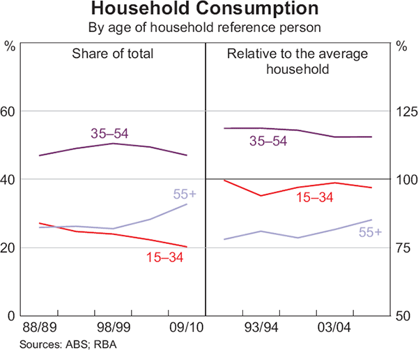
These trends have reflected two key developments. First, the share of older households (those aged 55 years and above) in the overall population has risen while the share of younger households (those aged 34 and below) has fallen. Second, older households now spend more, compared with the average household, than older households did two decades ago (Graph 7, right-hand panel). Conversely, both younger and middle-aged households now spend slightly less, compared with the average household, than was the case 20 years ago.
The increase in the importance of older households – who tend to spend less on goods and more on services than other households – has contributed to the aggregate shift in consumption away from goods and towards services, although the size of this effect has been small.
Increasing expenditure by older households has been facilitated by more recent cohorts of older households having higher disposable income and wealth compared with earlier cohorts. Indeed, the disposable income of older households has risen over the past two decades compared with that of the average household, while the disposable income of the youngest households (those headed by persons aged 15 to 24 years) has fallen compared with the average household; among other things, these trends reflect increases in the real value of the aged pension and the growing importance of superannuation and later retirement for older households (Grenville, Pobke and Rogers 2013).[10]
In contrast, the distribution of consumption across income groups has remained fairly stable. This suggests that consumption inequality has also been quite stable over recent decades, a phenomenon which is discussed in more detail in the next section.
Consumption and Income Inequality
The HES data can also be used to measure economic inequality across households. Recent studies on inequality in Australia have largely focused on income inequality (see, for example, Leigh (2013), Fletcher and Guttmann (2013) and Grenville et al (2013)).[11] There are several reasons why it is useful to examine consumption inequality. First, some economists consider consumption to be a more appropriate measure of household wellbeing than income (see, for example, Slesnick (1998)). If some households smooth temporary fluctuations in income by borrowing and saving, then income will be more variable than expenditure at a point in time and hence income will overstate the level of inequality in household welfare. Second, estimates of inequality based on consumption can be a useful cross-check if income estimates are relatively more affected by measurement error.[12] Third, examining changes in the distribution of consumption relative to income can shed light on household saving and borrowing patterns.
While consumption is typically considered to be a better guide to living standards than current income, it is still not a complete measure of household wellbeing. For example, the consumption estimates based on the HES data do not include measures of consumption of public goods (e.g. recreational facilities), social transfers in kind (e.g. government-funded goods and services such as public health care and education) or goods produced within the home. Past studies have typically found that including these factors lowers estimates of economic inequality, on average (Barrett et al 1999a).
The most common measure of inequality is the Gini coefficient, which is derived from the Lorenz curve. The Lorenz curve shows the share of spending (or income) by households ranked by spending (or income); the further the curve is below the 45 degree line, the less equal the distribution. Correspondingly, the Gini coefficient is calculated as the area between the Lorenz curve and the 45 degree line divided by the total area under the 45 degree line. The Gini coefficient ranges from zero to one, where zero represents perfect equality and one represents complete inequality.
Based on the 2009/10 HES, the Lorenz curve for gross income indicates that the top 20 per cent of households earned approximately 43 per cent of total household income (Graph 8). In contrast, the bottom 20 per cent of households earned about 8 per cent of total income. However, the Australian tax system reduces income inequality to some extent by redistributing income from rich households to poor households through government taxes and transfers. As a result, in 2009/10 the Gini coefficient for disposable income (0.30) was lower than that of gross income (0.34).[13]
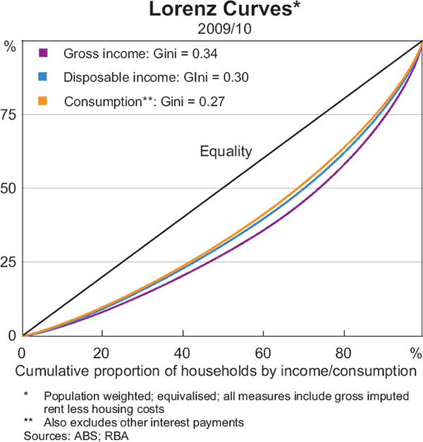
In addition, the Gini coefficient for consumption (0.27) was lower than that of disposable income (0.30), suggesting that economic inequality is further reduced by the ability of households to borrow and save to offset temporary changes in income. The Lorenz curve for consumption indicates that the highest-spending households (in the top 20 per cent) accounted for approximately 37 per cent of total spending in the economy. In contrast, the lowest-spending households (in the bottom 20 per cent) accounted for about 10 per cent of total spending.
Using this framework, and the various household expenditure surveys that are available, it is possible to examine how inequality in both spending and income has evolved over recent decades. Based on the Gini coefficient, gross income inequality has risen over the past quarter of a century (Graph 9).[14] The rise in income inequality has largely reflected an increase in non-wage income inequality and, in particular, capital income; wage income inequality has been little changed over recent decades.[15]
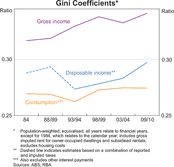
Disposable income inequality, based on the HES estimates, fell from the 1980s to the early 1990s and has been gradually rising since then. However, the disposable income inequality estimates for the 1980s should be treated with caution. The tax data for the 1984 and 1988/89 surveys are calculated based on a combination of actual reported taxes and imputations, but the tax data for the later surveys are entirely imputed. This complicates comparisons of inequality in disposable income before and after the early 1990s (Barrett, Crossley and Worswick 1999b).
Regardless, the HES estimates indicate that consumption inequality has been consistently lower than both gross and disposable income inequality. The increase in consumption inequality has also been less pronounced than the increase in income inequality over the past few decades. One interpretation for the differing trends is that some of the increase in income inequality has been due to an increase in transitory income shocks, which households have been able to smooth through borrowing and saving (Barrett et al 1999a).
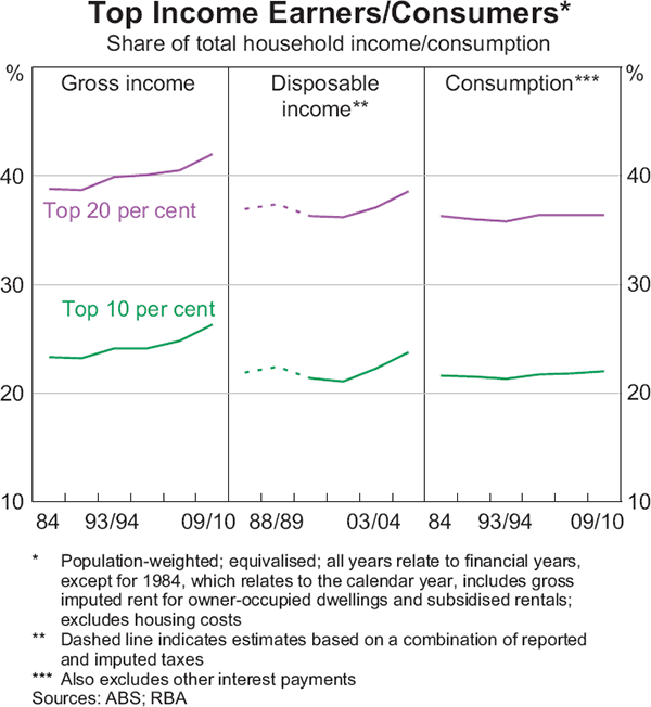
The Gini coefficient is a useful indicator for summarising distributions. However, it does not identify which parts of the distribution are responsible for any changes over time. An alternative approach to examining the distributions of consumption and income is to look at how much of aggregate household income is earned by the high-income households and, similarly, how much of aggregate household consumption is accounted for by the high-spending households. For instance, based on the gross income estimates, the top 20 per cent of income earners accounted for about 39 per cent of aggregate household income in 1984 and about 43 per cent in 2009/10 (Graph 10). The share of aggregate household disposable income earned by the top income earners also increased between 1984 and 2009/10 but to a lesser extent. This is consistent with the rise in income inequality based on the Gini coefficient. In contrast, the top 20 per cent of spenders accounted for about 37 per cent of aggregate consumption in both 1984 and 2009/10. This is again consistent with consumption inequality being little changed over the past few decades.
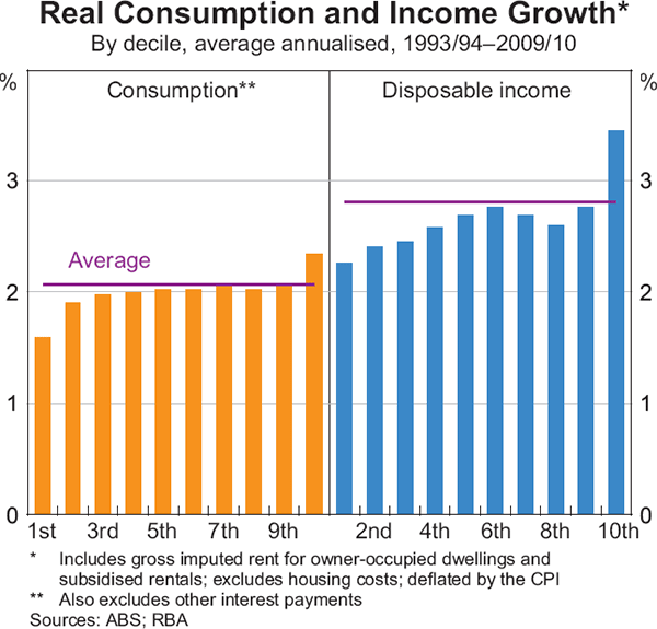
Another approach is to break down the distributions of consumption and income into separate deciles, and then examine the relative growth in consumption and income across each decile. Based on this, the top 10 per cent of earners have experienced a relatively large increase in real disposable income over recent decades (Graph 11, right-hand panel). This is consistent with the increase in income inequality based on the Gini coefficient. The top 10 per cent of spenders have experienced slightly faster growth in real consumption than other households over recent decades, though the difference in growth is less pronounced than in the case of income (Graph 11, left-hand panel). Taken together, the changes in both the distribution of consumption and income indicate that the highest-earning households increased their saving relative to all other households. This, in turn, is consistent with income inequality rising by more than consumption inequality over the past quarter of a century.[16]
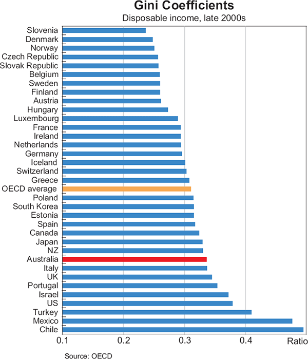
To put these results in context, it is useful to compare the estimates of inequality in Australia with corresponding estimates for other countries. The Organisation for Economic Co-operation and Development (OECD) has recently produced estimates of income inequality that allow for comparisons across countries. According to the estimates in OECD (2013), inequality in Australia is relatively high by international standards, and on a par with New Zealand and the United Kingdom, but lower than in the United States (Graph 12). Moreover, compared with the OECD average, Australia appears to have experienced an increase in income inequality over recent decades.
However, it is more difficult to find comparable estimates of consumption inequality for other developed economies. The academic literature suggests that, as in the case of Australia, consumption inequality is typically lower and more stable over time than income inequality.[17] However, most of these studies exclude durable goods from the consumption estimates, which typically results in a more equal distribution and may also affect the measured trends in consumption inequality.[18]
Conclusion
Household-level survey data indicate that older households have increased their share of total spending, due to both an ageing population and an increase in the average spending of older households compared with other households. There has also been a shift in real spending towards services and away from goods at the aggregate level, which has been accompanied by a rise in the relative price of services. The household survey data indicate that spending is more equally distributed than income, and that consumption inequality has been broadly unchanged despite an increase in income inequality over recent decades.
Footnotes
The authors are from Economic Group; they would like to thank Emily Gitelman for help with some of the analysis contained in this article. [*]
See ABS (2013) for details. [1]
In line with this, in the next section ‘spending’ and ‘consumption’ are defined as in the national accounts and include a number of items provided to households that are government funded, such as public education and health care; the subsequent two sections for the most part exclude such items (but include imputed rent). Imputed rent captures the implicit benefit an owner-occupier receives from owning his or her own home. Throughout this article, imputed rent is determined using the methodology outlined in ABS (2008) for each household survey. [2]
The household reference person (or household head) is the member of the household most likely to make economic decisions. Income is gross disposable income and includes earned income such as wages, salaries and the profits of small businesses, rental income (actual and imputed), and transfers such as social assistance benefits; it deducts taxes, interest payments and net non-life insurance premiums. [3]
Households are grouped by equivalised household disposable income, which is household disposable income adjusted for household size and composition. The aim of this adjustment is to produce an income estimate that more accurately reflects household wellbeing. For example, a given amount of household income shared among two people will enable a higher standard of living than the same income shared among four people. [4]
Durable goods include clothing and footwear, furnishings and household equipment, motor vehicles, computers and audio visual equipment, other durable recreational items and equipment (such as sports and camping equipment), and books. [5]
Essential services include the following spending categories from ABS (2013): healthcare services; water and sewerage services; electricity, gas and other fuel; communication services; education; insurance and other financial services. Discretionary services include recreational and cultural services; spending at hotels, cafes and restaurants; transport services; and other goods and services. Due to data limitations, for some categories it is not possible to entirely separate spending on goods and services or essential and discretionary spending. In these cases, the spending category is classified as either essential or discretionary depending on which type of spending makes up the largest share of that category (e.g. for transport services, the majority of spending is on air travel, which is classed as discretionary). [6]
Essential consumption consists of spending on essential services plus spending on food, motor vehicle fuel, and actual and imputed rent. Discretionary consumption includes spending on discretionary services, cigarettes and tobacco, alcoholic beverages and durable goods. [7]
For example, there is a noticeable difference between essential spending on food and discretionary spending at hotels, cafes and restaurants for high- and low-income households. As a share of total expenditure, households in the lowest income quintile typically spend three times as much on food as on hotels, cafes and restaurants, while households in the highest income quintile spend similar amounts on both. [8]
The rise in the relative price of services mainly reflects an increase in the relative price of dwellings and other essential services such as education. [9]
A priori, compulsory superannuation need not lead to higher wealth and consumption in retirement if households offset their compulsory saving via superannuation with reduced saving elsewhere. However, households do not appear to have acted in this way, with compulsory superannuation indeed leading to increased household wealth (Connolly and Kohler 2004; Connolly 2007). [10]
Earlier Australian studies examined trends in expenditure inequality (Harding and Greenwell 2002) and non-durable consumption inequality (Barrett, Crossley and Worswick 1999a) in Australia through the 1980s and 1990s. Barrett, Donald and Bhattacharya (2014) provide some more recent estimates of non-durable consumption inequality. Overall though, Australian research in this area is limited relative to other developed countries. [11]
Wilkins (2013) discusses some of the issues in measuring income inequality in Australia. [12]
Disposable income refers to gross income after deducting personal income tax and the Medicare levy. [13]
Measures of income inequality based on income tax data also indicate that there has been a rise in inequality over recent decades (see, for example, Leigh (2013)). [14]
The fact that wage income inequality has been broadly unchanged over the past two decades reflects two offsetting effects (Grenville et al 2013). On the one hand, high-income households have benefited relatively more from rising hourly wages for full-time employees and an increase in the share of part-time employment (which have tended to increase inequality). On the other hand, low-income households have benefited relatively more from the reduction in the share of jobless households (which has tended to reduce inequality). [15]
As the time-series estimates of inequality are based on repeated cross-sections of the HES data, it is not possible to track specific households over time. As a result, the characteristics of the highest-income households in the early 1990s could be quite different to the characteristics of the highest-income households in the late 2000s, which complicates an analysis of the determinants of changes in inequality over time. See Dollman and La Cava (forthcoming) for more details. [16]
For more details on consumption inequality in developed countries, see the Review of Economic Dynamics special issue on Cross Sectional Facts for Macroeconomists, which includes studies for the United States (Heathcote, Perri and Violante 2010), Canada (Brzozowski et al 2010), the United Kingdom (Blundell and Etheridge 2010), Germany (Fuchs-Schuendeln, Krueger and Sommer 2010), Italy (Jappelli and Pistaferri 2010), Spain (Pijoan-Mas and Sanchez-Marcos 2010) and Sweden (Domeij and Floden 2010). [17]
The evidence for consumption inequality is more mixed in the United States, with some studies indicating that consumption inequality has been broadly unchanged (see, for example, Krueger and Perri (2005) and Meyer and Sullivan (2012)) while other studies suggest that it has risen in line with disposable income (see, for example, Aguiar and Bils (2011) and Attanasio, Hurst and Pistaferri (2012)). [18]
References
ABS (Australian Bureau of Statistics) (2008), ‘Experimental Estimates of Imputed Rent Australia’, ABS Cat No 6525.0, Canberra.
ABS (2013), ‘Information Paper: Australian National Accounts, Distribution of Household Income, Consumption and Wealth, 2009-10’, Cat No 5204.0.55.009, Canberra.
Aguiar AM and M Bils (2011), ‘Has Consumption Inequality Mirrored Income Inequality?’, NBER Working Paper No 16807.
Attanasio O, E Hurst and L Pistaferri (2012), ‘The Evolution of Income, Consumption, and Leisure Inequality in the US, 1980–2010’, NBER Working Paper No 17982.
Barrett GF, TF Crossley and C Worswick (1999a), ‘Consumption and Income Inequality in Australia’, Centre for Economic Policy Research, Australian National University, Discussion Paper No 404.
Barrett GF, TF Crossley and C Worswick (1999b), ‘Consumption Inequality in Australia’, Monitoring Economic Progress: Australia and the World, Academy of the Social Sciences 1999 Annual Symposium, pp 47–54.
Barrett GF, SG Donald and D Bhattacharya (2014), ‘Consistent Nonparametric Tests for Lorenz Dominance’, Journal of Business & Economic Statistics, 32(1), pp 1–13.
Blundell R and B Etheridge (2010), ‘Consumption, Income and Earnings Inequality in Britain’, Review of Economic Dynamics, 13(1), pp 76–102.
Brzozowski M, M Gervais, P Klein and M Suzuki (2010), ‘Consumption, Income, and Wealth Inequality in Canada’, Review of Economic Dynamics, 13(1), pp 52–75.
Connolly E and M Kohler (2004), ‘The Impact of Superannuation on Household Saving’, RBA Research Discussion Paper No 2004-01.
Connolly E (2007), ‘The Effect of the Australian Superannuation Guarantee on Household Saving Behaviour’, RBA Research Discussion Paper No 2007-08.
Deaton A (1992), Understanding Consumption, Oxford University Press, Oxford.
Dollman R and G La Cava (forthcoming), ‘Consumption Inequality in Australia’, RBA Research Discussion Paper.
Domeij D and M Floden (2010), ‘Inequality Trends in Sweden 1978–2004’, Review of Economic Dynamics, 13(1), pp 179–208.
Fletcher M and B Guttmann (2013), ‘Income Inequality in Australia’, Economic Roundup, 2, pp 35–54.
Fuchs-Schuendeln N, D Krueger and M Sommer (2010), ‘Inequality Trends for Germany in the Last Two Decades: A Tale of Two Countries’, Review of Economic Dynamics, 13(1), pp 103–132.
Greenville J, C Pobke and N Rogers (2013), ‘Trends in the Distribution of Income in Australia’, Productivity Commission Staff Working Paper, March.
Harding A and H Greenwell (2002), ‘Trends in Income and Consumption Inequality in Australia’, Paper presented at the 27th General Conference of the International Association for Research in Income and Wealth, 18–24 August.
Heathcote J, F Perri and GL Violante (2010), ‘Unequal We Stand: An Empirical Analysis of Economic Inequality in the United States, 1967–2006’, Review of Economic Dynamics, 13(1), pp 15–51.
Jääskelä J and C Windsor (2011), ‘Insights from the Household Expenditure Survey’, RBA Bulletin, December, pp 1–12.
Jappelli T, and L Pistaferri (2010), ‘Does Consumption Inequality Track Income Inequality in Italy?’, Review of Economic Dynamics, 13(1), pp 133–153.
Krueger D and F Perri (2005), ‘Does Income Inequality Lead to Consumption Inequality? Evidence and Theory’, Federal Reserve Bank of Minneapolis Research Department Staff Report No 363.
Leigh A (2013), Battlers and Billionaires: The Story of Inequality in Australia, Redback, Collingwood, NSW.
Meyer BD and JX Sullivan (2012), ‘Winning the War: Poverty from the Great Society to the Great Recession’, Brooking Papers on Economic Activity, Fall.
OECD (2013), ‘OECD Factbook 2013: Economic, Environmental and Social Statistics’. Available at <http://www.oecd-ilibrary.org/economics/oecd-factbook-2013_factbook-2013-en>.
Pijoan-Mas J and V Sanchez-Marcos (2010), ‘Spain is Different: Falling Trends of Inequality’, Review of Economic Dynamics, 13(1), pp 154–178.
Slesnick DT (1998), ‘Empirical Approaches to the Measurement of Welfare’, Journal of Economic Literature, December, 36, pp 2108–2165.
Wilkins R (2013), ‘Evaluating the Evidence on Income Inequality in Australia in the 2000s’, Melbourne Institute Working Paper Series, Working Paper No 26/13.