Speech Employment and Wages

Guy Debelle[*]
Deputy Governor
Australian Council of Social Service (ACOSS) National Conference 2019
Canberra –
Over much of the past three years, employment has grown at a healthy annual pace of 2½ per cent. This has been faster than we had expected, particularly so, given economic growth was slower than we had expected. Employment growth has also been faster than the working-age population has been growing. As a result, the share of the Australian population employed is around its all-time high, which is a good outcome. Normally, we would have expected this strong employment growth to lead to a decline in the unemployment rate. But the unemployment rate has turned out to be very close to what we had expected and has moved sideways around 5¼ per cent for some time now.
So what is going on here? Strong employment growth but little change in the unemployment rate means that the strength in labour demand has been met by strong growth in labour supply. This increase in labour supply has come from more people joining the labour force and from some of those with jobs putting off leaving the labour force. These trends have been particularly pronounced for females aged between 25 and 54 and older workers of both sexes.
The surprising strength in labour supply has been one of the factors that has contributed to wages growth being slower than we had expected. But at the same time, the lower growth in wages has probably contributed to the strength in employment growth. My undergraduate honours thesis at Adelaide Uni examined the aggregate labour demand curve in Australia which was a much debated topic at the time.[1] So more than 30 years on, I will discuss similar issues today.
I will look at the rise in participation rates of females and older workers and discuss some of the factors that have been contributing to it. I will also look briefly at what jobs have been created. In doing so, I will make use of the micro data in the monthly labour force survey (LFS) as well as micro data from the HILDA survey.[2] That is, we are examining the micro data to understand the macro trends in the labour market.
By and large, the new jobs created over the past few years have been representative of the existing stock of jobs. There have been low wage and high wage, lower skilled and higher skilled jobs created, but about average on both counts. The jobs growth has been in household services jobs such as health care, social assistance and, education, as well as in business services. Two-thirds of the employment growth over the past two years has been in full-time jobs.
Then I will look at wages growth and show that the lower average wage outcomes of the past few years have reflected the increased prevalence of wages growth in the 2s across the economy.
Finally, I will look forward and talk about the RBA's forecasts for the labour market. Two of the critical influences on that forecast are how much further labour supply will increase and how entrenched are wage outcomes.
Participation
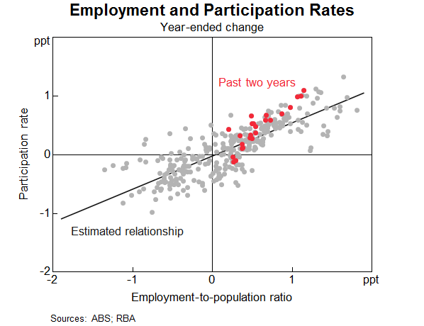
An increase in the number of people in employment can be met either by an increase in people entering from outside the labour market or a decline in unemployment. The increase in people coming from outside the labour force, causing an increase in the participation rate, is known as an ‘encouraged worker’ effect – when economic conditions improve, there is a tendency for people to enter or defer leaving the workforce.[3] Historically more of the increase in employment has translated into a reduction in the unemployment rate than by a rise in the participation rate.
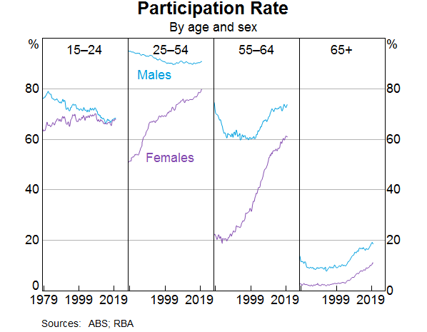
However, the past couple of years have been unusual. The increase in employment has been met disproportionately by an increase in the number of people participating in the labour force (Graph 1). The share of the population participating in the labour force is at a record high. The two main groups contributing to this rise in participation are females and older workers. I will discuss each of these in turn and some of the forces driving the outcomes over both the recent past and from a longer perspective. An understanding of these forces can help us assess how much further these trends are likely to continue.
Female participation
Female employment growth has accounted for two-thirds of employment growth over the past year. The female participation rate is now at its highest rate, and the gap between female and male participation is now the narrowest it has ever been (Graph 2).
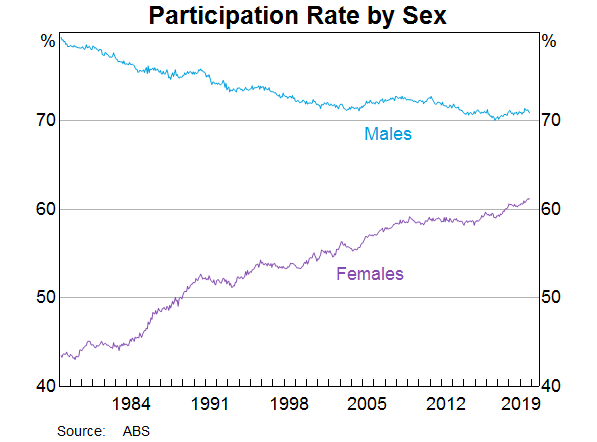
The female participation rate has steadily increased over recent decades (from 40 per cent in 1970 to 61 per cent in 2019), and a similar upward trend is evident across other advanced economies. Changing societal norms and rising educational attainment have contributed to more women moving into paid employment or employment outside the home. Female participation has also been influenced by the increasing flexibility of working-time arrangements, the availability and cost of child care and policies such as parental leave.
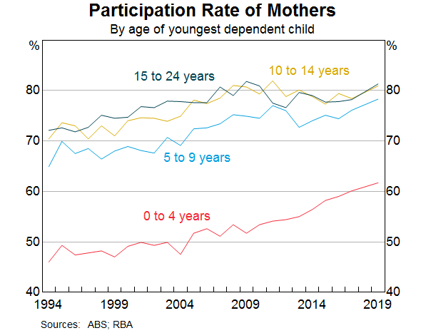
Nearly half of employed females work part time, often to care for children. Over recent decades, the participation rate of mothers with dependent children has trended higher, rising by 10 percentage points since the early 2000s to 73 per cent. Over the past decade, the rise in participation has been most pronounced for mothers with children aged between 0 and 4 (Graph 3). Of those returning to work within two years after the birth of a child, an increasing majority are citing ‘financial reasons’ as their main reason for doing so. Other mothers returning to work cite ‘social interaction’ or to ‘maintain career and skills’ as their main reason. Financial reasons could be capturing a number of different considerations including low income growth, the rise in household debt or child care costs.
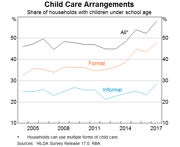
Research suggests the cost and quality of child care does have a significant effect on the labour supply of women.[4] Data from the HILDA survey show that the share of households using formal child care for young children has increased notably over the past decade (Graph 4). However, access to child care places and financial assistance with child care costs remain ‘very important’ incentives for females currently outside the labour force.
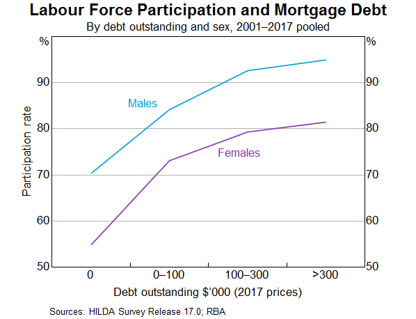
Another factor that is linked to higher rates of female participation over recent decades is the increase in the level of mortgage debt of home owners (Graph 5). The rise in debt levels has broadly coincided with the increase in the participation rate of females. However, it is difficult to establish which way causality is going. Are debt levels higher because more households have two incomes and can afford to borrow more? Or does the need to borrow more to afford housing drive the decision to participate more? Or is it the case that the low level of income growth in recent years has meant that households have more debt than they anticipated and need to work longer to pay it down? Research to establish causality has usually found some evidence of a causal relationship running from higher debt levels to higher participation.[5] However, the analysis indicates that the effects are not that large at an aggregate level.
The rollout of the National Disability Insurance Scheme (NDIS) may also have encouraged increased participation of female carers. We know from a detailed survey of NDIS participants and their families that parents of those with disabilities work fewer hours on average and are more likely to be in casual employment.[6] It is probably too early in the rollout of the scheme to see a material increase in the number of parents re-entering the labour market. The survey suggests there has been a slight increase in the average number of hours worked since the start of the scheme, but the percentage of families/carers of NDIS participants who wanted to work more hours has not changed.
Thus two significant drivers of the increase in participation rates of females aged between 25 and 54 over a long period of time are child care costs and other financial factors. The open question is how much more the participation rate of this group will rise.
Older workers
The share of the Australian population aged between 15 and 64 years has continued to decline, and is expected to continue to decline. This is due to the ongoing transition of baby boomers into retirement ages. All else being equal, an ageing population will result in a fall in the supply of labour, since the generation retiring is larger than the generation entering the workforce. But there has been a long-term trend for each cohort to participate more than previous cohorts did at the same age. That trend has accelerated recently, and more than offset the effect of ageing on its own. The share of 55 year olds and older that are employed is 35 per cent, compared to 22 per cent 20 years ago.
This cohort effect is particularly clear in the third panel of Graph 6. The much larger rise in female participation than males over the past two decades is a stark illustration of the effect, as the other drivers of participation in this age group should have similar influences on both male and female participation.
Why are older people working longer?[7] One contributing factor is improved health. People are working longer because they can, both because of their own health and also because the nature of work has changed over the years towards services and away from manual work, which means most people are in less physically demanding jobs.
It used to be the case that many older workers would have to choose between working full time and retiring. From a labour economics point of view, the labour/leisure trade-off has much more choice than it used to.[8] In the past, it was often an all or nothing decision. As the labour market has become more flexible over recent decades, older workers may be able to reduce their hours but still participate in the labour market. Indeed, around one-third of workers aged 55 years and older are working part time, with over half doing so because they prefer to do so. The ABS Retirement and Retirement Intentions survey suggests that of people aged 45 years and older, around one-third of workers intend to cut down from full-time work to part-time work as they get older.
As people live longer, they may want to work longer voluntarily, depending on the value they get from working. But they also may need to work longer to achieve the necessary income to support the standard of living they would like in retirement.
Access to a retirement pension or superannuation is a very significant element in the decision to retire. More than half of all retirees over 60 cite that reaching retirement age or becoming eligible for the pension/superannuation as the main reason they retired from work. The male participation rate begins to decline around age 50 and there is a noticeable change in the rate of decline around 65; the historical pension age for men. For women there is a similar pattern, although in the past there was also a change in the rate of decline around age 60.
Accordingly, announced and actual increases in pension ages are also likely to have contributed to increased participation. This has been documented in the past for females after the government increased the female pension age from 60 to 65 between 1996 and 2013 (in 6 month increments every 2 years).[9]
Currently the pension age is being raised to 67 years for both sexes; a process that began in 2017. The average age of job leavers over the age of 55 has increased slightly in recent years. Our analysis of LFS micro data provides tentative evidence that the 2017 changes to the pension age had an impact on workers' retirement decisions. The participation rate of those born in 1952 and 1953 (who were affected by the changes in 2017) does not decline as quickly when they turned 65, compared to the earlier cohort groups that were not affected by the pension age increase.[10] In aggregate, this analysis suggests that the pension changes boosted the participation rate by around 0.1 percentage point.
As I said above, some older workers are working for financial reasons. As we all know, one of the major considerations for those contemplating retirement is their wealth and ability to fund their retirement. Increasing house prices and share prices over much of the last decade are likely to have reduced participation of older individuals.[11] The recent decline in house prices may have resulted in some individuals delaying their retirement and not withdrawing their labour supply. However, the price declines were modest compared to the earlier increase, so that those considering retirement would have experienced a net gain in house prices and a decline in their debt.
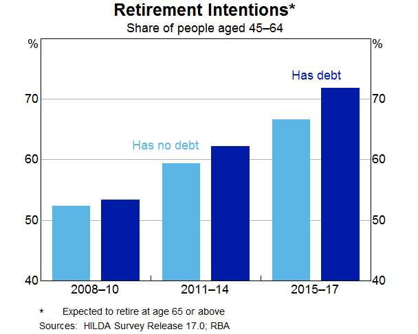
Similar to females, the rise in the participation rate of persons aged 55 years or older is also likely to have been related to developments in household debt. Over recent decades there has been a trend towards greater indebtedness for these persons. The proportion of older households with owner-occupied home loans has risen from around 20 per cent in the early 2000s to around 37 per cent today. The increase in debt has also been associated with a change in the retirement intentions of older workers. Over time, the gradual shift towards later retirement has been more noticeable for those with debt (Graph 7). As with the female participation story, there is a question of causality. Are people working later in life because they have an unexpectedly high level of debt? Or had they always intended to work longer and hence were more willing to borrow more and carry more debt later in life?
To draw this together, participation rates have risen as employment has grown over the past three years. This increase in supply has been unexpected, so it is important to try to understand what is driving it to have some sense on how much further these trends are likely to run. The two major shifts in participation have been amongst females aged 25–54 and older workers. These trends have been there for a while and have been even stronger recently. I have presented some of the insights from our analysis of various micro data sources but there is still more to understand. We will continue to focus on this given its importance to the outlook, which I will come to later.
Employment
What sort of jobs have been created in recent years?
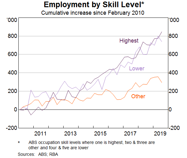
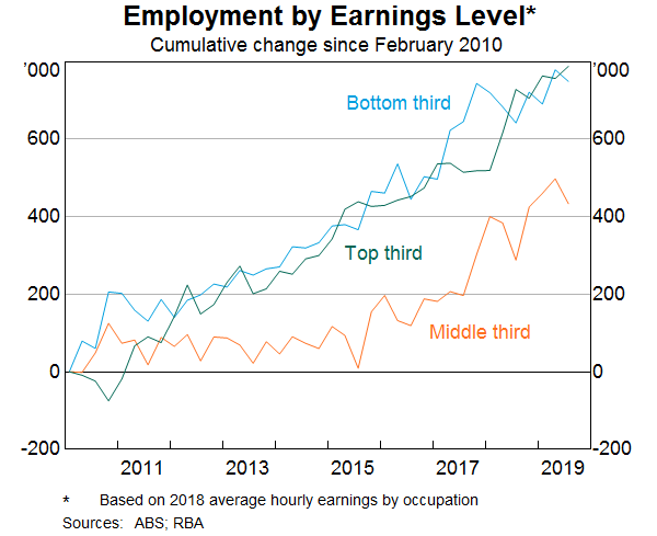
Some have assumed that the jobs that have been created in recent years are lower-skilled or lower-paid jobs. However, when we break down the occupation-level data by skill type or pay level, this is not the case. The strongest growth in employment over the past decade has been in highest-skilled (as defined by the ABS) jobs. There has also been solid growth over the same period in lower-skilled jobs (Graph 8). Similarly, the growth in employment has been broadly distributed across the pay spectrum (Graph 9).
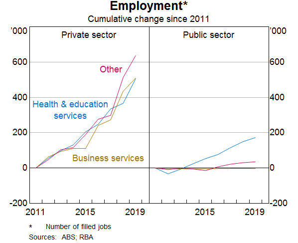
Another often stated view is that much of the job creation in recent years has been in the public sector, rather than the private sector. According to the Labour Account data, the number of jobs created in the private sector has far outnumbered the number of jobs created in the public sector (Graph 10).[12] Private sector job creation has been particularly strong in health care and education (which is partly, but a long way from entirely, due to government spending in these areas), but also in business services and industries like construction and hospitality.
We have also used the micro data to look at the people that have moved into some of these growth areas. For example, the share of employment in the health care & social assistance industry has increased from 9 to 13 per cent over the past decade. Those entering or leaving health care and social assistance tend to do so from a small number of other industries such as public administration, support services, education and training and other services into health care and social assistance. Around 10 per cent of people entering employment from outside the labour market are moving into health care, while a slightly smaller share move into this sector from unemployment. A large share of workers between the age of 55 and 69 years of age work in health care and social assistance, so this is likely to be related to individuals delaying retirement.
Wages
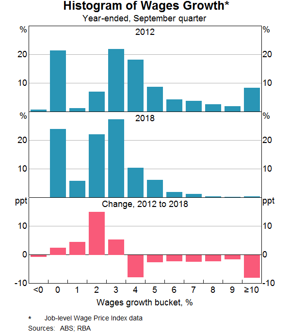
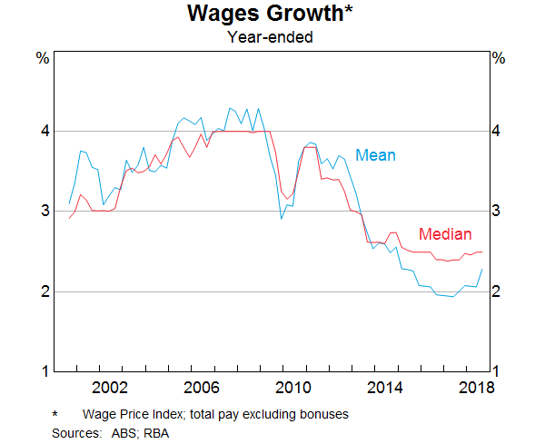
Wages growth has declined noticeably since around 2012. As wages growth has fallen, the distribution of wages growth has also become increasingly compressed. This fall in the dispersion in wages growth across jobs mainly reflects a sharp fall in the share of jobs receiving ‘large’ wage rises. The Bank has highlighted this previously, but I will update that analysis and illustrate the increased pervasiveness of wage outcomes between 2 and 3 per cent across the labour market.[13]
The share of jobs that experience a wage change of more than 4 per cent has fallen from over one-third in the late 2000s to less than 10 per cent of jobs in 2018 (Graph 11). Given that firms are also unwilling or unable to reduce wages, this has meant that the vast majority of wage growth observations in the labour market are now tightly clustered in the range of 0–4 per cent.
There is growing evidence to suggest that wage adjustments of 2 point something per cent have now become the norm in Australia, rather than the 3–4 per cent wage increases that were the norm prior to 2012. The rising prevalence of wage outcomes in the 2s can be seen in the official data and in the Bank's liaison with firms.
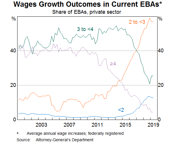
One notable example is the large increase in the share of enterprise bargaining agreements that provide annual wage rises in the 2–3 per cent range. The share of such agreements has risen from around 10 per cent over the 2000s to almost 60 per cent in 2019 (Graph 12). Over the same period, the proportion of agreements providing wage increases of 3 per cent or more has fallen sharply.
A similar picture emerges when we look at the job-level data that underlie the ABS's wage price index (WPI). These data, which also provide insights on wage outcomes for jobs where pay is set according to individual arrangements, also show that the share of jobs getting wage rises in the 2–3 per cent mark has risen noticeably. The Bank's liaison with firms also confirms that the share of firms reporting wages growth of between 2 and 3 per cent has increased to around 45 per cent in recent years. Prior to 2012, fewer than one in 10 firms were reporting wages growth in this range.
Another way to see this shift in wage setting over time is to look at the median rates of wages growth across all jobs in the labour market (Graph 13). Unlike the mean, the median is less affected by the large decline in ‘large’ wage rises in recent years and the changing prevalence of wage freezes. Prior to 2012, median wages growth was firmly anchored at 4 per cent. In recent years, median wages growth has fallen to 2½ per cent, and has remained at that level.
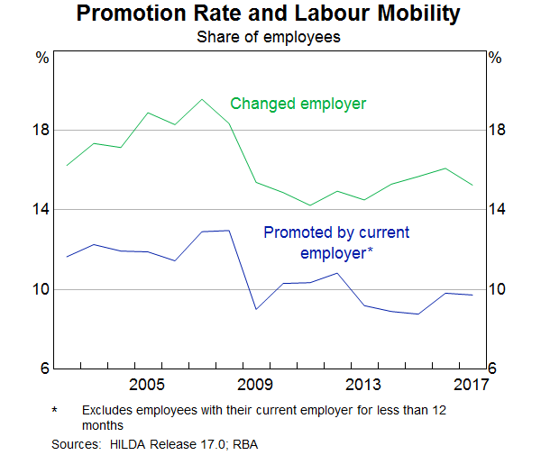
Different measures of wages growth capture slightly different concepts of labour costs. The WPI, which is one of the main measures that the Bank monitors, tracks wage outcomes of individual jobs over time, rather than tracking particular employees.[14] This feature of the WPI makes it useful for gauging developments in wages growth after abstracting from any changes in the nature of work or the composition of employment. However, this feature also means that the WPI does not capture wage rises that come from getting promoted or changing firms.
But other surveys suggest that promotions can be a key source of earnings growth for individuals. On average, a promotion leads to a 5 per cent boost in hourly wages, which is comparable to the wage rise a worker gets when switching firms. Since 2012, there has been a broad-based decline in the proportion of employees that are getting promoted at work or switching jobs (Graph 14). This means that a smaller fraction of the workforce are receiving these wage rises.
Why have wage outcomes in the 2s become so prevalent?[15] One phenomenon that could explain it is the well-known tendency for workers to resist reductions to their wages in real terms.[16] This phenomenon, also known as ‘downward real wage rigidity’, leads to a clumping of employees' nominal wage changes in the vicinity of their expected rate of inflation, particularly when nominal wages growth is tracking at a low level. In that sense, the RBA's inflation target of 2–3 per cent on average over time provides a strong nominal anchor in wage negotiations. When my colleagues looked at the job-level WPI data they did find evidence of a clumping of wage outcomes either at, or just above, expected inflation.
While wage increases in the 2s have become very common for many employees, those whose wages are set according to an award have generally been receiving wage increases in excess of 2 per cent in recent years. This reflects the Fair Work Commission adjustments, which have provided support to wages growth at the lower end of the skill distribution, given the prevalence of award-reliant jobs in this part of the labour market. Wages growth for the least-skilled jobs has outpaced all other skill groups since around 2013. This contrasts with the commodity price boom period, when wages growth was strongest for higher-skilled jobs. Consistent with this, the ratio of average hourly earnings of award-reliant employees to those of other employees has risen since 2012, largely reversing the falls seen in the earlier period.
Outlook
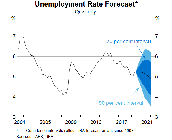
The recent Statement on Monetary Policy provided the Bank's latest forecasts for the labour market and wages growth. GDP growth is forecast to gradually increase over the next couple of years, which should result in a small decline in the unemployment rate from its current rate of 5¼ per cent. As Graph 15 shows, there is always uncertainty around that central forecast. One of the key sources of uncertainty currently around the outlook for the unemployment rate as well as wages growth, is whether labour supply will be as responsive to labour demand as it has been in recent years. That is, will the expected increase in labour demand encourage as much participation as it has most recently? How much further do some of these drivers of increased participation for older and female workers have to run? That is a difficult question to answer.
The dynamics of participation and unemployment flows will have an important bearing on wages growth as well as household income growth. We expect wages growth to remain largely unchanged at its current level over the next couple of years.
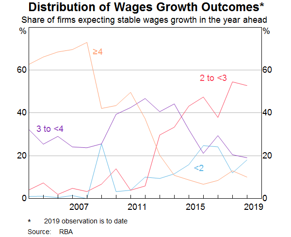
Why don't we think wages growth will pick up over the next couple of years? What we know from our liaison program is that the proportion of firms expecting stable wages growth in the year ahead is around 80 per cent and only around 10 per cent anticipate stronger wages growth. Of those firms expecting stable wages growth, the share reporting wage growth outcomes of 2–3 per cent has steadily risen over time. This supports the case that lower wage rises have become the new normal (Graph 16).
Recently there has been a rise in the proportion of new EBAs with a term of three years or more. The lower wages growth incorporated in those agreements suggests that wages growth of around 2½ per cent for EBA-covered employees will persist for longer than in the past.
The more wages growth is entrenched in the 2s, the more likely it is that a sustained period of labour market tightness will be necessary to move away from that. At the same time, I don't think there is much risk in the period ahead that aggregate wages growth will move any lower.
Conclusion
Today I have provided an overview of the current state of play in the labour market and the Bank's expectation about how it might evolve in the period ahead. I have highlighted some of the key forces that have shaped these developments, in particular, the rise in the participation rates of female workers and older workers. The Bank is trying to understand what has been driving these macro developments using some newly available micro data sources. This greater understanding should help inform our outlook for the labour market.
This increase in labour supply has meant that the strong employment outcomes in recent years has not generated the pick-up in wages growth that might otherwise have occurred. At the same time, I have highlighted the increased prevalence of wages growth in the 2s across the economy. A gradual lift in wages growth would be a welcome development for the workforce and the economy. It is also needed for inflation to be sustainably within the 2–3 per cent target range.
Endnotes
Thanks to James Bishop, Natasha Cassidy and particularly Blair Chapman for embedding himself at the ABS to analyse the micro data. [*]
My fantastic thesis advisers were Dick Blandy and Bill Mitchell, who have contributed much to labour market analysis in Australia over many years, though from quite contrasting perspectives. [1]
The RBA and ABS have been working together on a
micro-level labour force database. The ABS will release an experimental version of
6602.0 Microdata: Longitudinal Labour Force, Australia, 1982–2019 on 6 December. The
data contains over 26 million responses to the monthly labour force survey between 1982 and
August 2019. The previous release of the data only covered 2008 to 2010. I would like to thank the ABS
for making this data available to us.
This document uses unit record data from the Household, Income and Labour Dynamics in Australia (HILDA) Survey.
The unit record data from the HILDA Survey was obtained from the Australian Data Archive, which is hosted by The
Australian National University. The HILDA Survey was initiated and is funded by the Australian Government Department
of Social Services (DSS) and is managed by the Melbourne Institute of Applied Economic and Social Research (Melbourne
Institute). The findings and views based on the data, however, are those of the authors and should not be attributed
to the Australian Government, DSS, the Melbourne Institute, the Australian Data Archive or The Australian National
University and none of those entities bear any responsibility for the analysis or interpretation of the unit record
data from the HILDA Survey provided by the authors.
[2]
Ehrenberg R, R Smith (1981): Modern Labor Economics: Theory and Public Policy, Taylor & Francis Group, New York. Evans R, A Moore and D Rees (2018), ‘The Cyclical Behaviour of Labour Force Participation’, RBA Bulletin, September, viewed 22 November. Available at <https://www.rba.gov.au/publications/bulletin/2018/sep/the-cyclical-behaviour-of-labour-force-participation.html>. [3]
For evidence on the relationship between child care costs and female labour force participation see Gong X, R Breunig and A King (2010), ‘How Responsive is Female Labour Supply to Child Care Costs – New Australian Estimates’, Treasury Working Paper 2010-03, Australian Treasury, Canberra and Gong X and R Breunig (2012), ‘Estimating Net Child Care Price Elasticities of Partnered Women with Pre-school Children using a Discrete Structural Labour Supply-Child Care Model’, Treasury Working Paper 2012-01, Australian Treasury, Canberra. Most recent studies for Australia find evidence that there is a negative and statistically significant relationship between the labour force participation of mothers and the price of child care. [4]
Atalay K, G Barrett and R Edwards (2016), ‘Housing Wealth Effects on Labour Supply: Evidence from Australia’, Mimeo, University of Sydney and Belkar R, L Cockerell and R Edwards (2007), June, ‘Labour Force Participation and Household Debt’, RBA Research Discussion Paper 2007-05. [5]
National Disability Insurance Agency (NDIA) (2019), ‘NDIS Family and Carer Outcomes 30 June 2018’. Available at: <https://www.ndis.gov.au/media/1548/download>. [6]
See P Lowe ‘The Labour Market and Spare Capacity’, Address to a Committee for Economic Development of Australia (CEDA) Event, Adelaide, 20 June 2019 [7]
See Hamermesh D (1996), Labor Demand, Princeton University Press, New Jersey and Killingsworth M (1983), Labor Supply, Cambridge University Press, New York. [8]
See Atalay K and G Barrett (2015), ‘The Impact of Age Pension Eligibility Age on Retirement and Program Dependence: Evidence from an Australian Experiment’, The Review of Economics and Statistics, 97(1), pp 71–87. [9]
For those born between 1 July 1952 and 31 December 1953, the pension age was raised by six months to 65.5 years on 1 July 2017. For those born between 1 January 1954 and 30 June 1955, the pension age was raised by six months to 66 years on 1 July 2019. [10]
Some studies find that the participation of older married women responds to house prices, see: Atalay K, G Barrett and R Edwards (2016), ‘House Prices, Household Debt and Labour Supply in Australia’, Final Report No. 266, Australian Housing and Urban Research Institute, July. [11]
If the LFS data is used, the increase in private sector employment is still larger over recent years, but not by as much. The Labour Account data is gathered from businesses, the Labour Force data from workers. The ABS's view is that the Labour Account data provides a more accurate account of which industry the job is actually in. [12]
See Bishop J (2016), ‘Feature Article: The Size and Frequency of Wage Changes’, Wage Price Index, Australia, September 2016, November. Available at <https://www.abs.gov.au/AUSSTATS/abs@.nsf/Previousproducts/6345.0Feature%20Article1Sep%202016?opendocument&tabname=Summary&prodno=6345.0&issue=Sep%202016&num=&view=> and Bishop J (2018), ‘Feature Article: Update on the Size and Frequency of Wage Changes’, Wage Price Index, Australia, September 2018, November. Available at <https://www.abs.gov.au/ausstats/abs@.nsf/0/d04bd311916d748dca25806c001408a8?OpenDocument> and Lowe P (2016) ‘Inflation and Monetary Policy’, Address to Citi's 8th Annual Australian & New Zealand Investment Conference, Sydney, 18 October and Bishop J and N Cassidy (2017), ‘Insights into Low Wage Growth in Australia’, RBA Bulletin, March, pp 13–20. [13]
The WPI is designed to measure change in wage rates for a given quantity and quality of labour. [14]
See Okun A (1981), Prices and Quantities: a Macroeconomic Analysis, The Brookings Institution, Washington. and Mitchell D (1985), ‘Shifting Norms in Wage Determination’, Brookings Papers on Economic Activity, 2:1985, pp 575–599. [15]
The view that firms may be unwilling to cut nominal wages originated with Keynes J (1936), The General Theory of Employment, Interest and Money, Palgrave Macmillan, London. It has been documented in McLaughlin K (1994), ‘Rigid Wages?’, Journal of Monetary Economics, 34(3), pp 383–414, Kahn S (1997), ‘Evidence of Nominal Wage Stickiness from Microdata’, The American Economic Review, 87(5), pp 993–1008, Altonji J and P Devereux (1999), ‘The Extent and Consequences of Downward Nominal Wage Rigidity’, NBER Working Paper No. 7236, Wilson B (1999), ‘Wage Rigidity: A Look Inside the Firm’, Finance and Economics Discussion Series 1999–22, Board of Governors of the Federal Reserve System and Dwyer J and K Leong (2000), ‘Nominal Wage Rigidity in Australia’, RBA Research Discussion Paper No 2000-08. [16]