Speech The State of the Labour Market

Guy Debelle[*]
Deputy Governor
Citi 10th Annual Australia and New Zealand Investment Conference
Sydney –
Over the past year, there have been welcome developments in the Australian labour market. Employment has grown strongly, the participation rate is close to its highest level on record and the unemployment rate has declined to be at a six-year low. This is consistent with the above-trend GDP growth in the economy. Despite these improvements, there is still spare capacity in the labour market. Unemployment is higher than is desirable and a number of workers would like to work more hours than are currently on offer. This is a large part of the explanation for the low wages growth in recent years. As detailed in our most recent Statement on Monetary Policy, we anticipate that GDP will continue to grow above trend over the next few years, which will see the unemployment rate decline further. This in turn should see wages growth pick up, providing a welcome boost to household incomes.
The dynamics at play in the labour market are important considerations for monetary policy. Full employment is an objective for the RBA in and of itself, and the state of the labour market has a significant influence on the achievement of the RBA's inflation target.
Today, I will look at the labour market from a number of different angles. I will begin with the recent employment data, then discuss unemployment and wages before turning to the outlook for the labour market. In analysing the labour market it is important to not get hung up on one month's data. The standard error on the change in employment each month is around ±30,000.[1] Rather, it is more useful to look at the trends in the various labour market data, check that these are consistent and identify, and hopefully resolve, any anomalies.
Employment
Employment has grown by 2½ per cent over the past year (Graph 1). This is at the high end of historical outcomes and above the growth in the working-age population (around 1½ per cent currently). Over two-thirds of the increase in employment over the past two years has been in full-time work. Despite this, part-time employment as a share of total employment remains close to historical highs at around one-third of employment.
Quite a lot is often made of the full- versus part-time distinction, often with the unstated presumption that full-time jobs are better than part-time jobs. But of the one-third of the workforce which works part-time, three-quarters of them do so because that's what they want. Some of them do want to work more hours, but generally more hours in a part-time job. They don't want a full-time job. The important issue is whether there are enough jobs generating enough hours that people want to work.
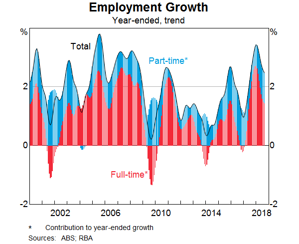
At the same time as there has been above-average employment growth, the participation rate has increased and is now close to its record high. Movements in the participation rate have been highly correlated with employment growth for some time (though this doesn't have to be the case). I will invoke Chris Caton in noting that you should always avoid statements like: if the participation rate hadn't increased, the unemployment rate would have been lower. Both the rise in the participation rate and the lower unemployment rate increase labour utilisation and reduce the amount of spare capacity in the labour market.
The rise in the participation rate has both structural and cyclical elements. Some part of the rise is occurring because each generation of women is participating more in the labour force than previous cohorts did at the same age. Some of it is because more people have joined (or deferred leaving) the labour force over recent years as employment opportunities have improved.[2] In particular, the participation rates of older workers and females have increased notably in recent years.
Where Has the Jobs Growth Been?
Employment growth has been strong over the past year. What sectors of the economy have underpinned this strong growth?
There are two ways of looking at this. First, there is the Labour Force Survey, which asks households which industry they work in. Second, there are the labour account data, which incorporate employment information from businesses. It is similar to the payrolls data in the US.
According to the Labour Force Survey, the industries that have contributed the most to employment growth over the past two years are health care & social assistance, construction and (perhaps more surprisingly) manufacturing (Graph 2):
- The increase in health-related jobs reflects both longer-term trends, such as the ageing of the population, as well as the rollout of the National Disability Insurance scheme over the past couple of years.
- Construction employment is close to 10 per cent of total employment, and this is around its highest share of employment since the 1920s. Construction employment has been supported by the large amount of activity in residential and infrastructure construction, particularly in the eastern states.
- More recently, there has been a noteworthy increase in manufacturing employment. This is a result of export demand for high-quality food and beverage products, demand for manufactured goods from mining-related activity as well as the high levels of residential and infrastructure construction. This more recent pick-up in manufacturing employment takes it back to its level around 2011.
- Professional, scientific and technical (PST) services employment has also grown strongly over the past year, driven by computer system design and management consulting.
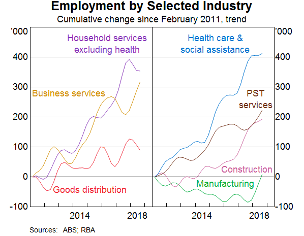
The labour account data provide an alternative perspective on where the jobs growth has been.[3] For example, businesses report that the number of jobs in construction has not increased anywhere near the extent that households have reported over recent years. This may be because construction workers hired or contracted out by labour hire or business services companies will not be recorded as construction workers in the labour account. Similarly, in answering a household survey, someone working for a professional services company who is deployed to a bank may think of themselves as working in the finance sector rather than in professional services. There is no ‘right’ way of measuring this. It depends on who you ask and what question you are trying to answer.
What sorts of jobs have been created in terms of pay? Drawing on the data from the (more than) 450 occupations tracked by the ABS, our assessment is that employment growth has been reasonably evenly distributed across pay levels over the recent period. There has been relatively strong employment growth in occupations with above-average rates of pay, such as jobs within health care, IT and engineering. But within the household services sector, employment growth has been strongest in occupations with below-average wages. These include bar attendants & baristas, waiters, child carers and aged & disabled carers.
It is also difficult to get a good read on the prevalence of ‘gig economy’ jobs. The share of people working as independent contractors has declined a little over the past decade, the share of people working casual jobs is also little changed. The labour account data reports information on workers with more than one job. It suggests that secondary jobs – i.e. filled by people who also have a primary job – account for around 6 per cent of total jobs, which hasn't changed much over the past five years.
Unemployment
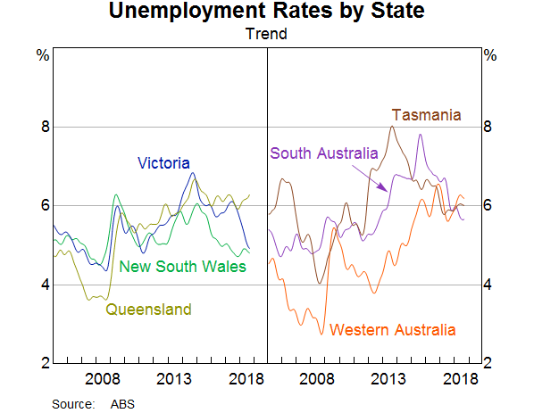
The aggregate unemployment rate has fallen over 1 percentage point since its recent peak in October 2014 and is now at its lowest level in six years. It has fallen from its peak across all states and territories. Recently, we have seen strong declines in the unemployment rates of Victoria and South Australia (Graph 3). In trend terms, my home state of South Australia has the third lowest unemployment rate for the first time since 2012 and its unemployment rate has fallen over 2 percentage points since its most recent peak.
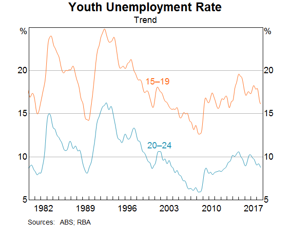
The recent decline in the unemployment rate has also been broad based across all age groups in the economy. The unemployment rate of younger people (15–24 year olds) has recorded the sharpest fall over the past year (Graph 4). The youth unemployment rate tends to be more sensitive to economic conditions than the unemployment rate of other age groups. Despite this, the share of younger part-time workers who want to work more hours than they currently do remains high. Furthermore, the share of 20–24 year olds that are neither engaged in employment nor full-time education or training remains higher than it was a decade ago.[4]
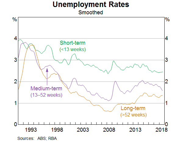
Looking at the duration of unemployment, the median duration of unemployment has declined over the past year to be around 15 weeks. There has been a noteworthy decline recently in those who have been unemployed for a year or less. However, the unemployment rate has not fallen for those who have been unemployed for over one year (Graph 5), remaining at around 1¼ per cent of the labour force. This is concerning given the adverse social and economic consequences that arise from long-term unemployment. That said, generally a sustained improvement in the economy does result, in time, in a decline in the average duration of unemployment. [5]
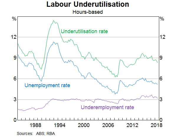
At 5.3 per cent, the unemployment rate is above our estimates of the NAIRU. We also closely monitor broader measures of underutilisation.[6] In that regard, here are some useful facts to keep in mind: around one-quarter of part-time workers are actively looking to work more hours than they currently do; on average they are seeking to work an extra two days a week. When combined with the number of hours of work that the unemployed are seeking, this gives a labour underutilisation rate of around 8½ per cent (Graph 6). While the underemployment rate has trended higher over time alongside the increasing prevalence of part-time work, movements in the unemployment rate remain the dominant driver of movements in the broader underutilisation rate. Hence, I still view the unemployment rate as the most useful summary indicator of the state of the labour market.
Wages
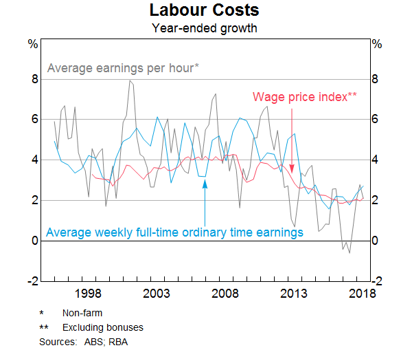
Given this spare capacity in the labour market, wages growth has been subdued. The RBA monitors a range of available measures of labour costs as they each capture a slightly different concept of wages growth. The wage price index (WPI) measures the change in the average hourly wage rate for a given job compared to the same job in the previous period (excluding any changes to the nature of the job). In contrast, the national accounts measure of average earnings per hour (AENA) and average weekly full-time ordinary time earnings (AWOTE) are broader in scope in that they measure the average wage bill. They embody changes to the composition of the labour force (for example, the movement of people in and out of higher-paying jobs in mining-related industries). AENA also includes non-wage payments such as allowances, superannuation and redundancy payments. These measures tend to be more volatile than the WPI, but better capture any inflationary pressure stemming from labour costs.
On any of the measures, wages growth has been low over the last few years (Graph 7). One of the factors contributing to this is the low level of voluntary job turnover. Workers tend to choose to leave their job for a better job – be it in conditions or pay. The fact that little of this is occurring is likely to be contributing to the subdued wages growth. Recently, some of our liaison contacts are now reporting that turnover is increasing.
Also, as the labour market has tightened, businesses are finding ways to retain some of their employees without raising wages for everyone. Many businesses in our liaison program report that they are linking wages growth outcomes to individual performance, which provides employers the flexibility to reward and retain strong performers and valued skill sets while keeping average wages growth contained. The use of bonuses, especially to retain key staff, is also prevalent, which doesn't permanently raise labour costs. Some firms are attempting to retain staff by using non-wage incentives, including flexible work arrangements, shares, subsidised gym memberships, development opportunities and additional annual leave.
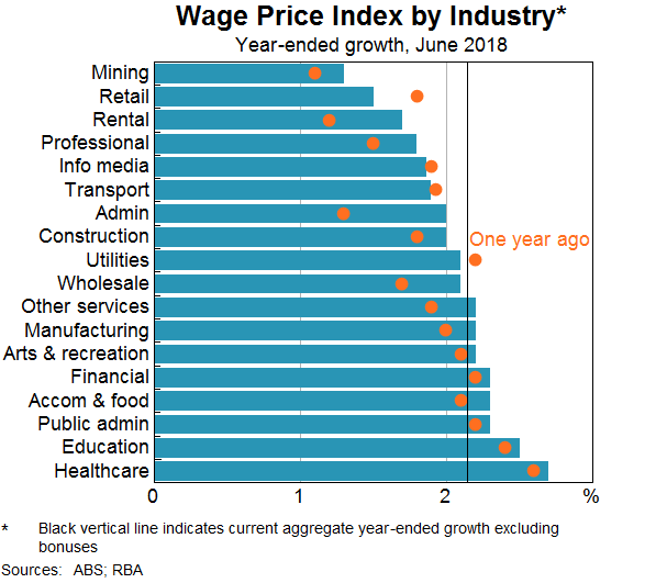
All of the wage measures indicate that a slight pick-up in growth has occurred recently. This increase has been broad based across most industries, although it has been modest in all cases (Graph 8). We are anticipating that wages growth will continue to pick up gradually as the unemployment rate declines and the adjustment following the end of the mining boom is close to running its course. There are a few other factors that are likely to contribute to this. Around one-quarter of all employees will have received a 3.5 per cent pay rise following the increase in national minimum and award wages on July 1. For some retail and public sector employees, we are also seeing some new enterprise bargaining agreements signed following a lengthy period where wages had been frozen.
Where to from Here?
Our outlook for the labour market is based on our outlook for the economy as a whole but also by a number of useful leading indicators.
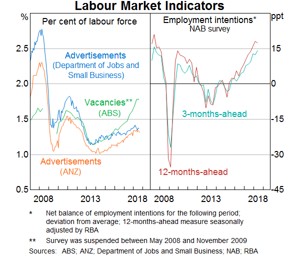
While there is always uncertainty around our forecasts, there are currently conflicting signals from the various measures of labour demand. Job vacancies data and business survey hiring intentions have recorded strong growth this year, but there has been little growth in the job advertisements data (Graph 9). While divergences in the signal from various activity indicators are not unusual, the divergence between vacancies and job advertisements (as a share of the labour force) has been steadily increasing over recent years. This in part reflects changes in the way that businesses recruit and workers search for jobs.[7] For example, the job advertisements data capture the main online recruitment websites, but they are not picking up newer recruitment sites or the use of social media sites, such as LinkedIn, so the usefulness of this series may be declining. Large corporations are also maintaining ‘expression of interest’ registers on their own websites, which reduces their need to advertise to fill a vacancy. Taking all of the information from these various indicators together suggests that employment is likely to grow a bit above its long-term average over the next six months. This is consistent with our forecast that GDP will also grow a bit above trend.
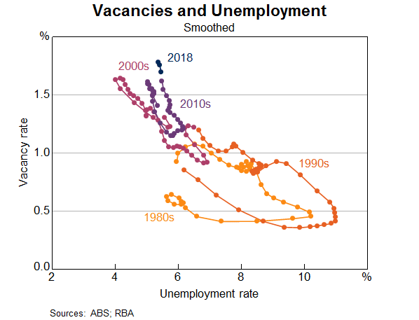
Empirically, there is a negative relationship between the number of job vacancies and the number of unemployed persons; when demand for labour is strong the number of vacancies will generally rise, which leads to a reduction in the unemployment rate as those vacancies are filled. This relationship is depicted as the Beveridge Curve[8], and this negative relationship has held over long periods of time and is observed in the data in other countries.
Over the past few years, there has been a large increase in vacancies but only a small decline in the unemployment rate to date (Graph 10). That is, firms are hiring fewer workers per job opening or vacancy than has been typical – suggesting a possible shifting to the right of the Beveridge Curve. A possible explanation for this would be an increasing skill mismatch between unemployed workers and available jobs. Structural changes in the labour market as a result of changes to participation, technological change or those stemming from a shock such as the mining boom can contribute to a mismatch. Lower mobility, either geographical or at the job level, can also reduce the ability of firms to find the appropriate worker. This last explanation seems unlikely given the relatively large net interstate migration flows we have seen as conditions in the state labour markets have varied, most notably the large flows in and then subsequently out of Western Australia. Finally, it may reflect underinvestment in training over recent years, including in technical skills.
That said, the vacancy rate is currently at its highest relative to the size of the labour force. That too is a very positive signal for the labour market outlook.
Conclusion
To sum up, the labour market is in pretty good shape: employment growth is above average, the participation rate is at a high level, the vacancy rate is at an all-time high and the unemployment rate is falling. However, the long-term unemployment rate has been little changed of late and wages growth remains low. The near-term indicators suggest demand for labour remains above average and the expected growth in the economy over the next few years should gradually reduce the spare capacity in the labour market.
As we have stated many times, we expect that will lead to a gradual increase in wages growth and, in turn, inflation. There are a number of uncertainties around the extent and timing of the decline in the unemployment rate and the pick-up in wages growth. The recent international experience indicates that the unemployment rate could decline further than historical experience would suggest before we see a material increase in wages growth. But against this, further increases in labour demand may be met more from the pool of unemployed rather than from people not currently in the labour force. That is, the unemployment rate may decline faster than we expect, rather than the participation rate increase further.
Endnotes
Thanks to Blair Chapman and Natasha Cassidy for their extensive help with this. [*]
The standard error is not large relative to the level of employment, but it is for the monthly change. [1]
See Evans E, A Moore and D Rees (2018), ‘The Cyclical Behaviour of Labour Force Participation’, RBA Bulletin, September. [2]
The Australian labour account balances information on jobs sourced from businesses and households; as such, it provides estimates of the number of jobs, people, hours worked and labour income in each industry. Conceptually the labour account is designed to be consistent with the national accounts data. In a welcome development, the ABS is also starting to release datasets that match administrative data and ABS survey data such as Business Longitudinal Analysis Data Environment (BLADE). These datasets should enhance our analysis of the labour market. [3]
For a more comprehensive discussion of labour market outcomes for the young, see Dhillon Z and N Cassidy (2018), ‘Labour Market Outcomes for Younger People, RBA Bulletin, June. [4]
See Ellis L (2018), ‘On Lags’, Sir Leslie Melville Memorial Lecture, Australian National University, Canberra, 17 August. [5]
A recent speech by my colleague Alex Heath looked at the increase in labour market flexibility over recent decades, and the impact this might have on our understanding of spare capacity. See Heath A (2018), ‘The Evolving Labour Market’, Business Educators Australasia 2018 Biennial Conference, Canberra, 5 October. [6]
See Edwards K and L Gustafsson (2013), ‘Indicators of Labour Demand’, RBA Bulletin, September, pp 1–11. [7]
Janet Yellen once referred to the Beveridge Curve as the ‘neglected stepsister of macroeconomics’. I recall sitting in lectures by Olivier Blanchard and Peter Diamond as they developed their work on the Beveridge Curve and job matching. They noted that, although the Beveridge Curve ‘has very much played second fiddle’ to the Phillips Curve, it conceptually comes first and contains essential information about the functioning of the labour market and the shocks that affect it. [8]