Speech Housing and Mortgage Markets: The Long Run, the Short Run and the Uncertainty in Between

Luci Ellis
Head of Financial Stability Department
Address to the Citibank Property Conference
Sydney –
Thank you to Citi for the opportunity to speak to this group today. I hope I can provide you with some insights into how we think about some of the structural and cyclical factors affecting the housing market.
Long Run: Two Core Themes
1. Normal in a low-inflation world
I would like to start by considering some of the longer-run factors that are shaping outcomes in housing and mortgage markets. The first is that Australia went from being a high-inflation country in the 1970s and 1980s to being a low-inflation country since the early 1990s (Graph 1). Yet housing prices continued to increase at a rapid pace for a period, even after consumer price inflation slowed.
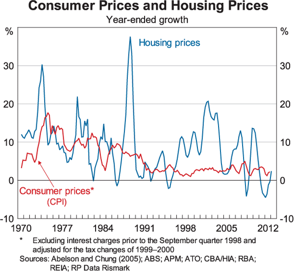
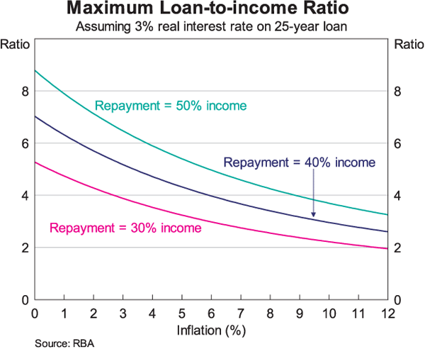
The reason is that inflation acts as a kind of credit constraint. Broadly speaking, mortgage lenders decide how much to lend to a household by working out the repayment they can reasonably make, given the household's income and other factors. For a given interest rate, this then backs out to a loan amount. The ratio of that allowable repayment to the borrower's income varies according to their circumstances, but for any given borrower this is roughly how it works. So if average inflation has declined, as it has in Australia, so does the inflation compensation component of interest rates. Nominal interest rates fall, and that translates to a higher loan amount. This diagram shows how that repayment test maps to loan-to-income ratios for different average inflation rates (Graph 2).[1] It shows that even if nothing else changed, the loan-to-income ratio that households could prudently obtain would have almost doubled as a result of disinflation. Since real mortgage rates also came down a bit over this period, we should expect income multiples for individual borrowers to have roughly doubled.
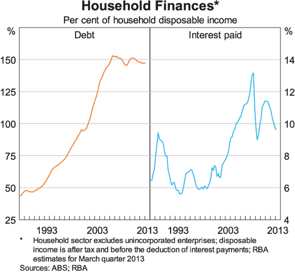
If individual households are now borrowing more relative to their incomes, obviously the nationally aggregated ratio of debt to income would rise. (There is also a second-round effect because nominal income growth is slower, so the debt-income ratios of longstanding borrowers do not decline as quickly. This boosts aggregate interest-servicing ratios as well as debt ratios.) Of course it takes time for this to work through the national aggregate ratios. It takes time before the people who borrowed before inflation declined have paid off their loan and dropped out of the calculation. It also takes time for this additional borrowing capacity to bid up housing prices. But the transition does end after a while, and it is our assessment that it has now ended.
So my first theme on the long run is that the transition period following the disinflation is almost certainly over. The aggregate debt-income ratio has been broadly flat since about 2005 (Graph 3). The ratio of average housing prices to income levelled off a year or so earlier. Consistent with this, interest-servicing ratios might be more volatile, but they, too, look to be cycling around a new, higher average now, rather than still being on an upward trend.
The transition period, and its completion, changed the behaviour of more than just housing prices and debt. One example is household saving behaviour. It stands to reason that if people are increasing their borrowing more than their income is growing, they are probably consuming at least some of that. The household saving ratio did indeed fall during the transition period and has since risen back to something like 10 per cent of income (Graph 4). We don't know exactly what the saving ratio will do in the period ahead. It might be that it has already reached its new long-run average, or it might be that it moves up or down a bit from here. We don't think it will necessarily return to the level in the 1960s and 1970s, because back then it was boosted by a larger contribution from unincorporated businesses. And we don't think the near-zero levels of a decade ago were sustainable in the longer term. Where the ratio ends up between those two extremes is hard to know. But given it has actually been quite stable for the past five years, it seems reasonable to suppose that where we are is at, or close to, a ‘new normal’.
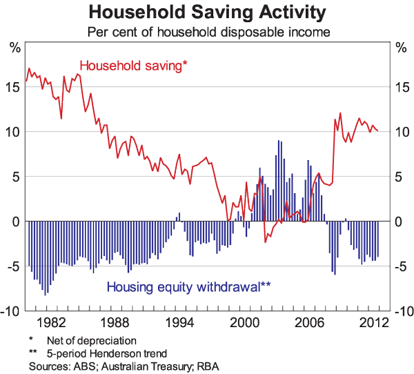
Parallel with these fluctuations in saving, during the boom period of transition, households began to withdraw equity from the housing stock. Some of the work the Bank did on this topic at the time showed that this was partly the result of higher turnover.[2] Put simply, there were more vendors with a lot of equity selling to buyers with much less equity. But whatever the drivers of this behaviour, this, too, has ended. Australia has returned to a more normal behaviour of households contributing equity, in net terms, to the expansion of the housing stock.
If our analysis is correct and we are indeed facing the ‘new normal’, it implies a number of things for future outcomes.
First, trend housing price growth will be slower in future than in the previous 30 years. We don't have a strong view about whether the ratio of prices to income should be mildly rising, falling or constant from here. We do not have a target for this variable. But we think it is very unlikely to return to its 1970s levels, or to rise rapidly once again. Nor would we want to see another boom like the one a decade ago.
A second implication is that, if housing price growth is now cycling around a lower average, there will be more periods when prices are falling (a little) in absolute terms. This has implications for the loss given default (LGD) in mortgage portfolios. In my view, this vindicates APRA's decision to require a higher LGD floor than the 10 per cent minimum built into the Basel rules for banks using their own models. It also vindicates its decision to require higher risk weights for non-standard and high loan-to-valuation loans for lenders that do not use their own models.
If trend growth in housing prices will be slower in the future than in the past, trend housing credit growth will necessarily be slower too. This has obvious implications for the rate of growth of bank balance sheets and profits. We have been making this point for a while. Financial stability requires that the owners of banks accept that domestic balance sheet growth will be slower from here than it was in the previous 20 years or so. We would not want banks to ease their lending standards to make more loans and bring back the boom times. Nor would we want them to cut costs in a way that impinges on their risk-management capabilities.
2. Demography and dwelling supply: Slower and denser
The other long-term trend I would like to talk about today is physical more than financial, but its economic implications are still profound. Australia had high population growth during the post-war era (Graph 5). Since then it has slowed, but with some bumps along the way. During much of that period, growth in the dwelling stock outpaced population growth. Household sizes were shrinking, partly because the population was ageing and partly because people were having fewer children than in the past.
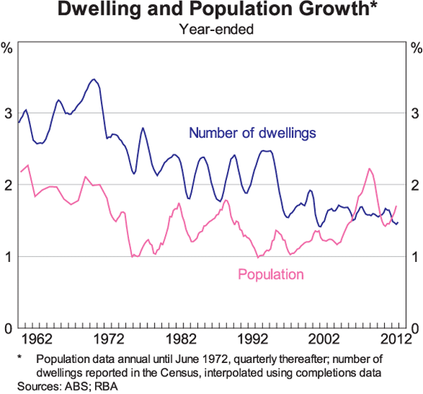
Population growth surged in the years after 2004, largely resulting from immigration. It was not immediately recognised, because part of the increase came from students and former students, whose long-term residency wasn't immediately obvious. It's fair to say that the fact of this acceleration in population growth wasn't fully appreciated at first. As such, it was therefore not planned for. So at least in some cities, we saw strong demand for housing and rising prices, even though the credit boom had ended, because construction did not rise to meet this surge in demand.
The housing and credit boom of 2002/03 was clearly demand driven, but even it sparked concerns about constraints on housing supply. Those concerns only intensified afterwards, when the pressure really was for more dwellings to accommodate the population, rather than just nicer ones to absorb the extra borrowing capacity. My colleague Christopher Kent spoke about this recently.[3] He noted that if constraints on land supply were the most important factor explaining high housing prices, we would see prices rising fastest where those constraints were most binding – the greenfield sites on city fringes. But that is not what we see.
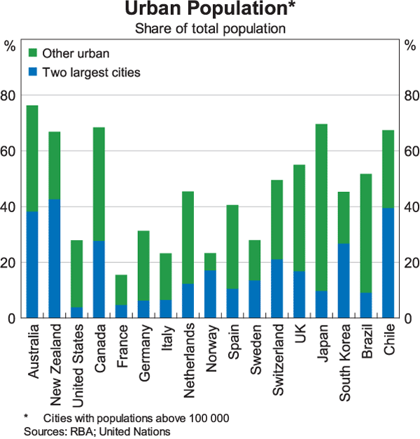
Part of the perception of supply constraints comes from our view of Australia as a big country. Yes, we have a lot of land. What we don't have much of is land where people actually want to live. In general, desirable land is the land within or adjacent to existing settlements. Australia's population is heavily urbanised compared with other developed countries, let alone most emerging countries.
It is also quite concentrated in a couple of large cities (Graph 6). So the range of acceptable locations is actually more limited than the map would lead you to believe.
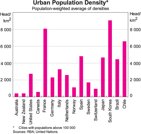
Perhaps more to the point, part of the reason why land seems in such short supply is that we each consume so much of it. As this graph shows, Australian cities are the least dense, in terms of population per square kilometre, than the cities of any other sizeable country, developed or emerging (Graph 7). Only New Zealand comes close, and that is partly because its cities are smaller. (Smaller cities tend to be less dense on average.) This is not even a case of comparing Australia with crowded European cities, or the megacities of developing countries. At around 375 people per square kilometre, Sydney is only 40 per cent as dense as Toronto. Melbourne is a bit more than half as dense as Toronto. And of the 276 US cities and towns in these data, only eight have lower densities than Sydney; the largest of those eight cities has only a little more than half a million inhabitants.
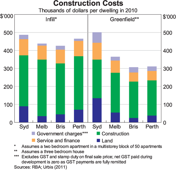
If land availability were the problem, we'd expect land costs to dominate the costs of producing a new home at the city fringe. But that's not what we see (Graph 8). Neither do government charges dominate total costs. Rather, it turns out that construction costs are the largest contributor to the total costs of production, and they seem quite high compared with the total cost of a newly built home in some other developed countries.[4]
What are the long-run implications of our demography and geography? I am not a demographer, but it seems reasonable to me to conclude that long-run population growth will be slower in future than in the decades following the Second World War. It also seems reasonable to expect that the decline in household sizes has come to an end.[5] The expansion in the housing stock needed to accommodate any given population increase will therefore be smaller than past data relationships implied.
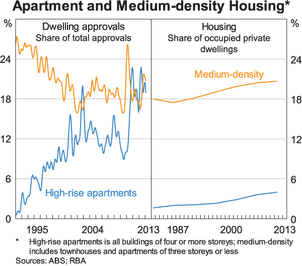
Even with slower population growth, the price of our low-density life has become unaffordable for some. It therefore seems likely that our cities will become denser over time. If so, the mix of residential construction will be tilted more towards medium-density and high-density dwellings than in past decades. We have already been seeing this shift over the past decade or so (Graph 9).
The Short Run: Monetary Policy Works
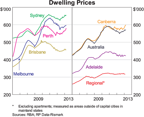
Interest rates have been lowered quite a bit over the past year and a half or so. As so often seems to happen, soon after a period of easing we start to hear concerns that monetary policy might not have any effect this time, because of some special factor interfering with normal relationships. After a period, though, the signs start to emerge. Typically, financial variables like credit and asset prices respond first. Output and inflation adjust later, the well-known ‘long and variable lags’. Recent data have followed precisely this pattern: monetary policy still works. Equity markets are up, and so are dwelling prices (Graph 10). Credit growth has remained quite slow, but loan approvals to investors and existing home owners have been picking up for a while.
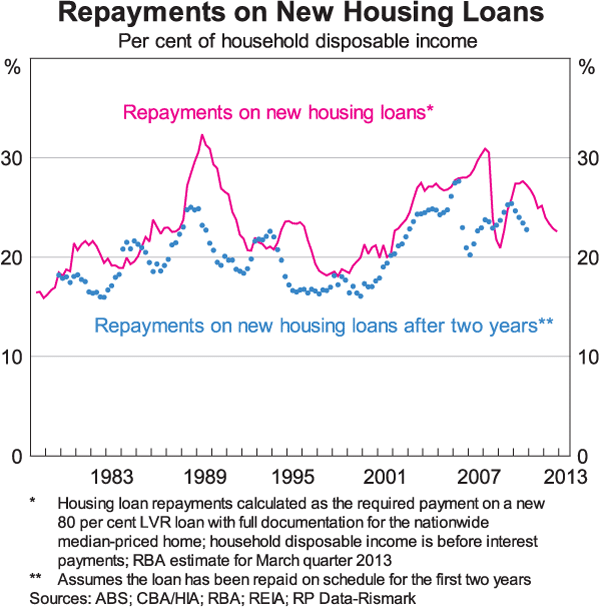
This recovery in dwelling prices makes sense given how much affordability has improved as interest rates have declined. The first-round effect on new borrowers is clear from the solid line in this graph; it shows the required repayment on a typical mortgage for a median-priced home, relative to average income (Graph 11). What is less often appreciated, though, is how much affordability has improved on existing loans. The dots on the graph take the same loan conditions, and factor in how much the ratio changes with movements in interest rates as well as growth in average incomes. Because nominal incomes typically rise, the dots are more often than not below the line; on average, it gets easier to pay your mortgage over time. In the recent period, that gap has widened again. Recent buyers – for example, those who bought two years ago – will be finding it easier to make their required mortgage repayment. That is a positive outcome for their financial resilience, and ultimately financial stability. It is certainly already apparent in mortgage arrears rates. But it is also part of the macroeconomic transmission of monetary policy. Some of those borrowers are using the decline in required repayments to pay off their loans faster; this is something we have discussed in detail in recent Financial Stability Reviews. But at least some of them will take advantage of lower interest rates to spend more, or to buy a bigger home.
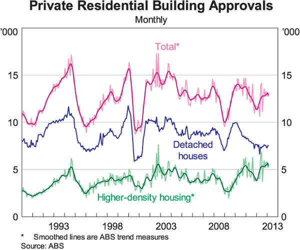
Over time, non-financial variables start to respond to policy as well. Building approvals have been rising only gradually in recent months, after bouncing back from the latest trough about a year ago (Graph 12). But my colleagues in Economic Group certainly forecast that the recovery will continue in the short run, and there is certainly room for this to happen. If you are wondering how we are going to manage to build extra homes, at the same time as you are wondering where all the workers no longer involved in mine-related construction might go, it might be worth putting those two thoughts together. Consider that indirect linkages can be just as important as direct substitution.
The Uncertainties in Between
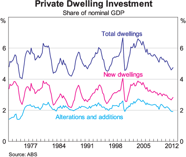
Between the short run and the long run, though, an awful lot can happen. Some of the structural, long-term changes I've described today could change some of the relationships and correlations between variables that we have come to expect. One I already mentioned is that if average household sizes are no longer falling, the relationship between population growth and growth in the number of dwellings will change. And if I am right in expecting the share of high-density housing to increase, the dynamics of construction will also change. It takes longer to build a block of apartments on a brownfield site than the same number of dwellings as detached houses at the fringe. Dwelling investment has already become less cyclical in the past 10 years than it was in the previous 20 years (Graph 13). It might well be that construction lags – and concerns about supply – will become even more acute.
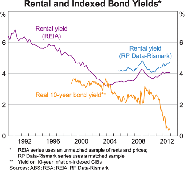
The end of the transition to a low-inflation, higher-debt world will also change past relationships in ways that not everyone might expect. Through that transition, property investors paid lower nominal interest rates than during the high-inflation period, but for a long time they continued to enjoy similar rates of capital gain. With slower trend growth in housing prices, total returns on rental properties would fall unless other things adjusted. Sure enough, rental yields, which are a real yield, have been rising in recent years (Graph 14). They are now back to a level that seems like a more reasonable spread over long-run average indexed bond yields, given the investment risk. (And when you consider the current level of indexed bond yields, the rental yield looks even more attractive.) But for given interest rates and rental yields, lower trend capital gains should result in less investor demand than we saw in the past couple of decades. Presumably this will also bring forth less construction activity than we used to see at a given level of interest rates.
On top of these more structural influences on apparently cyclical behaviour, there are also some more recent factors that could change historical relationships. One of these is that lending standards in the mortgage market have tightened, particularly the use of low-documentation loans (Graph 15). Some of this was a deliberate choice by lenders who had become more risk averse in light of the experience of the crisis. Some of it resulted from the drying up in securitisation markets. Many non-deposit-taking lenders could then no longer fund themselves, and market share shifted to the prudentially regulated sector, most noticeably the major banks. And some of it has no doubt been spurred by the recent changes to consumer credit regulation.
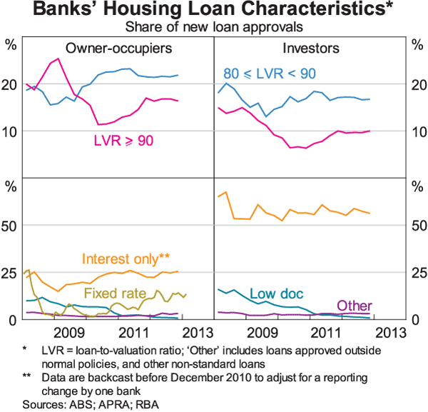
Lending standards are multidimensional. And even within each dimension, such as the loan-to-valuation ratio, we must distinguish between the maximum allowable level and the number of borrowers actually at that maximum level. But it is still useful to think of the lending standards prevailing in the mortgage market on a spectrum of prudence. Australia's is not the most conservative mortgage market out there, but it is nowhere near the position that the United States was in prior to its mortgage meltdown. It wasn't even particularly close to that point before the crisis, when lending standards were a bit easier here than they are now. But as I suggested earlier, it seems likely that the future will bring more periods of (mildly) falling housing prices than we saw in the past. It is therefore appropriate and desirable that lending standards remain at least a bit tighter than those prevailing before the crisis.
Every credit boom or bubble starts with something real, something fundamental. As I also mentioned earlier, we have a pretty good idea of what that fundamental was, and at least some idea of how far the transition would go. And we are pretty sure that the boom we saw in the early 2000s managed to end with a fizzle, not a bust. So we don't expect a sharp reversal from a starting point described by the situation we face now. But we certainly can't rule out the possibility of a major housing downturn in the longer-term future. It is hard to know exactly what the outcome would be because it depends on how we got to that point. Institutions differ across countries, so we can't simply extrapolate from experience elsewhere. And there would need to be another boom first.
That said, policymakers in Australia are only too aware of the costs to the financial system and to the macroeconomy if a major property bust were to happen. Suffice to say that major property busts in general, and housing busts in particular, are one of the key components of the scenarios used in APRA's regular stress testing of the banking system. The results of those tests inform APRA's supervision of each firm. From time to time, they also motivate a tightening up of the whole prudential framework. I should note here that history tells us that when a property boom turns to a bust, the big losses are more often on commercial loans than mortgages. Loans to property developers are usually a bigger source of risk than loans to the households who buy the homes.
The question is whether the authorities should be doing something more than diligent supervision of regulated firms. Internationally there has recently been a lot of talk about macroprudential tools. Many of these tools are intended to be manipulated over the cycle so as to lean against a property boom. But this boils down to waiting until you have a problem and then recalibrating your prudential framework. I can't help thinking that the civil engineers have a better approach, which is to have a safety factor built into the system from the outset. This means treating global minimum standards as minimum standards, being more conservative where local conditions require it, and remaining alert to the risks that could still exist.
Thank you for your attention.
Endnotes
See, for example, RBA (2003), ‘Household Debt: What the Data Show’, RBA Bulletin, March, pp 1–11. [1]
Schwartz C, T Hampton, C Lewis and D Norman (2006), ‘A Survey of Housing Equity Withdrawal and Injection in Australia’, Reserve Bank of Australia Research Discussion Paper 2006-08. [2]
Kent C (2013), ‘Recent Developments in the Australian Housing Market’, Address to The Australian Institute of Building, Sydney, 14 March. [3]
See Hsieh, W, D Norman and D Orsmond (2012), ‘Supply-side Issues in the Housing Sector’, Reserve Bank of Australia Bulletin, September, pp 11–20 [4]
See Kearns J (2012), ‘The Outlook for Dwelling Investment’, Address to the Australian Business Economists' Lunchtime Briefing, 13 November 2012 and Kent, C (2013) ‘Recent Developments in the Australian Housing Market’, Address to the Australian Institute of Building, 14 March 2013, for more discussion of the possibility that average household size might have stopped falling. [5]