Speech Australia in the Global Economy

Malcolm Edey
Assistant Governor (Economic)
Address to the Australia & Japan Economic Outlook Conference 2007
Sydney –
I thank AJEI and the Japanese Consulate-General for the invitation to speak today. This is the third time I have spoken at this conference, and I've found it an informative event for learning about developments in Japan and in our region.
In my remarks today I'll first review the world economic scene; I'll then make some observations of a longer-run nature about the Australian business cycle, and then look at some more recent developments.
Short-term global outlook
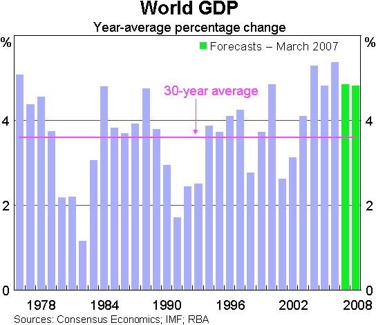
For the world economy as a whole, 2006 was another strong year. Growth for the year is estimated at 5¼ per cent, which is the highest rate in more than three decades. The latest set of Consensus forecasts indicate that growth rates are generally expected to remain high, though not as strong as last year (Graph 1).
In thinking about short-term prospects, a good deal of attention in the past few months has been focused on the United States (Graph 2).
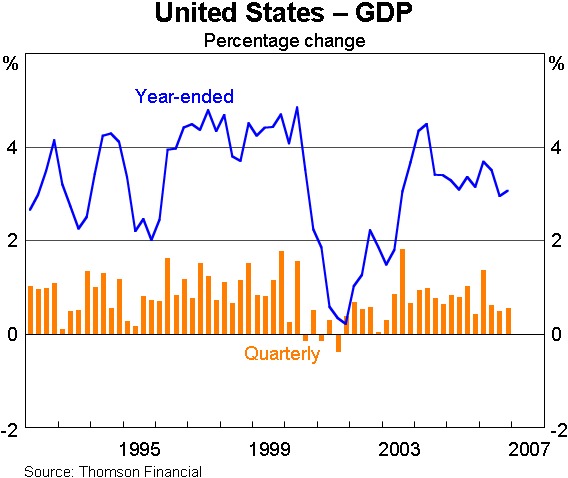
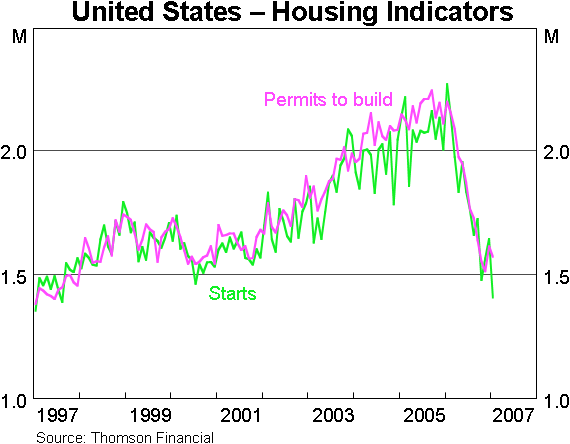
The US economy has been growing strongly for some years. Unemployment has fallen, and there has been some upward pressure on core inflation. Most observers now see growth slowing back to a more sustainable pace. This is generally seen as a desirable adjustment, and one that should help to alleviate inflationary pressures. The issue at the moment is whether the downturn in the US housing sector might have a larger than expected impact on the wider economy. Forward indicators of construction activity, like starts and permits, are down by about 30 per cent from their cyclical peaks, and the market for established houses has cooled (Graph 3). There has also been some well-publicised distress in the ‘sub-prime’ mortgage market in recent weeks.
How far these things might dampen activity is still unclear, and recent indicators have been ambiguous. But at this stage, the overall slowing in the US has been mild, and the housing downturn so far has not caused any major disruption to output and employment in the rest of the economy.
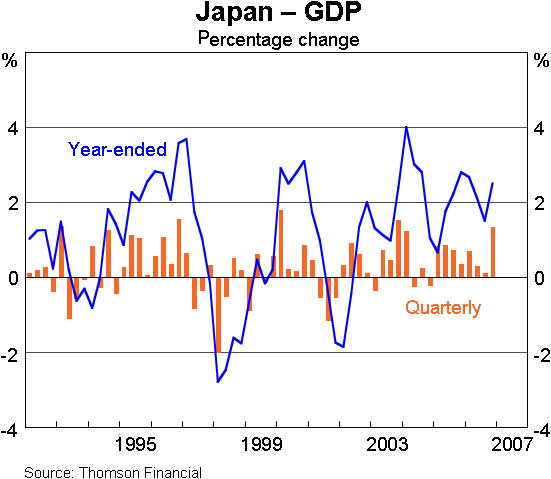
In other parts of the world the recent flow of new information has tended to be on the strong side of expectations. In Japan, GDP posted a surprisingly strong increase of 1.3 per cent in the December quarter, and other short-term indicators like employment and business sentiment point to continued momentum (Graph 4).
It is also encouraging that the longer-term problems of balance-sheet stress in Japan have been wound back, and there are signs of a return to more normal financial conditions. Profits are now rising rapidly, corporate debt has been reduced, and banks are again starting to expand their lending (Graph 5).
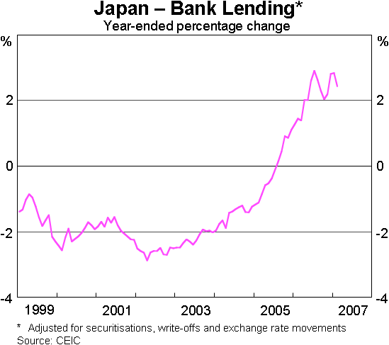
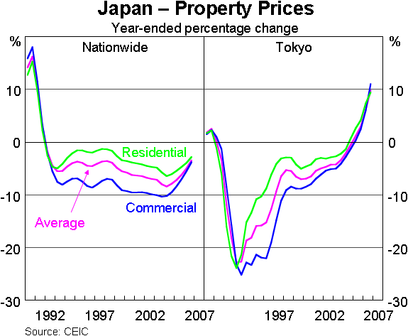
Although the rate of growth in bank lending is still low by comparison with most other countries, the fact that it has turned positive is one of a number of signs that the prolonged period of balance-sheet adjustment and financial consolidation is coming to an end. Another sign of return to normality is that land prices in some areas, notably in Tokyo, have stopped falling (Graph 6). These things, while obviously not guaranteeing economic success, do bode well for further growth over the years ahead.
China's economy is continuing to grow at a 10 per-cent-plus pace. I note that there has been some significant volatility in China's financial markets in the past couple of weeks, but it is too early to say whether that is likely to be disruptive to the economy's immediate prospects. But I will have more to say about China in a moment.
The other encouraging development for the world economy has been a pick-up in growth in the euro area (Graph 7).
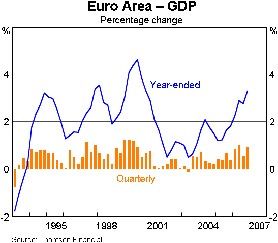
Europe was slow to recover from the downturn at the beginning of the decade, and for some years lagged behind the US. It was commonly said that the world economy was flying on only two of its four engines, namely the US and China. But with the euro area now growing slightly faster than the US, and Japan also doing better, that claim is no longer true. Overall, then, the growth in the world economy looks to be more evenly balanced geographically than it has been for quite a while, and the prospects for global growth in the short-term seem to be good.
Longer term, of course, it is to be expected that the world economy will continue to have a cycle, and I see little value in trying to predict when the next turning point might be. Instead I want to focus on some important longer-term forces, and particularly the emergence of China and India as major economies.
The rise of China and India
On almost any measure, the Chinese and Indian economies have advanced rapidly in their importance both to the world economy and to Australia (Table 1).
| China | India | |||
|---|---|---|---|---|
| 1995 | 2005 | 1995 | 2005 | |
| Share of world GDP (PPP weights) | 9.5 | 15.4 | 4.8 | 6.0 |
| Share of world GDP (mkt weights) | 2.5 | 5.0 | 1.2 | 1.7 |
| Share of world trade | 2.3 | 6.1 | 0.5 | 0.9 |
| Share of Australian exports | 4.4 | 11.6 | 1.5 | 5.0 |
|
Sources: ABS; CEIC; IMF |
||||
A few summary figures can illustrate this. Their combined share of world GDP (measured on a PPP basis) has gone up from 14 to 21 per cent in the past ten years. Their combined share of world trade has more than doubled, and their importance as export markets for Australia has gone up even more, so that together they now absorb about one-sixth of Australia's total exports.
In essence, what is happening is a process of catch-up similar to the ones seen in Japan and South Korea in earlier decades. Both of those countries experienced extended periods of rapid growth and then began to slow down as they got closer to the per capita income levels of the most advanced countries, approximated here by the US (Graph 8).
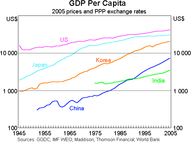
I've made the point on a previous occasion that this process of catch-up in China and India may well have quite a way to run. Both Japan and Korea were able to sustain growth rates in the vicinity of 10 per cent per annum for around three decades. But China took off from a much lower base than either Japan or Korea. This means that today, even after three decades of high growth, it is still well behind the relative income levels of those countries when they started to slow down. And India is a lot further behind still.
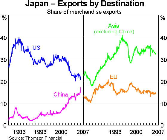
These developments are having some important effects, including on the volume and direction of trade in the Asian region. Industrialisation in east Asia has been associated with strong flows of Japanese direct investment into the region, and with rapid growth in intra-regional trade. Around 15 per cent of Japan's exports now go to China, compared with only 5 per cent a decade ago. A decade earlier, there was a similarly large increase in the share going to other east Asian destinations. The counterpart to those increases is that, over the past twenty years, the share of Japan's exports going to the US has fallen from a peak of 40 per cent to a bit over 20 per cent today.
In part this trend towards increasing intra-regional trade represents production ultimately destined to meet demand from outside the region. But a significant part of the growth is also directed at domestic demand, and may mean that the region becomes less sensitive to the business cycles of the US and Europe (Graph 9).
Another important set of effects flowing from this process of industrialisation is on the demand for resources. Clearly the Chinese and Indian economies are going to be increasingly important buyers of raw materials. To take the example of China, we can see that this is already happening for a range of resource commodities (Graph 10).
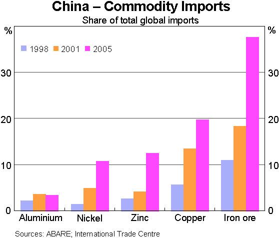
The clearest example of this is in iron ore, where Chinese demand has increased from 11 per cent to 37 per cent of global imports in less than a decade. Some of that, no doubt, will have replaced demand from other countries, but a big part represents a net increase in global resources demand. So China is already a large presence in world commodities demand, and it has the potential to become much larger, as does India in its turn.
From a global perspective, this process can be thought of as being driven by an increase in the supply of unskilled labour – that is, the release over a period of time of large numbers of unskilled workers into the industrial sectors of previously underdeveloped economies. For the world as a whole, this kind of shock can be expected to have some significant effects on relative prices, at least during the period of transition when the additional labour is being absorbed. Other things equal, it reduces the relative prices of labour intensive industrial outputs, and raises the relative prices of scarce inputs, notably raw materials. This seems to have been what happened in the last few years, and Australia, as a resource exporter, has been one of the beneficiaries.
At the same time, we should recognise that there are other forces that could limit this relative price shift over time. Economic convergence should eventually mean rising real wages and rising output prices in today's low-cost producers. In addition we should recognise that the extent of the real increase in resource prices will ultimately depend on the supply response of resource producers. What we can say with confidence is that the world is experiencing a very large increase in resources demand which is likely to go on for some time.
Australia: the longer-term context
Turning now to Australia, I'll begin with a few remarks about the longer-term context. The Australian economy was last in recession in 1991, so the current period of expansion is now in its sixteenth year (Graph 11).
The overall performance in that period has clearly been good, both by the standards of our own earlier history and in comparison with other advanced countries.
A few observations will help to make that claim a bit more concrete:
- Australia's growth rate since 1990 has averaged 3¼ per cent. That compares favourably against most (though not all) of the advanced OECD countries that we would normally take as a benchmark. One important aspect of that result is that, unlike a number of the other advanced countries, Australia avoided recession in 2001 (Table 2).
| GDP | GDP per capita | |
|---|---|---|
| Ireland | 6.4 | 5.3 |
| Australia | 3.3 | 2.1 |
| United States | 3.0 | 1.9 |
| Norway | 3.0 | 2.6 |
| New Zealand | 3.0 | 1.8 |
| Spain | 2.9 | 2.5 |
| Canada | 2.8 | 1.7 |
| United Kingdom | 2.5 | 2.1 |
| Netherlands | 2.3 | 1.6 |
| Sweden | 2.2 | 1.8 |
| France | 1.8 | 1.4 |
| Germany | 1.7 | 1.3 |
| Italy | 1.3 | 1.1 |
| Japan | 1.3 | 1.1 |
|
Sources: ABS; CEIC; Consensus; IMF; Thomson Financial |
||
- Australia's inflation performance has also been good. Since the inflation target was first formulated in 1993, CPI inflation in Australia has averaged 2½ per cent – in the middle of the target zone.
- It is also noteworthy that both growth and inflation have on average become more stable over time. One way to summarise that is to look at the standard deviations of these variables over successive decades. Economic performance deteriorated markedly in the 1970s, but volatility has been reduced in each decade since then. In the current decade, the outcomes for GDP growth, and for inflation, have been only about half as variable as they were in the 1980s (Table 3). Notwithstanding this general trend, however, CPI inflation has been quite volatile in the latest year, for reasons I will come back to in a moment.
| 1970s | 1980s | 1990s | 2000s | |
|---|---|---|---|---|
| Output | 1.5 | 1.0 | 0.8 | 0.5 |
| Inflation^ | 1.3 | 0.8 | 0.5 | 0.3 |
|
*Standard deviations of quarterly percentage changes
Sources: ABS; RBA |
||||
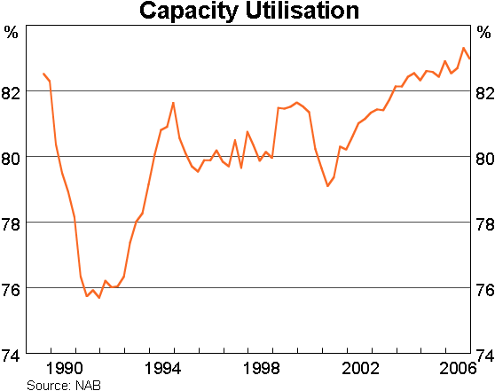
I have a couple of brief comments to make on the consequences of this general period of stable growth. The first is that economic slack has been substantially wound back. Unemployment has come down to a 30-year low, and direct measures of business capacity usage, such as this one from the NAB survey, are close to cyclical highs (Graph 12).
This means that the problems facing businesses and economic managers are very different from those of a few years ago. For example, businesses are commonly reporting that labour shortages are the main constraint on their activities, whereas previously they would have cited concerns about lack of sales or orders. It also means, as the RBA has been pointing out for some time now, that we should not expect the economy to grow as quickly as it did a few years ago, when there was still a lot of surplus labour and capital to be re-employed. These points, by the way, should not be seen as negatives. Rather, they are a consequence of economic success as the economy moves back closer to full employment.
My second comment concerns regional differences. In any given year, it is not uncommon to see significant differences in growth rates across the States, and the current period is no exception to that. At the moment, it is well known that the south-eastern states are growing more slowly than the resource-rich states of Western Australia and Queensland. At other stages of the cycle the positions have been reversed. Nonetheless, all the states have benefited from the extended nature of the current expansion. A useful summary indicator of that is the movement in unemployment rates (Graph 13).
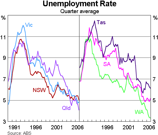
Clearly, on this measure, Western Australia and Queensland are performing the most strongly at the moment. But viewed over a longer period, all the States have seen their unemployment rates decline to their lowest for many years.
Recent developments
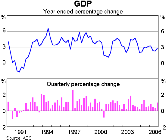
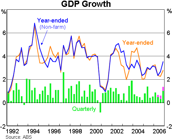
Turning to more recent developments, last week's set of national accounts figures showed, as expected, that the expansion continued in the December quarter. They indicated that the economy's annual growth rate picked up to 2.8 per cent, with non-farm output growing by 3½ per cent over the latest year (Graph 14). It remains the case that domestic demand is growing faster than GDP, although it has eased from the very high rates seen a few years ago.
We should of course be wary of reading too much into any single set of quarterly figures. Nonetheless, these latest accounts bring the estimates of growth more into line with other indicators which suggested the non-farm economy was strengthening in the second half of last year. In particular, they go some way towards resolving the apparent conflict between earlier soft GDP outcomes and the increase in employment growth in the second half of the year. A corollary of that is that the figures show a pick-up in estimated productivity growth. The Statistician's measure of market-sector GDP per hour worked rose by 1½ per cent over the latest year. This is reasonably close to its longer-run average, though it is still the case that average productivity growth over the past two to three years has been lower than it was earlier in the current expansion.
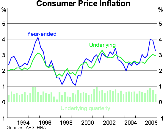
Australia's inflation rate has fluctuated quite sharply in headline terms during the past year, and it will continue to do so for a while yet, as the effects of movements in fuel and banana prices work their way through the annual calculation (Graph 15). As you know, the Bank does a lot of careful analysis of measures of underlying inflation designed to abstract from this kind of volatility. We estimate that underlying inflation picked up last year from around 2½ per cent to around 3 per cent. It was still around 3 per cent in annual terms at the end of the year, though the quarterly rate of increase eased in the December quarter.
The Bank's inflation forecast, as presented in the Statement on Monetary Policy in early February, was that underlying inflation would decline slightly over the next two years to around 2¾ per cent. This outlook is still higher than ideal: it implies that inflation is more likely to be too high than too low in the period we can foresee.
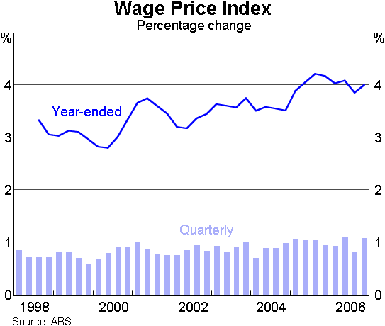
Information that has become available since that forecast was made suggests that some of the factors pushing up underlying inflation last year remain in place. The December quarter national accounts recorded relatively strong growth in demand and output. We also have some additional data on wages, which showed that growth in the Wage Price Index remained around 4 per cent in annual terms at the end of last year (Graph 16). This needs to be interpreted carefully, because the September quarter outcome, and hence also the annual figure, were artificially held down by a change to the timing of last year's minimum wage decision. The outcome for the December quarter, which was unaffected by that, was a quarterly increase of 1.1 per cent, which was at the top end of its historical range.
In summary then, the recent round of data has pointed to relatively strong outcomes for demand, output and wages growth in the December quarter. As always, the Bank will be giving careful consideration to these developments, along with other incoming data, as it continues to review inflation prospects month by month.
Let me finish by summing up the main points.
The short-term outlook for the world economy looks like it will be favourable to further growth in Australia.
Longer term forces associated with the emergence of China and India are boosting trade within the Asian region, and are having significant effects on global relative prices. The resultant rise in Australia's terms of trade has provided a substantial boost to aggregate incomes and spending.
Overall, the Australian economy has had a lengthy period of expansion. The economy has moved closer to full capacity, with recent indicators pointing to stronger conditions in the second half of last year.
Thank you.